
When a Gaming Setup Stops Being Just a Desk
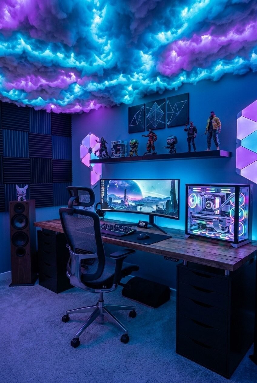
A gaming setup is one of the few corners of a home where practicality and personality are forced to share the same square footage. Every cable, panel, and light strip has to earn its place, which is why these rooms tend to look far more deliberate than a regular home office ever does.
We think that’s what makes this category so fun to study. A living room has to please everyone who walks in. A gaming setup only has to please the person sitting in it for six hours straight, so it gets to be moody, playful, or loud in ways other rooms rarely are.
Below are ten rooms that each solved that puzzle differently, from color story to furniture layout to the small props that tie a theme together. Watch for the repeated tricks: layered lighting, a strong focal wall, and shelving that turns collectibles into design instead of clutter.
A Cherry Blossom Command Center
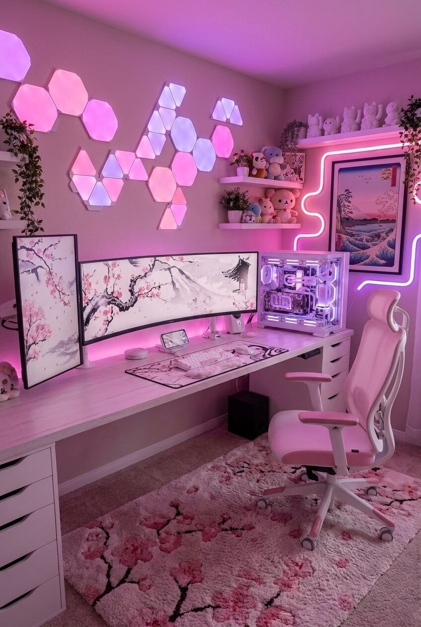
Pink and gaming don’t usually get paired in most people’s heads, but this room makes a strong case for it. The hexagon light panels are arranged like scattered petals rather than a neat grid, which keeps the wall from feeling like a showroom display, and the soft glow reads as warm instead of garish.
The ink-wash cherry blossom art on either side of the monitor does a lot of quiet work here. It repeats the pink-and-white palette without adding another light source, so the eye gets a rest between the glowing panels and the neon Fuji print on the right.
If you want this in your own space, start with one printed panel or piece of art before buying any lights. We find that people who chase the glow first usually end up overdoing the lighting and underdoing everything else. Add plush textures last, since a fluffy rug and matching mousepad are what make the whole thing feel finished rather than themed.
A Bedroom Stacked Above the Desk
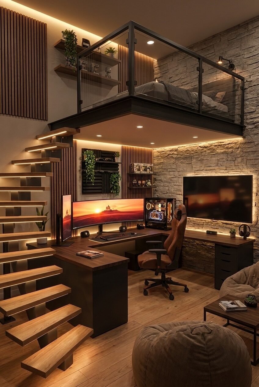
Vertical space gets ignored constantly in smaller homes, and this setup is a good reminder of what’s possible once you stop treating the ceiling as dead air. Building a sleeping loft above the desk zone effectively doubles the square footage of the room without adding a single wall.
Two materials are doing the heavy lifting here: raw stone and warm wood slats. They’re rough textures on purpose, since rough surfaces hide wear and still look good years later, unlike smooth painted drywall that shows every scuff within a season. The recessed lighting tucked under the loft’s edge and along the stair risers keeps the whole structure from feeling heavy despite how much is stacked into one corner.
Recreating a full loft obviously requires construction most renters can’t touch, but the underlying principle travels well. Look at your own vertical space, whether that’s a closet, an alcove, or the area above a desk, and ask what could live up there instead of sitting on the floor. Even a simple shelf bridge over a desk borrows the same logic.
Proof That Gray Isn’t Boring
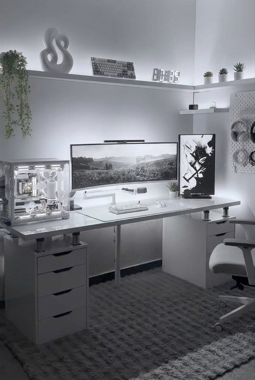
Monochrome rooms get accused of being flat, but this one avoids that trap through texture and object choice rather than color. Every surface is a slightly different finish, from the glossy white desk to the matte drawer fronts to the soft rug underneath, so the eye still has plenty to differentiate even without a single hue to lean on.
We’d argue the sculptural white object on the shelf is doing more for this room than the lighting is. A single organic-shaped piece against a flat wall gives the whole layout a focal point, which matters a lot in a palette this restrained, since there’s nowhere else for the eye to land.
To pull this off without it feeling sterile, keep at least one living element in the mix. The trailing plant on the left corner is the only thing in the whole photo that isn’t hard-edged or man-made, and it softens everything around it. Skip that step and a black-and-white room risks looking more like a server closet than a place to spend an evening.
Letting Plants Take Over the Wall
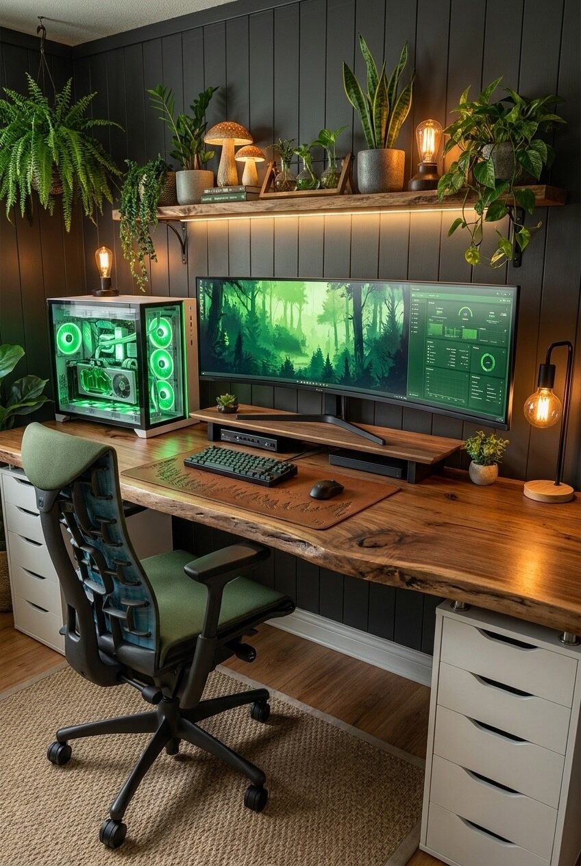
Start with the desk on this one, because it’s the least expected part of the whole room. A live-edge wood slab keeps its natural, uneven border instead of being cut into a clean rectangle, and that irregular line is what convinces your brain this is a plant room with a desk in it, rather than an office someone added greenery to.
Everything above the desk reinforces that same idea. Shelves are packed with trailing pothos, snake plants, and small terrariums at different heights, and the string lights and mushroom figurines scattered between them read like a forest floor rather than a display shelf. The green-toned monitor wallpaper mirrors the plants instead of competing with them, which is a detail a lot of themed rooms miss.
Real plants need real light, so if you’re recreating this, don’t rely on the warm bulbs shown here for actual plant health. Add a small grow light behind the monitor or near a window if the room doesn’t get natural sun, and choose trailing varieties like pothos or philodendron first, since they fill vertical space fastest.
Blue Light as the Whole Personality
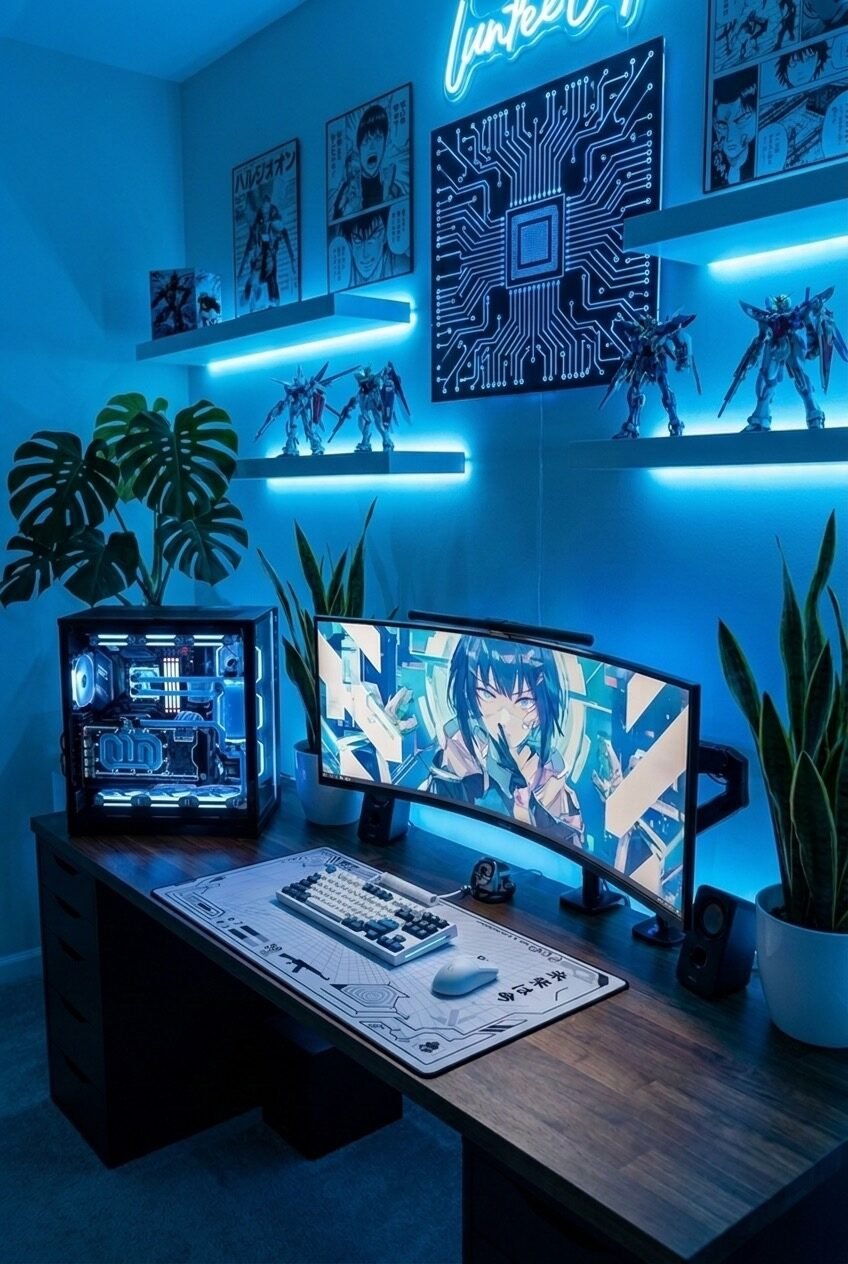
Cool-toned lighting can feel cold fast, but layering it under two separate shelves instead of one strip is what keeps this room from reading like a hospital corridor. Each shelf casts its own pool of light downward, so the wall has depth instead of one flat wash of blue.
The circuit-board wall art is the smartest choice in the whole layout because it’s a graphic pattern that echoes the theme without needing any specific franchise or fandom to make sense. Anyone walking in reads it as tech-inspired immediately, no context required, which is the opposite of relying on posters that only mean something to people who already know the reference.
Monstera and snake plants on either side of the desk keep a room this saturated in blue from feeling flat or one-note, since green is blue’s natural contrast on the color wheel. If you’re building something similar, buy your lighting strips in a warm-white-to-blue adjustable version rather than fixed blue, so you’re not locked into one mood permanently.
Autumn Doesn’t Need to Be Loud
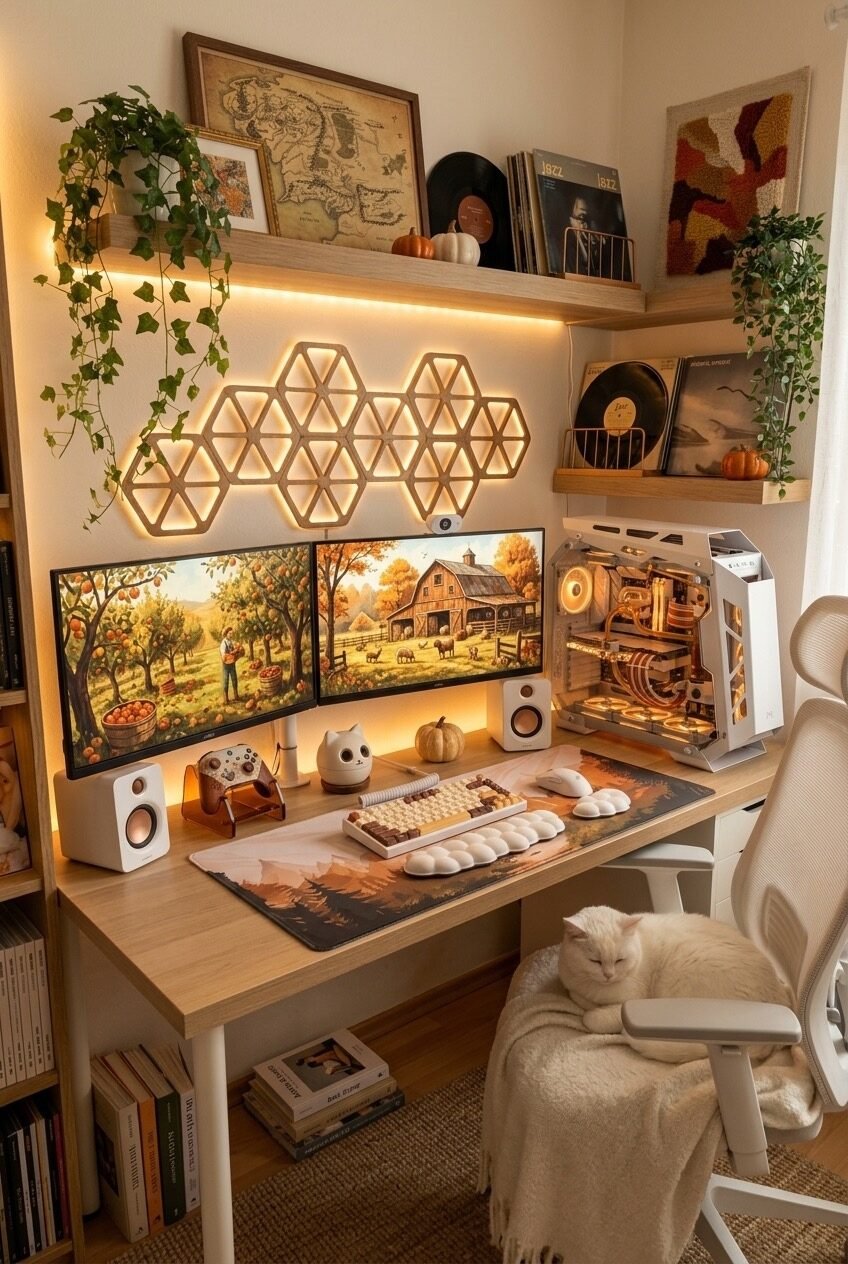
Warm honey-toned wood, dual monitors showing an orchard scene, and a cat curled up on a blanket on the chair. This is a room built entirely around temperature rather than a specific object or gadget, and that’s a harder trick to pull off than it looks, because warmth has to come from materials, not just bulb color.
A vintage fantasy adventure map, a stack of vinyl records, and a woven textile piece do the wall’s storytelling, and none of them are gaming-specific items. That’s worth noting: the desk and monitors are the only clue this is a gaming room at all, which means the rest of the decor can be pulled from any home goods store without breaking the theme.
The wooden hexagon light panel above the monitors is unlit here in favor of the warm shelf lighting doing the work instead, proving you don’t need every light source running at once. If you’re recreating this palette, shop for warm 2700K bulbs specifically, since anything cooler will fight the wood tones instead of complementing them.
A Neon Sign Setting the Mood
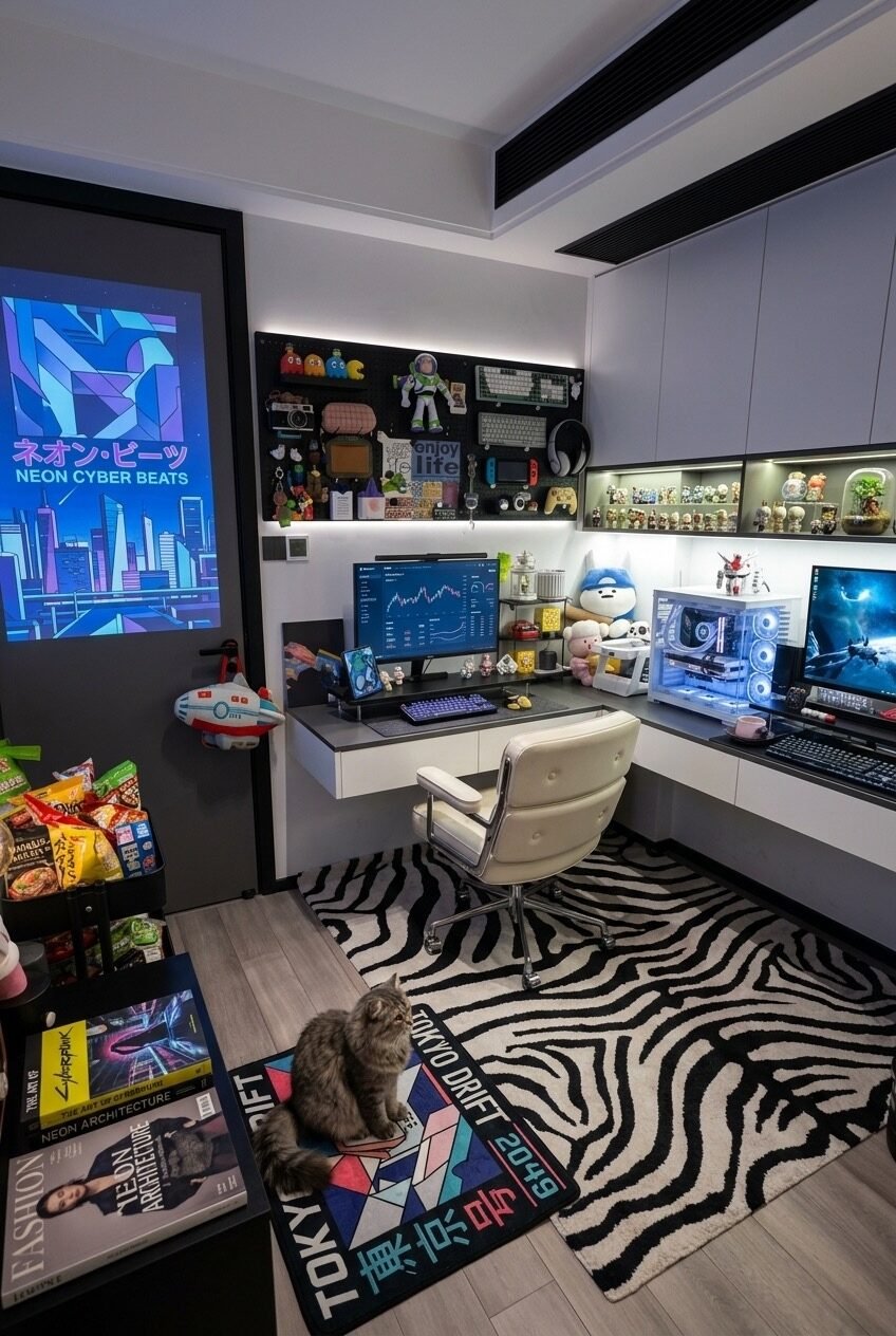
The illuminated poster by the door is the anchor of this entire layout, and it’s positioned deliberately across the room from the desk rather than above it. That placement means the glow bounces light across the whole space instead of just onto the monitor, which is the opposite of how most people install their accent lighting.
We appreciate that the desk itself stays fairly restrained: a cream leather chair, a compact glass shelf with figures, and a single ultrawide monitor, while the personality gets pushed onto the rug and the surrounding shelving instead. A bold graphic rug is doing double duty as both flooring and art, which is a smart trade-off in a small room where wall space is limited.
Books, snacks, and a magazine stack near the door might look like clutter in a photo, but in practice they’re what make a room feel lived-in rather than staged. If you’re building this look, resist the urge to hide everything in drawers. A few visible personal objects will sell the theme more than another light strip will.
Two Warm Lights Fighting for Attention
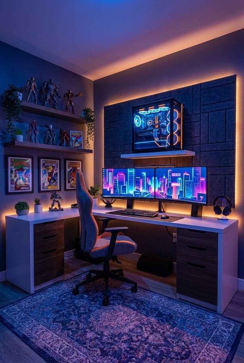
Purple-blue monitor glow against warm orange wall lighting shouldn’t work as well as it does here, but the padded fabric wall panel between them is the reason it holds together. It’s a neutral gray, which means it absorbs both colors without amplifying either one, acting like a buffer zone so the two light temperatures don’t visually clash.
Floating the PC case on its own shelf above the monitors is a clever space trick worth stealing regardless of your color scheme, since it frees up the entire desk surface for keyboard, mouse, and elbow room. Combined with under-desk drawer units on both sides, the whole setup stays organized without a single visible cable run.
Action figures and comic-style art on the shelves lean into a personal collection rather than a generic prop, and that specificity is what separates a room like this from a stock photo. Swap in whatever you actually collect, whether it’s vinyl toys, trading cards, or model kits, and the effect transfers directly.
When Gaming Room Meets Living Room
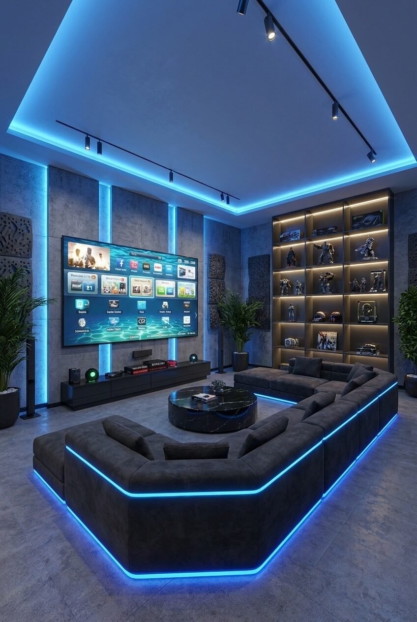
This space skips the desk-and-chair format entirely and builds around a deep sectional sofa instead, which is worth noticing because it reframes the whole idea of what a gaming room has to look like. Console gaming and movie nights both fit this layout better than a desk setup ever would, especially with a screen this large mounted at proper eye level for a couch.
Perimeter lighting traces the ceiling edge, the vertical wall panels, and the base of the sofa itself, which means the light source is never directly visible, only its glow. That’s a detail worth copying regardless of budget: hidden LED strips read as far more expensive than exposed fixtures, even when the hardware costs the same.
The display shelving on the right takes cues from museum casing, with individual lit compartments for each figure or collectible instead of one crowded shelf. If you’re working with a smaller room, even two or three of these lit cubbies will upgrade a collection instantly compared to an open shelf where everything competes for attention.
Dark, Moody, and Still Livable
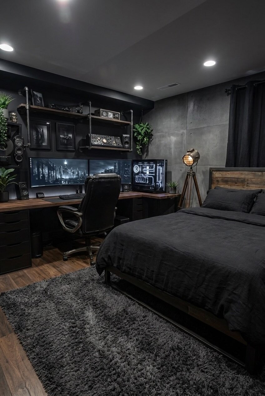
A near-all-black room runs the risk of feeling like a cave, and the industrial pipe shelving above the desk is what keeps this one from tipping that direction. Exposed metal piping reads as raw and unfinished by nature, which contrasts against the smooth concrete-paneled wall behind the bed and keeps the eye moving instead of settling into one flat, dark mass.
Combining a bedroom and a desk setup in one space is genuinely difficult to get right, since sleep lighting and gaming lighting want opposite things. The single tripod spotlight beside the bed solves that by giving the sleeping side its own dedicated, dimmable source, completely separate from the triple-monitor glow on the desk side of the room.
Wood tones on the bed frame and desktop keep the palette from going fully cold despite the dark walls and gray concrete panels. If you’re attempting a dark room like this, add at least one warm wood surface and one plant, since both of those are what stop black-heavy interiors from reading as unfinished or unfriendly.
The Best Setups Solve a Problem, Not Just a Look
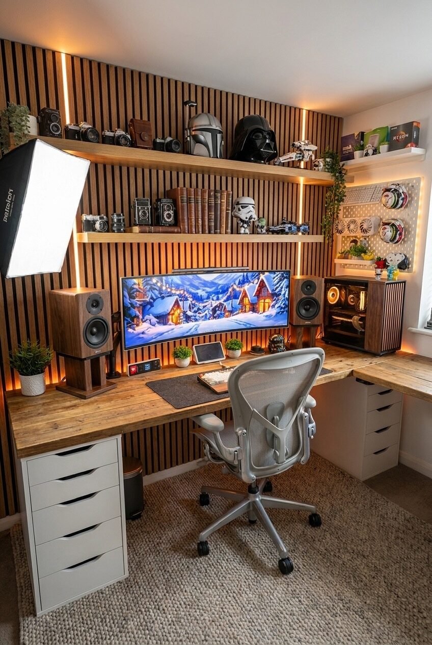
Looking at these ten rooms side by side, the common thread isn’t a specific color or gadget, it’s that every one solved a real constraint first and let the aesthetic follow from that solution. A loft bed solved a square footage problem. A neutral fabric panel solved a clashing light problem.
We think that order matters more than most people give it credit for. Chasing a look before understanding what a room actually needs tends to produce spaces that look right in photos but feel off to sit in for six hours straight, which defeats the whole point of a setup.
Whichever version speaks to you, start with your own actual constraint, whether that’s a small footprint, a shared bedroom, or a single accent wall, and build outward from there. The lighting and color story make more sense once that piece is settled first.

 Steal Our Home Styling Secrets!