
The Lasting Charm of the Nancy Meyers Home Aesthetic
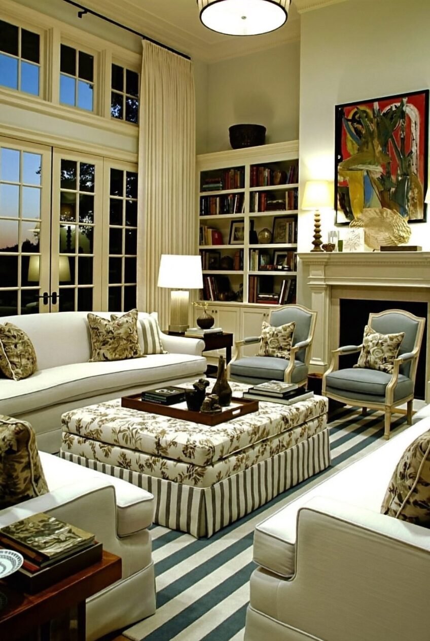
There is a reason people rewatch Nancy Meyers movies just for the rooms. The marble islands, the French doors thrown open to a garden, the stacks of linen and books that look like someone actually reads them. It is not a set so much as a whole philosophy about how a home should feel.
Strip it down and the formula is pretty consistent: warm neutrals, mixed textures, real flowers, soft layered light, and furniture arranged for conversation instead of for show. Nothing in these spaces looks brand new, even when it technically is.
What follows are ten real spaces that channel that same energy, broken down by the design choices that make them work and a few ways to borrow them without buying a Hamptons estate.
Outdoor Living Built Around A Fireplace
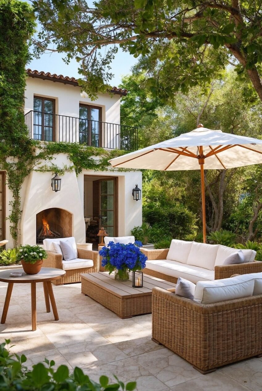
A patio fireplace changes the whole math of outdoor space because it gives people a reason to stay past sunset instead of drifting back inside once the temperature drops. Built into the house itself rather than a freestanding unit, it reads as a real architectural feature, not an accessory you ordered online.
The furniture here is doing a lot of work too. Woven wicker frames with thick white cushions keep things relaxed instead of formal, and a market umbrella in the same cream tone ties the seating area back to the house facade without screaming for attention. Even the climbing vines feel deliberate, softening the stucco edges.
If you are working with a smaller patio, you can borrow the bones of this without the built-in masonry. A tabletop fire bowl, neutral cushions a shade or two lighter than your hardscaping, and one oversized bouquet on the coffee table will get you most of the way there for a fraction of the cost.
Dark Cabinetry For A Grown Kitchen
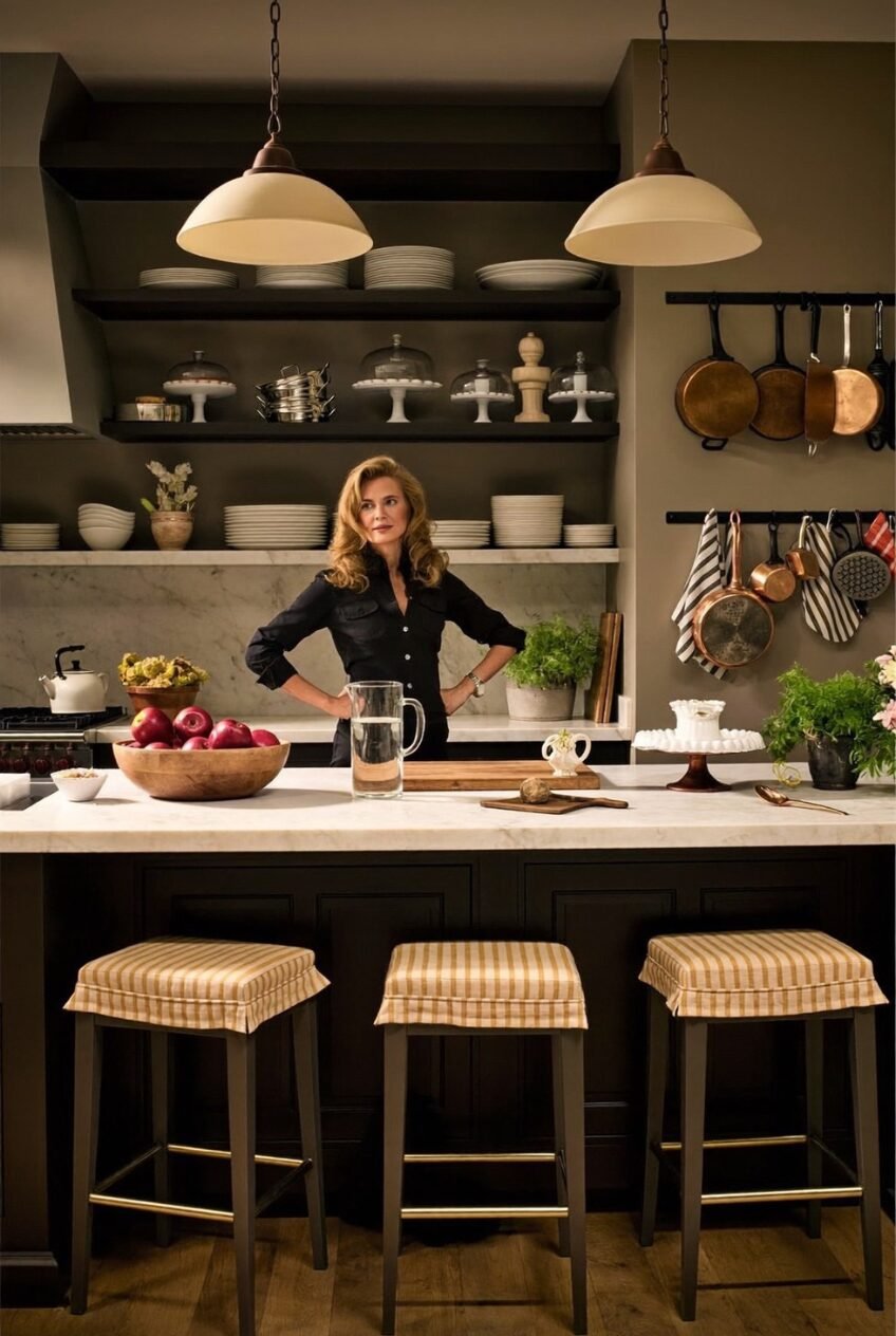
Most kitchen advice pushes you toward white and bright, so a deep espresso island like this one stands out by doing the opposite. Paired with honed white marble counters and brass hardware, the dark tone reads less like a trend and more like a kitchen designed by someone who actually cooks in it daily.
Open shelving holds the visual weight here. Stacked plates, cake stands under glass domes, and a row of copper pots hung within reach turn storage into something worth looking at, which only works because everything on display is genuinely used rather than staged for a single photo.
To recreate the mood without repainting your whole kitchen, start with checked or striped stool cushions in a warm gold tone, swap your cabinet pulls for unlacquered brass, and resist the urge to hide your good cookware in a drawer. Letting a few tools live out in the open is part of the point.
Texture Wins Over Color Here
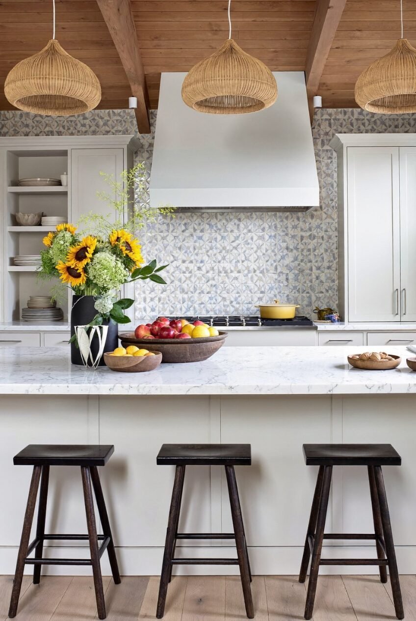
Sunflowers in a black ceramic vase, a yellow Dutch oven on the stove, a fruit bowl spilling over with apples and lemons. None of it is matched on purpose, and that is exactly why the kitchen feels alive instead of staged for a catalog shoot.
What actually anchors the room is texture: woven rattan pendant lights against a beamed wood ceiling, a hand-painted tile backsplash in soft blue and gray, and chunky stools carved from solid dark wood. White cabinetry stays quiet so all of that material variety has room to breathe.
If your kitchen leans flat or builder-grade, the cheapest fix is almost always lighting. Swap one boring fixture for a woven pendant, add a single oversized backsplash moment behind the range instead of redoing the whole wall, and keep a big bowl of real fruit on the counter at all times. It does more visual work than people expect.
A Coffee Table Tells Everything
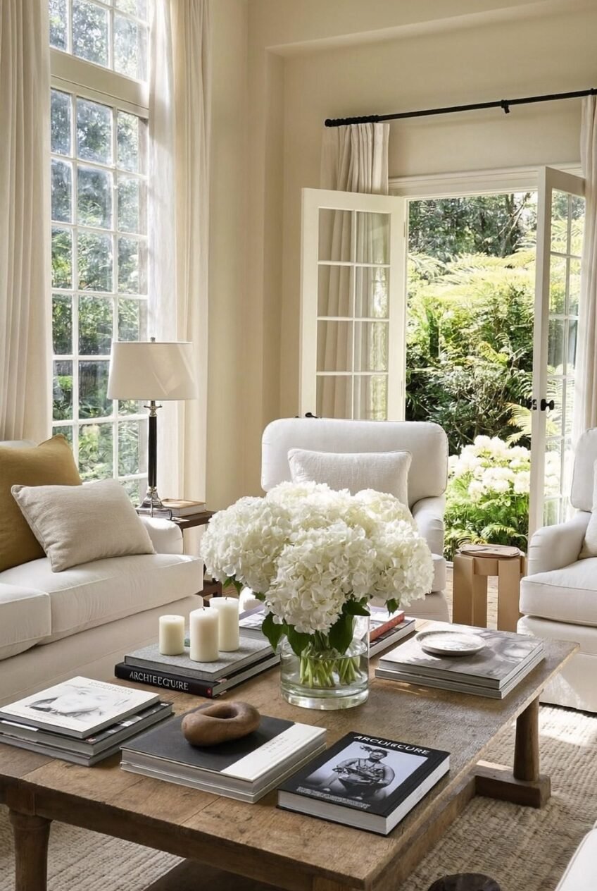
Look closely at this coffee table before you look at anything else in the room. Hardcover books stacked in uneven heights, a single oversized vase of white hydrangeas, fat pillar candles, and one strange little wooden object that does not need to justify its presence. That mix is what separates a styled table from a cluttered one.
Behind it, cream upholstery and floor-to-ceiling drapery in the same tone keep the room from competing with itself, while the French doors thrown open to a green garden do most of the work of making the space feel larger than it is.
For your own coffee table, pick books with spines you actually like the look of, not whatever happens to be on your shelf. Group them in two or three stacks of different heights, add one flower arrangement that is bigger than feels reasonable, and stop there. Restraint is what makes this work.
Color Drenching A Reading Nook
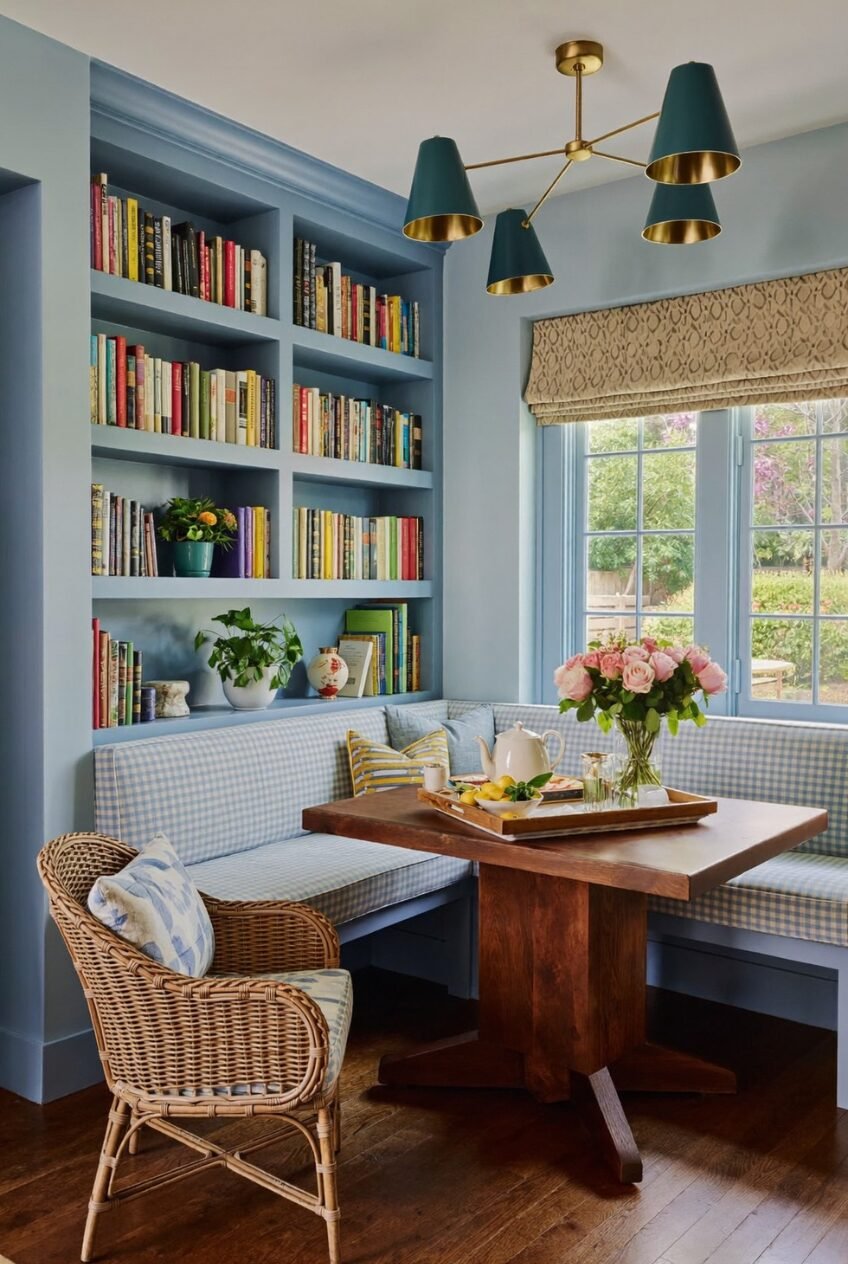
Painting the bookshelves, the trim, and the walls the same shade of dusty blue is what makes this corner feel like one cohesive moment instead of a wall of mismatched furniture. Designers call this color drenching, and it works because the eye stops noticing where one surface ends and another begins.
Inside that calm blue frame, everything else gets to be loud. Colorful book spines, a gingham banquette cushion, a brass and teal pendant light, and a vase of pink roses all sit comfortably together because the backdrop never competes for attention. It is a useful lesson in how to mix pattern without things going sideways.
You do not need a full architectural nook to steal this trick. Paint a single bookshelf and the wall behind it the same saturated color, fill it with books sorted by spine color rather than genre, and let one bold light fixture do the rest of the talking.
A Powder Room With Maximalist Confidence
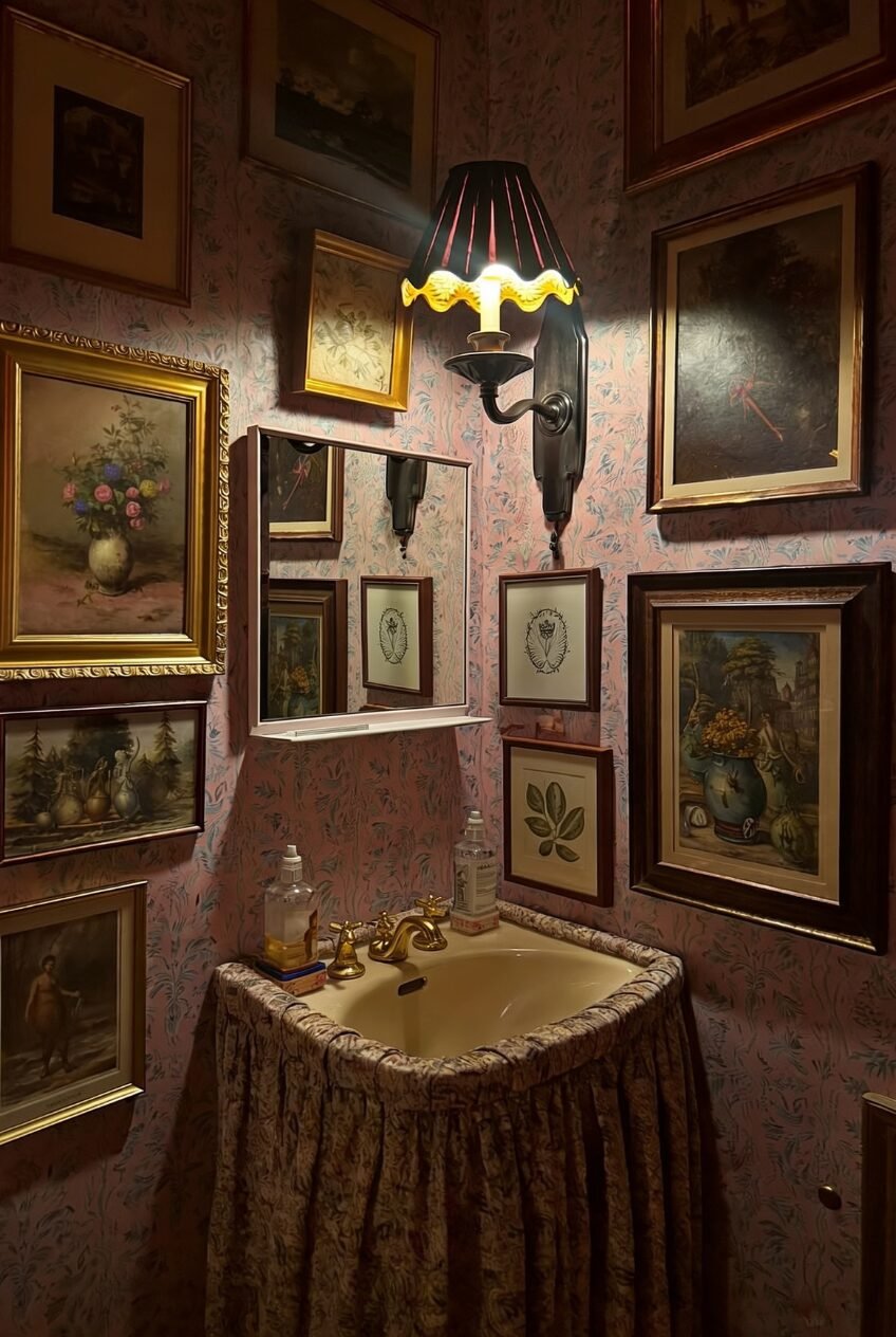
Most bathrooms get treated as an afterthought, but a powder room is exactly where you can go a little dramatic, because guests only spend a few minutes in there. Floor to ceiling artwork, busy floral wallpaper, and a skirted sink covered in matching fabric turn a tiny room into a small jewel box instead of a forgettable pit stop.
The lighting matters more than people realize in a moody space like this. A single fringed sconce with a warm bulb keeps the room from feeling cave-like, and the gold faucet hardware picks up just enough light to glint against all those dark, layered frames.
Hunt estate sales and flea markets for mismatched gilt frames rather than buying a matching set, since the slightly chaotic energy is the entire point. Hang them salon style with almost no breathing room between pieces, choose one bold wallpaper, and let a single warm light source carry the whole mood.
Wood And Brass Soften Florals
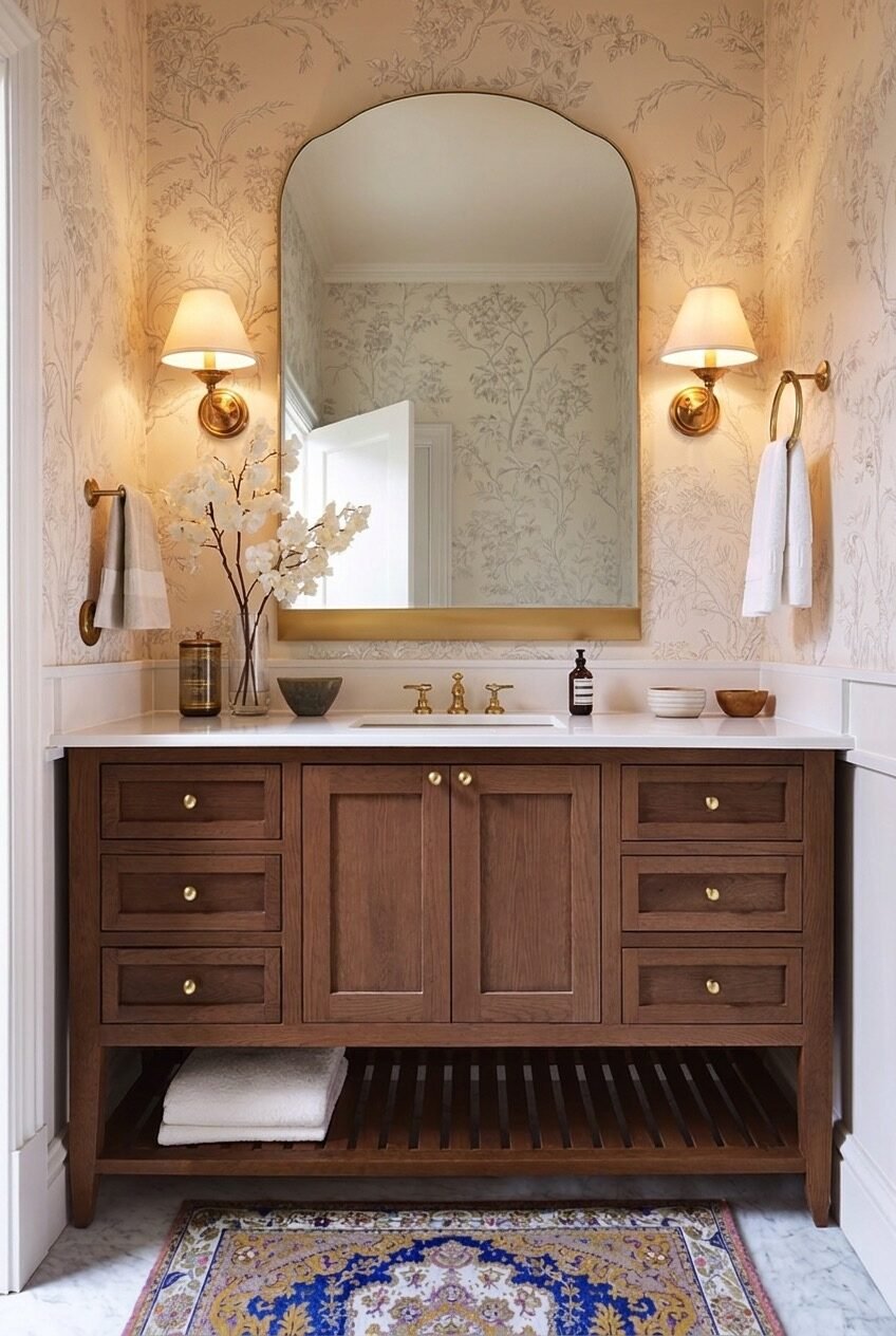
Take the same floral wallpaper instinct from the previous powder room and pair it with warm wood cabinetry instead of dark walls, and you get something closer to a sunlit garden than a jewel box. Soft beige tones across the walls, vanity, and even the floor make the whole bathroom feel like one continuous breath.
Brass hardware shows up everywhere here on purpose: the faucet, the sconces, the towel ring, and the mirror frame all share the same warm finish, which keeps a fairly busy room from reading as mismatched. An arched mirror also softens all the rectangular lines of the cabinetry below it.
A patterned rug in blue and gold underfoot stops the room from feeling too matchy-matchy, since florals on every surface can flatten a space if nothing breaks them up. If you are renovating, choose your wallpaper first and pull every other finish, including hardware, from one color already living in that print.
Built Ins Make A Room Personal
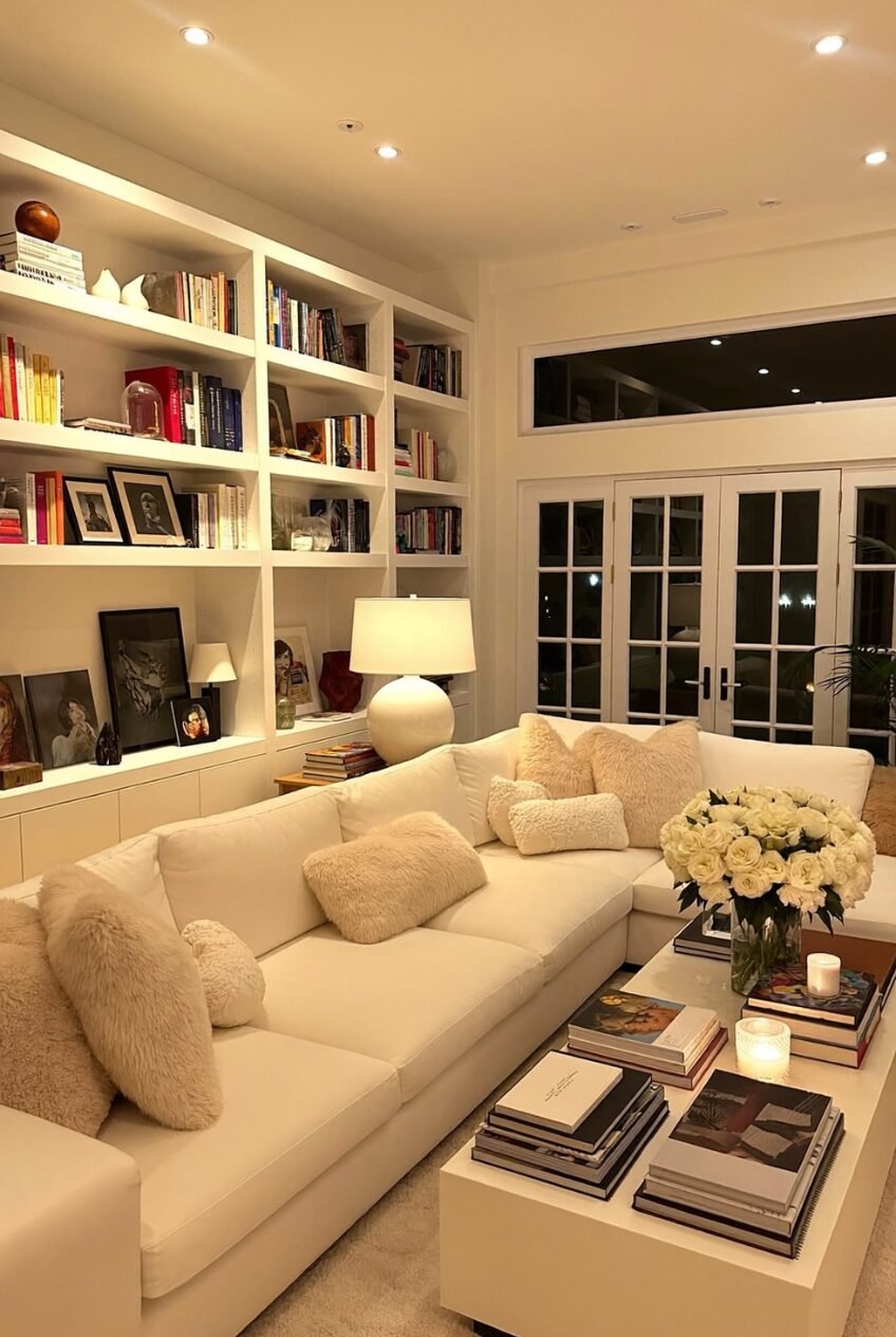
Floor-to-ceiling built-ins packed with books, framed photographs, small sculptures, and the occasional unmatched object do more to make a living room feel personal than any single piece of furniture could. Here, the shelving runs the length of an entire wall, and the slight disorder across it reads as collected over years, not arranged in an afternoon.
At night, the room leans into warmth rather than brightness. A cream sectional piled with fuzzy textured pillows, a single round table lamp, and a low coffee table stacked with art books all sit under soft recessed lighting that flatters everything instead of flattening it.
For a similar feel, resist filling new shelving with only books. Mix in a handful of objects with no obvious function, leave a few shelves slightly under-filled, and pick at least one lamp with a wide round shade for soft, even light once the sun goes down.
An Office That Feels Lived In
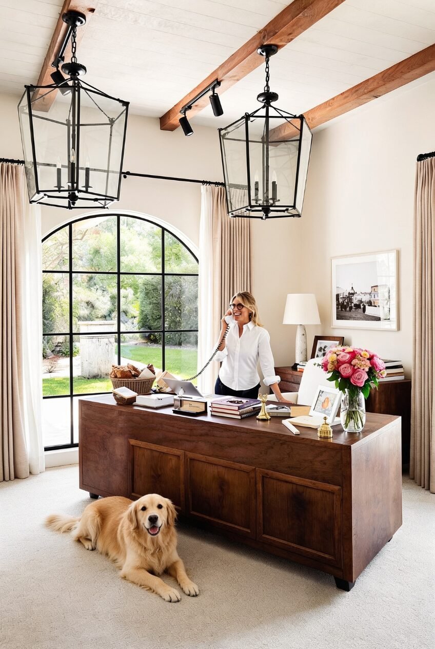
Two oversized lantern pendants hanging from a wood beam ceiling immediately tell you this is not a sterile home office, and an arched steel-framed door looking out onto a green lawn does the rest. The scale of the lighting is what makes the room, since smaller fixtures would have disappeared under those exposed beams.
A substantial wood desk anchors the space without crowding it, layered with books, a corded phone, and a generous bouquet that keeps the surface from feeling like a workstation. A dog sprawled on the floor underneath is doing more to set the mood than any decor choice could.
Borrow the scale lesson above everything else here. If your home office has any architectural ceiling detail, hang a light fixture bigger than feels reasonable, choose a desk in dark wood rather than anything that looks disposable, and keep one fresh flower arrangement on the surface at all times.
Black Accents Anchor A Room
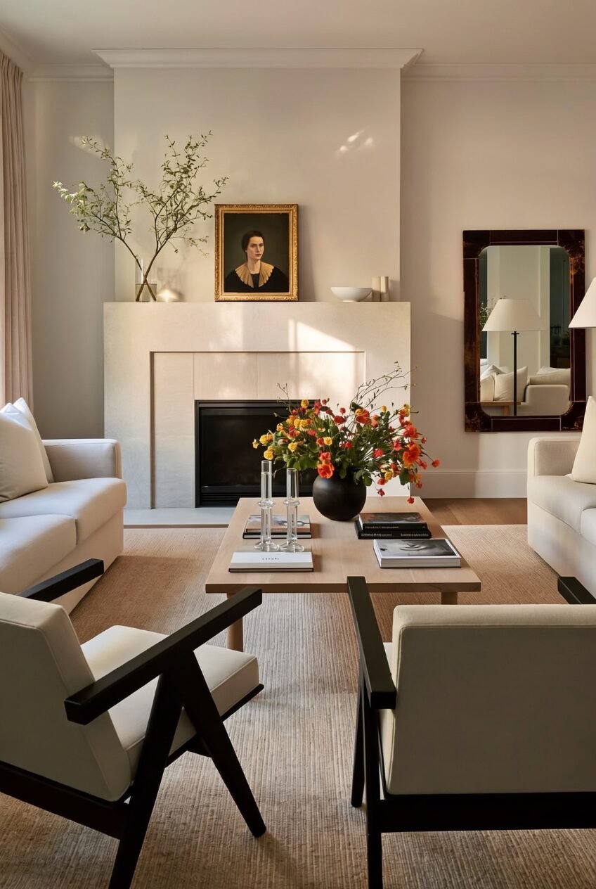
Every surface in this living room sits somewhere between cream and oatmeal, which could easily read as flat if not for two black-framed accent chairs pulling the entire composition into focus. Those chairs are doing more work than the fireplace, the rug, or the artwork combined.
A low wood coffee table holds a single black ceramic vase loaded with wild orange and yellow blooms, which becomes the only saturated color in the whole room and stands out precisely because everything else stays so quiet. A dark slim mirror on the far wall repeats that same black accent without crowding the space.
This is one of the easiest looks to replicate on a budget. Keep your sofa, walls, and rug in tonal neutrals, then introduce exactly one or two black-framed pieces, whether that is a chair, a mirror, or a lamp base, and finish with a single bright floral arrangement to keep the room from feeling flat.
Glamour That Still Looks Like Somebody Lives There
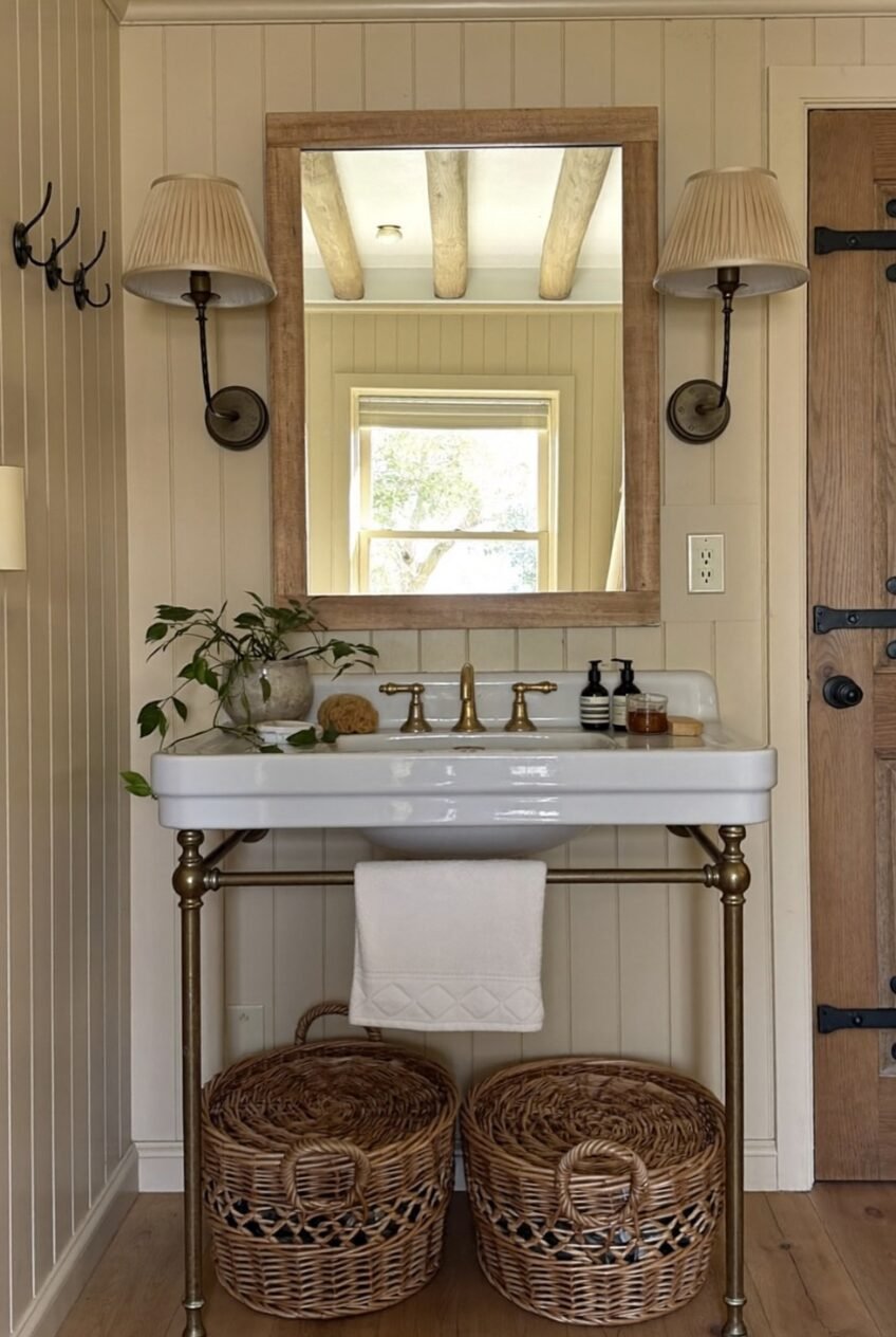
What ties all ten of these spaces together is restraint mixed with warmth. Nothing here looks untouchable, even the moodier, more dramatic rooms still have a stack of real books or a half-burned candle proving someone actually exists inside them every day.
The pattern worth stealing is not a single paint color or fabric. It is the habit of layering texture, picking one or two confident details per room, and always, always keeping fresh flowers somewhere in the mix, even in a kitchen or a home office.
None of this requires a full renovation budget or a design degree. Pick one room, choose two or three ideas from this list, and let the rest of the space stay simple while those choices do the talking for you.
 Steal Our Home Styling Secrets!