
Leopard Print Bedrooms That Actually Avoid Feeling Costume-Like
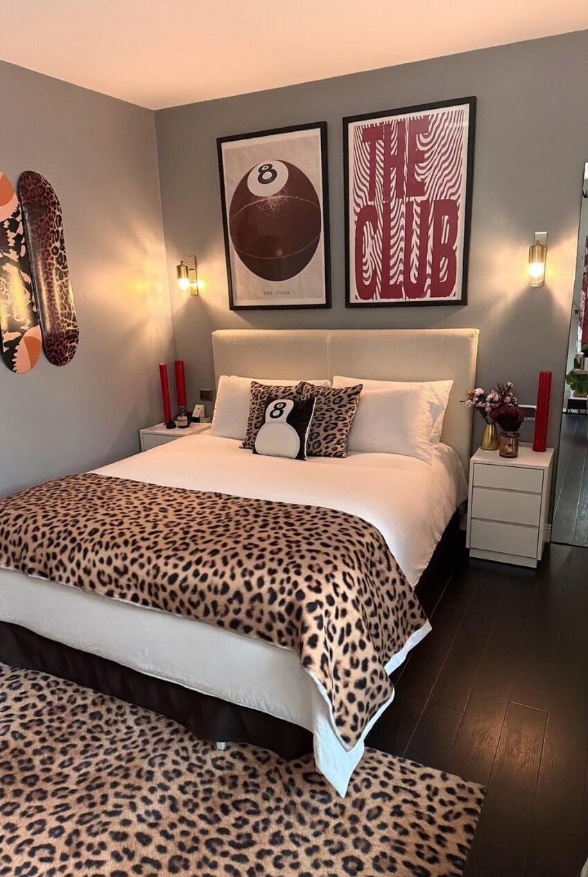
There’s a reason leopard print keeps clawing its way back into bedrooms every few years instead of quietly disappearing into a design fad graveyard. It’s one of the only patterns that reads as both wild and warm at the same time, which is a strange trick very few prints manage to pull off. Most patterns pick a lane. Leopard just doesn’t.
What we noticed pulling references for this roundup is how differently people are using it right now. Some rooms whisper it through a single throw pillow. Others go full commitment with wall-to-wall spots and don’t apologize for it. Both approaches work, which says a lot about how flexible this print actually is as a design tool rather than a gimmick.
Spaces like this tend to feel less like a themed room and more like a personality got translated into fabric. Below are ten completely different ways people are pulling that off, from subtle accent moments to rooms that go all in without blinking.
Boho Layers Meet Wild Print Accents
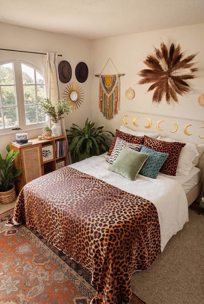
Boho bedrooms live and die by layering, and this one uses leopard print as the anchor pattern instead of an afterthought. The blanket draped across the bed does the heavy lifting, while everything else — the macrame, the palm frond wall art, the little brass moon garland — gets to play a supporting role without competing for attention.
We think what makes this work is restraint in an unexpected place. The walls stay a soft cream, the rug pulls in warm terracotta tones, and the print itself gets to be the loudest element in the room by default. Nothing fights it.
If you want to recreate the vibe, start with a neutral base — cream walls, natural wood furniture — then let one leopard piece do most of the visual work. Add plants generously. Boho rooms almost always need more greenery than feels reasonable at first.
Girlish Glam Gets a Wild Edge
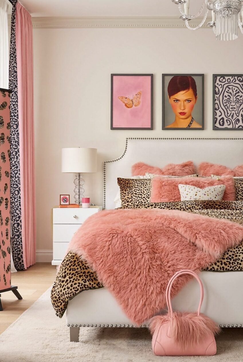
There’s an obvious contrast happening in this room between soft, fluffy pink textures and the sharp graphic punch of leopard spots, and honestly, it shouldn’t work as well as it does. Fuzzy blankets usually read as young and a little saccharine. Leopard print usually reads as bold and a little dangerous. Put them together and you get something that feels playful without tipping into childish.
The framed portrait and butterfly art above the bed matter more than they might seem to at first glance — they keep the room feeling curated rather than random, like someone actually thought about the wall before decorating it.
Recreating this means picking one dominant pink shade and repeating it in at least three places: bedding, a throw, maybe a rug. Then layer in leopard through pillows or a smaller blanket rather than the whole bedspread, so the pink still leads.
A Late-Night Glow With Playful Prints
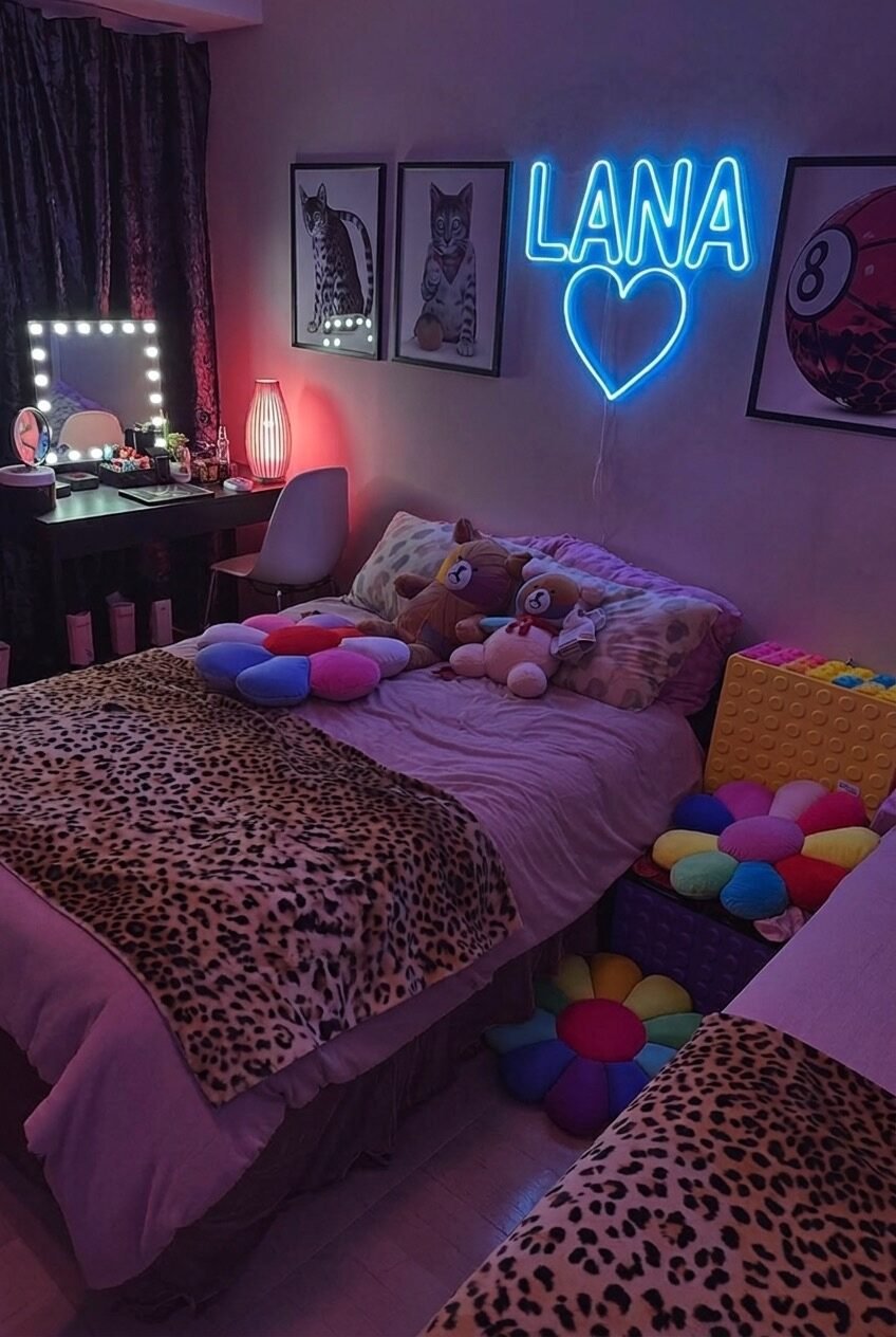
Lighting changes everything about how a print reads, and this room is proof. Under warm ambient light and a neon sign, the same leopard print that could look sophisticated elsewhere suddenly feels fun and a little rebellious, more teenage hangout than design magazine spread.
The vanity setup with the bulb-lined mirror is doing a lot of quiet work here too. It signals that this room is built for getting ready, for friends coming over, for a very specific kind of evening. The stuffed animals and colorful floor pillows keep things from feeling too serious, which fits the whole mood.
If you’re drawn to this look, invest in mood lighting before you invest in decor. A dimmable lamp, a neon sign, string lights — these change how every pattern in the room behaves far more than swapping out the bedding ever will.
Moody Luxe With a Fashion-Forward Twist
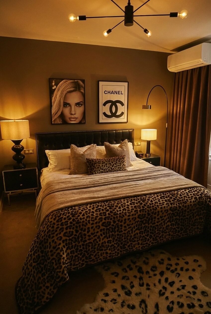
Dark walls, warm brass lighting, and a tufted headboard set the tone before leopard print even enters the conversation. This is a room built on mood first, pattern second, which is exactly why the print doesn’t overwhelm anything despite being on full display.
What’s smart here is the restraint — leopard shows up as a single lumbar pillow and a rug, not the whole bed. The Chanel-style print on the wall does more to signal the room’s personality than the animal print itself does, which is a detail worth stealing even outside this specific aesthetic.
Deep wall colors, warm brass or black metal fixtures, and layered lamp lighting instead of overhead light will get you most of the way there. Add leopard in small, confident doses rather than covering every surface.
Maximalist Spots Without Any Filter
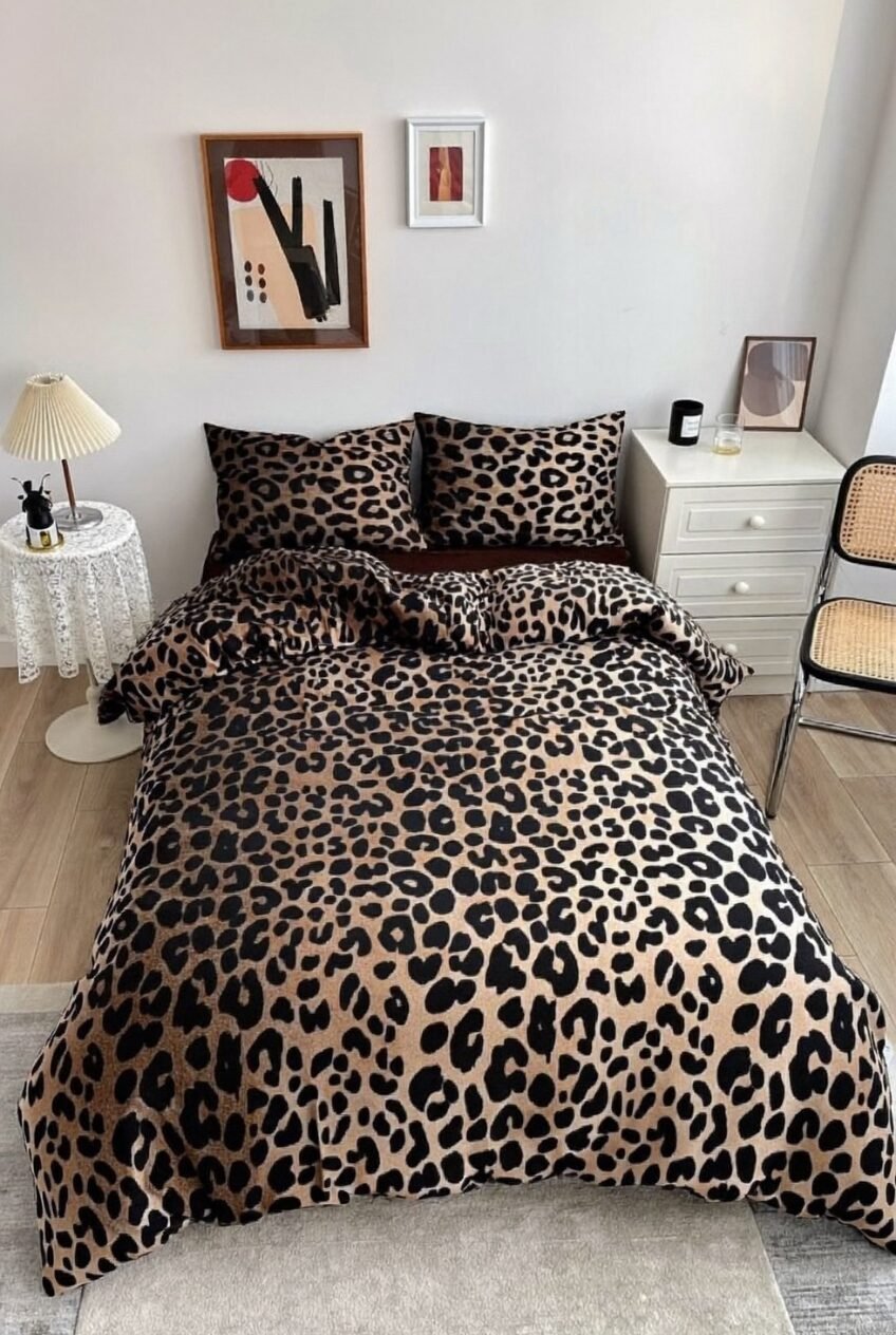
No neutral buffer, no accent wall to soften things — this bed just commits to leopard print on the duvet, the shams, everything, and lets that be the entire statement. It’s the most literal interpretation of the trend in this whole roundup, and there’s something refreshing about a room that doesn’t try to talk itself out of a bold choice.
The surrounding decor stays deliberately quiet: white furniture, minimal wall art, light wood floors. That contrast is what keeps the print from feeling overwhelming even at full volume.
If full commitment appeals to you, the trick is discipline everywhere else in the room. One loud pattern can carry a space, but only if you’re willing to let every other surface stay plain. Add pattern anywhere else and it starts competing instead of standing out.
Rose Gold Softness Against Wild Print
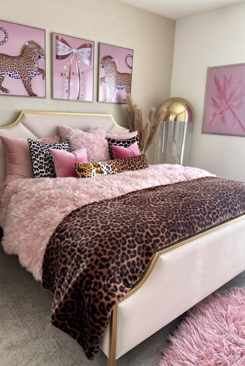
Pink and leopard again, but this version leans more romantic than playful, thanks to gold accents and a headboard shape that feels almost vintage vanity-inspired. The three matching leopard-and-bow prints above the bed pull the whole palette together in a way that feels planned rather than accidental.
We’d argue the pampas grass detail is doing more than decoration here — it softens the transition between the gold accents and the fluffy textures, keeping things from feeling too polished or too fussy at once.
To get this look, pick warm blush and gold as your consistent thread, then let leopard print show up in pillows and throws rather than the main bedding. Symmetry in your wall art will help tie mismatched textures together far more than you’d expect.
Fashion Magazine Energy in Blush and Gold
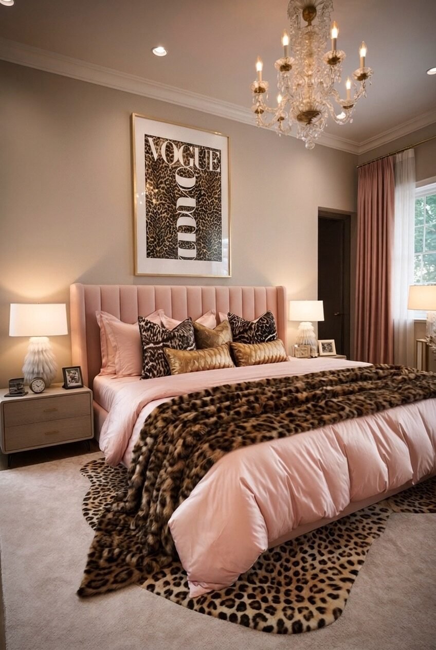
A blush velvet headboard, a genuine faux fur throw, and a framed Vogue-style print with a leopard pattern baked right into the typography — this room reads less like a bedroom and more like a fashion editorial got permission to exist in 3D. That’s not an accident. Every element here is doing double duty as both function and styling.
The gold accents on the lamps and curtain hardware keep the whole thing from tipping into overly sweet, which pink-heavy rooms can struggle with. Metallics ground pastels in a way almost nothing else does.
Go for genuine texture contrast if you want this result: silky bedding against a real or faux fur throw, glossy gold hardware against soft channel-tufted upholstery. The leopard print here works as a finishing layer, not the foundation.
Hot Pink Meets Understated Leopard Accents
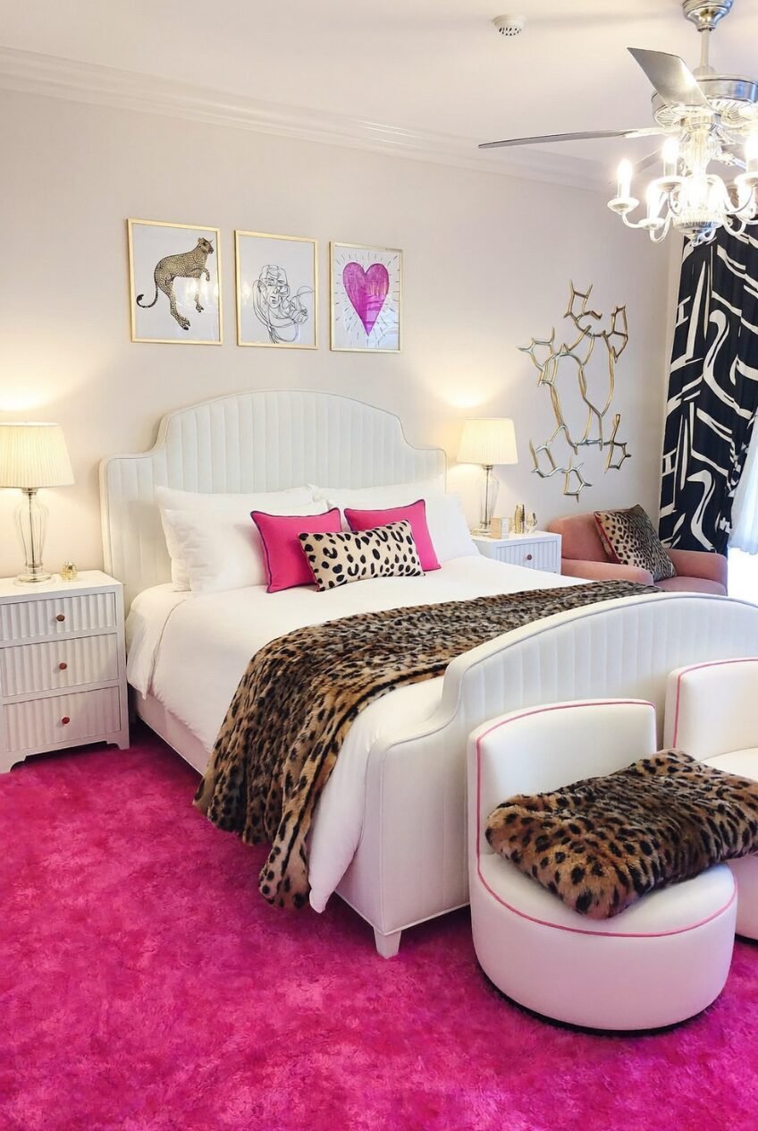
This room proves leopard print doesn’t need to be the star to make an impact. Against a shockingly saturated pink rug and mostly white furniture, a leopard throw and one small lumbar pillow are the only nods to the pattern, and that’s genuinely all it needs.
The black-and-white graphic curtain adds a second pattern language into the mix without clashing, mostly because the color story stays disciplined — white, pink, black, gold, and leopard, nothing else sneaking in.
If bold color intimidates you more than bold pattern does, this is your blueprint. Pick one saturated color for the floor or an accent wall, keep the furniture white or neutral, and let leopard print show up in exactly one or two small pieces.
An Editorial Gallery Wall Sets the Mood
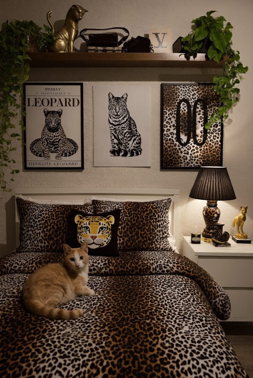
Here, the wall art is arguably doing more storytelling than the bedding itself. A vintage-style leopard illustration, a sitting cat portrait, and a graphic double-zero print work together like a curated gallery rather than random purchases, and that intentional grouping is what elevates the whole room past novelty territory.
The floating shelf above adds another layer, styled with a brass cat figurine and trailing greenery that softens all those hard graphic lines below it. Small styling choices like this are usually what separate a room that feels collected from one that feels matched.
For your own version, hunt for leopard-themed art in different styles — vintage botanical, modern graphic, illustrative — rather than matching prints. Group them close together and let a shelf or ledge add dimension above the frames.
Vintage Eclectic Charm Layered in Spots
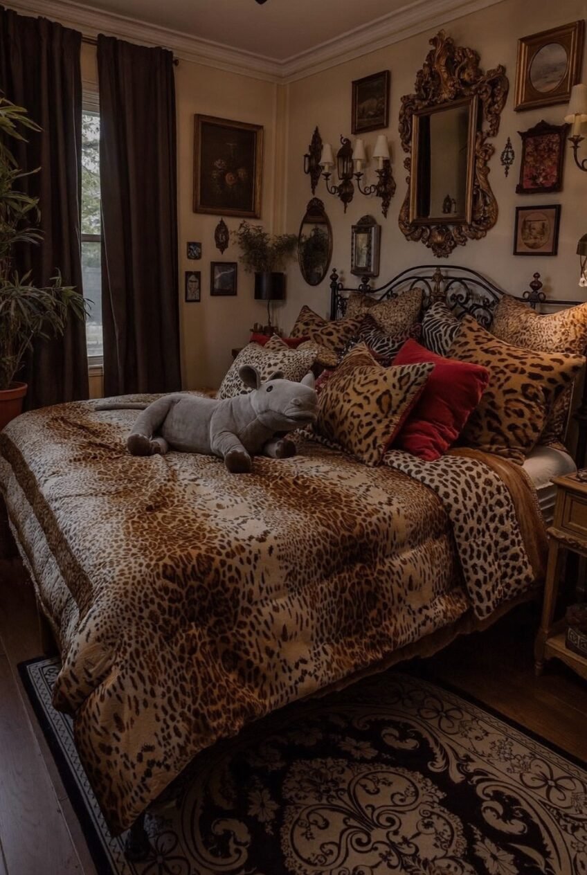
Ornate mirrors, gilded frames, and an iron bedframe already signal antique-inspired styling before you even register the leopard bedding piled underneath it all. What’s interesting is how many pillow patterns are mixed here — leopard, zebra-adjacent textures, solid reds — and yet the room doesn’t feel chaotic, just layered.
That’s largely because everything shares a warm, aged color temperature. Gold frames, brown drapery, amber lamp light. Nothing in this palette is cool-toned, which keeps a fairly busy room feeling cohesive instead of cluttered.
If you’re chasing this eclectic-vintage feel, shop secondhand for frames and mirrors in varying gold tones rather than matching sets. Mix pattern generously in pillows, but anchor everything with one consistent warm color temperature throughout the room.
Why This Print Refuses to Go Out of Style
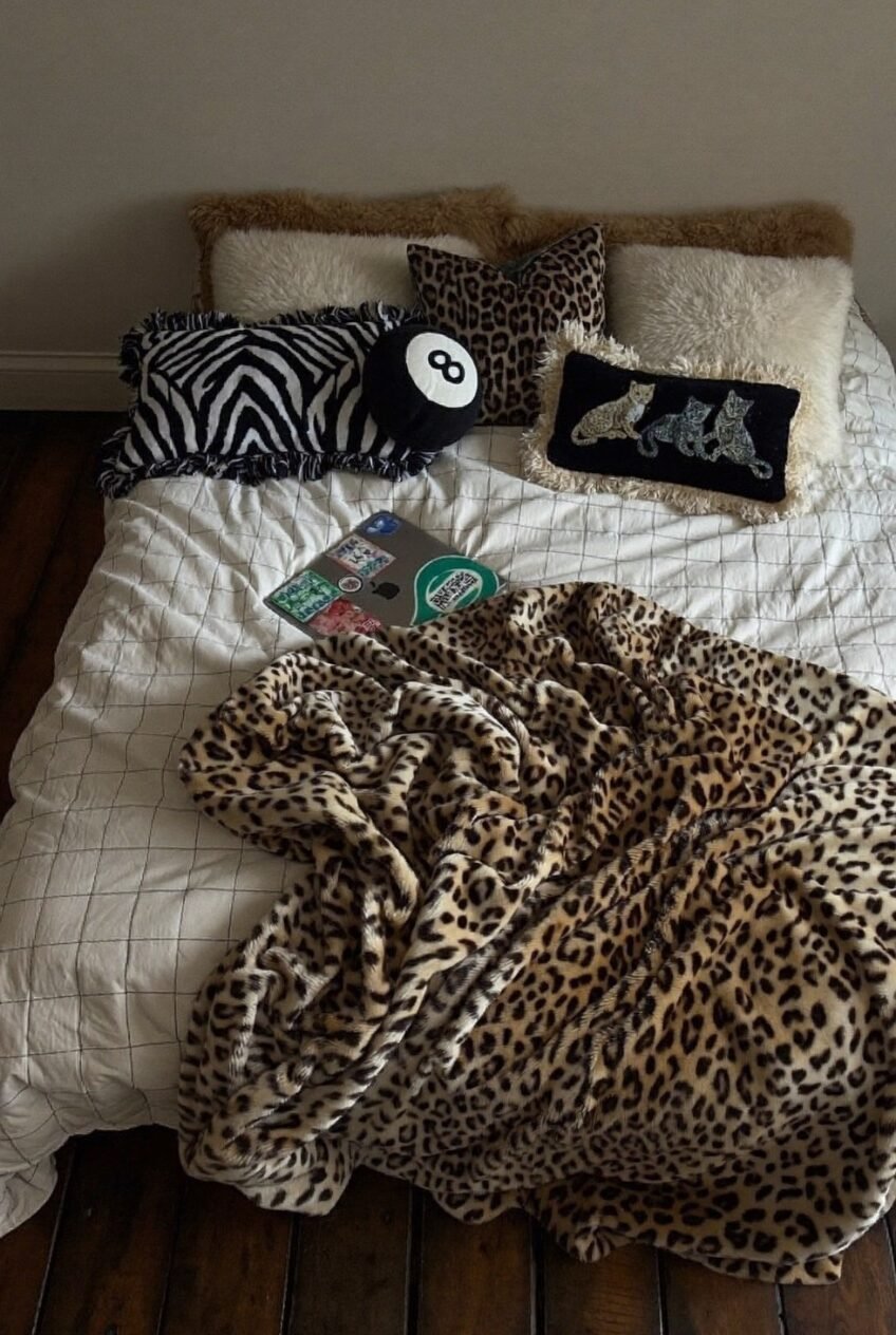
Looking at these ten rooms side by side, it’s obvious leopard print isn’t really one aesthetic — it’s a tool that bends toward whatever mood you’re building around it. Pair it with pink fluff and it goes girlish. Pair it with brass and dark walls and it goes moody. Pair it with vintage frames and it goes eclectic without much effort at all.
That flexibility is probably the actual reason this print keeps returning instead of aging out like other trends. It doesn’t demand a full theme commitment. A single pillow can nod to it, or an entire bedspread can lean all the way in, and either choice still reads as deliberate rather than half-finished.
If you’re considering it for your own space, start smaller than you think you need to. One accent piece will tell you fast whether the print earns a bigger role in your room or stays a supporting player, and either answer is a perfectly good one.
 Steal Our Home Styling Secrets!