
Pink and Green Dorm Rooms That Skip the Usual College Clichés
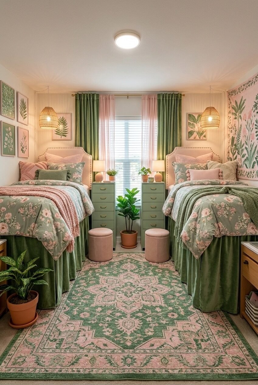
Pink and green sounds like a color combo built for a nursery, but somewhere between the sage revival and the return of chintz, it turned into one of the most requested dorm palettes we’ve seen. It reads soft without tipping into saccharine, and it’s flexible enough to stretch from grandmillennial florals to something closer to a jungle-meets-cottage mashup.
What makes it work in a dorm specifically is contrast management. Green, whether it’s sage, emerald, or deep forest, grounds the pink and keeps the whole room from reading as one long cotton candy cloud. Add brass hardware or gold frames and the palette stops feeling juvenile and starts feeling like an actual design choice.
Below, we’re breaking down ten dorm setups that use this pairing in genuinely different ways, through lighting, texture, furniture shape, and small personal touches. Some lean maximalist, some keep it restrained. Pick the one that matches how you actually live, not just how it photographs.
A Personalized Neon Sign Statement
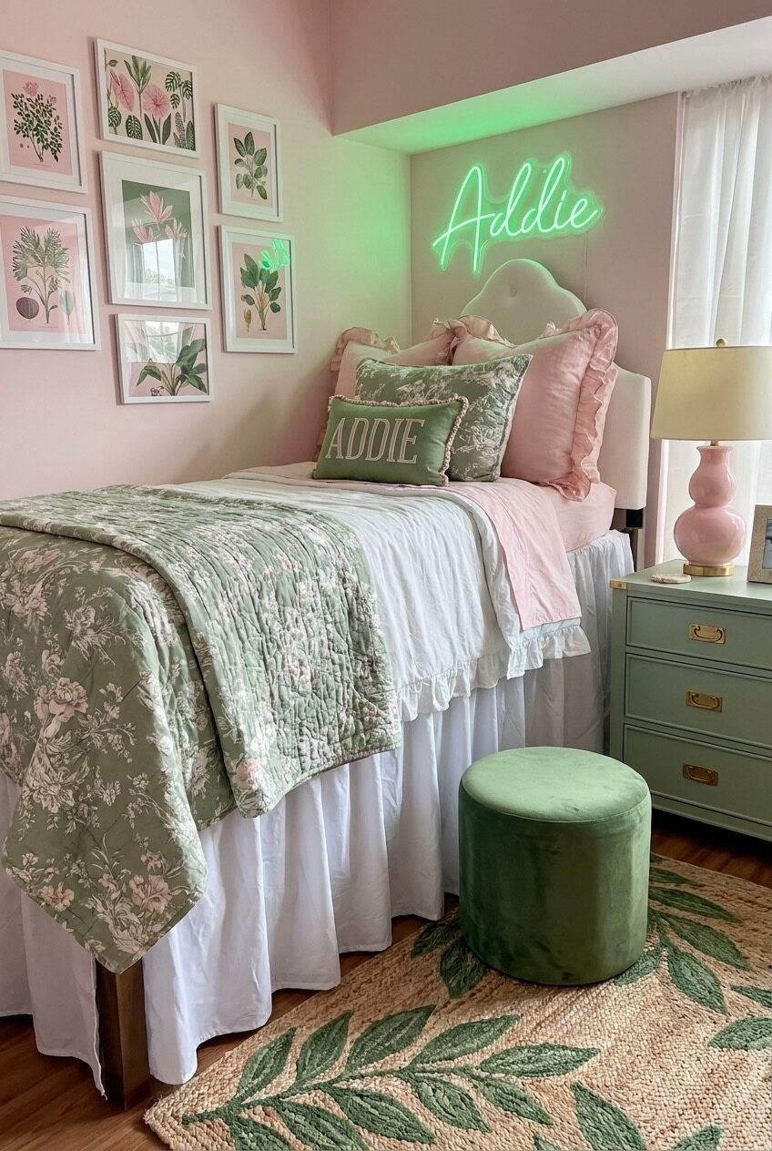
The green neon script spelling out a name above this bed isn’t just a personal touch, it’s the anchor the whole room takes its cues from. The botanical prints on the gallery wall repeat that same cool green, so your eye keeps landing back on the sign instead of getting scattered across a dozen unrelated pieces.
A single custom element can do more visual work than a dozen matching accessories. That’s the real lesson here: the sign, the embroidered pillow, even the color of the dresser all echo each other, which is what makes a small dorm room feel put-together instead of thrown together.
If you’re recreating this, pick one green, sage, moss, whatever reads calm to you, and repeat it in at least three spots: a light fixture, a textile, and a piece of furniture. Custom name signs run anywhere from budget LED strips to proper neon, so there’s room to scale this up or down.
Two Beds, One Shared Middle Ground
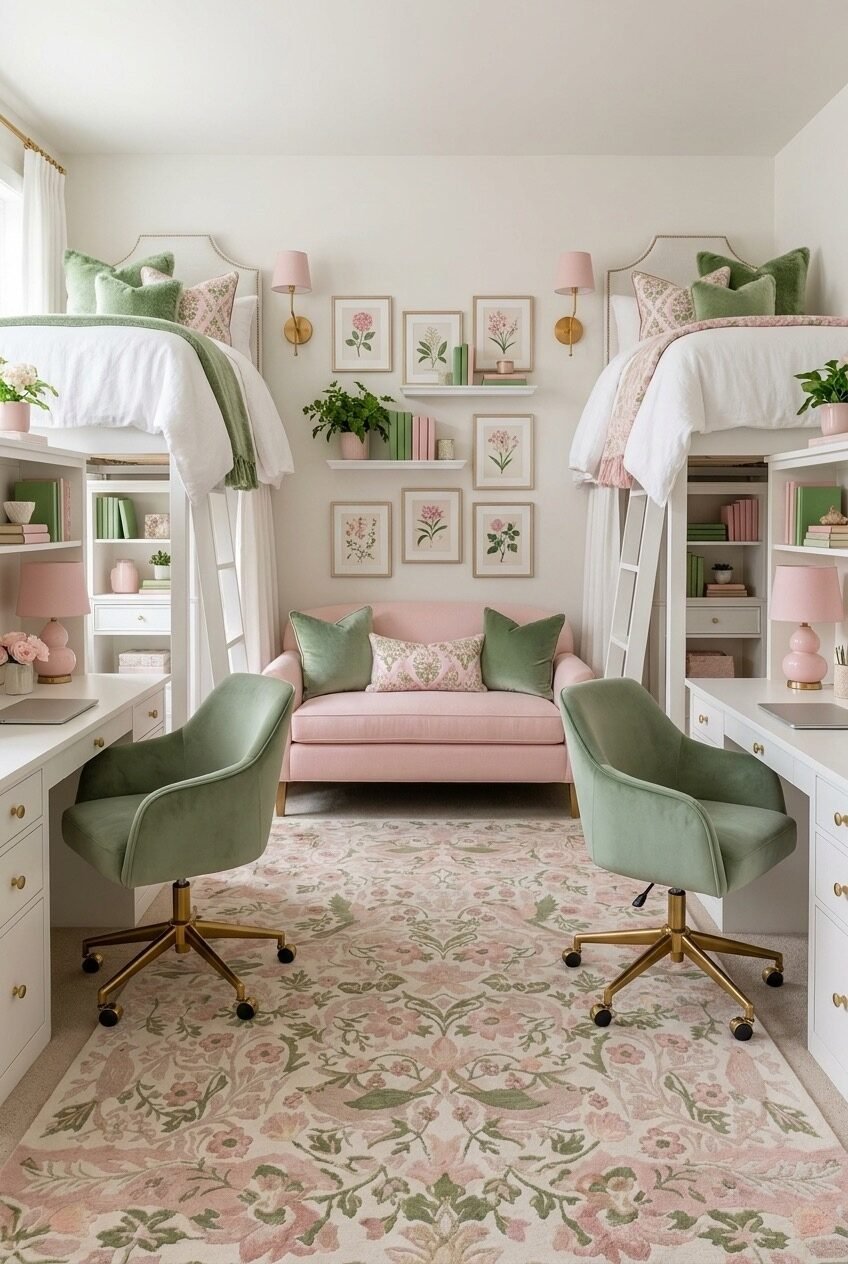
If you’re sharing a room, this layout solves the hardest part of dorm design: giving two people separate territory while keeping the room from feeling split in half. Raised beds free up the floor, and identical desks on each side mean neither half reads as the better one.
The pink loveseat parked in the middle is doing more than filling space, it’s a neutral zone that belongs to both of you, not either of you. Symmetry is the real design principle at play here: matching headboards, matching shelves, matching gallery walls, so the eye never has to pick a favorite.
Recreating this doesn’t require lofted beds specifically. Even bunk beds or a divided layout with a small shared bench between two zones borrows the same idea, one shared piece, everything else mirrored.
Maximalist Dorm Energy Done Right
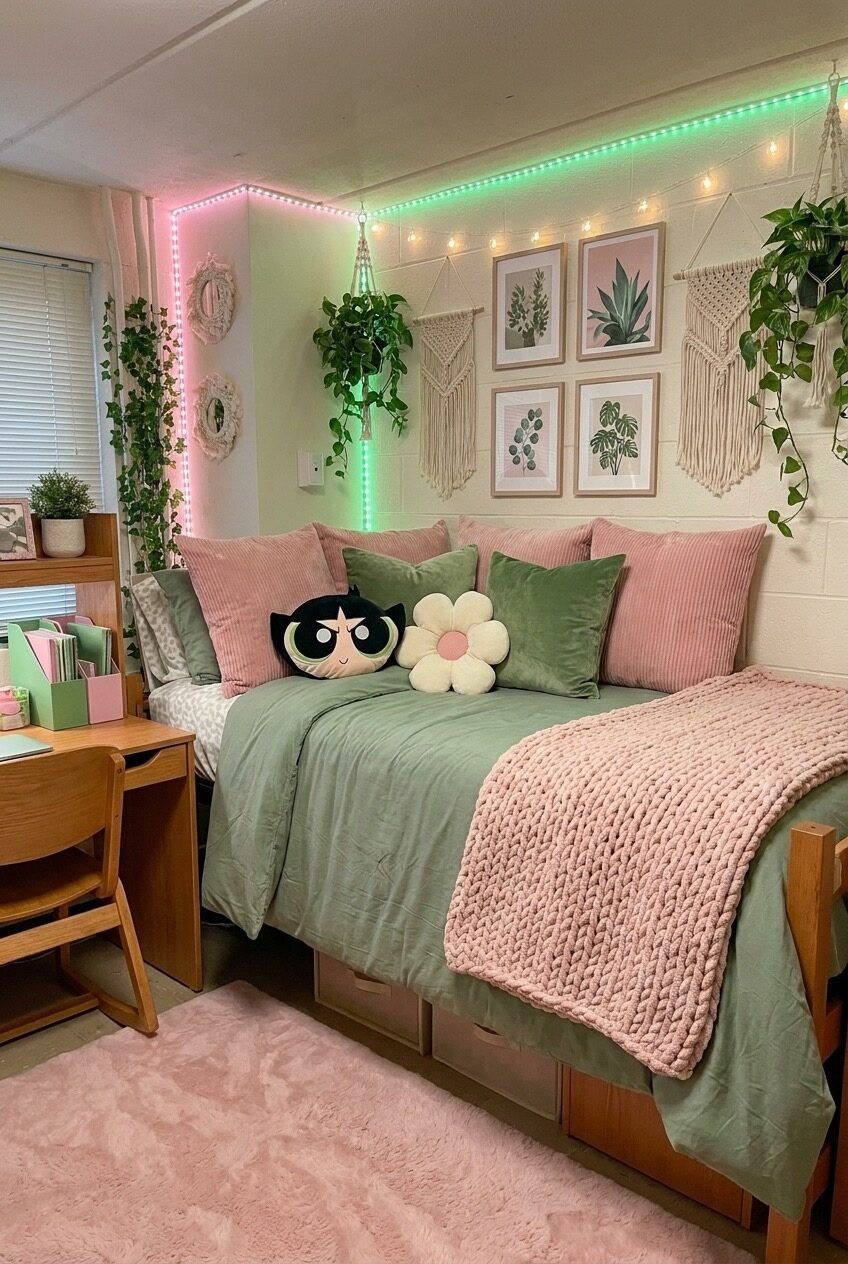
This is the room for someone who thinks a bare cinder block wall is a personal insult. Pink and green LED strips trace the corner like a frame, macrame hangers layer in texture, and trailing pothos vines do what they do best: soften every hard edge in sight.
A cartoon character pillow sitting next to a plain white daisy pillow shouldn’t work together on paper, but it does, because everything else in the room, the pink shag rug, the green velvet cushions, is speaking the same relaxed, slightly nostalgic language.
To pull this off, pick one playful piece you genuinely love, a character pillow, a poster, whatever, and let the rest of the room support it quietly. LED strip lights are cheap, removable, and honestly do half the mood-setting on their own.
A Room Built Around Small Rituals
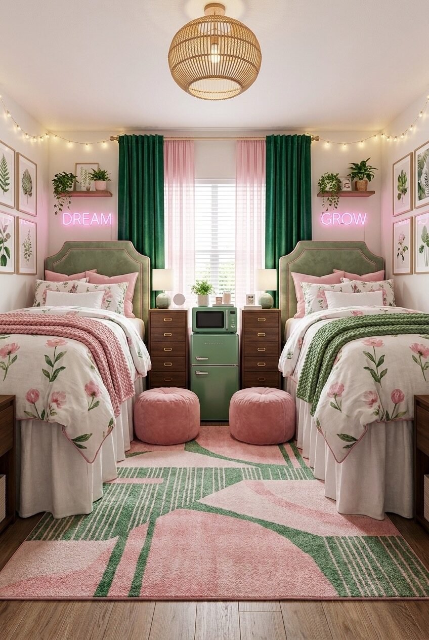
Two pink neon words glowing above matching green headboards sound like something off a motivational poster, but here they read more like a private joke between roommates than an actual slogan. The retro mint fridge tucked between the nightstands is the real showstopper, though.
Geometric rugs like the one here are doing quiet, important work: they add pattern without competing with the floral bedding, and they visually split the room into two halves without needing an actual divider.
If you want this look, don’t skip the small appliance styling. A fridge or microwave in a color that matches your palette instantly reads more intentional than a plain white one shoved in a corner. Pair it with one or two lighting moments, whether that’s neon or just warm string lights.
Living Room Layout in Disguise
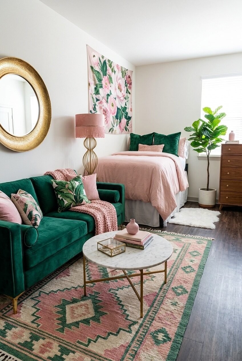
Not every dorm or first apartment layout announces itself as a bedroom. Here, the emerald sofa and marble coffee table sit close enough to the bed that the whole space reads like a proper living room with a mattress tucked into one corner.
Scale is the principle worth studying: a piece like a fiddle leaf fig or a floor lamp with some height keeps the room from feeling squat, especially useful in a space with lower ceilings or awkward proportions.
To recreate the effect, treat your bed as one zone and your seating as a completely separate one, even if they’re four feet apart. A rug under the coffee table, distinct from whatever’s near the bed, is usually enough to sell the split.
Storage That Doubles As Decor
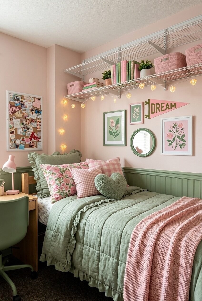
Wire shelving is about as unglamorous as dorm furniture gets, but stack it with books spine-out in alternating pink and green, tuck in a couple of woven baskets, and suddenly it’s doing double duty as storage and as the room’s visual anchor.
Gingham and floral pillows sitting side by side shouldn’t clash this little, and they don’t, because the green wainscoting below the chair rail gives everything a shared baseline to sit on top of.
If your dorm has open shelving you didn’t ask for, lean into it instead of hiding it. Group items by color rather than by category, it photographs better and, more importantly, it’s genuinely easier to keep looking tidy.
The Desk Corner Nobody Skips
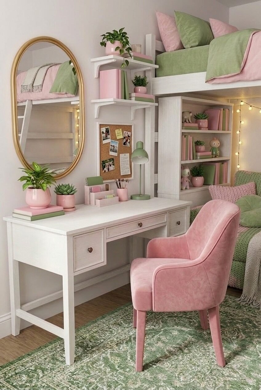
The desk is usually the first thing to get buried under textbooks and forgotten, but this corner treats it like real estate worth styling. A gold oval mirror above the surface does the heavy lifting, bouncing light around a space that otherwise gets none from a window.
Small potted plants and a corkboard layered with photos keep the vignette from feeling sterile, while the pink velvet chair pulls in just enough color to tie the desk back to the bunk bed above it.
Recreating this is mostly about restraint. Pick two or three objects that matter, a plant, a photo board, one good lamp, and resist the urge to fill every remaining inch. A cluttered desk stops being decor and just becomes a place you avoid sitting.
A Softer, Quieter Green Palette
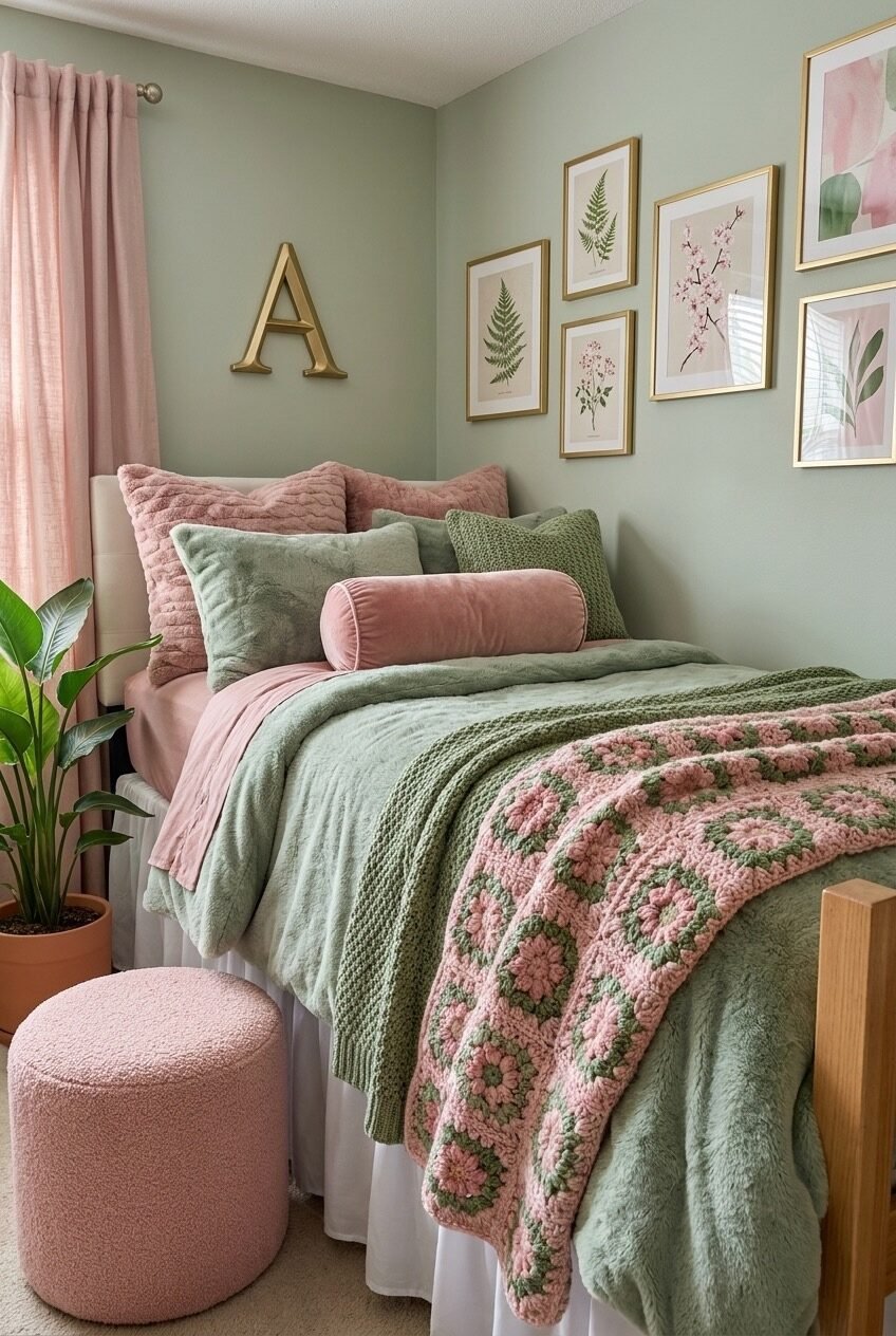
Sage green walls read a lot older and calmer than the brighter greens showing up elsewhere in this trend, and that’s really the point of this room. Pairing it with dusty pink instead of anything more saturated keeps the whole space feeling muted rather than sugary.
The crochet granny-square throw is arguably the hardest-working piece here, it introduces pattern and a handmade texture without adding a single new color to the mix, which matters when you’re trying to keep a palette this restrained.
For a similar effect, choose your green first and let it set the temperature of the whole room before adding pink accents. A gold monogram letter or frame is an easy way to warm up a sage wall that might otherwise feel a little cold.
Curtains Build a Room Downstairs
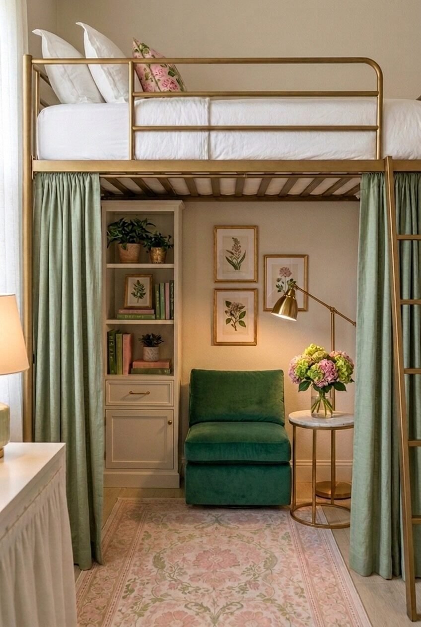
Hanging curtains around the underside of a loft bed is a trick that does more than look pretty, it actually creates a defined room where there wasn’t one, complete with its own reading chair, side table, and shelving.
The brass bed frame and the marble-topped side table push this past typical dorm territory. Mixing metals and materials, rather than sticking to one finish, is what keeps a small enclosed space from feeling like a fort built out of blankets.
If you’re working with a loft or bunk bed, curtain rods can usually be mounted directly to the frame without any drilling. Choose a fabric heavy enough to actually block light if you want the reading-nook effect to feel real, not just decorative.
Botanical Details Without Real Plants
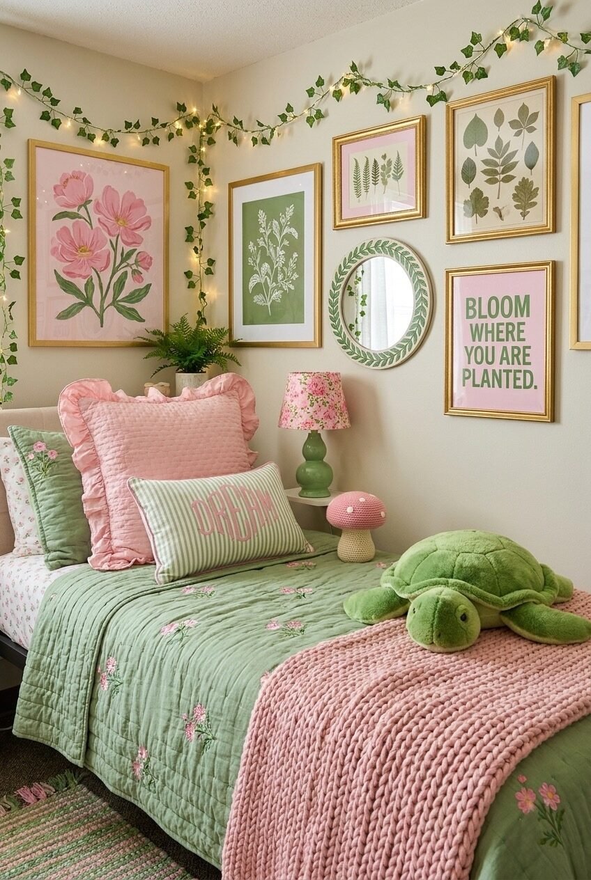
Real plants and dorm rooms have a famously short relationship, so this corner leans on printed and string-light ivy instead, and it honestly holds up. The garland threading along the ceiling line does what a real vine would, just without the maintenance or the guilt when it inevitably dies in December.
The gallery wall mixes a framed motivational phrase in with the botanical art, which keeps the corner from reading as one-note nature content. Repetition of leaf and floral motifs across the mirror, the frames, and the bedding is what makes a busy corner still feel cohesive.
To copy this without it looking like a theme park, keep your botanical prints in a consistent color story and add just one or two playful, non-plant objects, a stuffed animal, a small trinket, so the corner still feels lived-in rather than staged.
The Same Two Colors, Ten Completely Different Rooms
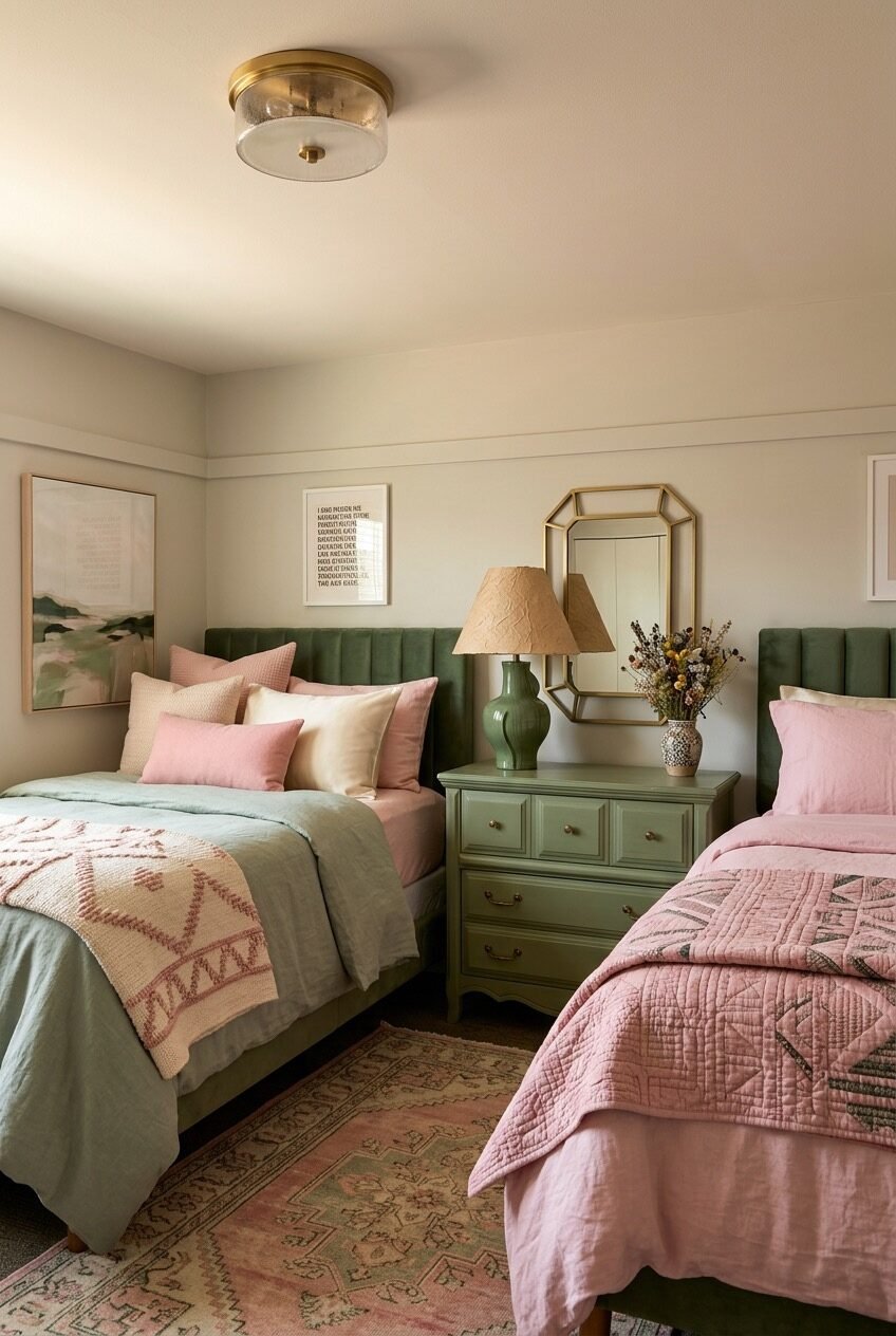
What stands out looking at all ten of these rooms side by side is how little they actually resemble each other, despite starting from the same two colors. Neon signs, brass loft frames, crochet blankets, wire shelving, pink and green stretched to cover all of it without ever feeling like a rule that had to be followed exactly.
That’s really the takeaway if you’re planning your own space: the palette is a starting point, not a script. Lean into whichever version feels like you, whether that’s the quieter sage-and-blush pairing or the full neon-and-macrame version.
Wherever you land, keep coming back to the small stuff, a repeated color, one great light fixture, a plant that isn’t real but looks like it could be. That’s usually what makes a dorm room feel finished.
 Steal Our Home Styling Secrets!