The Dorm Decor Decisions That Make the Biggest Difference Fastest
There’s a particular kind of exhaustion that comes with staring at a blank dorm room. White walls, fluorescent overhead lighting, a mattress that’s seen things — and somehow you’re supposed to make this feel like home before classes start. The good news is that a lot of people are doing it really well, and the principles behind the best dorm setups aren’t complicated once you see them in action.
What separates a dorm room that feels genuinely lived-in from one that just looks decorated comes down to a few things: layering, intentional use of vertical space, and not being afraid to mix function with personality. A room that only looks good in photos but doesn’t actually work for studying, sleeping, and existing? That’s the real failure.
The ideas ahead pull from real spaces — rooms where someone clearly thought about how every square inch would be used and what kind of atmosphere they wanted to wake up in every morning. Some are maximalist, some are restrained, but all of them have something worth stealing.
Over-the-Toilet Shelf Done Beautifully
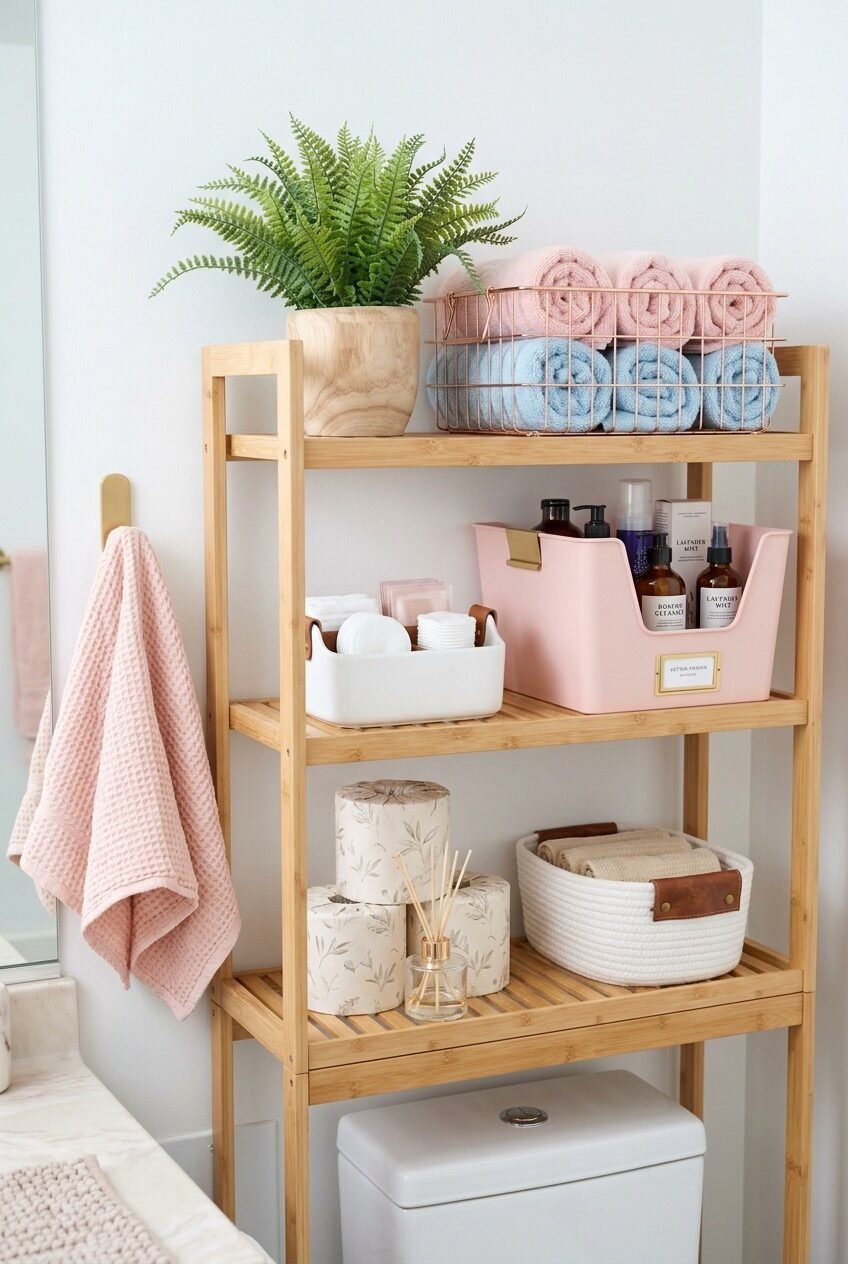
Start with bamboo. That’s the first principle this bathroom setup gets right — the warm, natural tone of the shelving unit does the heavy lifting before a single product is placed on it. Against a white-walled shared bathroom, a bamboo over-the-toilet rack immediately introduces texture and warmth that painted metal shelving simply can’t replicate. The material choice isn’t decorative indulgence; it anchors the whole space visually.
The storage logic here is tiered by frequency of use, and it’s worth copying deliberately. Top shelf holds display items — a fern in a wooden pot, rolled towels in a rose-gold wire basket (the metallic finish keeping it from reading too rustic). The middle shelf holds daily-use products corralled into labeled containers, which makes the clutter disappear even when there’s actually quite a bit stored. The bottom shelf handles bulk extras and a reed diffuser, which is a smart sensory detail in a space that doesn’t always smell great.
The real trick is the color palette: blush pink towels, white organizers, and the warm bamboo all operate within a narrow range that makes the whole unit read as designed rather than assembled. If you swap in different colors for each container and towel, the effect collapses. Commit to two or three tones and keep everything within that range.
Pink Walls, Neon Name, Total Commitment
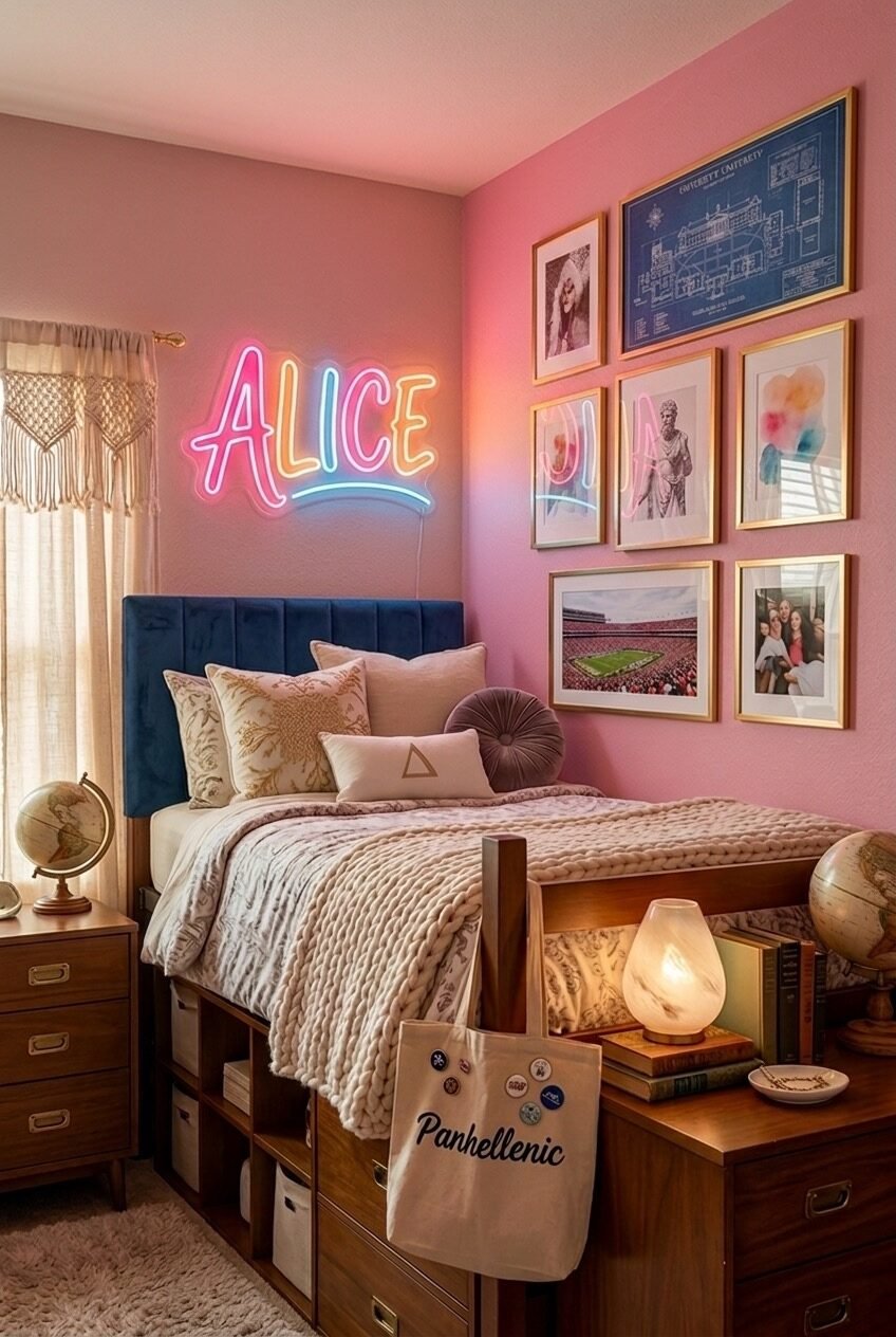
The bravest thing about this room is the pink walls — and they work precisely because everything else leans into them rather than fighting them. The navy velvet headboard, the warm wood furniture, the gallery wall in gold frames: none of these are typical pink-room companions, which is exactly why the combination feels mature and considered rather than juvenile. Choosing one dominant color and then deliberately contradicting it with unexpected accents is a design principle that takes confidence to execute, but the payoff is a room that looks genuinely personal.
The neon sign is the statement piece, and what makes it land is scale. It’s large enough to read as architecture rather than accessory. A tiny neon sign on a big wall reads like an afterthought; this one commands the corner above the bed the way a headboard commands the sleeping zone. The macramé panel on the window side introduces softness and organic texture that keeps all the hard edges — neon, gold frames, structured headboard — from feeling cold.
For anyone recreating this, the gallery wall is worth studying closely. It mixes a campus blueprint print, personal photos, and abstract art in a consistent gold-frame finish. The frames unify wildly different content types, which means you can put literally anything in them as long as the frames match. That’s a genuinely useful principle for personalizing a space without it looking chaotic.
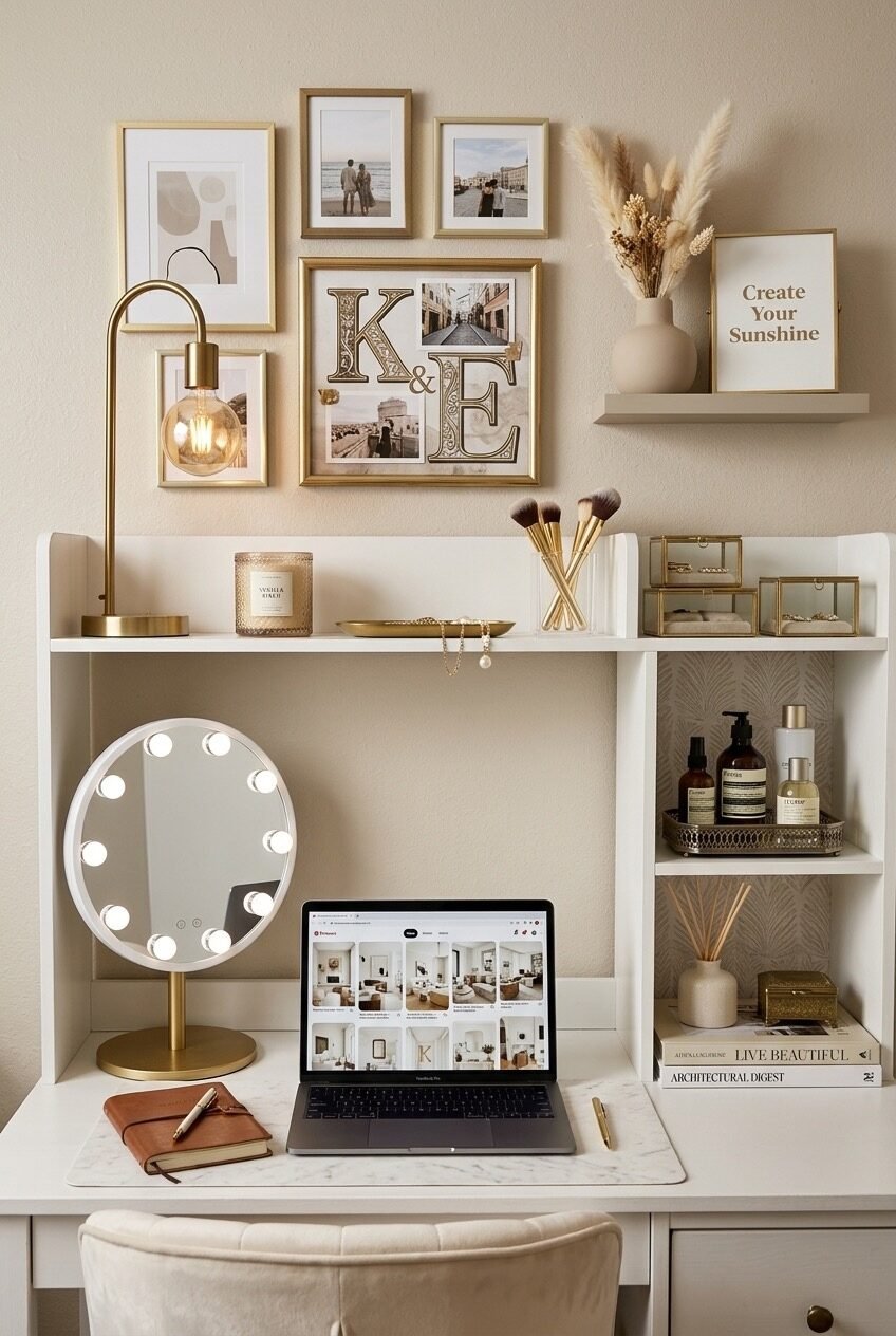
The Rolling Cart as Vanity Station
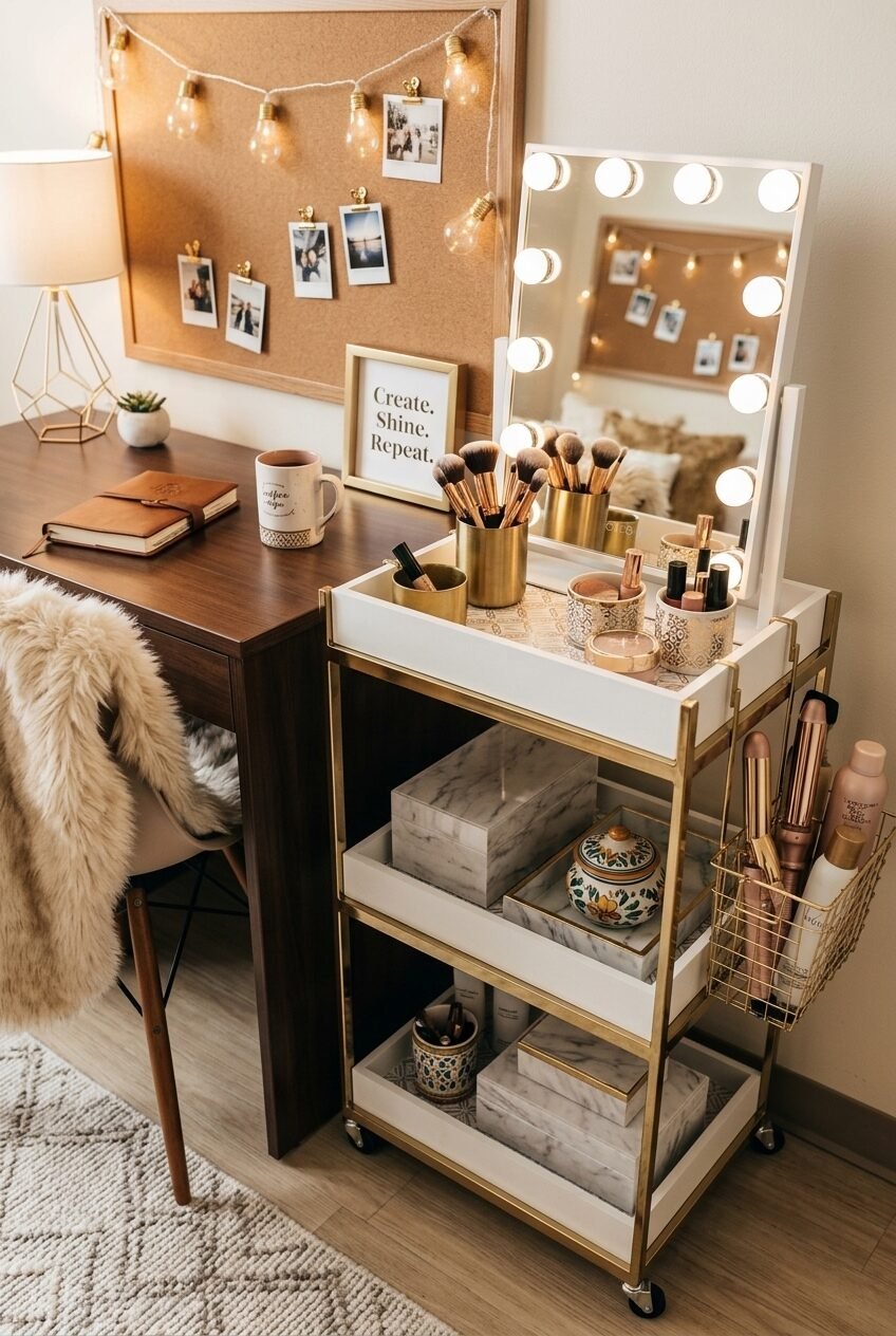
Most people buy a rolling cart and use it as overflow storage — random stuff that doesn’t have a home. This setup does the opposite: the cart is the hero, positioned as a full vanity station with a Hollywood mirror mounted directly on top of it. That one decision elevates the entire corner from functional to intentional. The mirror is propped rather than wall-mounted, which means no drilling and no damage deposits lost, but the effect reads as permanent.
Gold and white marble are doing a lot of work here. The cart’s brass frame, the gold brush holders, the marble-contact-papered shelves below — it’s a material story told consistently enough that the corner feels like a designed vignette rather than a collection of Amazon purchases. The middle and lower shelves hold storage boxes that have been wrapped or lined to match, which is an extra step most people skip but which makes an enormous difference to how finished the whole thing looks.
The cork board behind the desk is an underrated move — it provides a visual backdrop that adds warmth and gives the entire corner depth, while the Edison bulb string lights draped across it soften the workspace without using up any surface area. If you’re working with a small desk area, think of the wall behind it as part of the design, not just the neutral background.
Collected Over Time, Not Bought Together
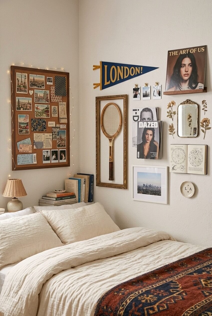
The tennis racket in a gilded frame is the detail that makes this wall work. Everything else — the cork board, the Polaroids, the magazine covers, the pennant flag — reads as recognizable dorm territory. But a vintage wooden racket hung as art in an ornate frame is a genuinely unexpected choice, and it shifts the entire wall from “decorated” to “collected.” That distinction matters more than people realize.
What’s happening compositionally is a split between two wall sections that feel related but not matching. Left side: a large framed cork board covered in travel ephemera and photos, wrapped in fairy lights that trace the frame perimeter. Right side: an eclectic mix of frames in different sizes and finishes, some with art, some with photos, plus the floating shelf holding a vinyl record. The asymmetry is real — this isn’t a perfectly balanced gallery wall — and that’s what makes it feel authentic rather than Pinterest-staged.
The linen bedding underneath is doing quiet but essential work; a neutral, texture-forward base keeps the maximalist wall from overwhelming the room. If the bed were dressed in patterns, the two would compete. Restraint in one area enables freedom in another — that tradeoff is worth remembering whenever a space feels like it’s trying too hard.
Arch-Framed Memo Board as Memory Wall
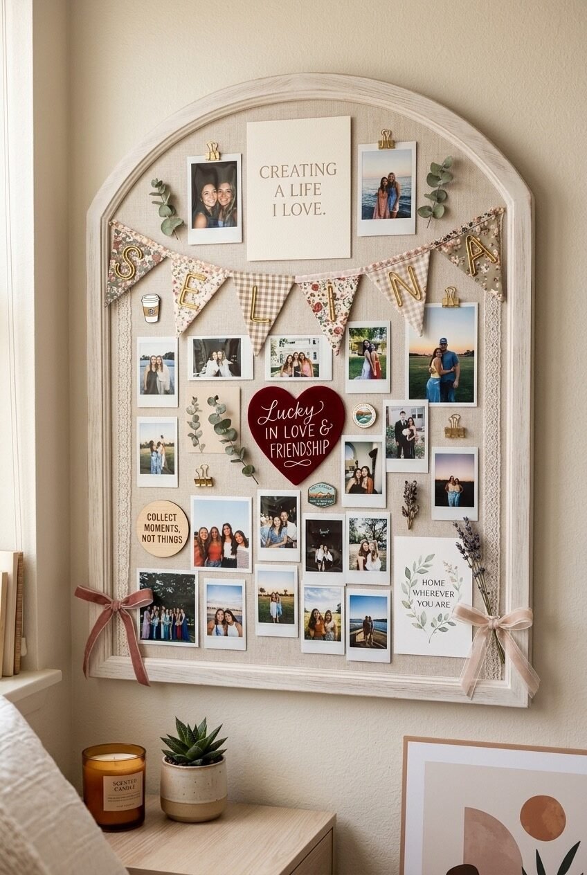
The frame shape is doing everything here. An arched linen memo board immediately reads as something more considered than a standard rectangle — it has the visual character of a window or a mirror, which means it commands wall space the way furniture does. For a dorm room where you often can’t paint or make permanent changes, an arched board like this is essentially a piece of wall art that also functions as a pinboard.
The layering inside the board follows a smart density principle: nothing is so crammed that individual items lose meaning, but there’s enough overlap and variety — Polaroids, quote cards, dried eucalyptus, fabric bunting with name letters, small enamel pins — that the eye has somewhere to travel. The bunting spelling out a name introduces personalization at a scale that’s visible from across the room, which is something a single small Polaroid can’t achieve.
Ribbon bows tied at the lower corners of the frame are the finishing touch that most people wouldn’t think to add, but they shift the board from functional to genuinely decorative — treating the frame itself as something worth adorning rather than just a border. For anyone building a similar board, start with the largest items and work down to the smallest; placing small photos first and then trying to fit everything else around them almost never works.
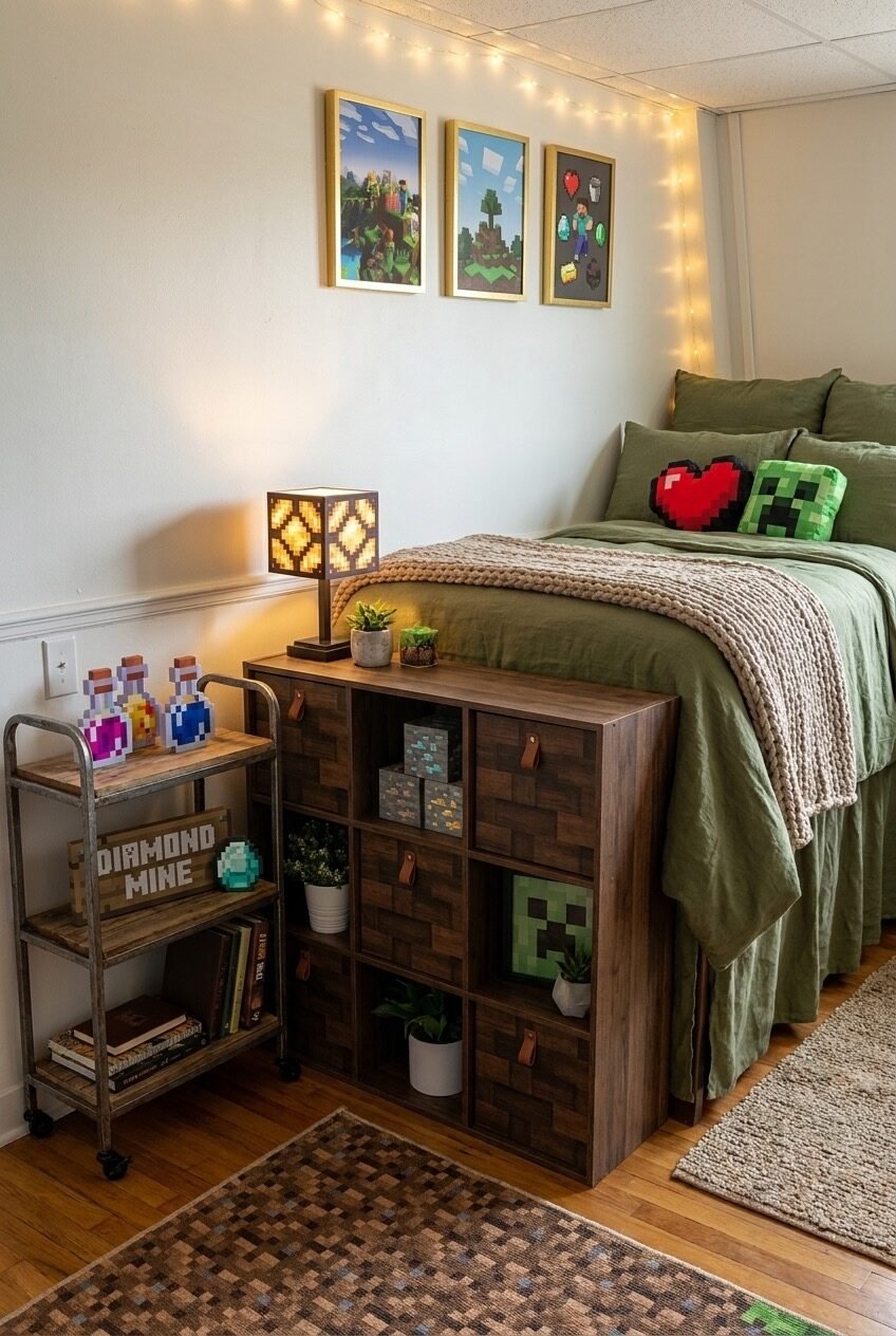
Storage Bed That Actually Looks Good
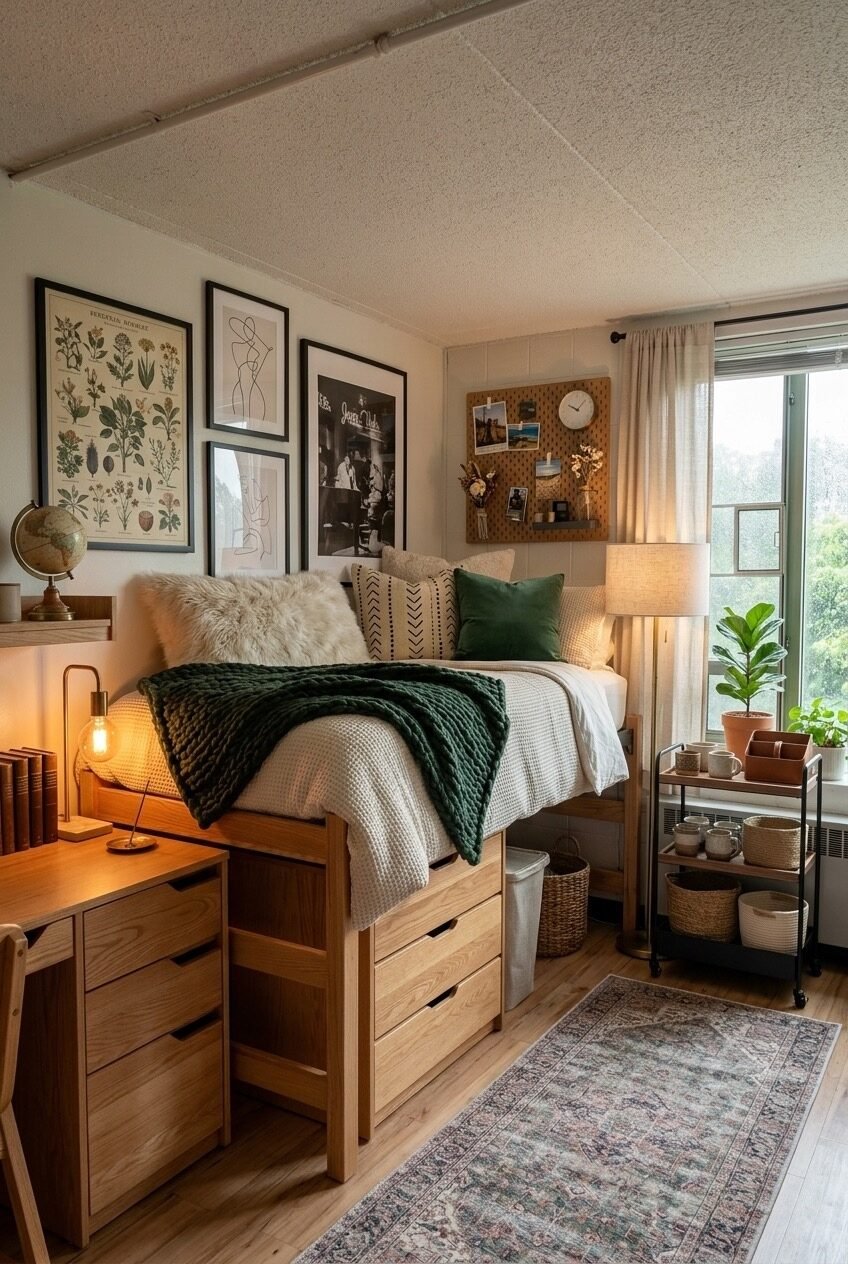
Pull-out drawers under a raised platform bed are a familiar enough concept, but the execution here is worth a closer look. The bed frame itself is in warm light oak — not the flat, cool-toned beige that most storage beds come in — and that single material choice is what allows it to feel cohesive with the warm wood desk, the rattan accents, and the botanical art prints on the wall above. Material temperature consistency is one of the quieter principles of interior design, and getting it right in a small space pays off disproportionately.
The gallery wall above the bed mixes botanical illustration prints, a simple line-art figure study, and a vintage-style black-and-white photograph, all in thin black frames. The mix of subject matter works because the frame profile is unified and the print scale is varied — one large anchor print on the left, smaller prints filling in around it. A rolling cart by the window holds plants, mugs, and woven storage baskets, which serves as a room divider of sorts between the sleeping zone and the window.
The green chunky-knit throw draped across the bed is a texture move that prevents the white bedding from reading as sterile. If there’s one takeaway from how this room handles softness, it’s that a single heavy-weight textile in a saturated color does more for warmth than three decorative pillows ever will.
Shared Room Where Both Sides Win
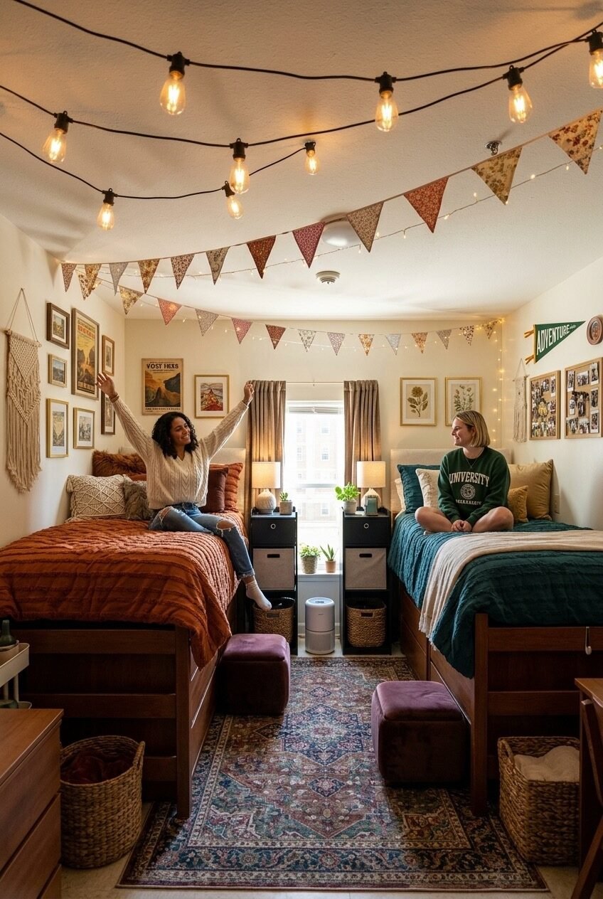
Shared dorm rooms usually end up as two completely separate visual worlds divided by an invisible line down the middle. This one manages something harder: both sides look different but they read as part of the same room, and the overhead elements are what make that happen. Edison bulb string lights looped across the ceiling and fabric bunting strung from wall to wall function as a shared canopy that both occupants live under, which visually unifies the space before you even register the individual bed setups.
Each side has a distinct personality — warm rust-and-brown on the left, deep teal and hunter green on the right — but the warm cream walls, the shared vintage rug in the center, and the matching black nightstands between the beds all act as connective tissue. When coordinating with a roommate on decor, negotiating the shared middle ground (rug, central storage, ceiling treatment) matters far more than agreeing on bedding colors.
The gallery walls on each side are personalized independently, which is the right call — trying to agree on art is how roommate relationships get strained. But both use a similar hanging approach: clustered frames at different heights with a pennant flag as an anchor. That structural similarity, even with different content, keeps the room from looking like two separate dorm rooms that happen to share a floor.
Gold Cart as Book Nook Sidekick
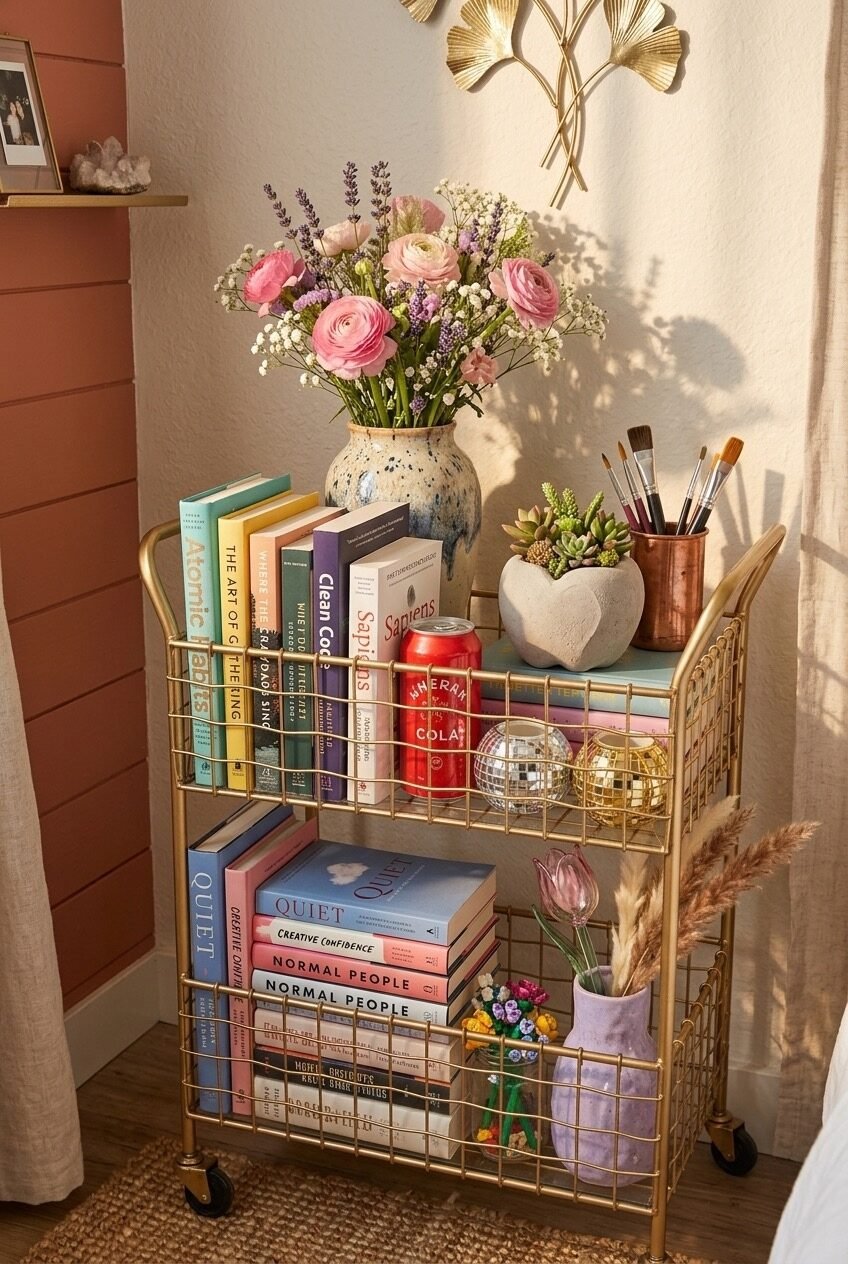
Rainbow-spined books stacked on a gold wire cart sounds like it could go very wrong, but the reason it works here is restraint in everything else. The wall behind is a warm terracotta-adjacent tone that gives the cart a backdrop with actual presence. The cart itself is gold wire, open on all sides, which means the books become the visual — the cart is just the structure holding them up. Against a busy storage unit, the books would read as clutter; against that warm wall, they read as a display.
The top shelf’s styling follows a principle that coffee table book arrangers know well: mix vertical and horizontal orientations, and anchor with a living element. Here, a speckled ceramic vase with pink ranunculus and lavender provides the height, a small succulent in a concrete heart planter adds ground-level softness, and art brushes in a copper cup introduce material contrast without competing for attention. The small disco ball tucked among the books on the middle shelf is the personality detail — it’s not trying to be anything except fun, and that’s exactly what makes it work.
A gold bar cart holds a significant amount of weight when it comes to perceived room quality — the metallic frame catches light, and the openness of the wire sides means it never reads as bulky, even when fully loaded with books. For a small dorm room, it’s one of the better multi-function pieces available at its price point.
Globe Lights and Under-Bed Storage Magic
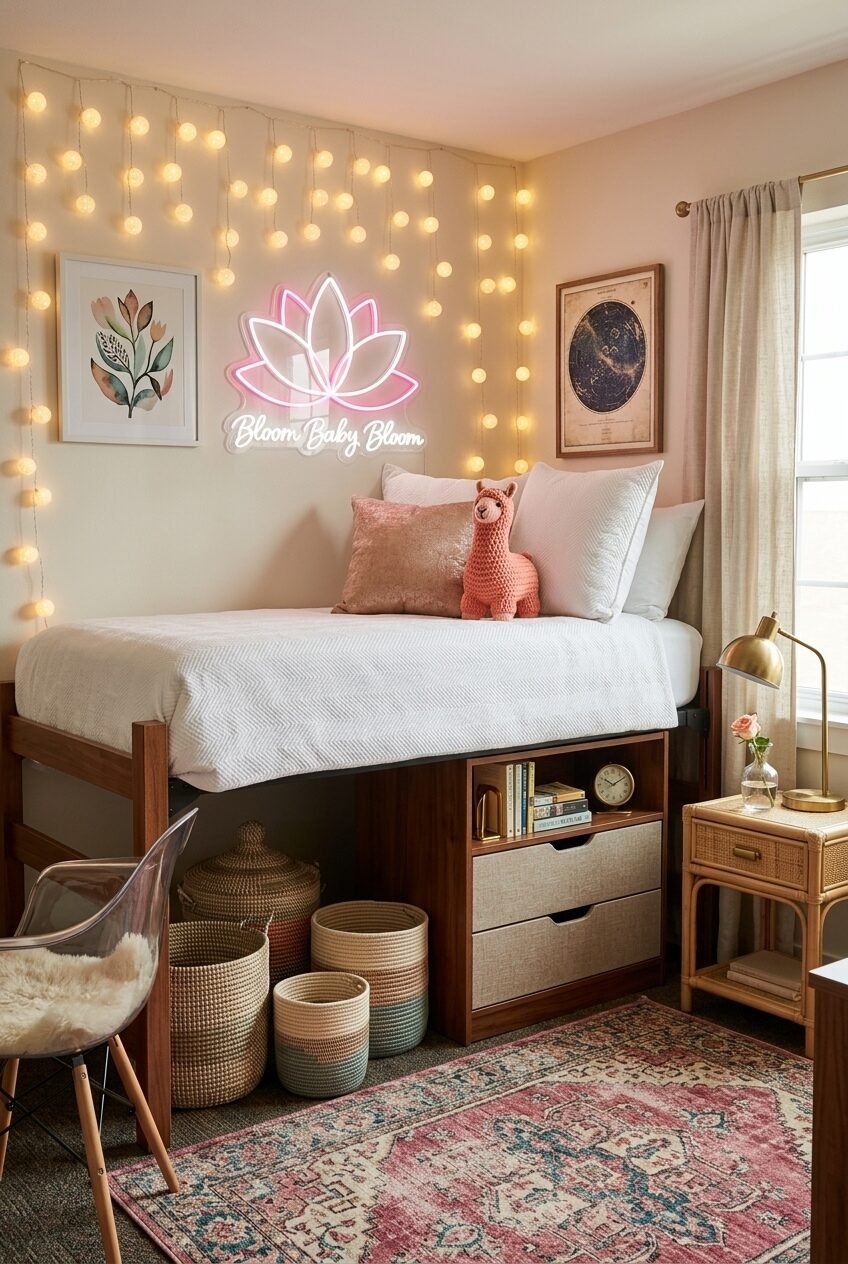
Globe string lights get overused in dorm rooms, but hung vertically like curtains against the wall rather than strung horizontally across it — as seen here — they become something different. The cascading drop creates a soft, layered backdrop behind the bed that functions similarly to a fabric canopy without actually requiring any ceiling hardware beyond a few adhesive hooks. The warm yellow glow against the blush-pink wall produces a gradient that feels genuinely atmospheric.
Below the lofted bed, the storage approach is layered intelligently: a built-in drawer unit on one side holds books and has integrated drawer storage, while a cluster of woven baskets in varying sizes fills the opposite corner. The mix of structured and unstructured storage — drawers versus baskets — is a practical nod to the reality that some things need to be accessed quickly while others can be buried. A clear ghost chair in the corner keeps the under-bed zone from feeling completely enclosed, while the rattan nightstand beside the bed introduces natural warmth to balance the pink-and-white palette.
The lotus neon sign above the bed operates as both light source and focal point — a lotus in neon pink is a softer, more personal choice than the word-based signs that flood every college marketplace. For anyone wanting a neon sign that doesn’t read as generic, shape-based designs tend to age better than phrase-based ones.
Terracotta Canopy Built for One Person
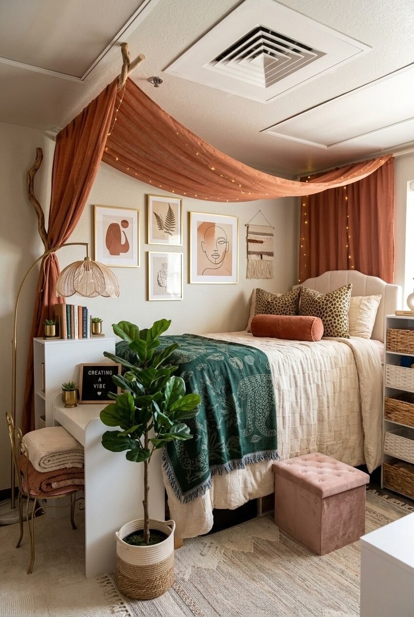
Draping fabric from the ceiling to create a bed canopy is one of those ideas that sounds ambitious and turns out to be mostly about finding the right anchor points. Here, the terracotta linen is suspended from what appears to be a driftwood branch mounted near the ceiling on one side — an organic, sculptural element that adds considerably more visual interest than a simple curtain rod would. The fabric drapes forward and then pools slightly at the sides of the bed, framing the sleeping zone like a stage.
The color choice is where this room earns its character. Terracotta as a dominant hue pulls the whole space toward a warmer, earthier register — the botanical line-art prints in gold frames, the teal paisley throw, the leopard-print pillows, the fiddle-leaf fig in a rope basket all land differently against that warm canopy than they would against white or gray. It’s a room that would look completely ordinary without the color commitment overhead.
The tufted pink storage ottoman at the foot of the bed is easy to overlook but solves a real problem: extra seating, hidden storage, and a soft landing for end-of-day clothes all in one compact piece. The macramé wall hanging on the side wall adds another layer of textile warmth without requiring any planning around wall color or artwork. In a rented space where you can’t change the walls, layering textiles overhead and on the walls is often the most powerful design move available.
The Best Dorm Rooms Solve Problems While Looking Good
A dorm room that works is one where the design choices and the practical needs aren’t in conflict. The spaces worth paying attention to are the ones where someone figured out how to store things, sleep well, study without misery, and still wake up in a room that reflects who they actually are — not just what was on sale at the campus store.
Most of the principles here are transferable across styles and budgets. Commit to a material temperature. Give the walls something to do. Think about what goes overhead. Use the under-bed zone. Get one statement piece that earns its space rather than five that compete for it. These aren’t rules so much as habits of thinking that separate rooms that feel designed from rooms that just feel filled.
Whatever direction you take your dorm space, the most useful thing we can say is this: start with what you actually need the room to do, and let the aesthetic follow. A room designed around your real life will always feel more like home than one designed around a mood board.
 Steal Our Home Styling Secrets!