
Why Some Toddler Boy Rooms Feel Designed Instead Of Just Decorated
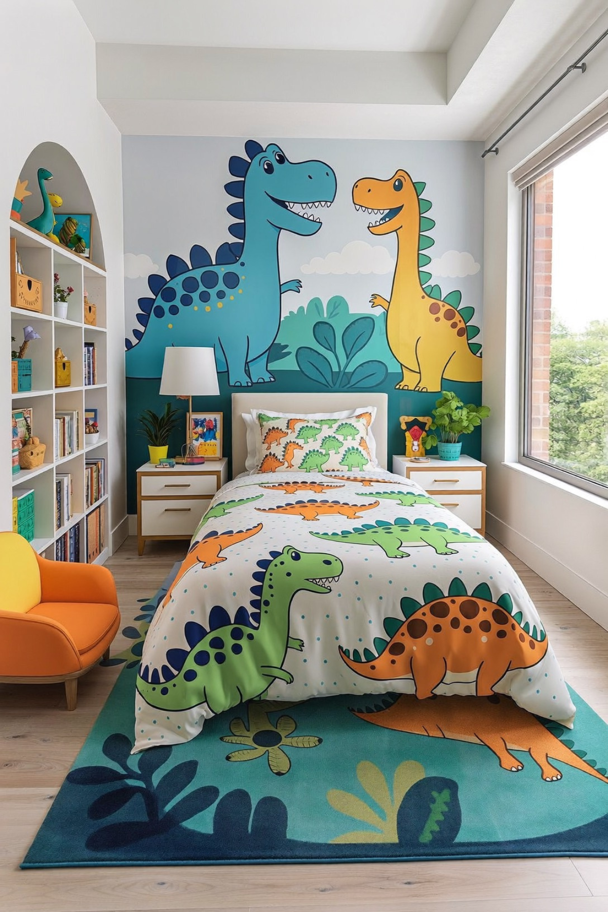
A toddler’s room has to do a lot at once. It’s a place to sleep, a place to build blanket forts, and also a place that doesn’t make you want to redecorate the second they turn six. The trick isn’t picking a theme, it’s picking details that can grow with them.
We pulled together real rooms that handle that balancing act in different ways. Some go loud with color, some lean into texture and quiet, and a few commit hard to one idea and let it carry the whole space. What ties them together is restraint in the right places.
None of these require gutting a room to the studs. Most start with paint, a rug, or one statement piece a toddler will notice. We’re breaking down why each one works, not just what it looks like, so you can borrow the parts that fit your space.
A Pixel World Built From Paint

One wall got the ambitious treatment here, and the rest of the room simply let it. A hand-painted brick pattern climbs from floor to ceiling in cool gray tones, broken up by two glowing torch sconces that look pulled straight out of a blocky video game world. It’s a big commitment for a single wall, and that’s exactly why it reads as a statement instead of a theme slapped on top of a room.
The green accent wall does the heavy lifting on color while the mural stays neutral, which keeps the whole thing from tipping into overload. Layer that with a rug patterned in oversized blocky faces, and the floor starts to feel like part of the game world instead of an afterthought underneath the bed.
Keep the rest of the palette calm. A solid navy or gray bedding set lets the mural and rug carry the personality instead of competing with more pattern, and toy storage that echoes the same gray-and-green scheme, even loosely, keeps the whole room from feeling like three unrelated ideas taped together.
The Gallery Wall Trick That Works
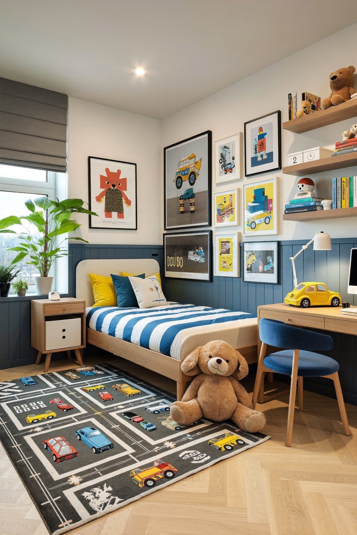
A gallery wall only looks put together when the frames vary in size instead of lining up like a spreadsheet. This one leans into that unevenness on purpose, mixing a large statement print with a grid of smaller ones, so the eye has somewhere to land before it wanders across the rest.
The color story is doing more here than people give it credit for. Navy wainscoting stops halfway up the wall, and everything above it, the frames, the yellow throw pillow, even the toy car on the desk, reads warmer because of that cooler base underneath it. Swap the wainscoting color and the whole room would feel different.
A desk tucked into the corner gives this room a job beyond sleeping, which matters more as a toddler grows into a kid who wants a place to draw. Pair it with a rug that turns the floor into its own little road system, and you’ve built in a reason to actually play on the ground.
Give The Room A Craft Corner
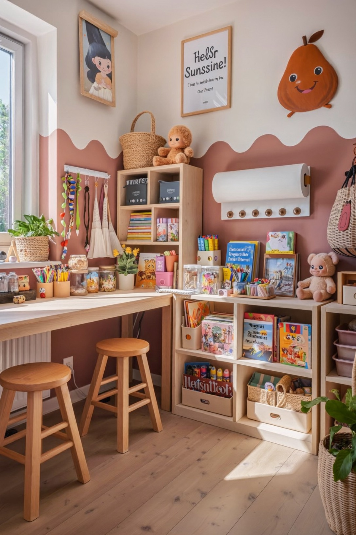
Start with a wall that stops partway up if you want this kind of nook to feel deliberate rather than incomplete. The scalloped edge where the terracotta paint meets the plain wall above does more visual work than a straight line ever would, and it’s a weekend project, not a renovation.
Everything below that line earns its keep. Open cubbies at kid height mean books and art supplies actually get put away instead of dumped in a bin nobody opens, and two low stools turn the space into somewhere a toddler can sit down and use their hands instead of just storing toys they forgot about.
The playful wall decor, a smiling piece of fruit, a hand-lettered sign, keeps the whole corner from feeling like a storage solution wearing a costume. Small, low-cost touches like that are what make a nook feel like it belongs to the kid instead of just being furniture someone else picked out.
Let A Name Be The Art
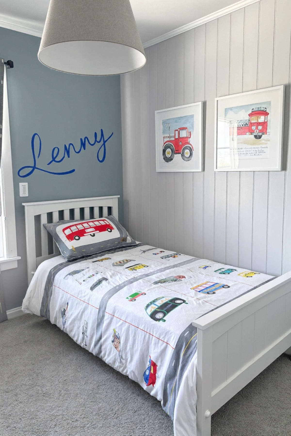
The name painted in cursive script above the bed is doing what a framed print usually does, minus the trip to a print shop. It’s personal in a way mass-produced wall art can’t fake, and it costs about as much as a can of paint and a steady hand, or a printable stencil if the hand isn’t that steady.
Beneath it, the bedding carries a whole transportation theme without shouting about it. Trucks, buses, and cars are appliquéd onto a road-striped background instead of printed flat, and that texture is the difference between bedding that looks like a toy and bedding that looks like it was made for one.
Gray shiplap paneling on the walls keeps things from feeling too busy next to the pattern, and it’s a finish that ages well past toddlerhood, unlike most themed wallpaper. The watercolor truck prints on the opposite wall pick up the same color story without repeating the exact motif, a small trick that keeps a themed room from feeling one-note.
A Bed Frame Shaped Like Home
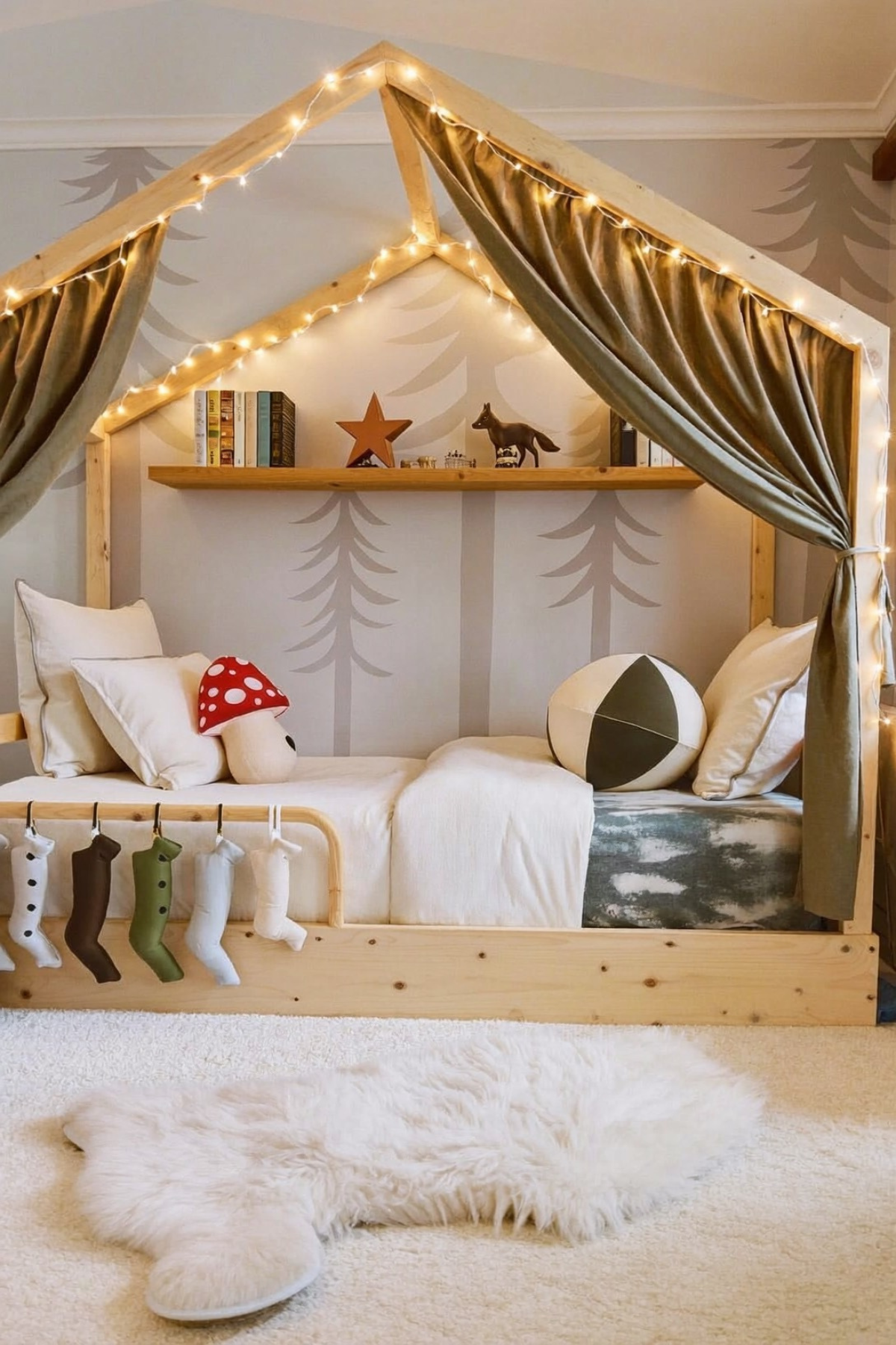
A house-shaped bed frame gives a toddler’s room something most furniture can’t, a sense of architecture inside the architecture. The peaked silhouette reads as a little building of its own, which means the bed becomes the visual anchor of the room instead of just the biggest piece of furniture in it.
String lights woven along the frame and curtains tied back at the sides add warmth without needing a single extra lamp, and the forest silhouette wallpaper behind it stretches the outdoors-inspired feeling past just the bed itself. A small shelf built into the frame holds books and a few favorite toys at exactly the height a toddler can reach without asking for help.
The texture layering is what keeps this from feeling like a stage set: a faux fur rug underfoot, linen curtains overhead, a knit mushroom pillow tossed in for good measure. Hanging felt stockings off the frame’s edge is a nice touch for the holidays, but the frame itself earns its keep the other eleven months too.
Trucks Without The Primary Colors
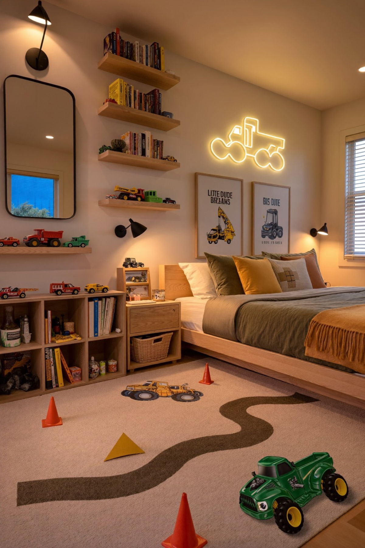
Most truck-themed rooms reach for red, yellow, and blue straight out of the toy box. This one doesn’t. The bedding leans into olive, mustard, and rust instead, which lets a neon truck sign glow as the room’s one bright note rather than getting lost in a room already full of primary color.
Floating shelves stacked with books and a rotating lineup of toy trucks turn a wall into a low-effort display case instead of a bin that gets dumped out daily. It’s a small shift, vertical storage instead of horizontal, but it means the toys stay visible and half-tidy by default.
Down on the floor, a rug printed with a winding road gives a toddler an actual place to run trucks without scattering plastic traffic cones across the whole carpet. Pairing a play-focused rug with genuinely warm, adult-feeling bedding is what keeps a truck room from reading as a toy store display.
A Boat Bed Worth The Effort
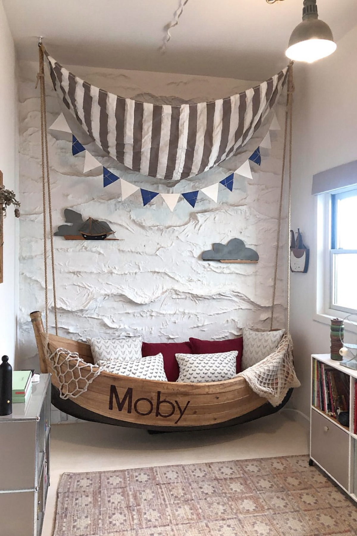
This is the one idea on this list that takes real commitment. A suspended, boat-shaped bed isn’t a weekend project, and it’s not cheap. But if a nautical theme is the one your toddler won’t grow out of in six months, this is the version that goes all in instead of settling for a few anchor-print pillows.
The textured plaster wall behind it, built up in layers to look like rolling waves, is what sells the whole scene, and a striped fabric canopy strung from the ceiling reads like a sail without needing an actual mast. Small wooden clouds mounted as shelves hold a toy boat and other trinkets at eye level.
A carved name on the bow makes the piece feel like it belongs to one specific kid instead of a generic nautical prop, and a woven net draped over one side adds texture without adding clutter. It’s a big swing, but rooms built around one serious piece like this rarely feel dated the way trend-driven decor does.
The Ceiling Is Part Of It
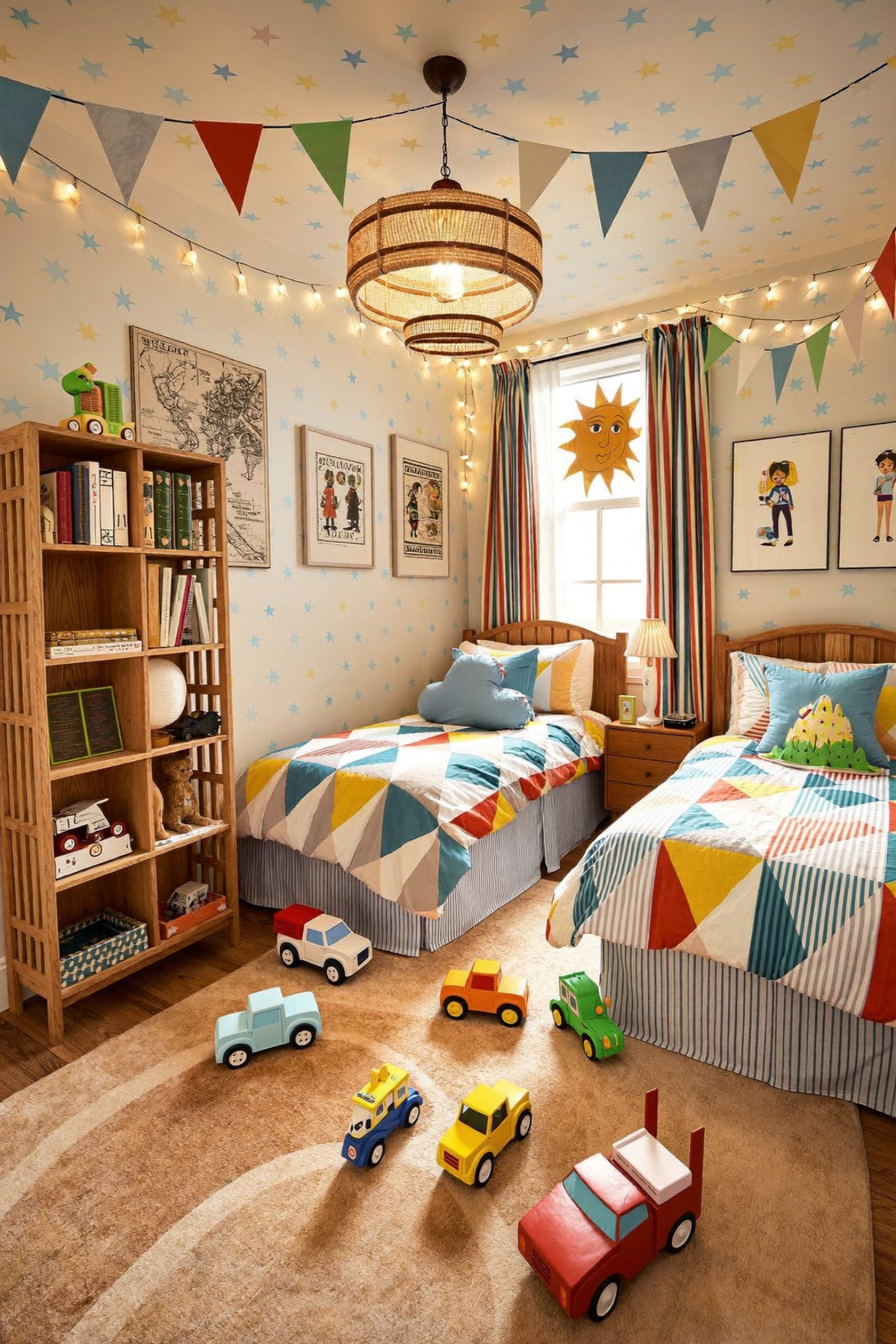
Most rooms stop decorating at the top of the wall and treat the ceiling as dead space. This one keeps going all the way up. A scattering of hand-painted stars covers the ceiling and turns what’s usually blank space into part of the design instead of the one part everyone forgets to look at.
Pennant bunting strung wall to wall and a woven pendant light hanging low do more to set the mood at night than the daytime decor ever could, especially once the string lights get switched on. It’s proof that a room can feel festive without a single seasonal decoration in sight anywhere.
The twin beds match in shape but not exactly in pattern, which keeps a shared room from feeling like a matched set bought off one page of a catalog. A geometric patchwork print does the same job as a bold wallpaper would, minus the commitment, and it’s an easy swap if tastes change later.
When A Bedroom Needs To Multitask
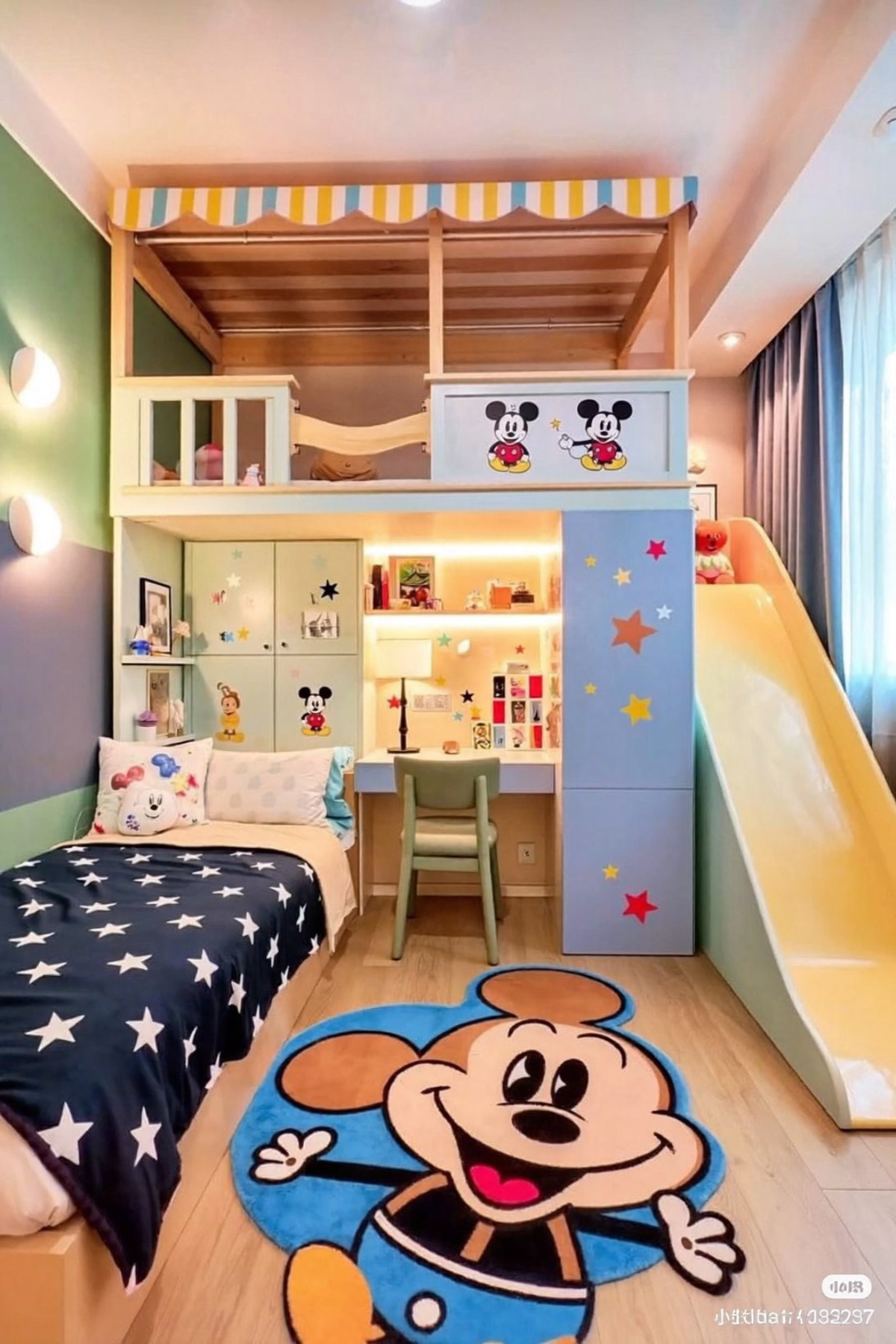
A small footprint doesn’t have to mean fewer features, it just means stacking them instead of spreading them out. This room puts a loft bed, a slide, and a full desk setup into roughly the same square footage most rooms use for a bed alone, and none of it feels squeezed in.
A striped fabric awning over the top bunk does the visual work of a market stall, which softens what could otherwise look like a plain wooden frame. Star decals scattered across the built-in cabinetry and a favorite round-eared cartoon mouse character on the rug keep the whole thing feeling playful instead of purely functional.
The desk nook underneath is lit well enough to actually get used, not just photographed, and the slide is the kind of detail that makes bedtime feel less like a chore and more like the last ride of the day. Vertical thinking like this is worth stealing even in a room that isn’t nearly this small.
Nothing Here Matches On Purpose
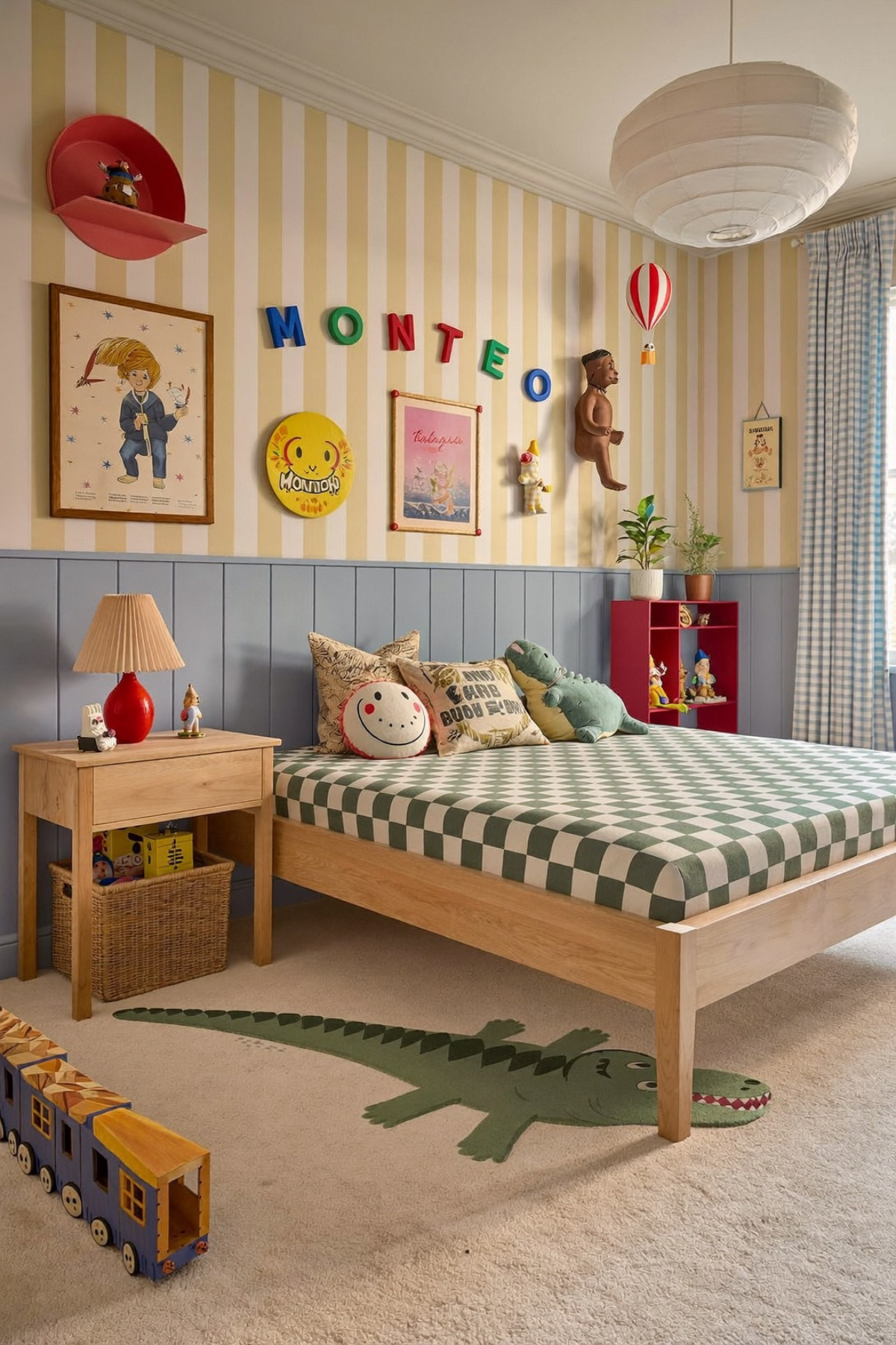
A green-and-white check on the bed, yellow-striped wallpaper behind it, and a blue gingham curtain by the window. On paper, none of that should work together. In the room, it does, because everything is grounded by the same denim-blue wainscoting running underneath all of it.
The wall above that wainscoting is stacked with vintage-style character art, a hand-lettered name, and a couple of small display shelves, none of it hung in a straight line and none of it matching in frame style. That’s what makes it read as collected over time rather than bought in one trip.
A plush alligator and a matching rug motif tie the animal theme together without turning the whole room into one costume, and a wooden pull-along train left out on the floor does more to suggest a kid actually lives here than any styled vignette could. One repeated color is what holds the rest of the mixing together.
The Best Kid Rooms Keep Growing With Them
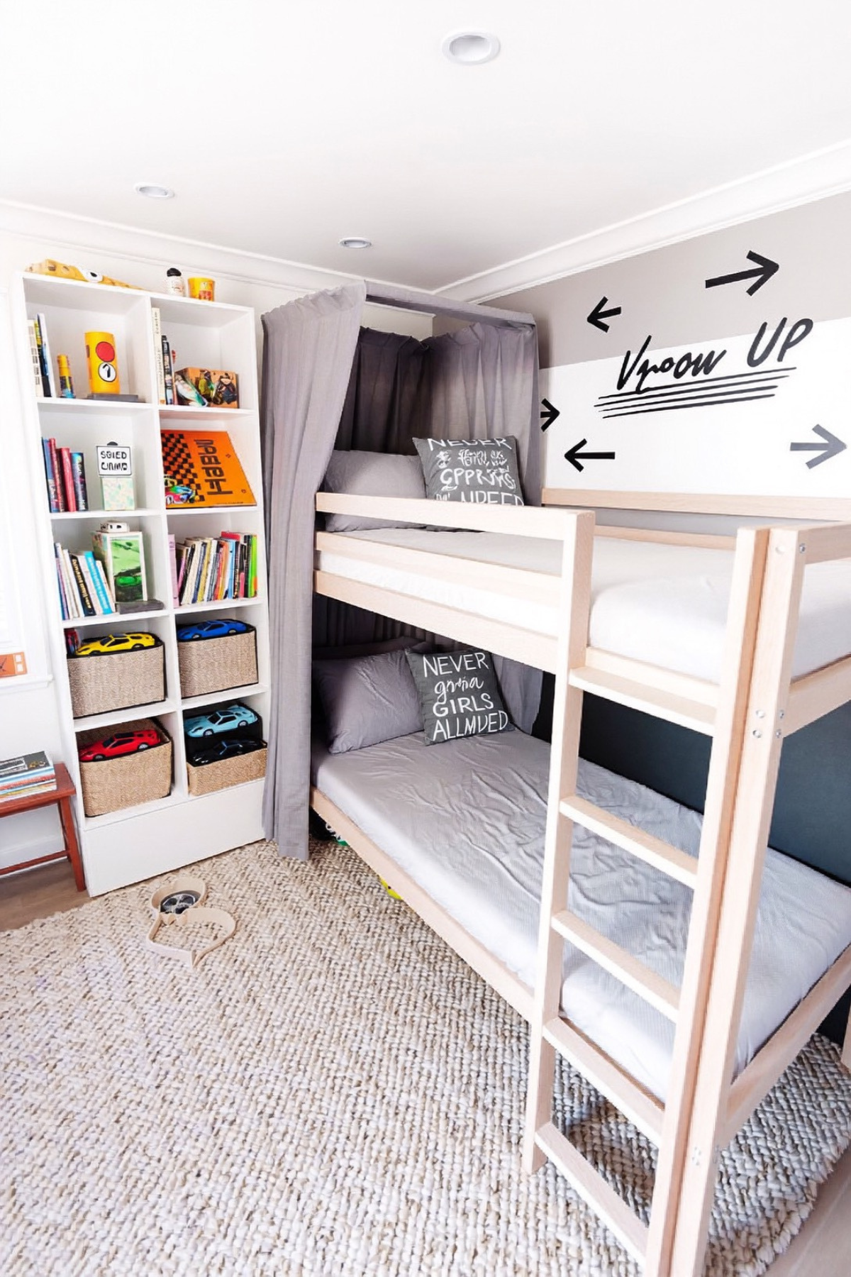
What ties these rooms together isn’t a shared color palette or a single theme, it’s restraint paired with one strong idea, carried all the way through instead of half-finished. A mural, a name on the wall, a boat-shaped bed: each room picked one thing to go big on and kept everything else simple around it.
That’s the part worth copying even if the exact theme doesn’t match your kid’s current obsession. Pick the element your toddler will actually notice and care about, build the rest of the room to support it quietly, and resist the urge to theme every surface in sight.
A room built this way tends to age better, since swapping bedding or a rug is a lot easier than repainting a mural you’re already tired of. Start with whichever idea matched something your kid already loves, and let the rest follow naturally.
 Steal Our Home Styling Secrets!