
Why This Tartan Christmas Look Keeps Showing Up Everywhere This Year

Tartan gets treated like a seasonal accessory, something you drape over a chair and forget about come January. But look closely at the rooms ahead and it is doing structural work, anchoring color, adding weight, giving a space its backbone before a single ornament goes up anywhere near it.
The rooms that follow lean into one specific world: brass fixtures, oil paintings in gilt frames, dark wood paneling, velvet ribbon instead of the usual bow. It reads less like a decorating scheme and more like a house that has been collecting objects for decades and simply added greenery this year.
What we are breaking down here is not a shopping list. It is the actual reasoning behind every room featured, why a bow gets tied where it does, why a mantel gets dressed a certain way, and how you would translate any of it into a house that looks nothing like these.
The Bow Doing Structural Work
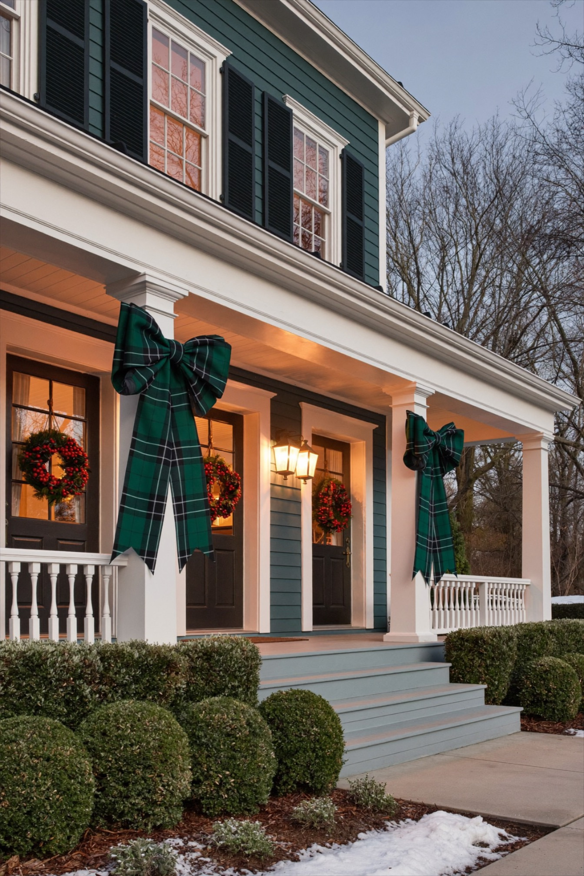
A porch with three matching wreaths reads as decorated. A porch with three matching wreaths plus one absurdly oversized tartan bow at the top of each column reads as designed. That is the entire trick in this photo, and it costs almost nothing to copy at home.
Most people buy a bow sized like a gift topper and wonder why it disappears against a full-height column. The bows here are nearly as tall as the porch railing itself, which is exactly why they register from the street instead of getting lost in the architecture around them.
Repetition does the rest of the work. Every door on this porch got the same wreath, the same ribbon, the same red berries, so nothing competes for attention. If you are working with a smaller entry, keep the pattern to one wreath and one ribbon color, and make each piece bigger than instinct tells you to.
A Stockpot as the Main Event

Somebody looked at a copper stockpot, the kind that lives in a cabinet eleven months of the year, and decided it belonged in the middle of a formal table instead of a floral arrangement. The choice is unexpected precisely because a room dressed this formally usually plays it safe.
The chandelier above it is doing quieter work. Built from branch and antler shapes strung with pine and pinecones, the light fixture becomes part of the greenery instead of something you decorate around separately. Mixing brass candlesticks with the copper pot keeps the metals feeling collected rather than matched.
If you want this at home, raid your own kitchen before you buy anything. A Dutch oven, a punch bowl, even a large mixing bowl surrounded by pine sprigs and a few pinecones will do the same job. The tartan tablecloth underneath is what makes an odd centerpiece choice look deliberate rather than accidental.
A Motif Repeated Down the Table
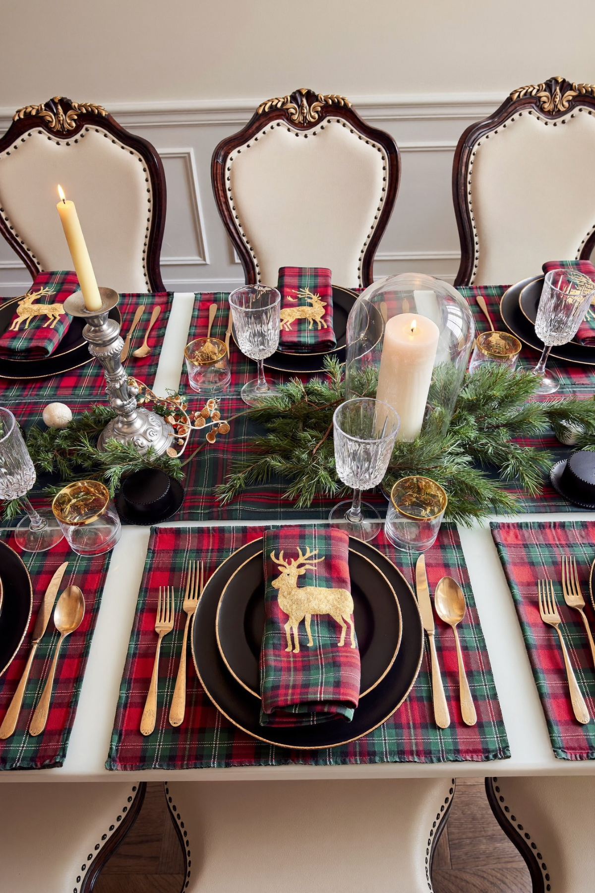
Long tables are hard to style because the eye has to travel the whole length of them and notice something consistent, not just pretty. This one solves it with a single gold reindeer stitched onto every napkin, folded the same way, sitting on the same black charger, at every place setting.
Black chargers underneath red and green tartan placemats is the other quiet decision here. Black usually reads cold at a holiday table, but paired with warm plaid and gold flatware it grounds the whole spread instead of competing with it. Nothing above the plate line is left to chance.
For a smaller dinner, buy one motif, whether it is a reindeer, a holly sprig, or a monogram, and put it on every napkin without exception. Skip mixing different placemat patterns down the table. The goal is a spread that feels planned even if it only took twenty minutes to set.
Christmas Enters the Bedroom Quietly

Living rooms get the big tree and the mantel. Bedrooms usually get skipped entirely, which is exactly why swapping in tartan bedding here feels like such a simple upgrade. A plaid duvet and matching pillow shams carry most of the holiday mood without a single ornament anywhere near the bed.
A cream, heavily textured throw gets folded across the foot of the bed on top of the red plaid, and that contrast in weight and color keeps the room from tipping into costume territory. The small live tree tucked into the corner takes up almost no floor space but still earns the room its glow.
Bedrooms rarely need more than three moves: a patterned bedding swap, one textured throw in a neutral tone, and a small tree if there is a corner to spare. A warm lamp left on nearby does more for the mood than any additional decoration would.
Dressing the Art Instead of Hiding
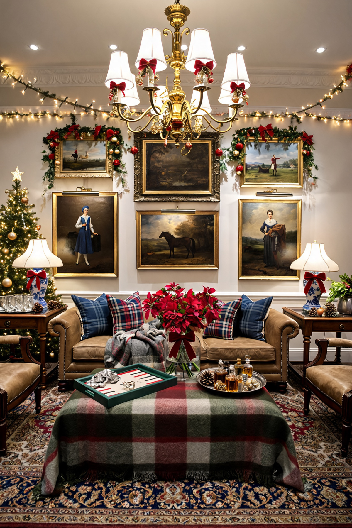
Most people take art down before they decorate, or leave it up and ignore it completely. This room does neither. Garland gets draped directly over the top corners of an entire gallery wall of framed paintings, red bows tucked into the greenery, so the art stays the focus rather than getting buried under it.
Below the wall, the sofa carries blue plaid and tartan pillows against worn leather, a combination that should not work on paper and does anyway because every color pulls from the same warm, muted family. A vase of deep red poinsettias replaces the more typical white arrangement and reads richer against the leather.
A backgammon board left open on the coffee table turns a formal room into one that looks like people actually sit in it. Decorating a gallery wall does not require removing a single frame, only garland cut long enough to drape across the tops of each one in sequence.
The Same Bow Multiplied Everywhere
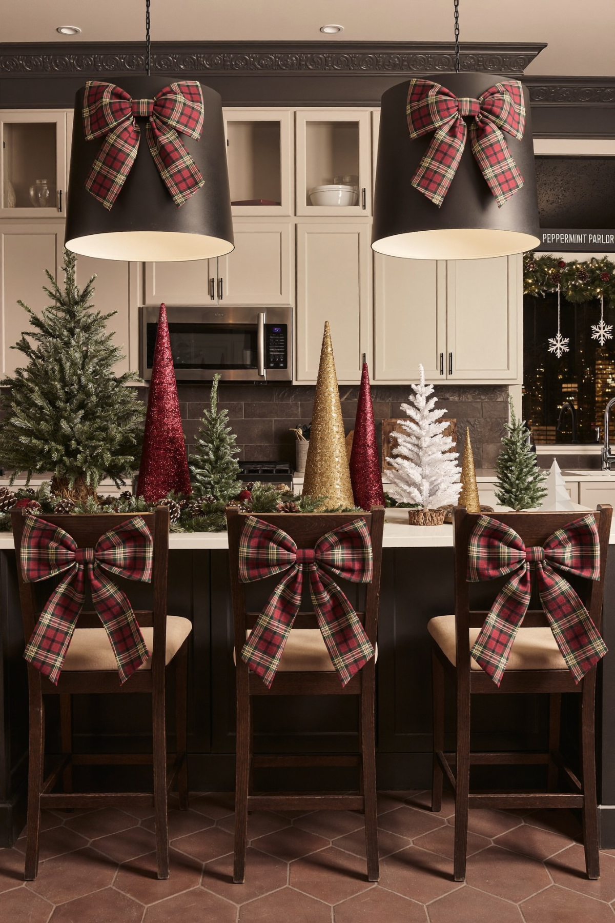
Three barstools, two pendant lights, one bow tied identically on every single one of them. That repetition is the whole idea in this kitchen, and it is a far cheaper way to make a space feel decorated than buying separate ornaments for every surface in the room.
The counter itself gets treated like a mini forest instead of a single tree: a flocked pine, a mirrored cone, a gold glitter cone, a plain white bottlebrush tree, all different heights and finishes clustered together over a base of real pinecones and greenery spread across the island.
To copy this without a full kitchen renovation, pick one ribbon and tie it everywhere, a chair back, a light fixture, a cabinet knob, then group a handful of mismatched mini trees on any open counter. Five identical trees look far less interesting than three different ones standing shoulder to shoulder.
The Sink Gets Decorated Too
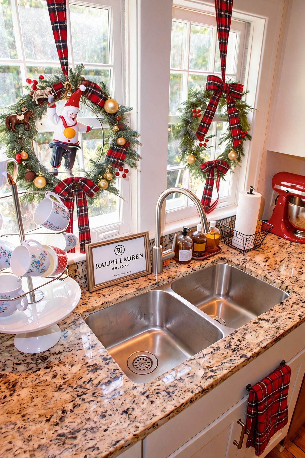
Kitchen windows above a sink are one of the most overlooked spots in holiday decorating, mostly because nobody stands there long enough to admire it. This kitchen hangs a wreath in each pane anyway, with long tartan ribbon streamers running down past the window frame instead of a small bow tucked into the greenery.
One wreath carries a small vintage toy figure tucked into the branches alongside gold and red ornaments, a good reminder that a wreath does not have to stay purely botanical. A plaid towel looped through the oven handle and a cluster of holiday mugs on a tiered stand round out a corner that took maybe fifteen minutes total.
Ribbon length is the easiest thing to steal here. Instead of a bow sized to match the wreath, let the tails run long, down past the sill, almost to the counter below. It is a small change that makes a plain wreath look considerably more finished.
A Tree Built Like a Study
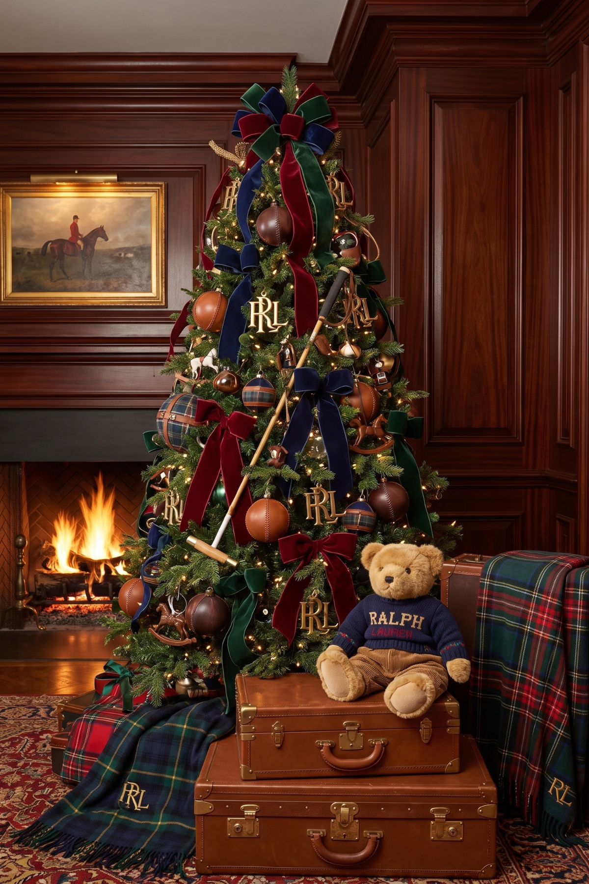
Wood paneling and a lit fireplace do most of the heavy lifting before a single ornament goes on this tree, which is why the palette stays so restrained: leather brown, deep burgundy, forest green, navy, and brass, nothing brighter than that anywhere in the frame.
Velvet ribbon replaces most of the ornaments you would expect, tied in oversized bows down the height of the tree instead of scattered evenly across it, and the ornaments that remain lean equestrian: saddle-shaped leather balls, small rocking horses, monogrammed hanging discs. A vintage polo mallet propped against the trunk and a stack of old leather trunks underneath push the theme past the tree itself.
A stuffed bear in a knit sweater sitting on the trunks keeps the whole vignette from feeling like a museum room instead of a living one. A handful of well-placed objects near the base can carry as much personality as the tree does.
A Palette Kept That Simple
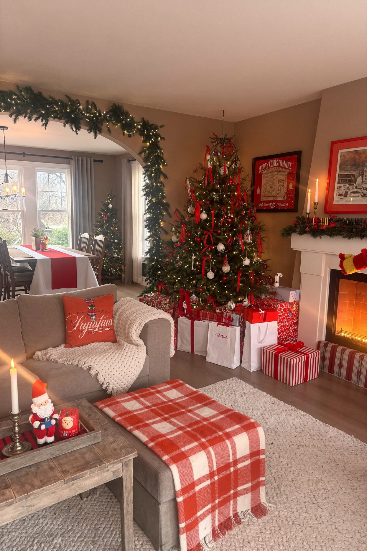
Red, white, and the natural wood and neutral upholstery already in the room. That is the entire palette here, and stopping there is what keeps a fairly busy tree from looking cluttered next to a mantel, a stack of wrapped gifts, and a plaid throw draped over an ottoman nearby.
Ribbon streamers run through the tree instead of tinsel or garland, a cheaper and lighter-looking way to add movement between the ornaments. Gift wrap gets included as part of the display rather than hidden until the day itself, stacked deliberately by size with the tallest boxes at the back near the tree.
A pair of taper candles on the mantel and a couple of small figurines on the coffee table are doing more than they look like they should. If your space already leans neutral, resist adding green as a third color and let red carry the whole room instead.
Bows Spaced Like a Rhythm
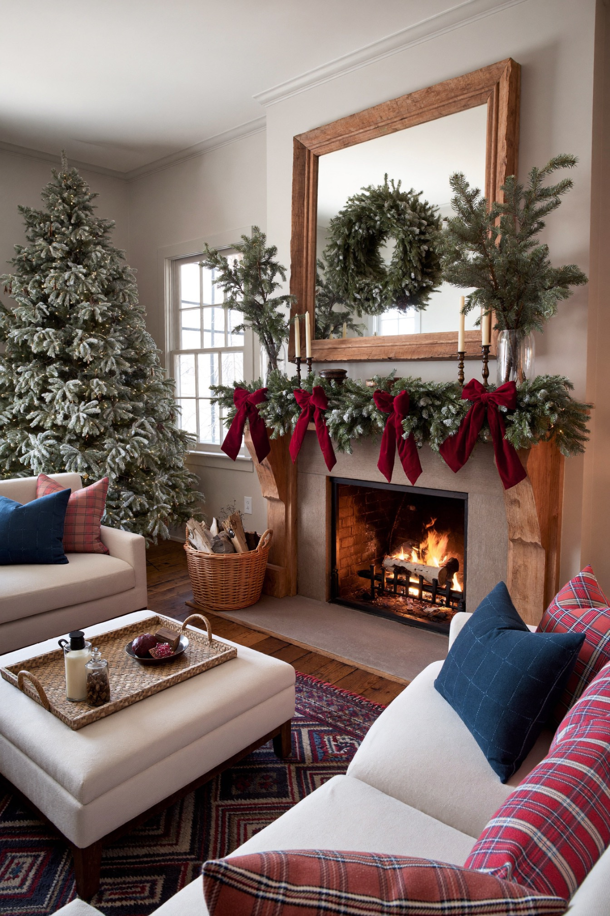
Four burgundy velvet bows sit along this mantel garland at almost exactly equal intervals, and that even spacing is doing more for the finished look than the garland or the greenery underneath it. Uneven spacing is the single fastest way to make a mantel look thrown together instead of styled.
A large wood-framed mirror above the fireplace reflects a second wreath that is actually hanging behind the camera, doubling the greenery in the room without adding another physical piece anywhere. The flocked tree beside the sofa reads as snowy without needing real snow, softening what would otherwise be a fairly saturated red and navy pillow mix nearby.
Count your garland length before buying bows, then divide it evenly rather than clustering ribbon wherever looks good in the moment. A mirror angled to catch a wreath, a tree, or even string lights is a genuinely free way to make a room look more decorated than it actually is.
Every Detail Here Was a Small Decision
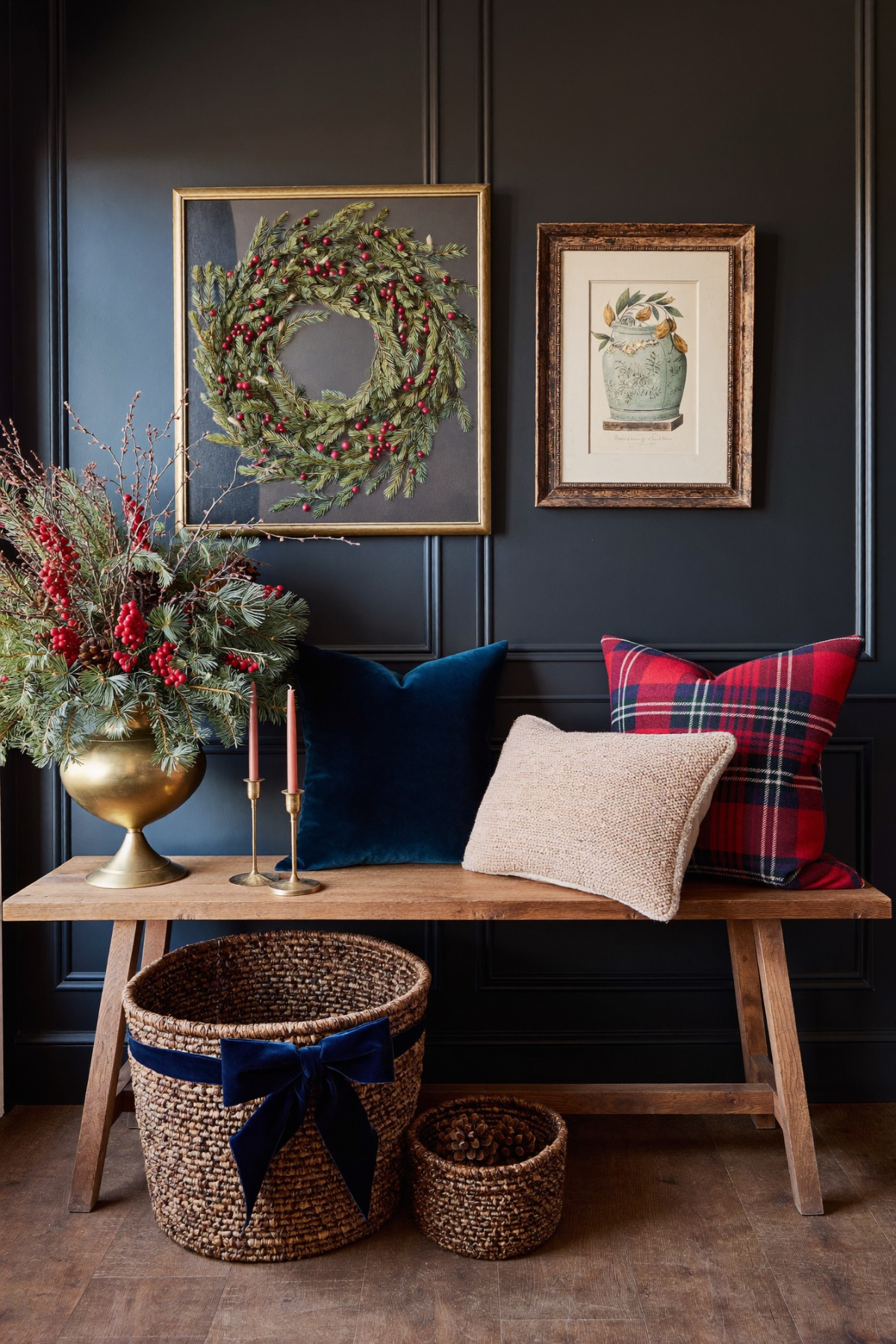
None of the rooms above depended on a single expensive centerpiece. A stockpot instead of flowers, a mirror angled to catch a wreath, bows spaced evenly along a mantel, one ribbon tied identically across a whole kitchen. The through-line is restraint applied on purpose, not a bigger budget behind the scenes.
Pick one or two ideas rather than all of them at once. A house that borrows the oversized porch bow and the evenly spaced mantel ribbon will look more considered than one that tries every idea in this post in a single weekend and ends up with no clear color story at all.
Plaid, velvet, brass, and deep greenery carried almost every room here, and that consistency is replicable in a house that looks nothing like these ones. Start with the palette, keep it to three or four colors, and let the small repeated details, the bow, the ribbon, the motif, do the rest.

 Steal Our Home Styling Secrets!