
Whimsigoth Style Explained Through A Handful Of Real Living Room Photos
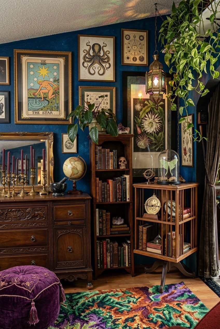
Whimsigoth is what happens when someone who loves velvet couches also owns a deck of tarot cards and refuses to apologize for either. It’s dark walls and jewel-tone furniture and a chandelier that looks like it survived a haunted house auction. It’s witchy without being a costume.
What makes it work in a living room specifically is that it leans on things people already collect: old books, plants, candles, mirrors, the odd crystal picked up on a whim. The whole style is basically a permission slip to stop hiding your weird stuff on a shelf in the closet.
We pulled ten rooms that show how this look actually gets built, piece by piece, so you can steal the parts that fit your space instead of trying to copy a whole room at once. Some of these ideas cost nothing but rearranging what you already own.
Let Jewel Tones Do The Anchoring
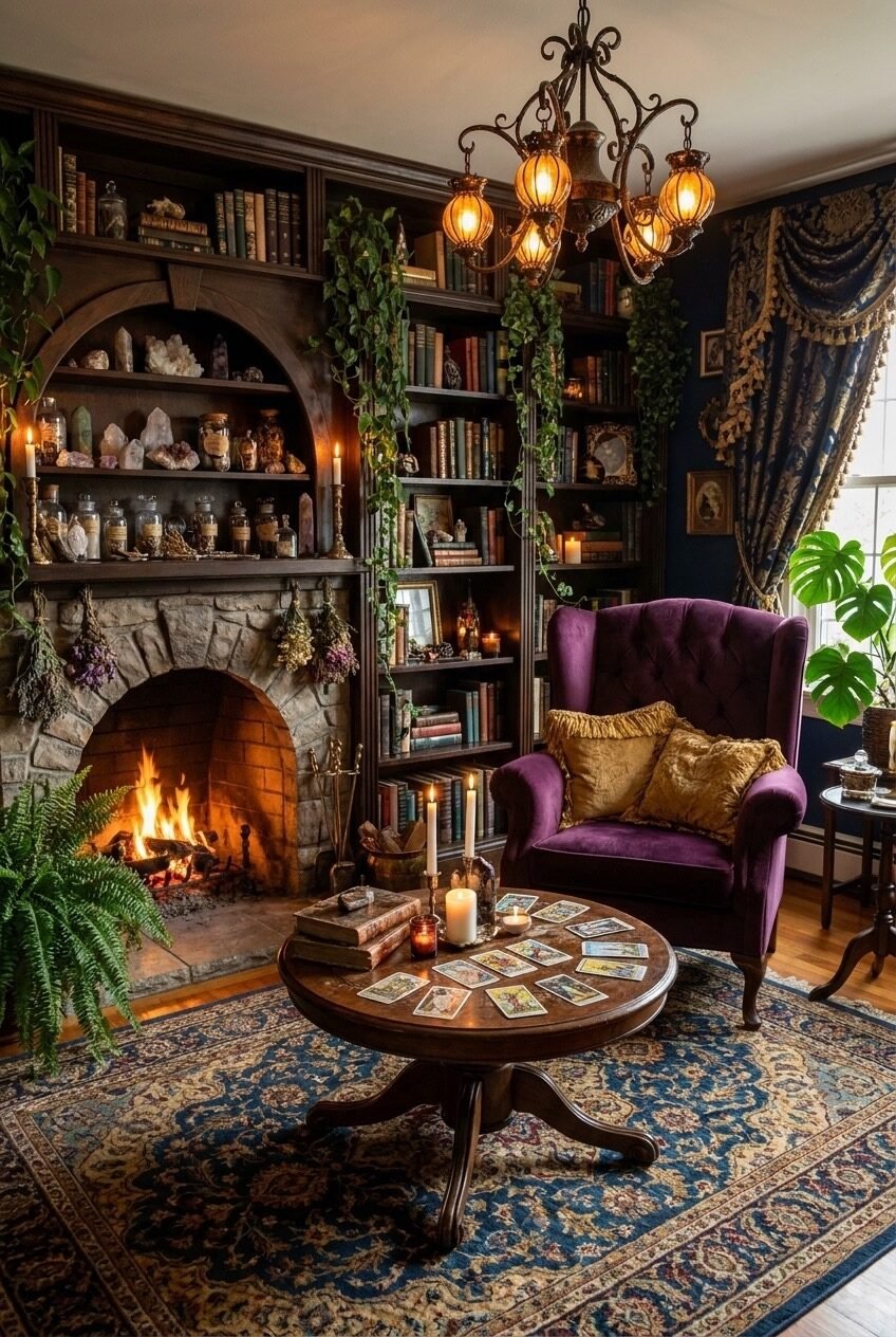
Purple velvet, mahogany wood, brass candlesticks, and a deep blue wall all sitting in the same room should clash. It doesn’t, because every color here sits in the same jewel-tone family instead of competing for attention. That’s the actual trick behind rooms that read as rich instead of chaotic: pick one tonal register and let every object, no matter how random, live inside it.
The arched niche packed with crystals and apothecary jars works for the same reason a messy bookshelf can look styled or can look like clutter. Group similar objects by height and material, tuck the smaller pieces toward the back, and the whole thing reads as a collection rather than a pile.
A round table set with tarot cards under a warm chandelier is a small detail worth copying even if you never touch a tarot deck. Any low round table pulled slightly off-center from the main seating gives a room a place to actually do something in it, instead of existing purely for looks.
Drape Your Ceiling On Purpose
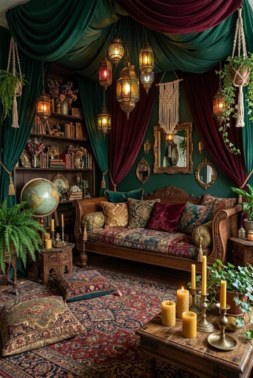
The ceiling is the one surface almost nobody decorates, which is exactly why draping it in green and burgundy velvet here feels like such a left turn in the best way. Fabric overhead lowers a room visually and gives it the density of a tent, which is a strange thing to want in a living room until you actually sit in one.
Layering Moroccan-style lanterns at uneven heights underneath the drape does more work than any single light fixture could. Uneven hanging heights break up the ceiling plane and force your eye to travel around the room instead of settling flat on one spot, which is basically free visual interest.
None of this requires touching the ceiling itself. Curtain rods mounted at the corners and fabric pulled toward a center point get you most of the effect for the price of a few yards of velvet and an afternoon.
Put A Galaxy On Your Ceiling
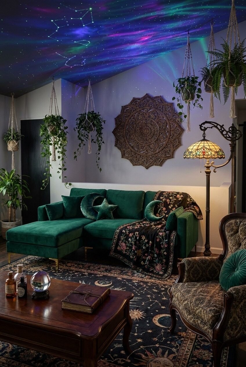
A star projector or a hand-painted constellation mural turns a plain ceiling into the most-looked-at surface in the room, which sounds dramatic until you see how much dead space most ceilings actually are. This one goes further with an aurora-style light wash and painted constellations, but even a basic star projector aimed upward gets you a solid chunk of the mood for a fraction of the effort and none of the paint fumes.
Down below, the moon and star throw pillows on an emerald sectional aren’t just cute shapes; they’re a quiet callback that ties the furniture to the ceiling so the whole room feels planned rather than randomly matched. Small repeated motifs like this are cheaper than they look and do more visual work than people give them credit for, especially against a single-color sofa that would otherwise read as plain.
If painting a full mural feels like too much commitment, a projector is genuinely the easier route, and it’s reversible the second you move out or get bored of it. Renters especially should start here before touching a single wall.
One Mirror Anchors A Gallery Wall
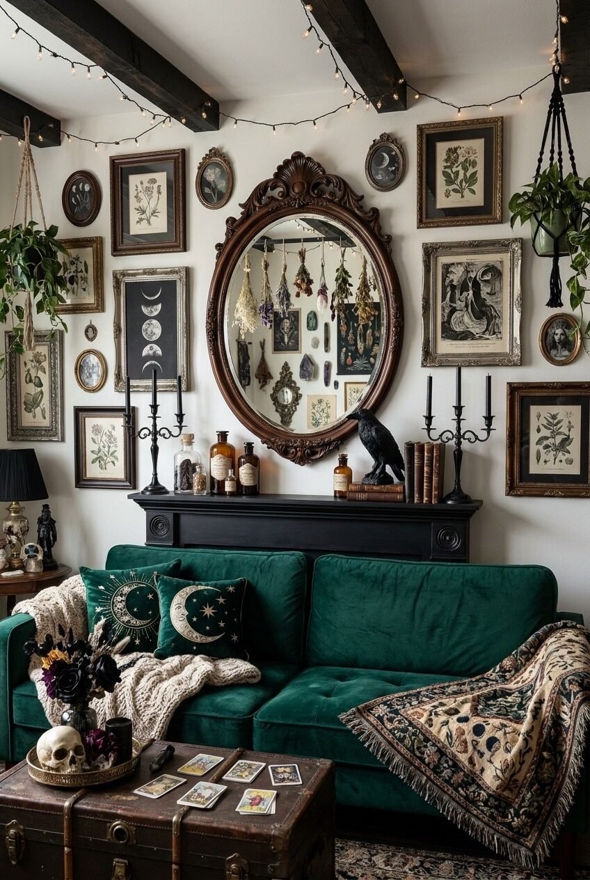
Most gallery walls fail because every frame is roughly the same size, so nothing anchors the eye and the whole arrangement reads as noise. Here, one oversized oval mirror sits dead center and every smaller botanical print and moon-phase illustration orbits around it, giving your eye an obvious place to land before it wanders out toward the smaller frames.
Hanging dried florals inside the mirror frame itself is a detail worth stealing on its own. It turns a mirror from a purely functional object into a display piece, and it costs about as much as a bundle of dried flowers from a grocery store and an afternoon of patience with some floral wire.
Below it, the black mantel styled with apothecary bottles and a taxidermy raven keeps the whole wall from floating. Every gallery wall needs a surface underneath it doing its own thing, or the art ends up looking stranded halfway up a blank stretch of paint with nothing grounding it below.
Paint The Story Onto Your Beams
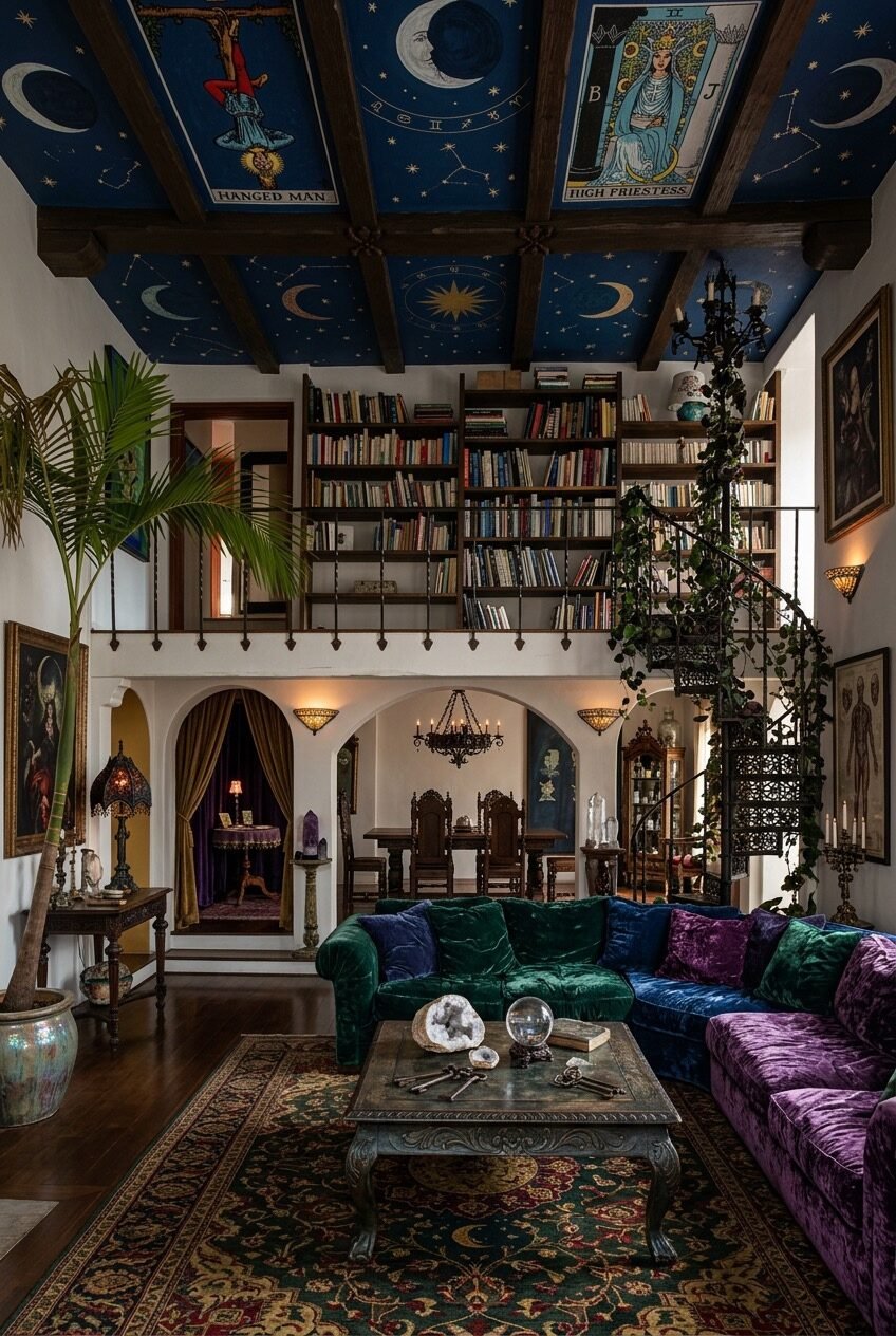
Tarot imagery and constellations painted directly onto exposed ceiling beams is obviously a bigger undertaking than anything else on this list, but the underlying idea scales down fine: architectural details like beams, moldings, and built-ins don’t have to stay wood-toned. Paint is the cheapest way to make a structural feature feel like part of the design instead of something the room just happens to have.
The loft library with its wrought iron spiral staircase does something else worth noting: it stacks a second, smaller room on top of the main one instead of spreading everything out on one floor. If your space has any vertical room to spare, a library loft or even a single tall bookshelf reaching toward the ceiling borrows some of that same effect.
Jewel-tone velvet sectionals in green, blue, and purple sitting together, meanwhile, prove you don’t need to pick just one accent color.
Let Two Dark Colors Collide
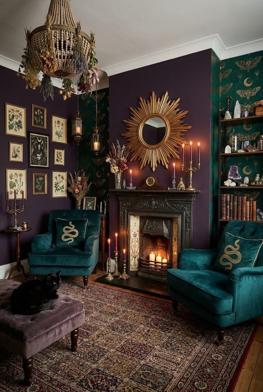
Deep aubergine on one wall and dark emerald moth-print wallpaper on the next sounds like a color pairing that shouldn’t survive contact with each other, and yet it’s the reason this corner has any depth at all. Two saturated dark colors sitting next to each other, instead of one dark wall against three neutral ones, is what keeps a moody room from reading as flat or gloomy.
The gold sunburst mirror above the fireplace earns its keep by being the one warm, reflective object in an otherwise cool, matte room. A single metallic piece against two dark colors does more to lighten a space than adding another lamp would.
We’re also not going to pretend the black cat lounging on the velvet ottoman isn’t doing half the marketing for this whole aesthetic, but a plain throw pillow works too if your cat has other plans.
Cluster Mismatched Mirrors Like A Collection
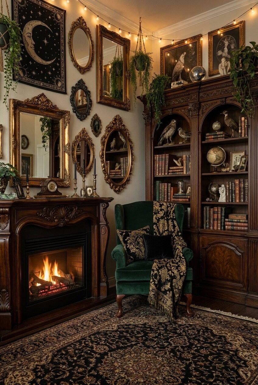
Thrift stores are full of gold-framed mirrors nobody wants because they don’t match anything, which is precisely why they’re perfect for this. Grouped together in different shapes and sizes above a mantel, mismatched mirrors stop reading as leftover frames and start reading as an actual collection, the same way a shelf of unmatched vintage books looks better than one uniform set bought all at once from a catalog.
Multiplying reflective surfaces in a room lit mostly by string lights and a fireplace also does something practical: it bounces what little warm light there is around the whole wall instead of letting it die in one corner. A room this dark needs every bit of borrowed light it can get, and glass does that job for free.
Taxidermy birds tucked onto the bookshelf beside the mirrors round the whole cluster out, but pressed botanicals or small framed prints get you the same layered, collected-over-time feeling without needing a taxidermist or a strong stomach for that kind of shopping trip.
Give The Skylight A Second Job
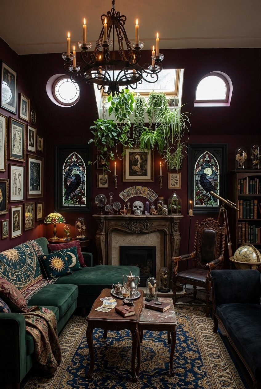
A round window and a skylight flanking a stained-glass fireplace is not a layout most of us can replicate, but the underlying move is worth borrowing: this room refuses to let the fireplace be the only thing worth looking at. Hanging a cluster of plants directly beneath the skylight gives the eye a second stopping point, so the room reads as layered instead of centered on one single wall.
Stained glass panels on either side of the mantel pull color out of daylight itself, which shifts throughout the day in a way a fixed piece of art never will. Even a single stained-glass suncatcher hung in an ordinary window does a smaller version of this same job, and it costs a fraction of what a full panel would.
A telescope propped in the corner is a nice touch, but honestly it works as well as a decorative object as it does for actual stargazing, so nobody has to feel guilty about it just sitting there looking good.
Layer Textiles Instead Of Furniture
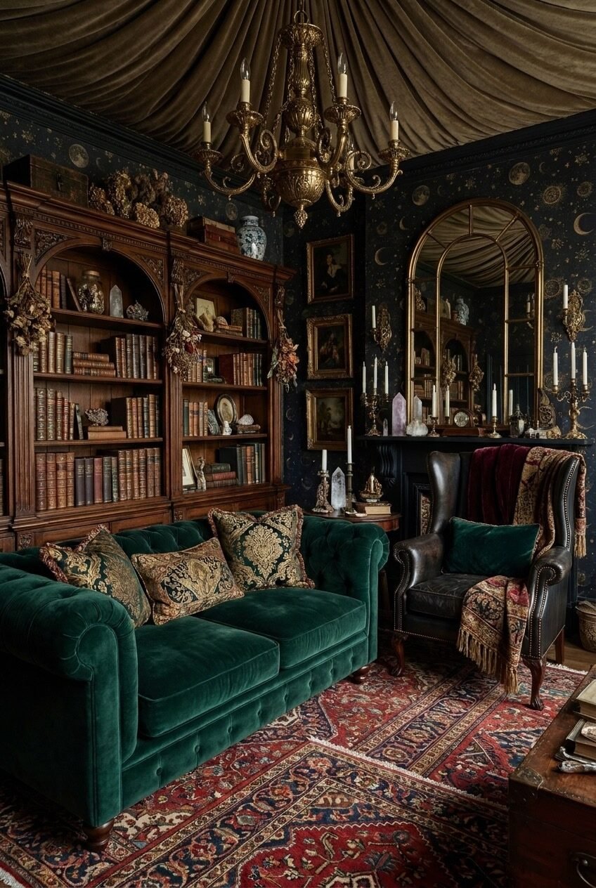
The tufted emerald chesterfield here isn’t doing all the work; the draped ceiling fabric, the constellation wallpaper, and two overlapping Persian rugs are. Layering textiles is consistently the cheapest way to add drama to a room, and it’s the one this space leans on hardest instead of buying more furniture it doesn’t actually have room for.
Overlapping two patterned rugs, rather than centering one large rug under the sofa, is a specific trick worth stealing on its own. It adds visual depth at floor level and makes a room feel finished even before you’ve hung a single thing on the walls, which is useful if your budget for art is smaller than your budget for rugs.
Brass candelabras and crystal clusters on the mantel are doing double duty as both light and object, which matters in a room this dark. When wall space and floor space are already busy, the mantel is where the smaller, denser details belong, since there’s nothing else competing for attention right there.
Build A Cabinet Of Curiosities
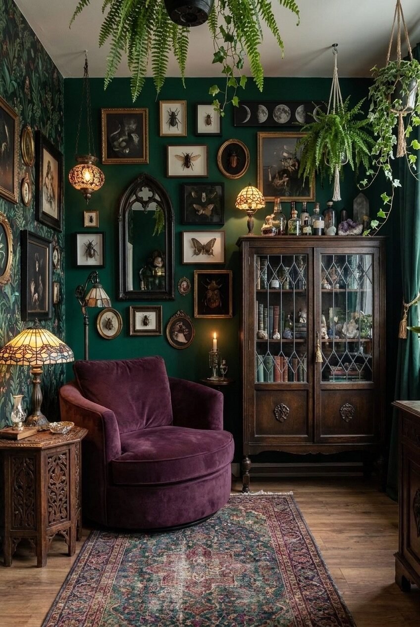
Somewhere between a Victorian study and a natural history museum gift shop is this exact wall, and we mean that as a compliment. Framed insect specimens, a moon-phase print, a small gothic mirror, and botanical wallpaper all sit together, and the wallpaper is what saves it from looking like a random pile of oddities someone couldn’t decide where else to put.
A patterned wallpaper underneath a busy gallery arrangement gives every framed piece something consistent to sit against, so the eye reads the wall as one composition instead of counting individual frames one by one. Try that same trick on a plain painted wall by adding a strip of patterned wallpaper just behind where the frames will eventually hang.
The plum velvet swivel chair and glass-front curio cabinet keep the corner from tipping into museum-diorama territory, proving a curiosity wall still needs one or two soft, sit-in-me pieces nearby so the room stays livable instead of feeling like an exhibit behind glass.
Take The Parts That Fit Your Space
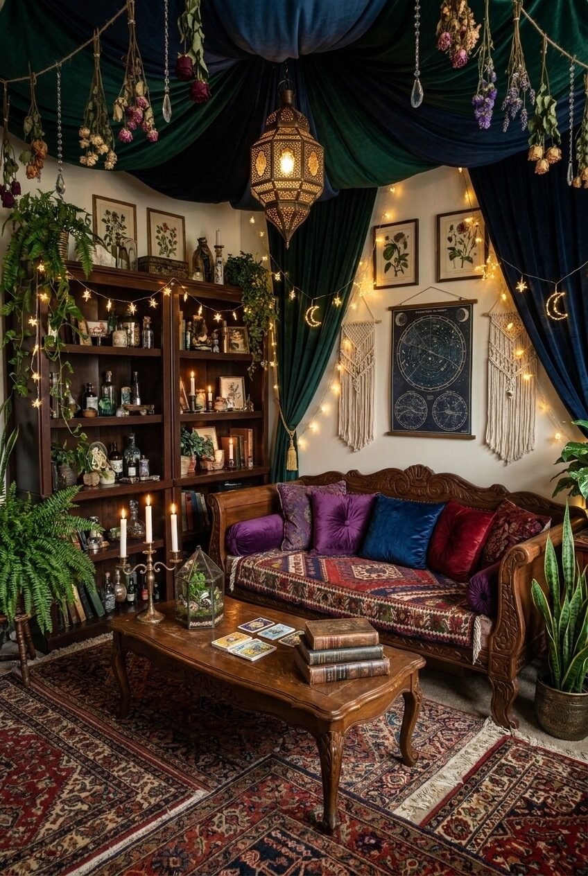
None of these rooms are asking you to paint every wall aubergine or hunt down a taxidermy raven by next weekend. Whimsigoth works room by room, sometimes object by object, and the strongest examples above are usually doing two or three small things well rather than everything at once.
If you’re starting from zero, the cheapest entry points are the ones that don’t involve furniture at all: layered textiles, a cluster of mismatched mirrors, jewel-tone pillows on whatever sofa you already own. Paint and wallpaper come next, and full ceiling treatments are the last thing worth attempting, not the first.
The common thread across every version here is restraint hiding inside what looks like maximalism. Pick a tonal family, repeat a motif somewhere twice, and let one object per room do the heavy lifting. The rest is just collecting things you actually like.
 Steal Our Home Styling Secrets!