
The Preppy Bedroom Trend Nobody Really Explains Properly Until Right Now
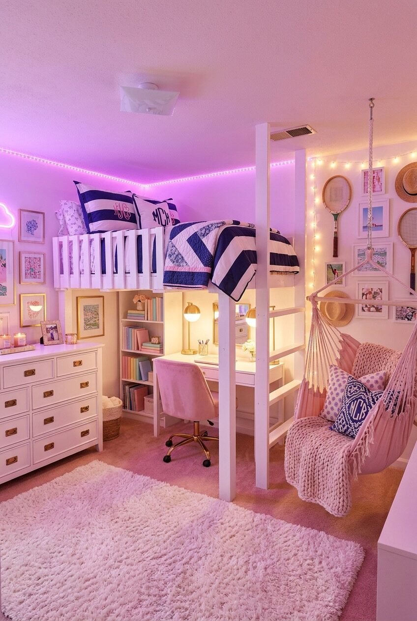
Preppy used to mean navy stripes, a monogram, and maybe a tennis racket mounted on the wall above a headboard. That definition has stretched a lot in the last few years, and honestly, the style is more fun for it now than it used to be.
What ties these rooms together isn’t one color palette or a single brand of pillow you’re supposed to own. It’s confidence: bold lighting choices, layered textures, and walls that actually say something real about the person sleeping in that bed every night.
We pulled together real rooms that show how far this style can stretch, from soft pastel corners to full neon glow-ups near a vanity. Each one comes with the reasoning behind it, so you can pull whichever pieces actually fit your own space and budget.
Layer Your Lighting Like A Pro
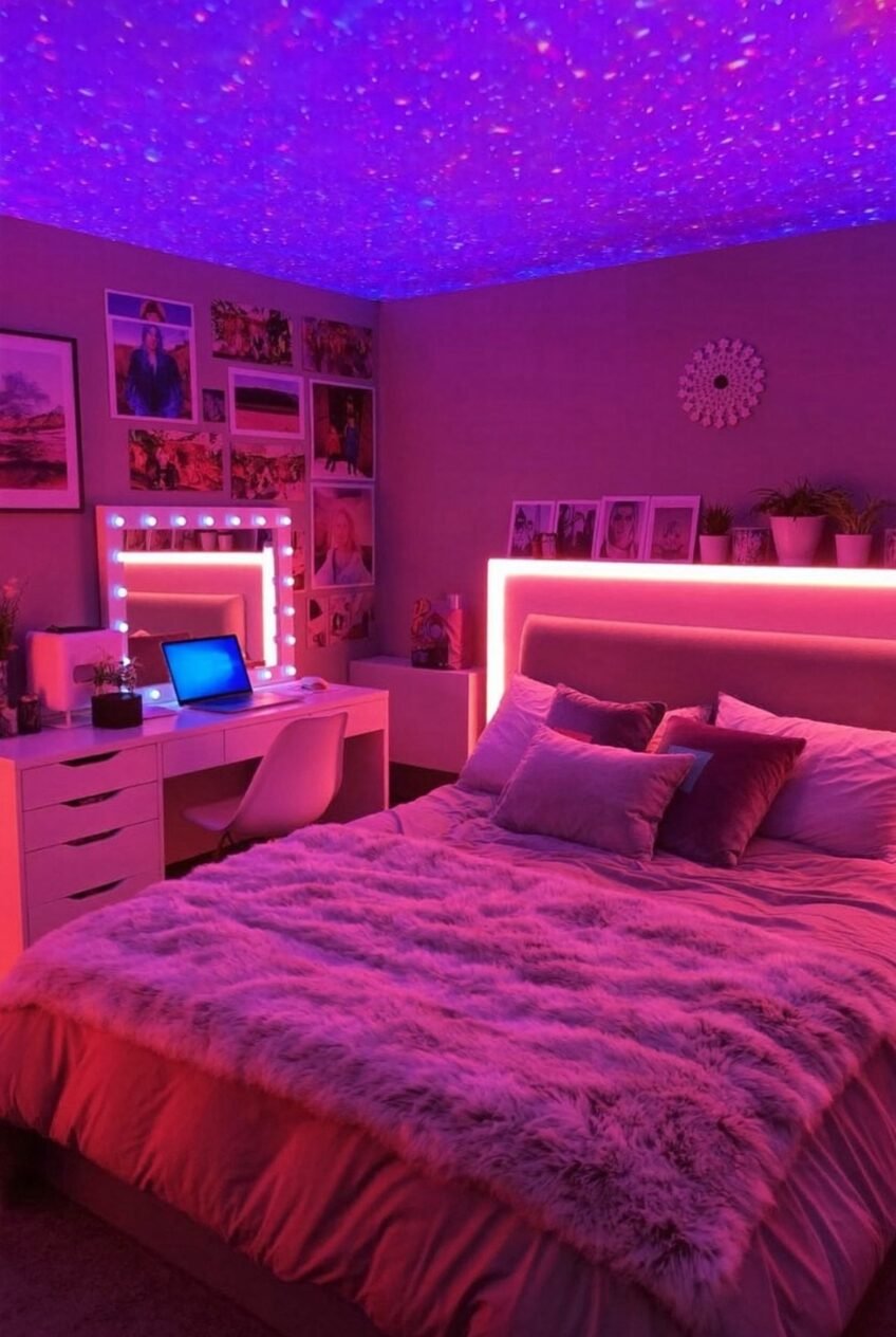
The ceiling turns into the main character in this room before your eyes even land on the bed. A galaxy projector does that job, and it’s a cheap trick that makes a plain ceiling feel like part of the design instead of an afterthought nobody planned for.
Below that, an LED strip runs behind the headboard and along a vanity mirror, which means the room has three separate light sources instead of one overhead fixture doing all the work by itself. That’s the real principle here: light in layers, not just raw brightness.
If you want this at home, start with a strip light behind the bed frame, add a mirror with bulb trim for the desk area, and save the projector for last since it’s the detail that actually makes people stop scrolling and look twice. Even a gallery of printed photos on the wall benefits from all that extra light bouncing around the room.
Let A Warm Wall Do Work
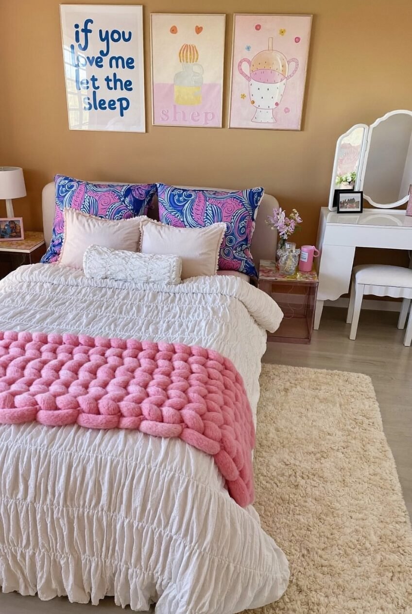
A warm mustard wall color is doing a lot of quiet heavy lifting in this setup. It gives the whole room a backdrop that reads cozy without going dark, and it makes every pastel accent placed on top of it look deliberate rather than random or last-minute.
Above the bed, three matching frames hang in a tight row, which is a much easier gallery formula to pull off than a sprawling mixed collage. Keep the sizes identical and the spacing even, and even quirky, playful artwork ends up looking pulled together instead of thrown up in a hurry.
On the bed itself, a single chunky knit throw is the only heavily textured piece against an otherwise smooth, ruffled bedspread. One statement texture tends to read better than five competing ones, so resist the urge to keep adding more layers on top. A tri-fold vanity mirror nearby borrows the same restraint, staying simple so the wall grouping keeps all the attention.
Build A Palette From Prints
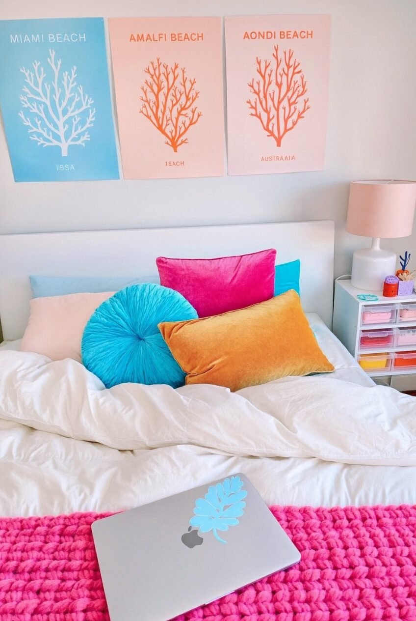
A round teal pillow, a hot pink rectangle, and a mustard velvet lumbar shouldn’t really work together on paper, yet they do, and the reason is sitting right above the bed. Three matching art prints shift through blue, coral, and orange, and that gradient is quietly telling every pillow which color to be.
That’s a genuinely useful trick for anyone nervous about mixing color: pick one art series that already moves through a palette, then pull pillow colors straight from it instead of guessing at random combinations. Keep the actual bedding white or off-white so the accent colors have plenty of room to breathe.
Mixing pillow shapes matters too, and it’s an easy detail to overlook. A round pillow placed next to two rectangular ones keeps the eye moving instead of settling on one flat row of matching cushions and losing interest. A laptop sticker in a matching leaf shape is a tiny finishing touch that ties the whole desk area back into the same palette.
Add Height With A Canopy
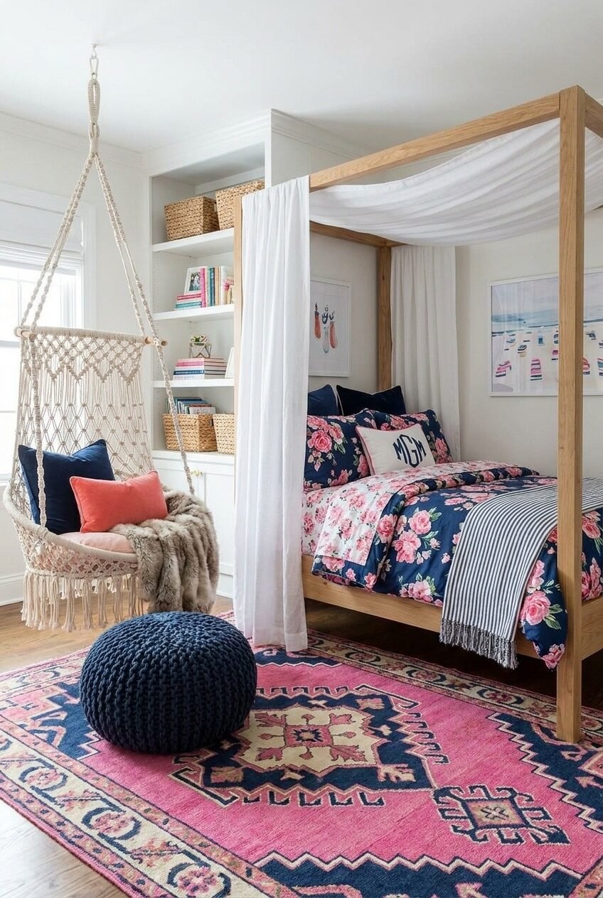
Want a bed to feel like the focal point of a room without adding a heavy headboard at all? Sheer white fabric draped over a simple wood frame does that instantly, softening every hard line in the room while pulling the eye upward toward the ceiling.
The floral navy bedding underneath carries a monogrammed pillow, which is a small detail that makes a fairly busy print collection feel personal rather than store-bought and generic. Pair it with a boldly patterned rug in the same navy-and-pink family so the two big patterns feel related instead of competing for attention.
A hanging macrame chair fills the reading-nook role here, tucked beside a built-in shelf stacked with woven baskets and paperbacks. That combination gives the corner an actual job to do instead of sitting there empty and unused. A striped throw folded loosely at the foot of the bed adds one more pattern without asking for any real attention.
Pick One Sign To Anchor It
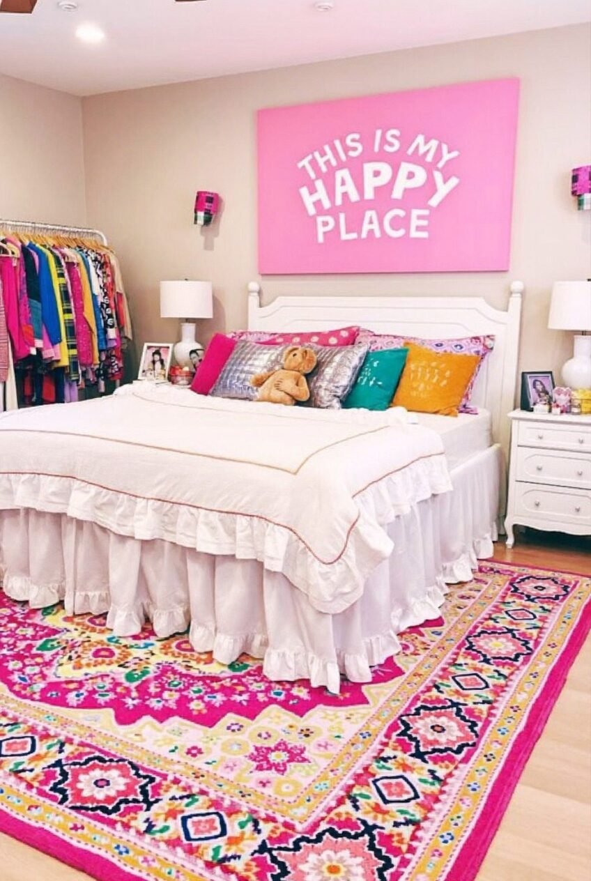
A big graphic sign hanging above the bed is doing almost all the work in this room, and that’s really the point of including it at all. When you commit to one loud, oversized piece of wall art, everything else in the room gets to be simpler by comparison.
Underneath it, the bedding stays white and ruffled, which keeps the whole look from tipping into visual chaos even with a rug that’s basically a fireworks show of pattern and color underfoot. That’s the real lesson worth borrowing: pick one place for maximum color, then let the rest of the room support it quietly.
Even the closet gets treated like decor here, with an open rack of colorful clothes standing in as a second art piece near the bed. If your wardrobe is already colorful, hiding it behind a closed door might be wasting free styling you didn’t even have to plan for.
Mix Coastal Color With Gold
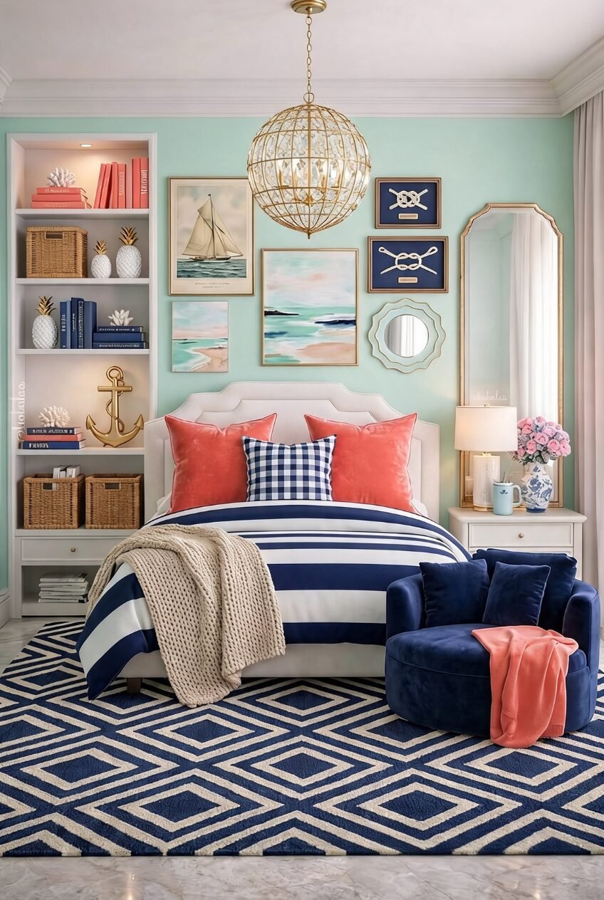
Mint green, navy, and coral is a classic coastal trio, and this room leans all the way into it without feeling like a beach rental somebody rushed to furnish. Striped bedding sets the base, coral velvet pillows add warmth, and one gingham cushion keeps the whole mix from feeling too perfectly matched.
The real upgrade is the gold: a globe chandelier, a gold-framed mirror, and gold accessories scattered across the shelf pull the palette out of purely beachy territory and into something that reads more polished and grown-up. Coastal colors paired with warm metal tones aren’t a combination people reach for often, but they genuinely work.
On the bookshelf, books are grouped roughly by color rather than height or subject, which is a small styling move that makes open shelving look considered instead of cluttered and thrown together at the last minute. Little coastal objects like a brass anchor and a pair of pineapple bookends fill the gaps so nothing feels sparse.
Give Every Piece Its Pastel
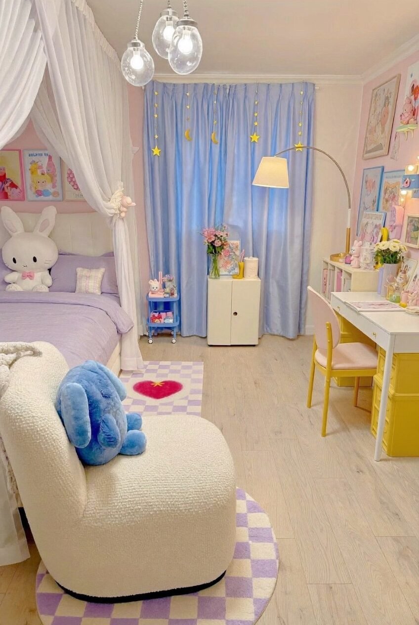
Instead of matching everything to one single pastel, this room assigns a different soft color to nearly every piece of furniture in it: a lilac bed, a pale blue curtain, a yellow desk, a pink chair pulled up close. That approach sounds risky on paper, but pastels are gentle enough that mixing four of them barely reads as clashing.
A checkered rug in lilac and white grounds the whole thing, giving the eye one graphic, repeating pattern to land on amid all that softness. Small details do a lot of the emotional heavy lifting too, like a star and moon garland clipped along the curtain rod and a soft plush rabbit propped against the pillows.
Recreating this at home doesn’t require matching furniture at all, which is honestly the best part. Pick three or four pastels you actually like, give each one a specific job, and let a patterned rug tie the whole room together.
Mix Words With Illustrations Here
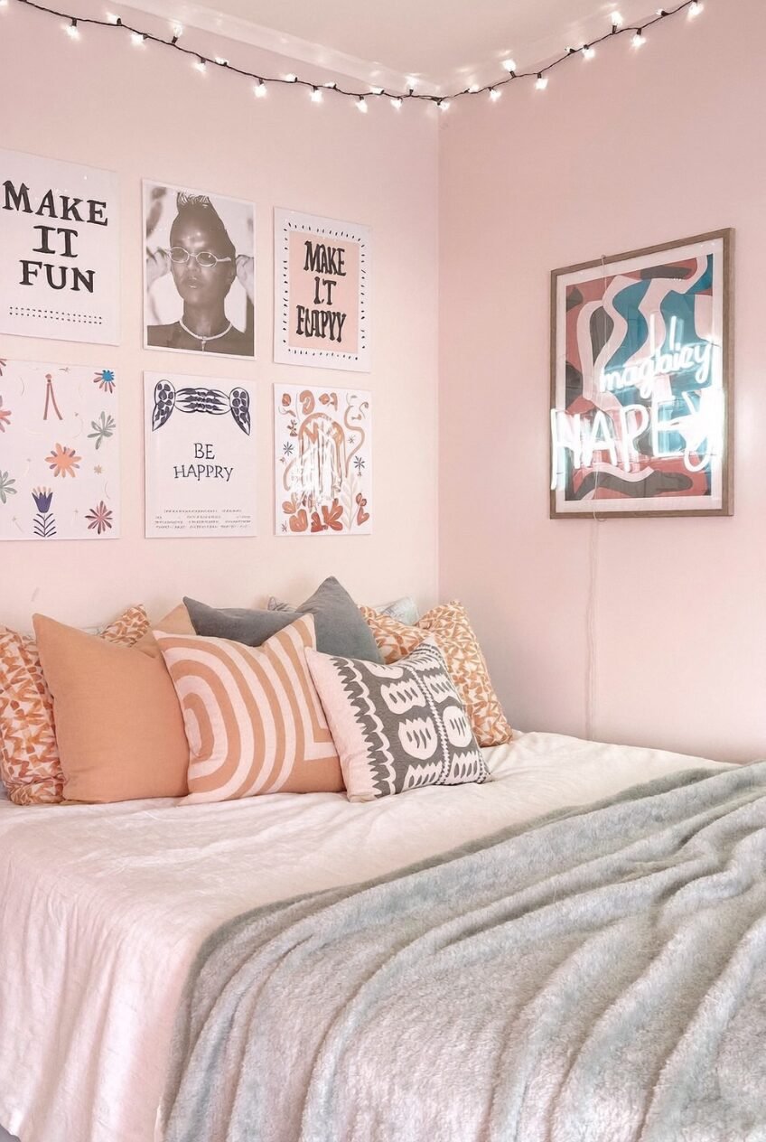
Gallery walls usually go one of two ways: all photos, or all illustrated prints hung in a grid. This one mixes typographic quote prints with illustrated pieces and even a moody photo portrait thrown in, and that variety is exactly why it doesn’t feel like a template someone copied straight from a store display.
String lights run along the ceiling line here instead of just wrapping a headboard the way they usually do, which gives the whole top half of the room a soft glow at night without needing an overhead fixture switched on. It’s a small placement shift with a bigger payoff than most people expect from it.
The pillow pile sticks to warm terracotta, gray, and blush tones, which keeps a fairly busy gallery wall from fighting with the bed for attention. Pick one warm neutral family for your textiles and let the wall art carry most of the personality instead.
Treat Open Shelves As Display
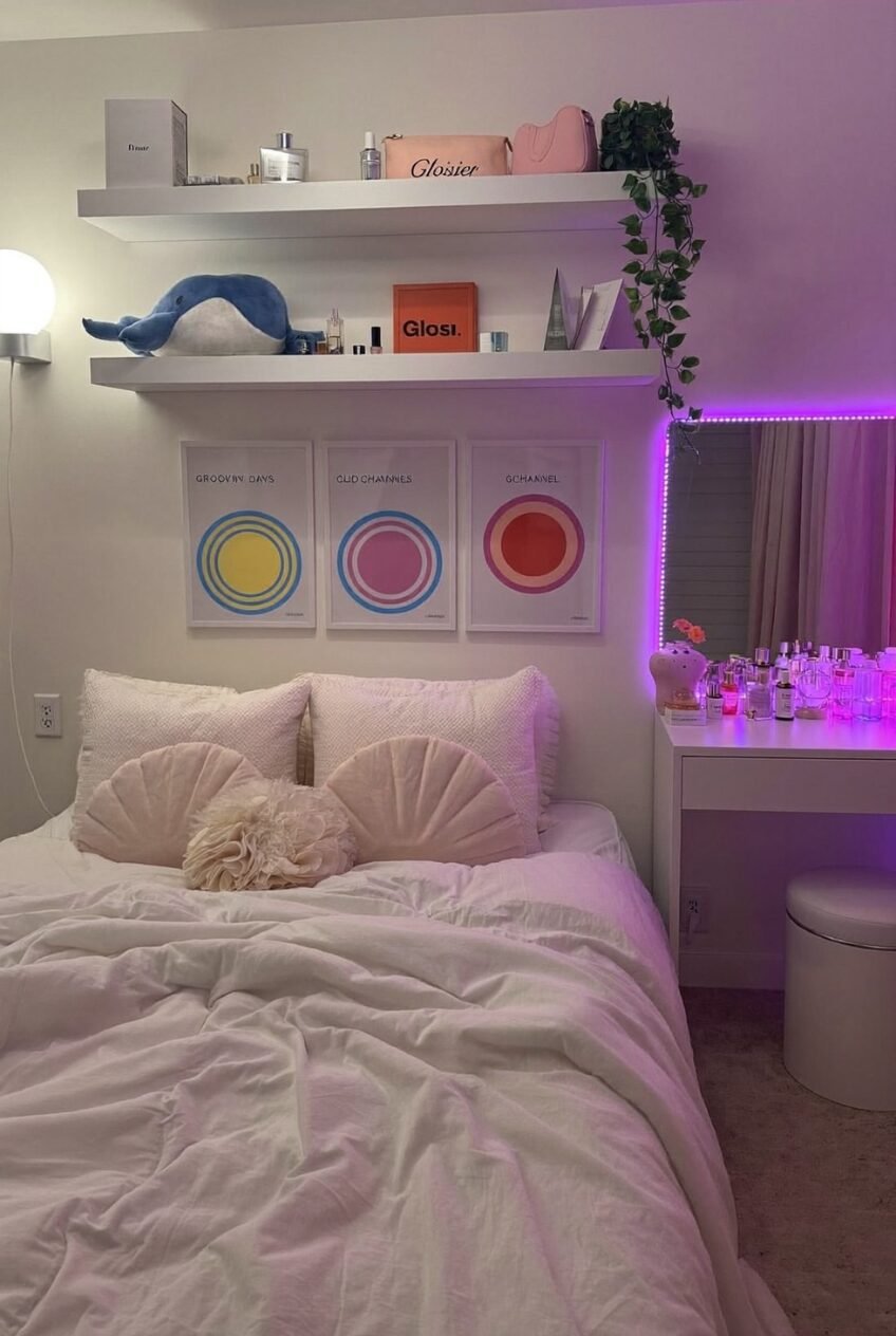
Floating shelves above the bed hold a plush toy, a trailing plant, and rows of favorite beauty essentials, all styled like they’re meant to be looked at rather than hidden away in a drawer somewhere. That’s really the whole idea here: if you already own it and like looking at it, put it on a shelf instead of behind a closed door.
Three circular prints in a gradient of warm colors repeat the same shape at slightly different sizes, which is a simple way to make separately purchased art look like a matched set. Nearby, a pink LED strip frames the vanity mirror, turning what’s normally a purely functional object into a light source too.
The vanity surface itself stays crowded with perfume bottles and skincare, and that’s a deliberate choice rather than an accident of clutter. A little visual density on a vanity can read as lived-in and personal instead of messy if it’s arranged with any care at all.
Repeat One Gold Metal Everywhere
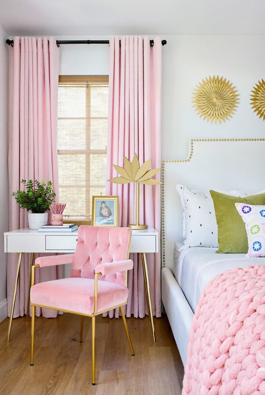
Gold shows up in five different places in this corner of the room: nailhead trim zigzagging across the headboard, a pair of sunburst mirrors on the wall, the legs of a velvet armchair, and a lotus-shaped lamp sitting on the desk nearby. That repetition is what makes a room full of different textures feel like one cohesive idea instead of five separate purchases made at different times.
The headboard trim in particular is worth copying if you’re working with something plain. A basic upholstered headboard gets a geometric zigzag of nailheads instead of a straight border along the top, which adds graphic interest without needing any extra pattern on the fabric itself at all.
A small desk near the window is treated like its own vignette, with a lamp, a framed photo, and a plant arranged the way you’d style a shelf in a living room. Even a tiny desk deserves that kind of attention paid to it.
The Best Rooms Borrow Rules, Not Whole Templates
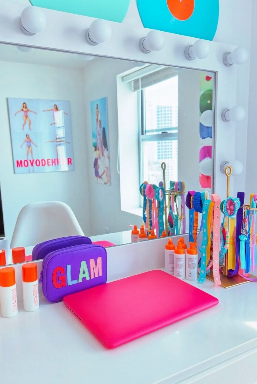
None of these rooms follow the exact same formula, and that’s really the whole point of putting them side by side. Preppy, in its current form, has room for neon glow and soft pastel corners under the same umbrella, as long as the choices behind them feel deliberate.
The common thread across them is restraint somewhere and boldness somewhere else in the same room. Every one here picks one or two things to go big on, whether that’s a graphic sign, a metal finish, or a lighting layer, and lets everything else support that choice quietly.
Steal the reasoning more than the exact shopping list if you’re trying to recreate any of this. A gold accent repeated three times, one loud print series, a checkered rug under pastel furniture — those are the moves that actually translate to a different room and a completely different budget.
 Steal Our Home Styling Secrets!