
Small Cozy Girly Apartments That Prove Square Footage Was Never the Real Point
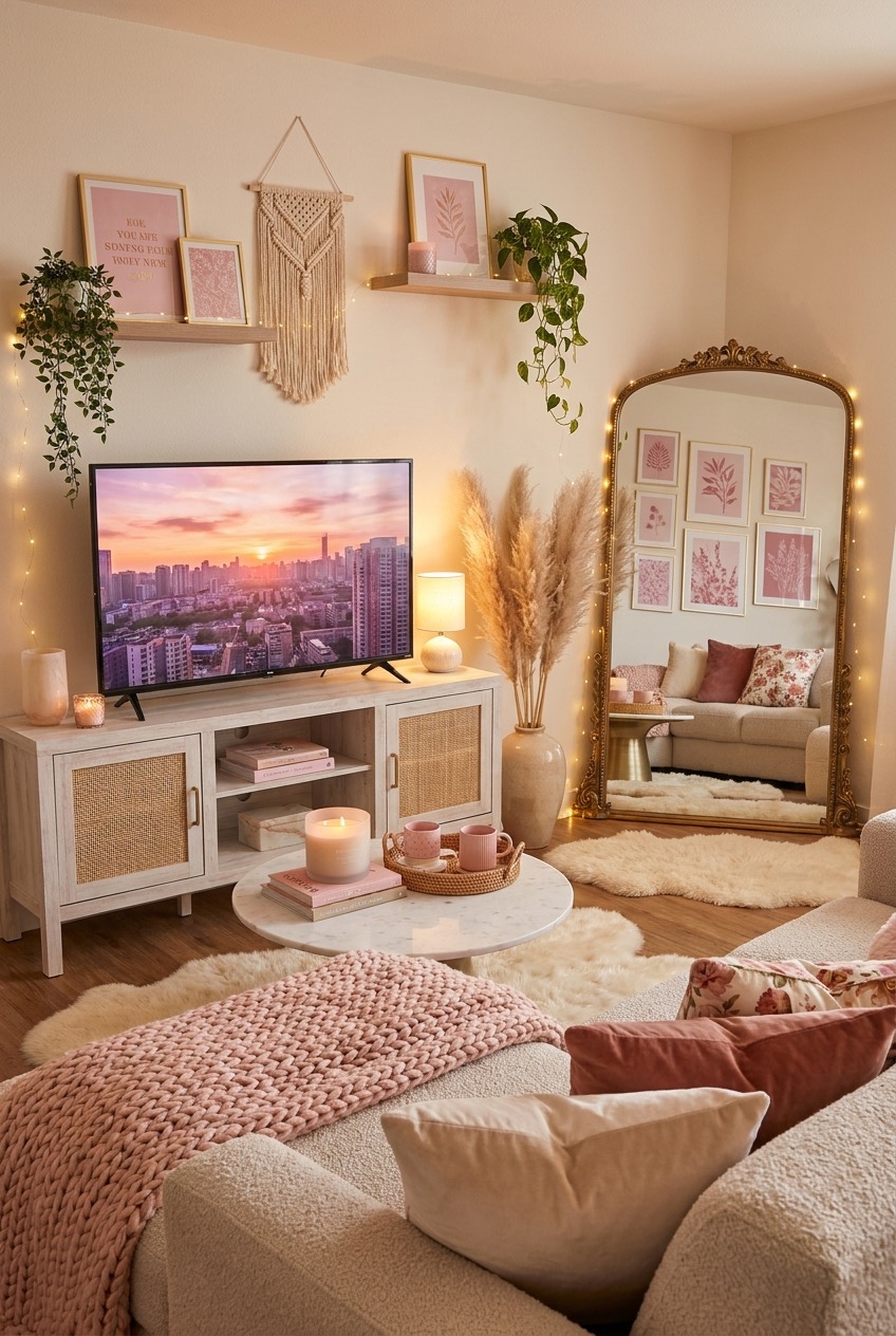
“Girly” gets treated like a color choice a lot of the time, but the apartments that actually pull it off are doing way more than swapping gray for blush. They’re playing with light, layering textures, and treating personality like an actual design material instead of an afterthought bolted on at the end.
The spaces below range from a few hundred square feet to a full skyline view, and none of them lean on one single gimmick to carry the whole room. Warm lighting shows up constantly, but so does contrast — a chunky knit throw against smooth marble, or brass hardware against a matte pink cabinet front.
We pulled apart what’s actually happening in each one: the lighting decisions, the shelf styling, the color logic that keeps a room from tipping into candy-coated chaos. Some of it you can copy directly. Some of it just needs to shift how you think about your own space before you buy anything.
Small Details Carry This Whole Room
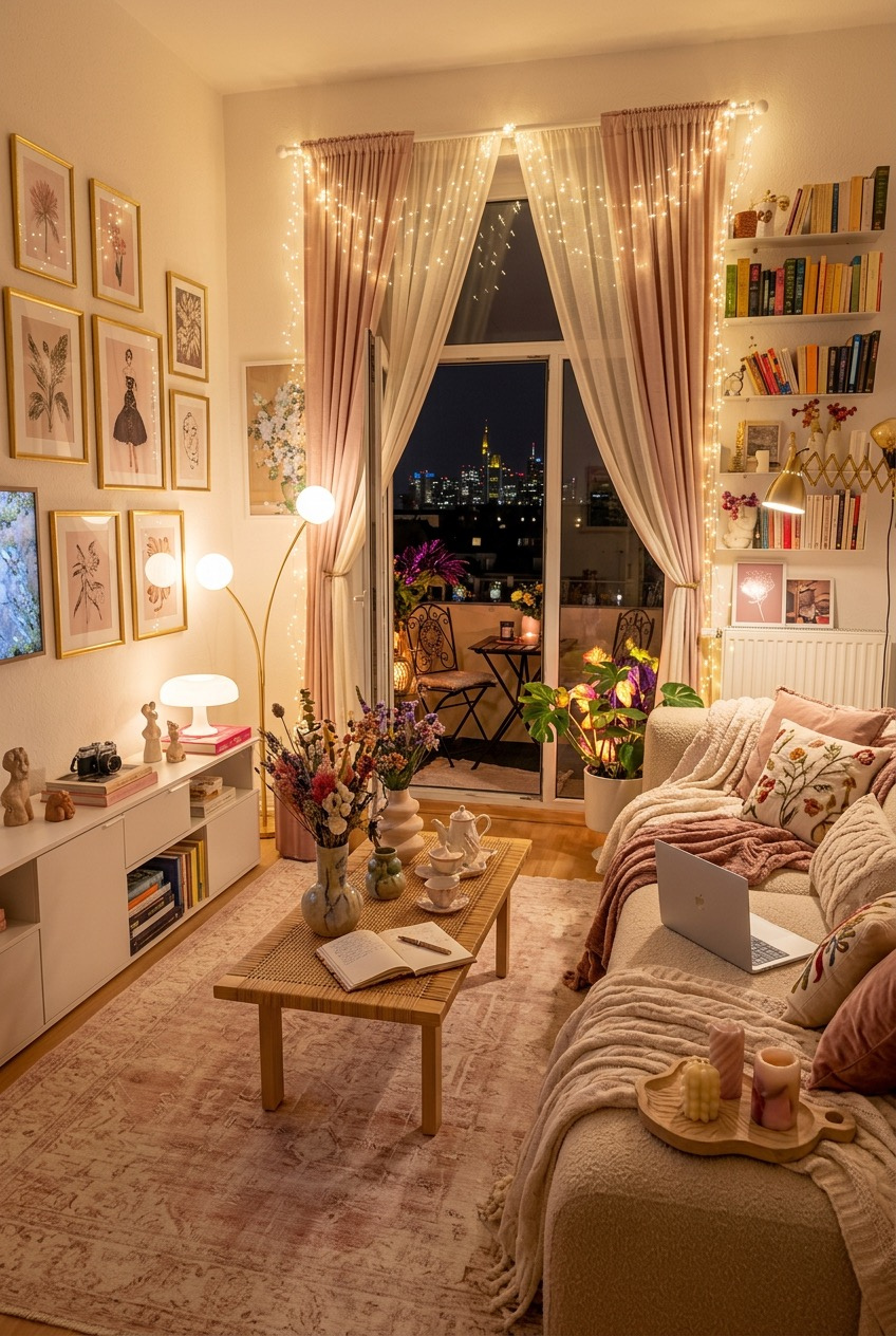
The gallery wall here isn’t one big statement piece — it’s a dozen small ones, all held in matching thin gold frames so the mismatched art still reads as a single collection. That’s the detail people skip when they DIY a gallery wall of their own: consistent framing does more visual work than whatever’s actually printed inside each frame.
Down below, the open shelving mixes books, a vintage camera, and small ceramic figures without ever turning into clutter, mostly because everything sits within the same warm color family. Add one plant trailing off the edge of a shelf and the whole ledge stops looking like storage and starts looking like a display someone actually thought through.
String lights framing the window aren’t just there for nighttime glow — they soften the hard edge between curtain and wall, which is a cheap trick worth stealing even outside a pink-toned room. Layer a textured throw over the sofa arm afterward and the whole corner stops feeling staged and starts feeling like somewhere you’d actually read a book.
Vertical Space Becomes the Main Feature
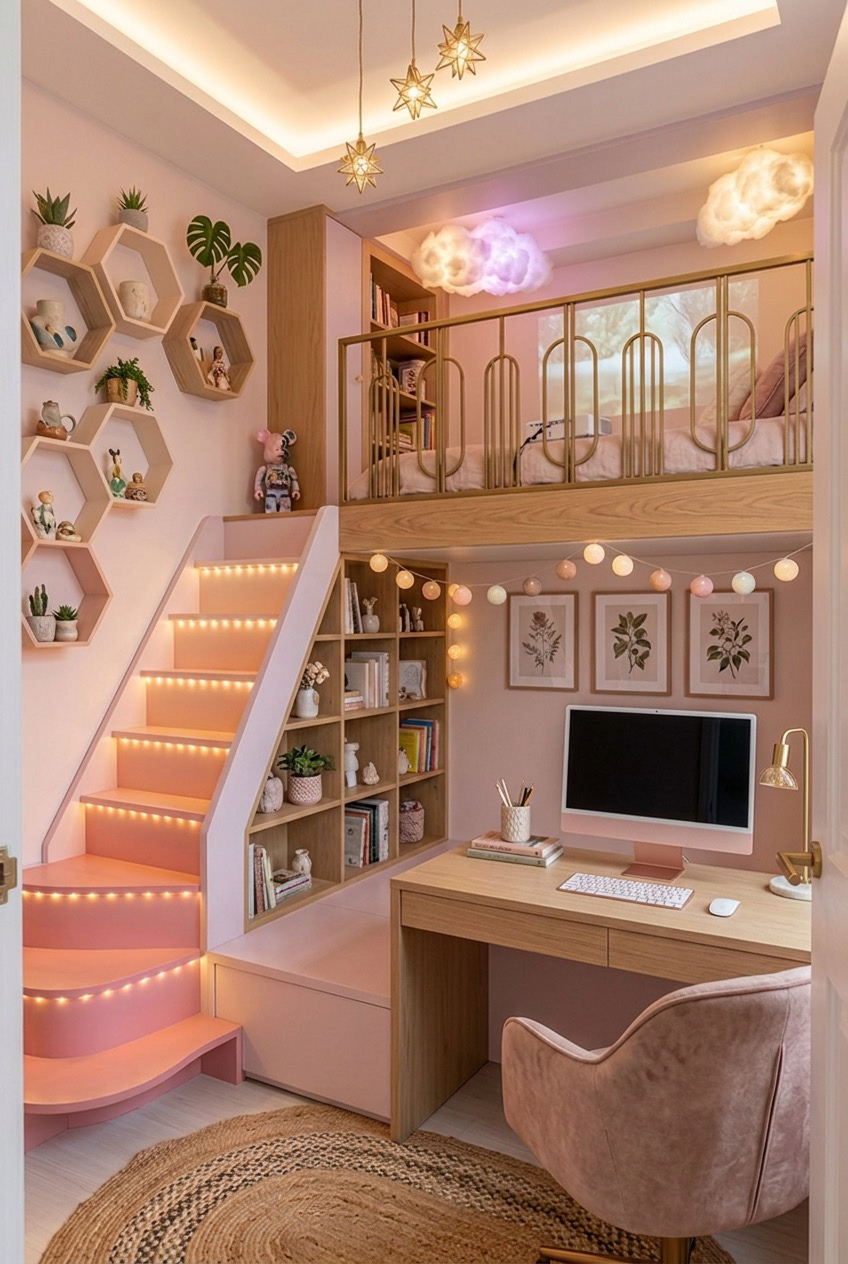
When floor space is tight, this layout goes up instead of out — a loft bed sits above a full desk setup, connected by a staircase painted the same blush as the surrounding walls so it reads as one continuous structure rather than something bolted on after the fact.
Hexagon shelves on the side wall break up what would otherwise be a flat expanse of paint, and mixing small plants in between the ceramics keeps the whole arrangement from feeling like a display case in a store. The star-shaped pendant lights and cloud-shaped lamps pull double duty as both lighting and decor, which matters a lot in a room with this little floor plan left to spare.
Built-in lighting along the stair treads is the part worth copying even in a normal-height room with no loft in sight — a strip of warm LED along a step edge, a shelf lip, or a baseboard adds real glow without eating into your outlet count or stretching your budget.
A Ladder Shelf Solves Bathroom Storage
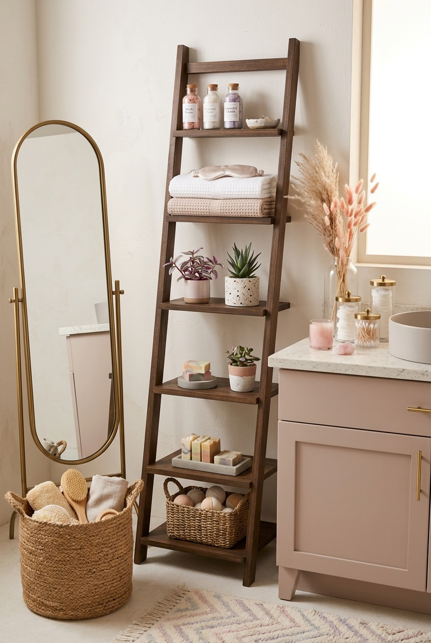
Small bathrooms rarely have enough cabinet space, and this one solves it with a leaning ladder shelf instead of anything mounted to the wall — no drilling, no landlord conversation, and it moves with you the next time you leave.
Each rung holds one category and nothing else: bath salts up top, folded towels below that, then plants, soap, and finally a woven basket for bath bombs at the very bottom. Grouping by function instead of scattering items across whatever shelf has room is what keeps a narrow piece like this from looking messy within the first week of actually using it.
The dried pampas grass sitting in a glass vase next to the vanity is doing a lot of quiet work too — it adds height and texture without needing water, sunlight, or upkeep of any kind, which is honestly more than we can say for most bathroom plants people bring home with good intentions and then forget.
One Statement Fixture Sets the Tone
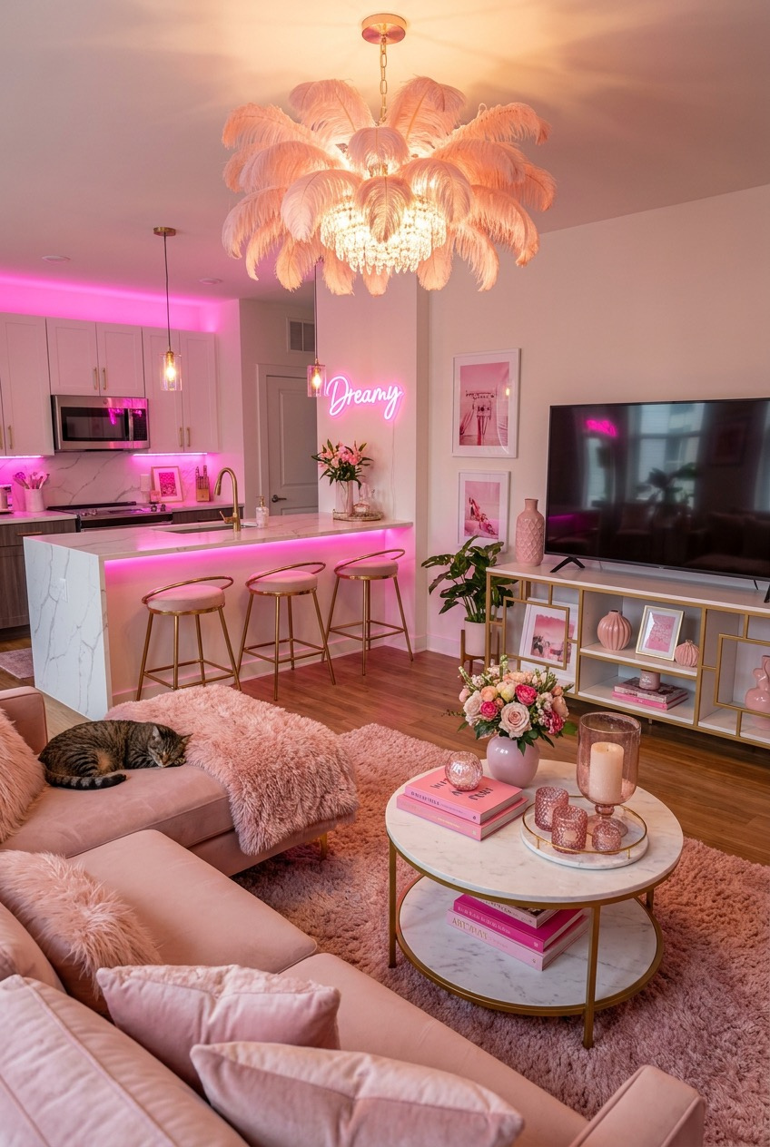
A feather chandelier hanging over the kitchen island is doing most of the emotional labor in this room, and everything else — the marble counters, the pink bar stools, the neon sign on the wall — is just supporting a decision that got made with the light fixture first and the rest of the layout built around it.
Pink LED strips tucked under the cabinets and along the counter edge add a colored glow without repainting a single surface, which is worth remembering if you’re renting and genuinely can’t touch the walls. It’s a rental-friendly move that photographs as fully custom despite costing almost nothing to install or remove later.
Fresh flowers on the counter and a shaggy rug underfoot keep all that glam from feeling cold or showroom-like. Glam finishes read as sterile fast without something soft and a little imperfect sitting right next to them, and a cat curled up asleep on the couch honestly doesn’t hurt the effect either.
Let the View Do the Talking
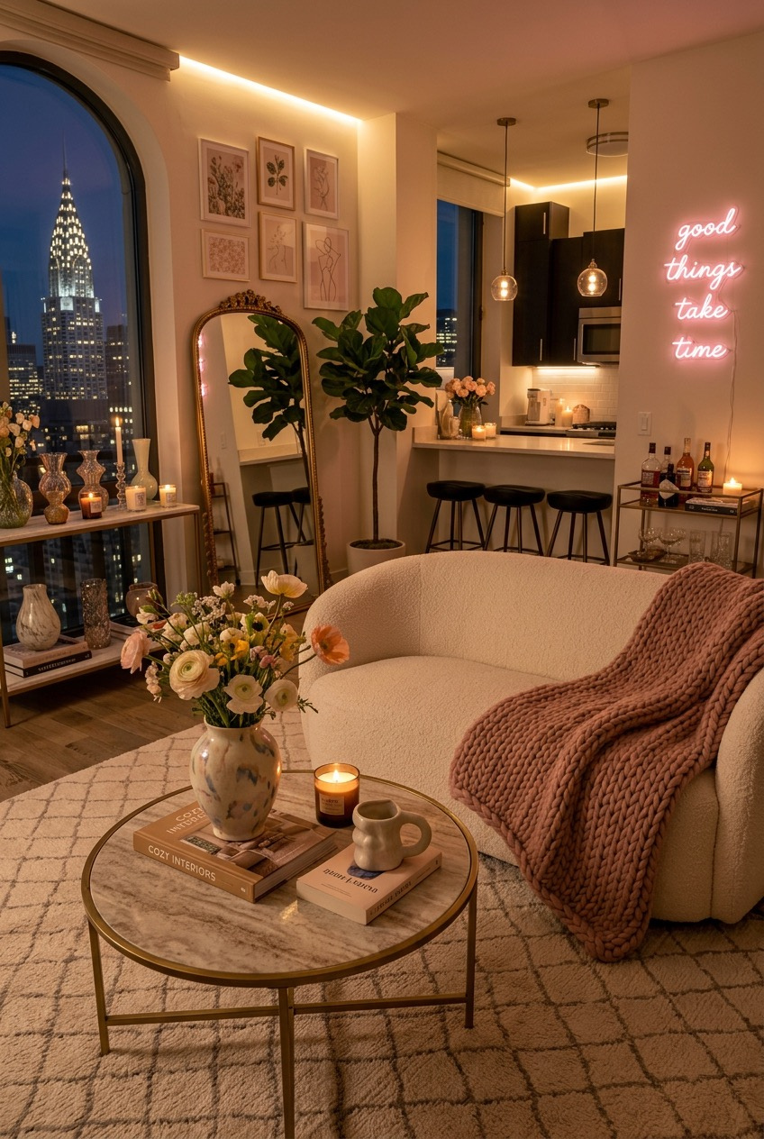
With a skyline like this outside the window, the room wisely gets out of its own way — sheer curtains instead of heavy drapes, a low arrangement of furniture, and nothing tall blocking the arched window frame that the whole layout was clearly designed around in the first place.
A boucle armchair and a chunky knit throw bring in texture without competing for attention, and a neon sign reading good things take time adds a bit of personality to a wall that would otherwise just be negative space sitting next to that view, doing nothing.
What we’d steal from this one is the coffee table styling: two stacked design books, a lit candle, and a single mug, nothing more piled on top. It’s a small, repeatable ritual that makes a table look lived-in instead of arranged five minutes before guests show up at the door, and it costs basically nothing to copy.
Skip the Frames, Paint the Wall
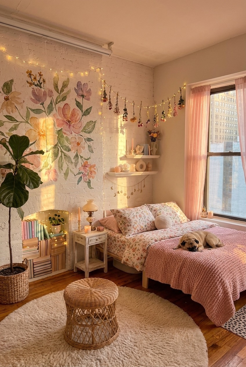
Instead of hanging florals in frames, this bedroom paints them straight onto exposed brick, climbing up toward the ceiling in a way that no store-bought print could really match at this scale. It’s a bigger commitment than a gallery wall, sure, but it also can’t fall off the wall during a move or get knocked crooked by a passing dog.
A garland of dried flowers strung along the string lights repeats the floral theme in the third dimension without matching it exactly, and floating shelves nearby hold small objects instead of more art, which keeps the whole wall from tipping into overload despite how much pattern is already going on.
On the practical side: the nightstand here is just a stack of crates filled with books, topped with a small vintage lamp. Furniture doesn’t need to come from a store to look finished — it needs a clear job and a consistent color story, and this little corner has both covered without spending much at all.
Backlit Mirrors Change a Bathroom Instantly
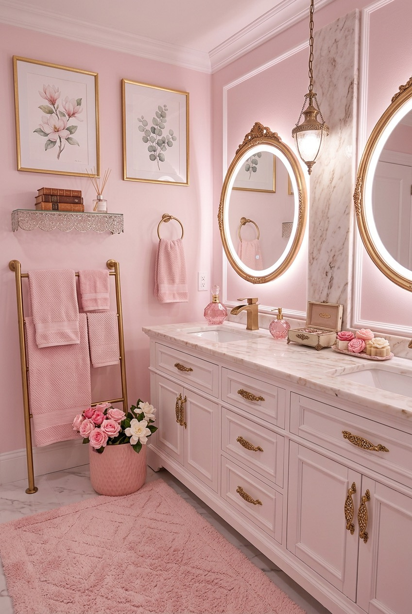
Two oval mirrors edged in gold with built-in LED backlighting are a big part of why this bathroom photographs like a hotel suite instead of a rental. Backlighting removes the harsh shadows that regular overhead bathroom lighting throws across a face, which is honestly half the reason bathroom mirror selfies look better here than anywhere else in the apartment.
The walls, cabinetry, and even the bath mat all sit in the same soft pink, which sounds risky written out on paper but works in person because the gold hardware and white marble counter keep breaking up the color so it never fully takes over the room.
Fresh roses sitting in a small pot by the sink cost almost nothing compared to everything else going on in this room, and they’re doing more to soften the space than half the fixtures combined, which says a lot about how far a five dollar bouquet can stretch.
Committing to One Color Fully
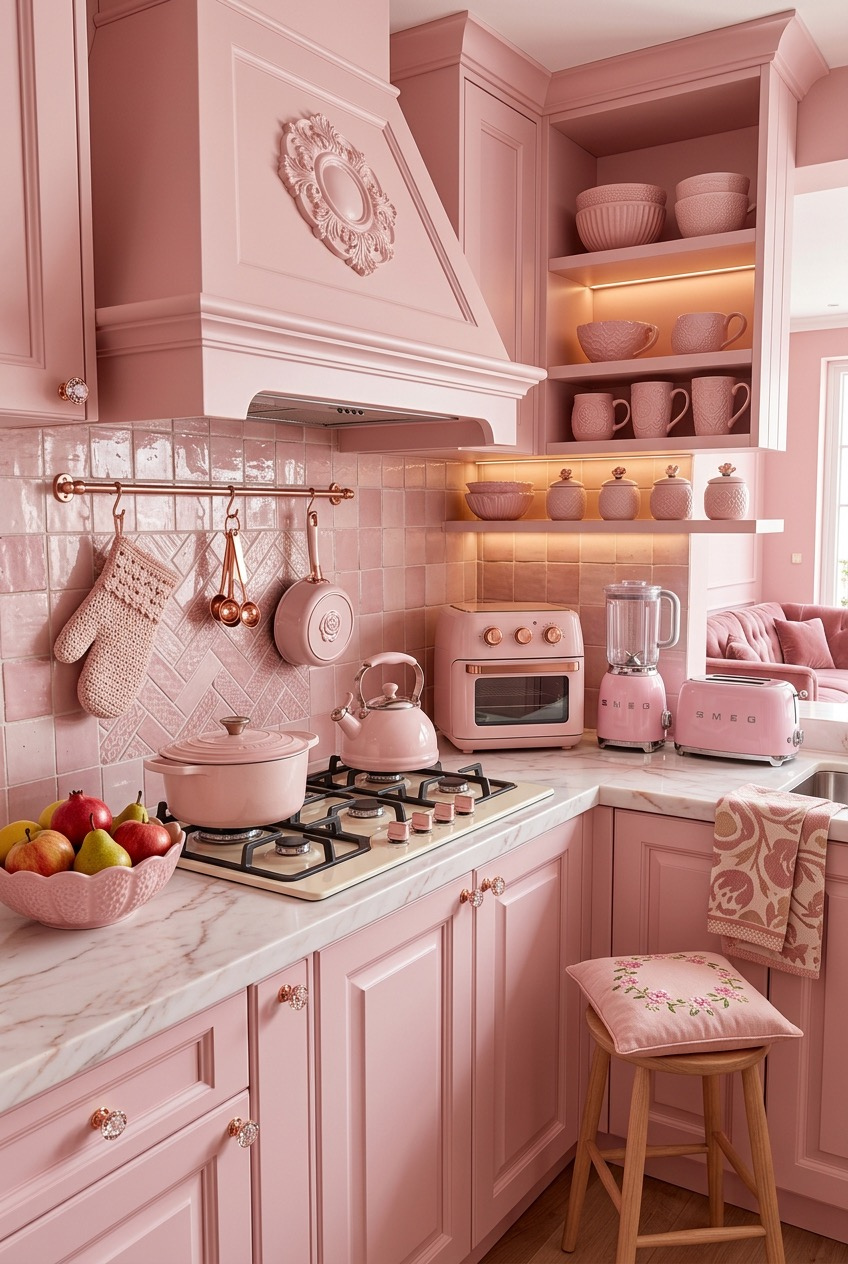
This kitchen doesn’t use pink as an accent — it’s the cabinets, the range hood, the tile backsplash, the small appliances, even the cookware sitting on the stove. Committing this hard to a single hue is a specific kind of design confidence that either reads as fully deliberate or completely chaotic, and the difference comes down to keeping the tone consistent instead of mixing five slightly different shades of pink in one room.
Open shelving above the stove displays matching pink dishware like it’s meant to be seen, because it is — closed cabinets would hide the exact detail that makes this kitchen work in the first place, and burying the good stuff behind a door defeats the whole point.
A retro-style pink toaster and stand mixer sit out on the counter as color-matched appliances rather than stainless steel afterthoughts, proving that even the boring functional stuff can carry a palette if you actually let it instead of hiding it away in a cabinet.
A Light Canopy Softens the Ceiling
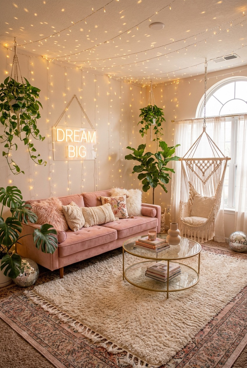
Fairy lights don’t just line the walls here — they’re draped across the entire ceiling in loose swags, turning what’s usually the most ignored surface in a room into part of the actual atmosphere instead of just a blank white lid over everything else.
A macrame hanging chair by the window adds a playful, slightly impractical seat that earns its place in the room anyway, because not every piece of furniture needs to be the most efficient option available in order to justify taking up floor space it could have given to something else.
Two rugs layered on top of each other — a patterned one underneath, a plush cream one on top — add depth underfoot the same way the lighting adds depth overhead, and a pair of disco balls tucked into the corners keep the whole room from taking itself too seriously, which honestly feels like the entire point of a space like this one in the first place.
Rough Textures Keep Soft Ones Grounded
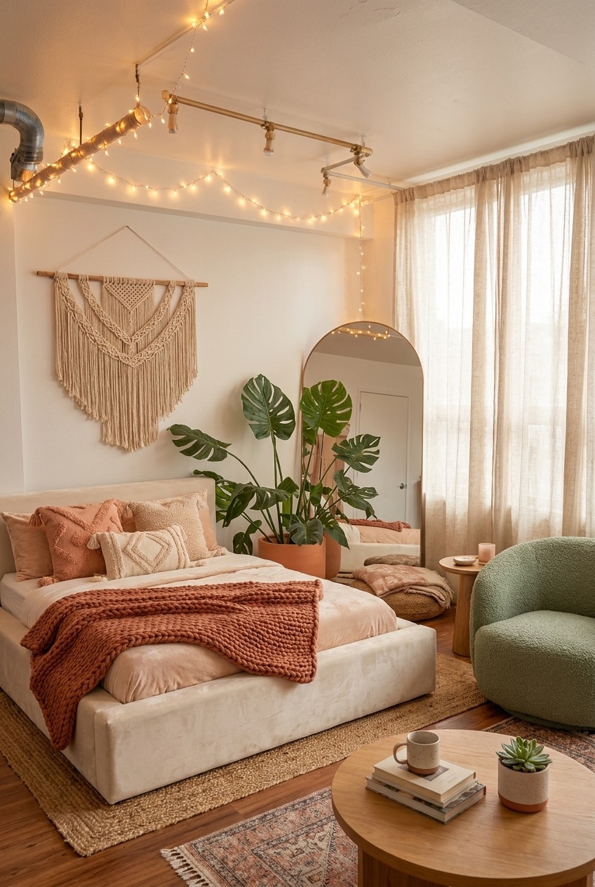
An exposed pipe running across the ceiling could easily read as an eyesore in most rooms, but wrapping it in string lights turns a structural flaw into an actual design feature instead of something to hide behind a dropped ceiling panel or a rushed coat of matching paint.
Underneath it, a macrame wall hanging and a pair of monstera plants soften that industrial edge, and a single green boucle chair breaks up what would otherwise be an all-neutral, all-beige room with one confident block of color that draws the eye without shouting for attention or fighting with anything else nearby.
On the floor, a jute rug layered under a patterned one adds texture without adding visual noise, and the rust-colored knit throw pulls warmth out of an otherwise cool, exposed-brick kind of space. Small, warm-toned lighting scattered throughout keeps the industrial bones of the room from ever feeling cold, clinical, or unfinished.
None of This Needs a Full Renovation
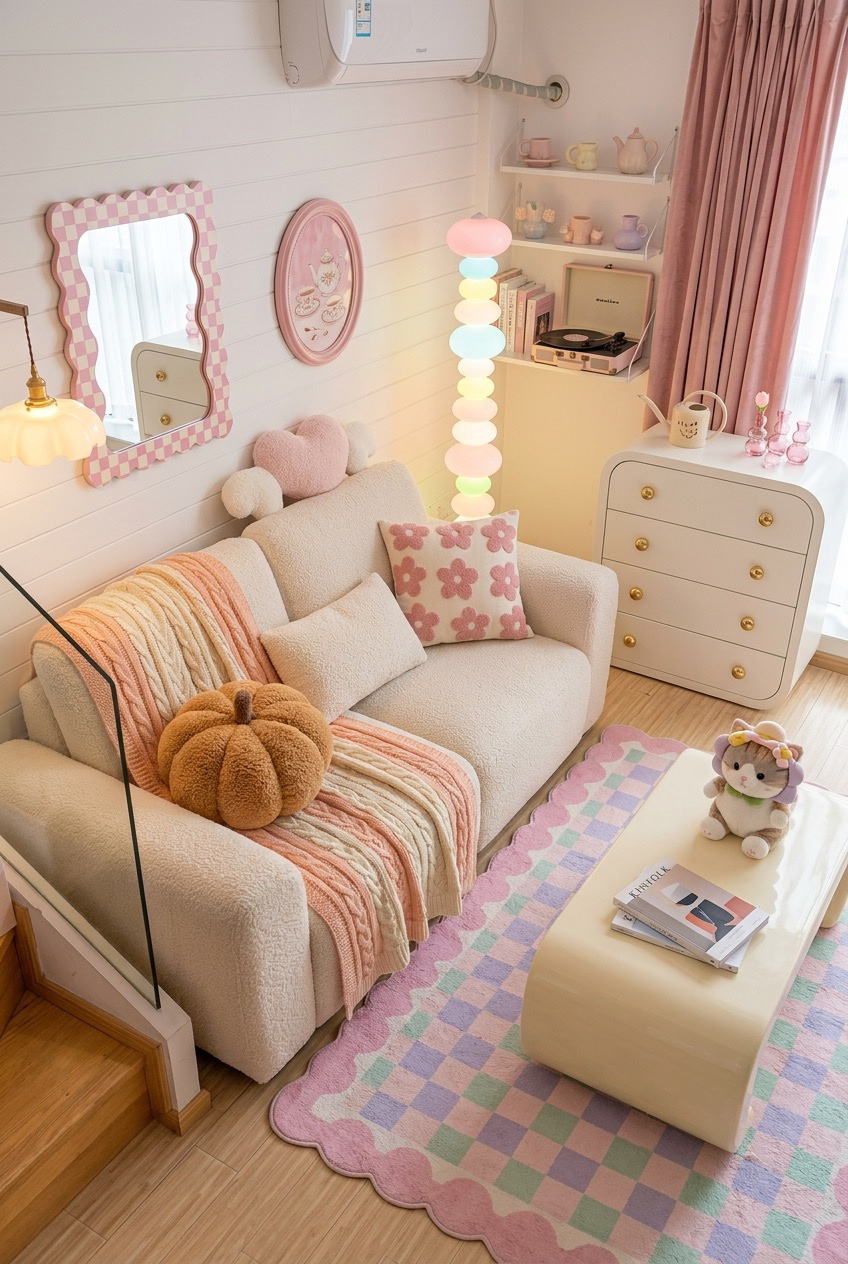
What ties these ten spaces together isn’t actually the pink — it’s restraint sitting right next to excess. A feather chandelier gets balanced by a plain marble table. A wall of florals gets balanced by a stack of plain books. That push and pull is what keeps a soft palette from tipping into a theme park.
If you’re starting from a blank rental, skip the big pink sofa as your first purchase. Start with lighting and one collected surface instead — a shelf, a nightstand, a bar cart — and let the rest of the room build outward from there once that one spot actually feels right.
If you already own a space that leans this way, the shift from a pink room to a room people actually want to sit in usually comes down to texture, not more color. Add something rough next to something smooth, something matte next to something shiny, and the whole room settles.
 Steal Our Home Styling Secrets!