
The Case For Designing A Homeschool Room Kids Actually Choose To Use
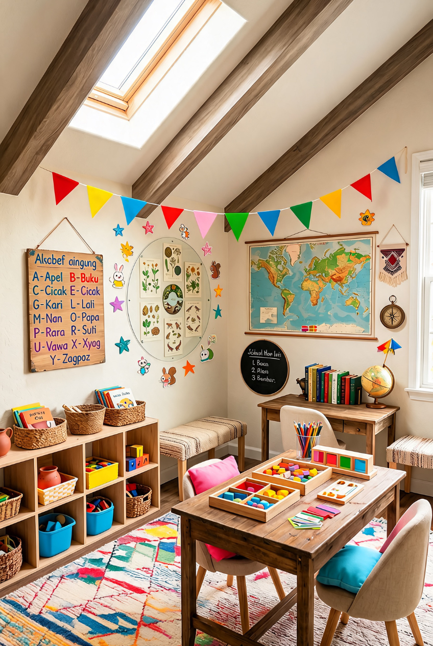
Something about a designated homeschool space changes the whole rhythm of the day. Kids show up different when the room says this is where we think instead of just spreading books across the kitchen table between breakfast dishes and someone’s leftover cereal bowl.
The best setups we have seen do not try to look like a real classroom. They borrow structure, desks, storage, a spot for maps and books, then layer in whatever makes a kid actually want to sit down. Color, texture, a rug that is fun to sprawl on.
What follows is a mix of rooms that each solved this differently, from color-blocked sibling stations to a chalkboard wall pulling double duty as art project and daily planner. Steal the parts that fit your space and skip the rest completely.
Color-Coded Desks Make Sharing Easier
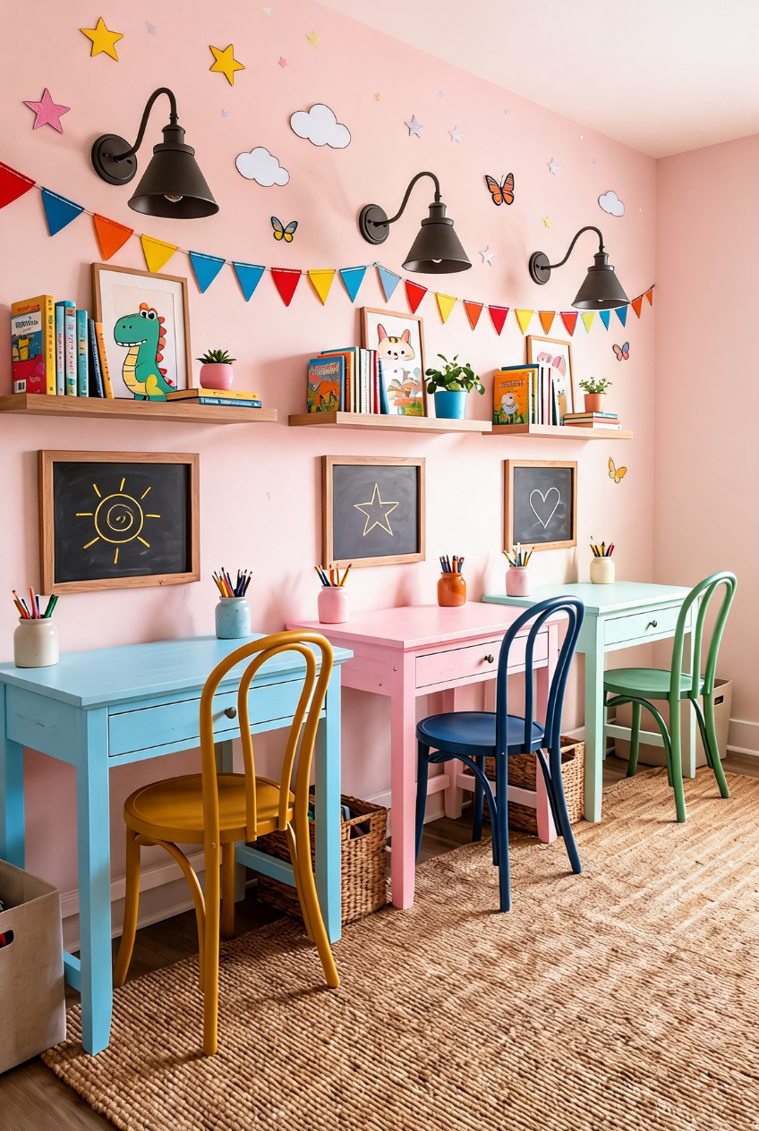
Color is doing a lot of the organizational work in this setup. Each kid gets a desk in a different hue and a matching chair, which sounds simple but solves the eternal whose stuff is this problem before it even starts. A shared room, three plainly marked territories, zero morning arguments over the good chair.
The small chalkboards mounted above each station are the detail worth copying first. A drawn star, a heart, whatever the kid feels like that morning, turns a static desk into something that changes daily, which keeps a room from going stale the way matchy-matchy setups tend to after a month.
If you are working with one long wall, this layout scales down easily. Even two desks in contrasting colors with a shared shelf above reads planned rather than thrown together. Add bunting or string lights overhead to tie the different colors back into one palette.
A Chalkboard Wall Worth Drawing
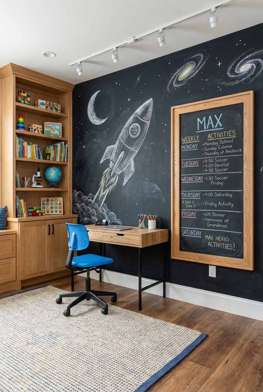
A full wall of chalkboard paint is one of those upgrades that looks dramatic in photos and is genuinely cheap to execute. Dark background, white and pastel chalk, a rocket blasting past a couple of hand-drawn galaxies, the kind of mural a parent can redo every few weeks without touching the budget at all.
What makes this version smart rather than just pretty is the framed schedule board sitting right in the middle of the space scene, doing the actual planning work. A personalized name across the top and a full week laid out below turns an art wall into a functioning command center.
Built-in shelving on the side keeps the chalk dust contained to one wall while books, a microscope, and a globe stay put nearby. Track lighting overhead means the mural still reads well on a gray afternoon, so no extra lamps are required. A woven rug with a dark border grounds the whole corner so it reads finished rather than like a project still in progress.
Vertical Shelving That Skips The Clutter
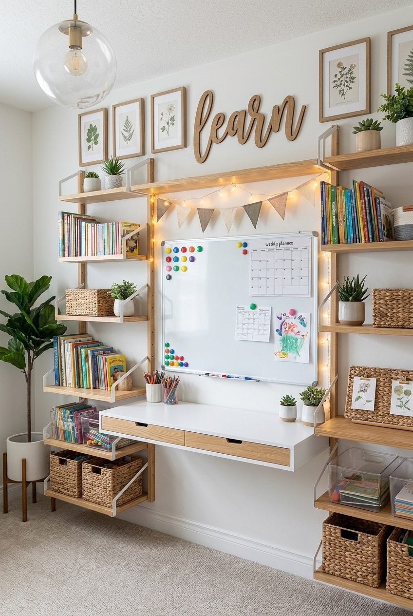
Start by measuring your wall height before buying a single shelf. The reason this setup feels open instead of crowded is that the shelving climbs vertically in a narrow footprint, leaving the actual desk surface clear for whatever the kid happens to be working on that day.
Botanical prints in matching frames do a lot of quiet work above the desk. They read as art rather than clutter because they share one color story and one frame style. A wood word cutout adds personality without needing a whole gallery wall of mismatched pieces competing for attention.
Baskets on the lower shelves are not just for looks. Keeping loose supplies in closed containers rather than open bins is what keeps a heavily used shelf from looking chaotic by Wednesday. Add a string of warm lights along the top shelf and the whole thing feels finished after dark too, even once the desk itself is buried in the day’s actual work.
One Big Table, Different Zones
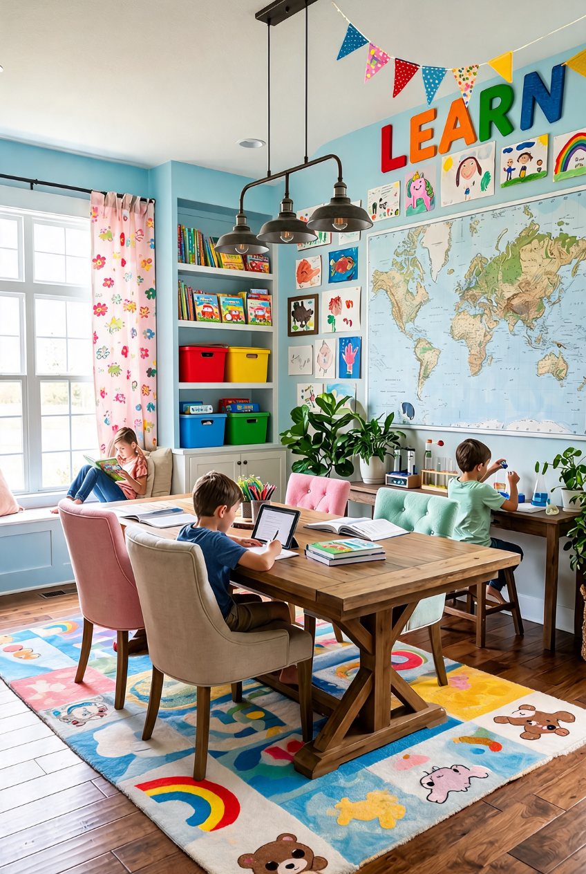
Not every homeschool room needs individual desks. This one bets on a single long table where three kids do three completely different things, reading, tablet work, an actual science experiment, and it works because the table is big enough that nobody is bumping elbows over it.
The oversized map on the back wall is doing double duty as decor and as a genuinely useful reference point mid-lesson. Pair it with a rotating gallery of the kids’ own drawings nearby and the wall becomes proof of progress, not just wallpaper filling space.
A window seat tucked into the corner gives one kid permission to read somewhere that is not the table, which matters more than it sounds. Not every learning moment happens at a desk, and a soft spot with good light covers that gap nicely. Mixed chair colors around the table keep the whole setup from looking like a matched furniture set, which somehow makes it feel more like an actual family room instead of a showroom display.
Kid-Height Shelving Built For Independence
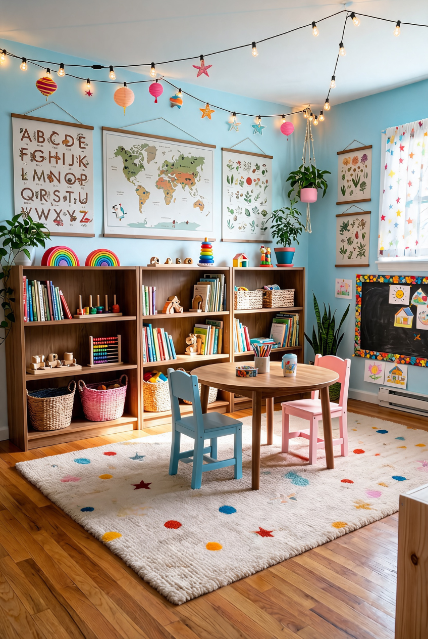
The single biggest decision in this room is height. Everything a kid might reach for, books, toys, a rainbow stacker, sits low enough that nobody needs to ask an adult for help getting it down, which is basically the whole independence argument in one bookshelf.
Layering string lights, paper lanterns, and star cutouts above the shelving keeps the ceiling from feeling like an afterthought. It is a cheap fix that most rooms skip, and it is the difference between a space that photographs well and one that actually feels magical to sit in.
The small round table with two mismatched chairs matters too, furniture sized for a child’s body rather than scaled-down adult furniture. A soft dotted rug underneath means the floor becomes usable space, not just the gap between the table and the shelves. Even the hanging plant in the corner is placed low enough to feel like part of the room rather than something purely decorative and out of reach.
Supply Storage That Actually Gets Used
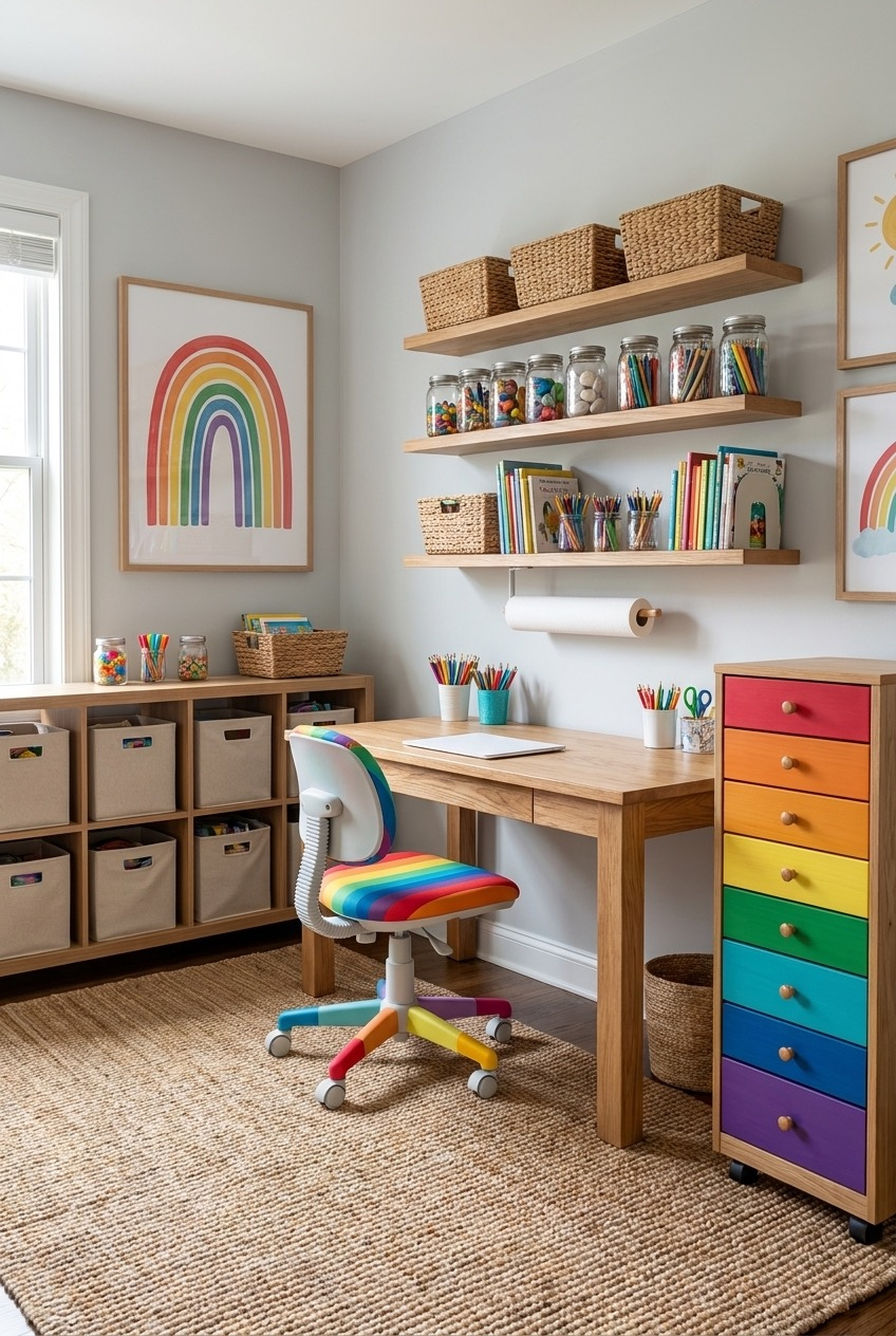
Glass jars filled with pom-poms, buttons, and beads look like a craft store display, and that is sort of the point. When supplies are visible and sorted by type, a kid can find what they need without dumping out three bins first, and cleanup actually happens.
The gray walls and plain wood shelving are doing something important by staying quiet. A rainbow poster, jars of colorful supplies, and a rolling drawer cart in every shade of the spectrum all get to be the visual star instead of competing with a busy wall.
A rolling cart is worth the extra cost if floor space is tight. It tucks under the desk on a regular day and pulls out for a bigger project, so storage never has to be sacrificed for workspace or the other way around. A roll of paper towels mounted right at the desk means spills and paint accidents get handled on the spot instead of turning into a bigger cleanup later.
Twin Desks Divided By One Shelf
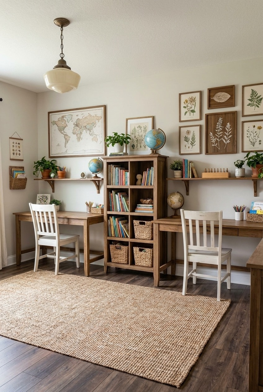
Mirror-image desks on either side of a central bookshelf is an old trick, and it still works because it gives two kids equal real estate without either one feeling like they got the smaller half of the room. The bookshelf in the middle stores everything both desks need daily.
A gallery wall of botanical prints in matching wood frames keeps this room from tipping into anything too juvenile. It reads more like a study than a playroom, which some families actively want as kids get older and outgrow the rainbow-everything phase for good.
The schoolhouse pendant light overhead is a small detail that pulls the whole thing together. It nods to an actual classroom without being literal about it. A jute rug underneath softens all the wood and keeps the room from feeling like a furniture showroom, and matching desk lamps at each station mean neither kid has to fight for the good light once the sun goes down.
L-Shaped Storage Solves Awkward Corners
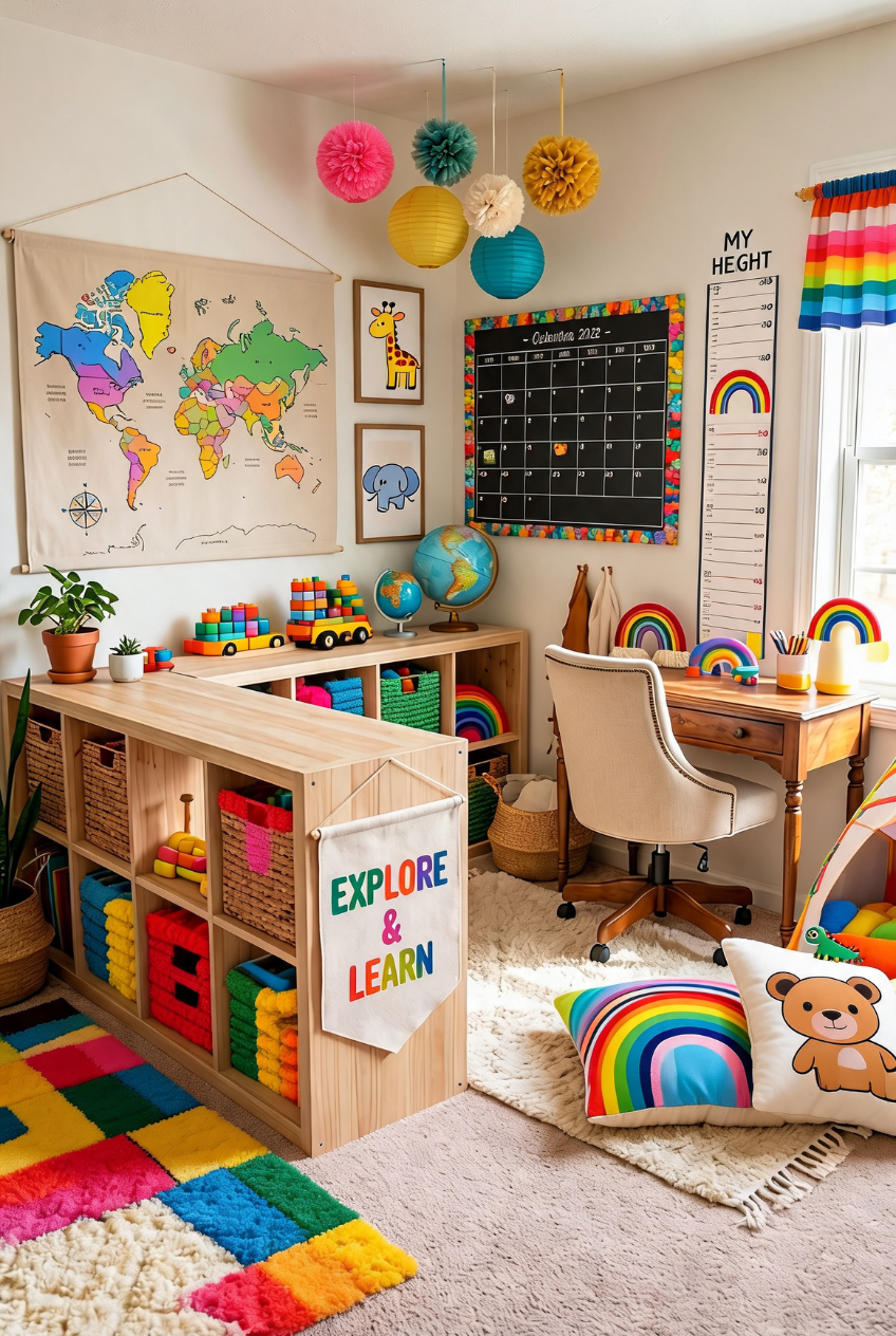
A canvas banner spelling out explore and learn and a growth chart taped to the wall are the kind of details that make a room feel lived-in rather than staged. They are small, they cost almost nothing, and they are the first things a kid points out to a visitor.
The real structural move is the L-shaped run of open cubbies wrapping the corner. Corners are usually wasted space in a room this size, and turning one into wraparound storage means every toy and book bin has an actual home instead of getting shoved wherever it fits that day.
Paper lanterns and pom-poms hung at different heights add movement to the ceiling without much real effort, and a shag rug layered over a flatter base gives the floor somewhere soft to land. None of it matches perfectly, and that is exactly why it works so well, proof that a room can look put together without every single piece coming from the same collection.
A Fabric Map Softens Dark Walls
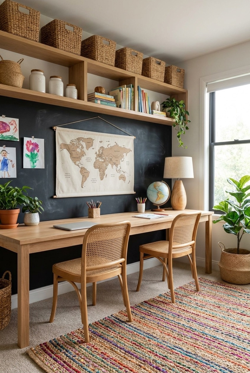
A chalkboard-painted wall reads bold and a little severe on its own, which is why the fabric map hanging in the center matters so much. Textile softens whatever it touches, and here it keeps the whole wall from feeling like a classroom rather than a room someone actually lives in.
Two kids share one long desk rather than getting separate furniture, with woven cane chairs adding warmth against all that dark paint and pale wood. Floating shelves above hold the overflow, baskets, jars, a lamp with a globe base, without eating into legroom below.
Kids’ artwork pinned directly to the chalkboard wall does double duty as decor and as proof the room gets used. A striped rug in a handful of colors keeps the palette from feeling too moody, and the big window means natural light carries most of the room anyway, so the dark backdrop never turns the space gloomy the way people tend to assume it will.
A Window Nook Anchors Two Desks
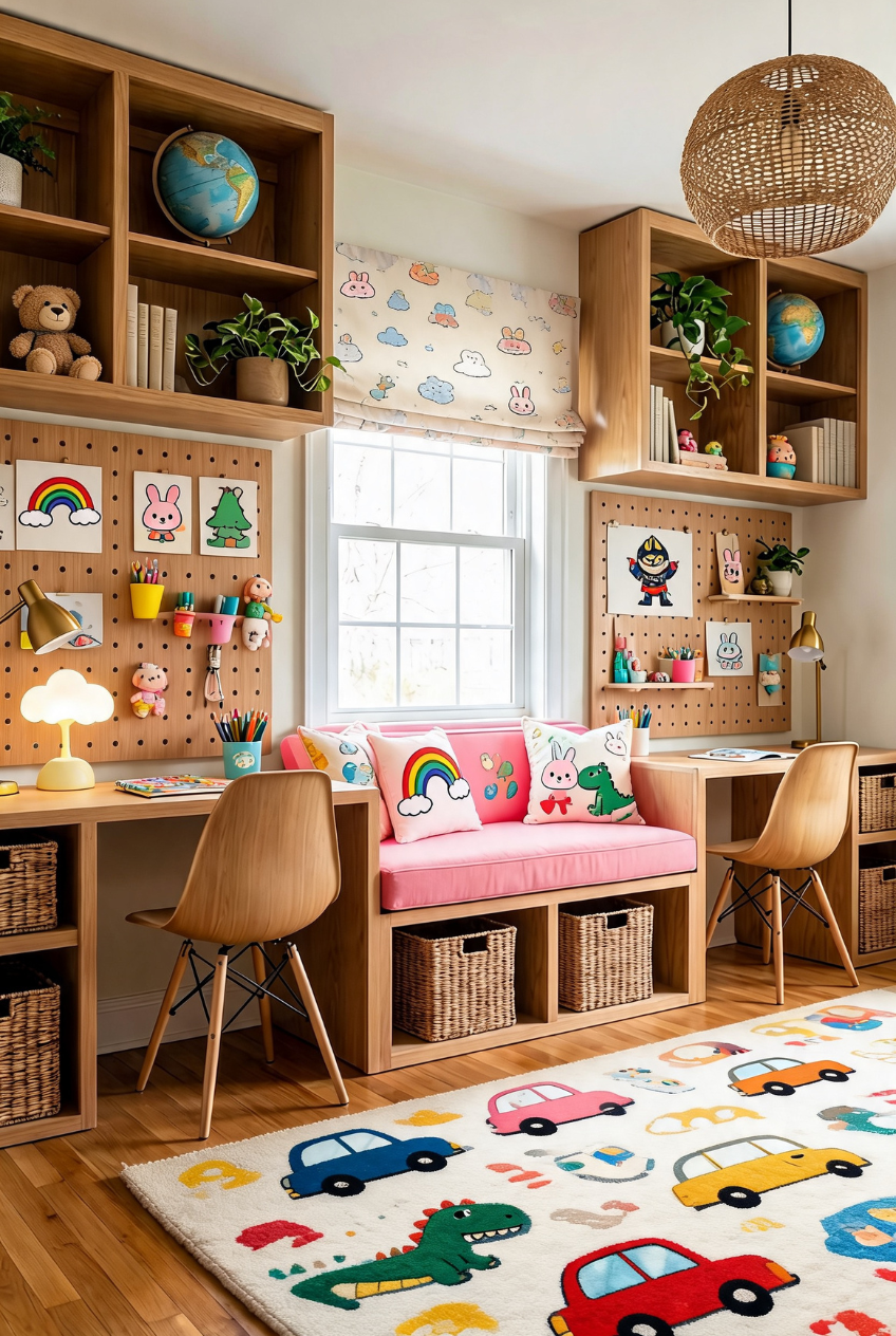
Putting a cushioned bench directly under the window and building two desks around it turns the best light in the room into the actual focal point, instead of pushing furniture against it and calling the window an afterthought. Both kids end up facing the same source of natural light all day.
Pegboard walls flanking each desk are the most flexible storage choice in this entire lineup. Hooks, shelves, and pinned artwork can all move around as a kid’s interests change, which regular shelving cannot really do without a full rework every year or two.
A patterned roman shade and a couple of throw pillows on the bench keep the whole nook from feeling purely functional. It is a place to actually sit and read, not just a gap between two desks, and that distinction is worth designing for on purpose. Even a stuffed animal or two propped against the pillows signals that this corner belongs to a kid, not to a catalog.
A Homeschool Room Should Change As Kids Do
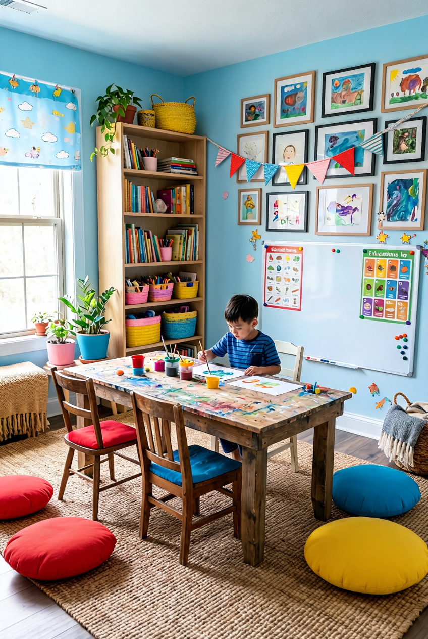
None of these rooms look finished in the way a hotel lobby looks finished, and that is sort of the point. A space built around a six-year-old is going to look different in two years, whether that means swapping a rainbow rug for something quieter or turning play shelves into an actual desk setup.
The common thread across every version here is that storage and personality got equal attention. A room can be organized without being sterile, and it can be colorful without turning into visual noise, as long as someone thought about where things actually live before worrying about how the wall looks.
Pick the one or two ideas that solve your actual daily friction, too much stuff on the floor, siblings fighting over one desk, a corner nobody uses, and start there. The rest of the room tends to sort itself out once that real problem gets solved.
 Steal Our Home Styling Secrets!