
Decorating Lessons From College Apartments That Don’t Look Like Everyone Else’s
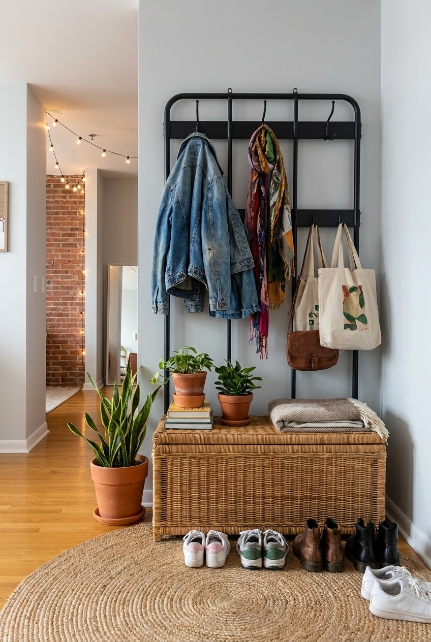
Most people move into their first apartment with way more excitement than furniture. The couch is a hand-me-down, the walls are a color nobody chose, and the budget is whatever’s left after rent. That’s normal, and it’s exactly why decorating one of these places is such a fun puzzle to solve.
Because most of these apartments are rented, the real skill isn’t renovating, it’s layering. Lighting, textiles, plants, and a handful of personal objects can turn a beige box into a place that feels like yours, without touching a wall or losing your deposit.
We pulled together some of our favorite examples of students and young renters making their spaces feel lived-in and personal, from a single glowing corner to a full open-concept layout. Some of these you can copy in an afternoon, others are more of a mood to build toward.
Let Lighting Do the Heavy Lifting
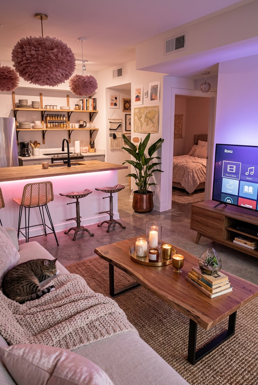
The overhead light in most rental kitchens is doing you no favors, and this layout proves it. Swap it for something with personality, here it’s a pair of blush pom-pom pendants, and suddenly the counter looks like a place you’d actually want to hang out, not just microwave something and leave.
Color-changing LED strips under the cabinets do something similar for the living side, letting one open room shift from bright and functional during the day to warm and pink at night. It’s a cheap way to make a single space feel like two different rooms depending on the hour.
You don’t need an electrician for any of this. Plug-in pendant lights and stick-on LED strips both work in a rental, and both come down clean when you move out. Pair them with a warm wood coffee table and open shelving instead of closed cabinets, and the kitchen stops feeling like a landlord picked it.
Fake Vines Are Doing Real Work
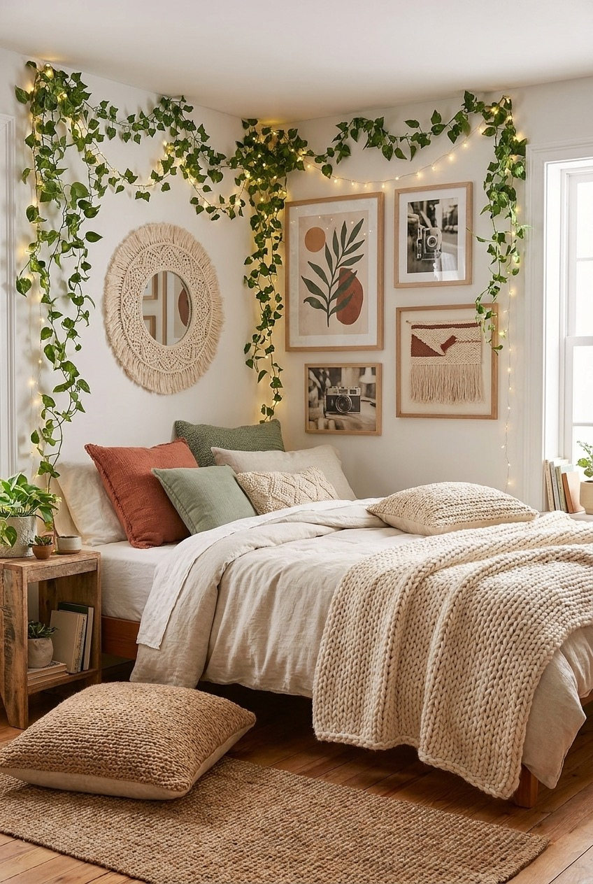
Worried about drilling holes in a rented bedroom? Start here. This corner uses faux vine garland and string lights looped along the ceiling line with removable adhesive hooks, which means zero commitment and zero damage-deposit anxiety, but it still makes the room feel taller and greener than it actually is.
The gallery wall underneath mixes botanical prints, black-and-white photography, and a woven macrame mirror instead of matching frames, which reads as more personal than a single big art piece would. Layering different pillow textures, cable knit, linen, chunky wool, does the same job for texture that the gallery wall does for the walls.
If you’re recreating this, buy more vine garland than you think you need. A skimpy single strand along a corner looks half-finished, while a full, layered drape actually looks like it belongs there. Add the fairy lights last, threading them through the leaves instead of laying them on top.
The Bar Cart Isn’t for Drinks
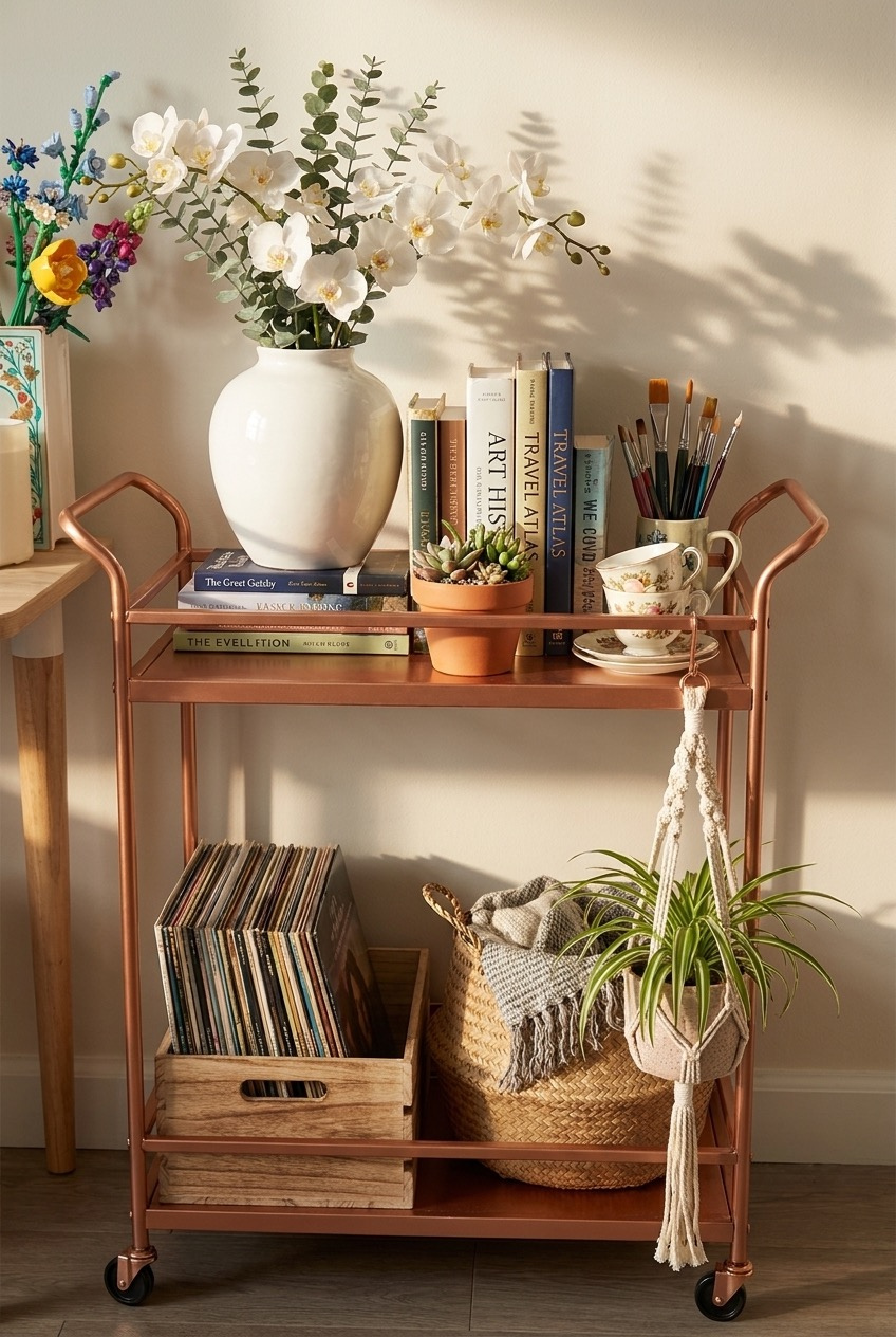
Bar carts get treated like a one-trick piece of furniture, but the real value is the two open tiers and the fact that it rolls. Here it’s working as a display shelf for records, books, and a fresh vase of flowers, plus a little hidden storage underneath for a folded throw blanket and a woven basket.
Tiered storage like this matters more in small apartments than people give it credit for. Stacking books flat instead of upright, mixing in a plant or two, and letting a macrame hanger swing off the handle turns a narrow gap between the wall and the sofa into an actual feature instead of dead space nobody looks at twice.
The move here is restraint, not more stuff. Leave a little breathing room on the top shelf so the vase and stacked books don’t compete with each other, and use the bottom tier for the bulkier, less photogenic stuff like blankets and record crates. Wheels also mean you can roll the whole thing wherever the party happens to land that week.
Let Your Gallery Wall Stay Messy
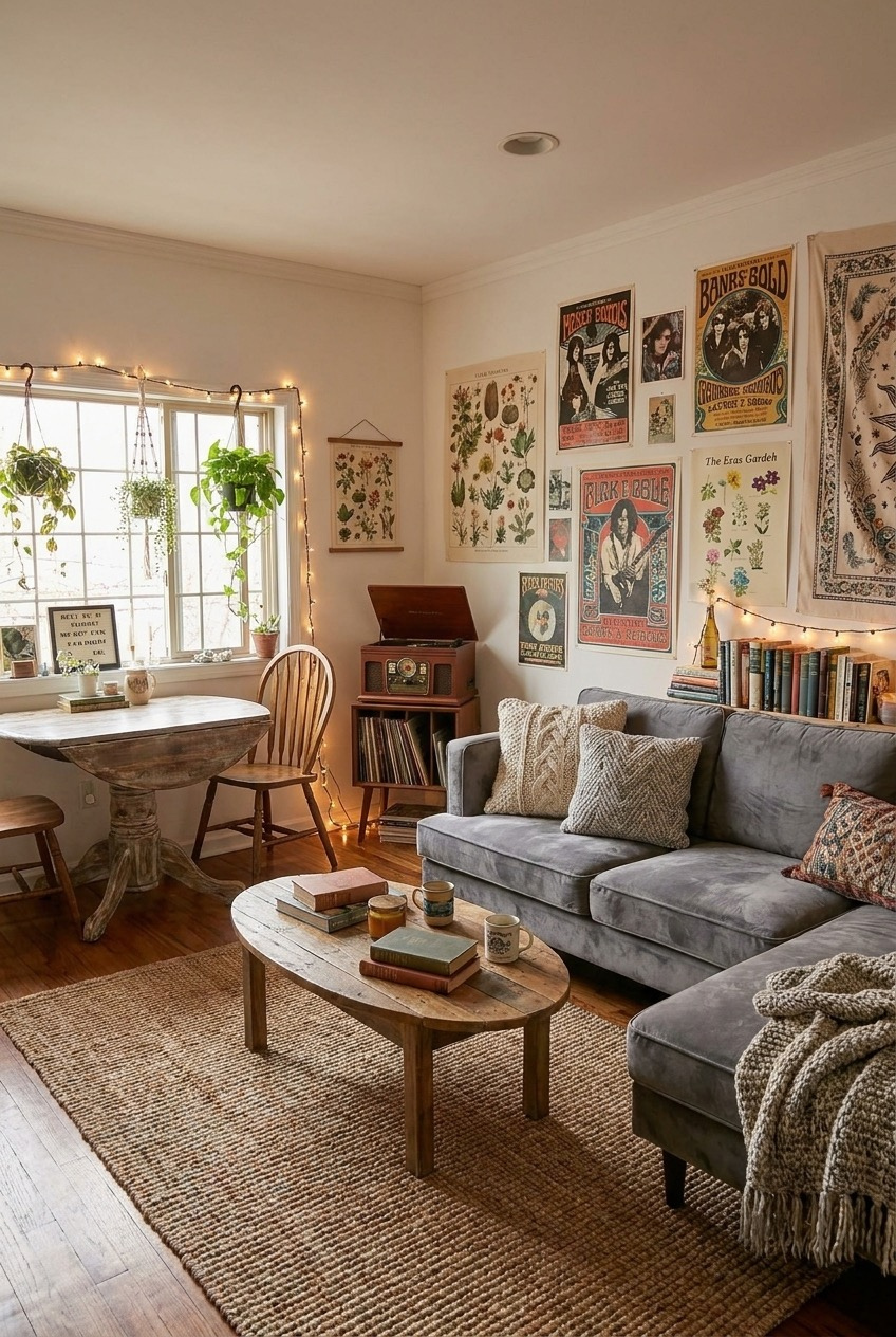
A gallery wall doesn’t need matching frames to look good, it needs a mix. This one leans into vintage-style concert posters, botanical prints, and a woven tapestry at all different sizes, and the slight visual chaos is exactly what makes it feel collected instead of ordered off one page of a catalog.
Two hanging plants by the window do a lot of the softening here, breaking up the corner where the wall meets the ceiling. The oval coffee table underneath is doing something smaller but just as important, rounding out a room full of straight-edged furniture and art frames stacked edge to edge.
Walls covered but the room still feels flat? Look at your pillows before you buy more art. This sofa mixes a chunky cable knit, a woven pattern, and a plain solid, and none of them match, which is the actual trick to layering textiles well without it looking like a matched set from one store.
Small Dining Corners Still Deserve Style
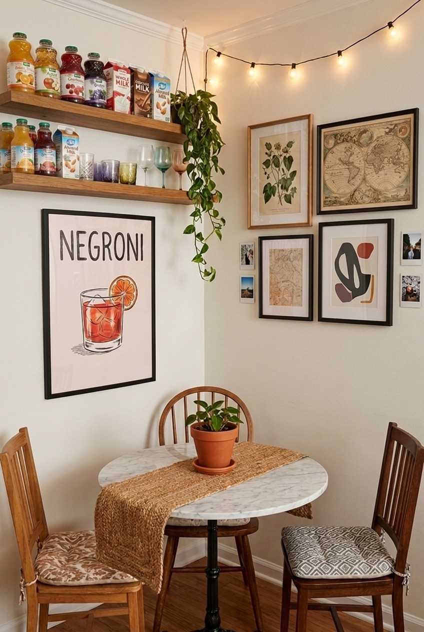
Two chairs and a round table pushed into a corner is most students’ entire dining setup, and it’s easy to treat that corner as an afterthought. This one doesn’t. A woven table runner, a small potted plant, and string lights strung along the ceiling turn a table for two into a spot people actually want to sit at.
The open shelving above is arguably doing more design work than the table itself. Juice cartons and milk aren’t usually decor, but grouped by height and mixed in with a few glasses, they stop reading as clutter and start reading like a small, well-stocked bar.
Personal touches carry this corner just as much as the table does: a cocktail print, vintage maps, botanical illustrations, and real photo strips from nights out share the same wall, which keeps it from feeling like it came straight off a store shelf. If space is tight, group the small personal photos close together so they read as one cluster instead of clutter.
One Neon Sign Changes Everything Here
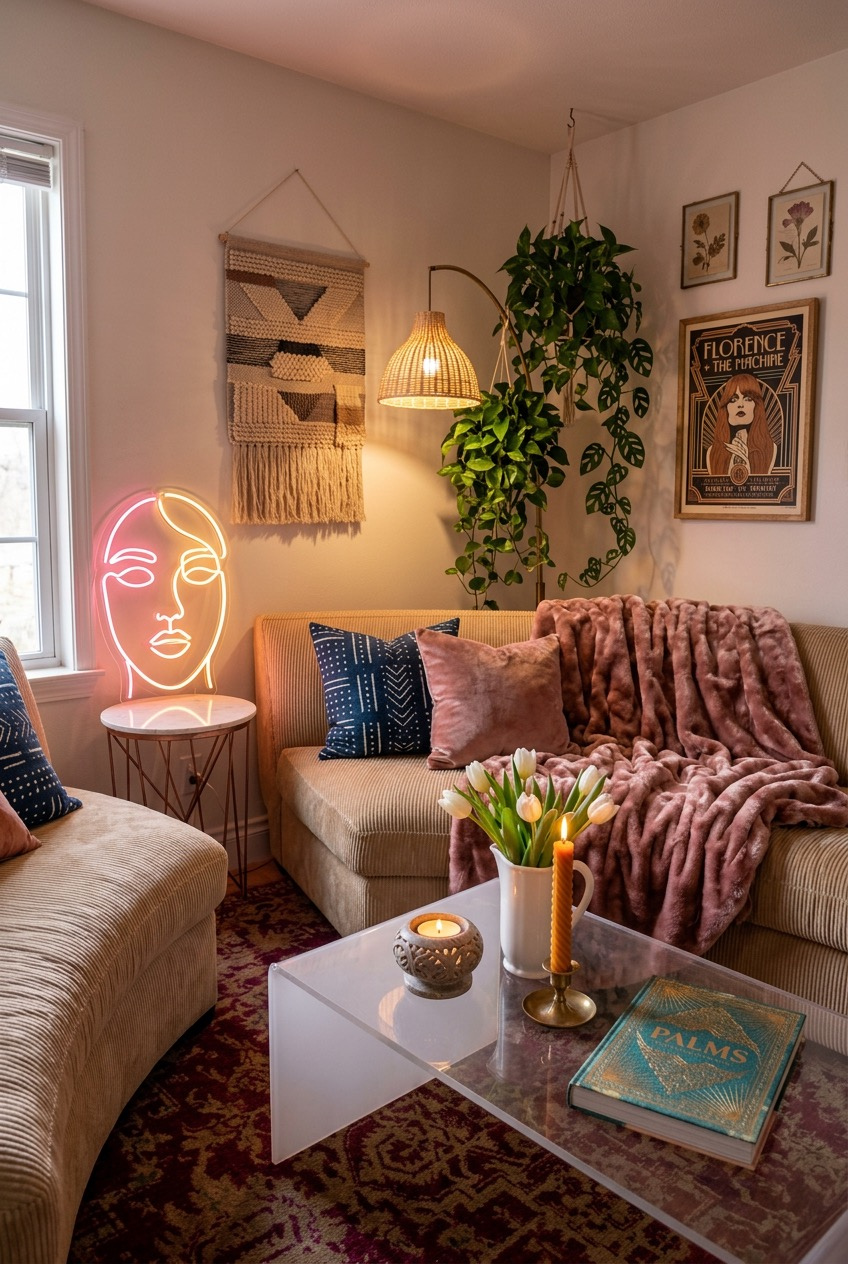
We’re fully willing to die on this hill: a neon sign is one of the highest-impact, lowest-effort things you can add to a small living room. This one-line face sign does more to set the mood in this corner than the sofa, the rug, and the throw blanket combined, and it plugs into a regular outlet.
Everything else in this corner is playing a supporting role to the light. A woven wall hanging and a trailing plant soften the wall above the couch, while a rattan pendant lamp adds a second, warmer light source so the neon isn’t the only thing glowing after dark.
The acrylic coffee table is a small but smart choice for a room this size. Clear furniture doesn’t visually take up space the way solid wood does, which matters when you’re already layering a patterned rug, a velvet throw, and a corduroy sofa in one corner.
Pattern Gets Easier With One Anchor
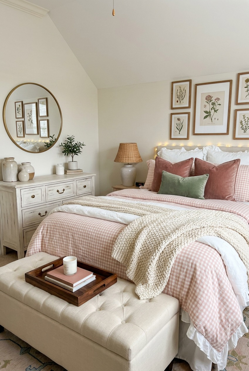
Mixing patterns confidently is hard, so this room doesn’t really try. It picks one, a pink gingham, and lets it repeat on the duvet and the pillow and nowhere else, which means the room reads as patterned without feeling busy, because everything around it, the dresser, the walls, the trim, stays neutral.
The botanical prints above the bed are hung in a tight, even grid, which is a more forgiving formula than an eclectic gallery wall if you’re not confident about spacing. A round mirror on the opposite wall reflects that same grid back, which makes the room feel bigger and doubles the art without buying more of it.
The tufted storage bench at the foot of the bed is worth copying even if nothing else about this room fits your style. It hides bulky items, adds a soft surface for a tray, and breaks up what would otherwise be a wall of bed frame and floor.
Try Leaning Your Mirror Instead
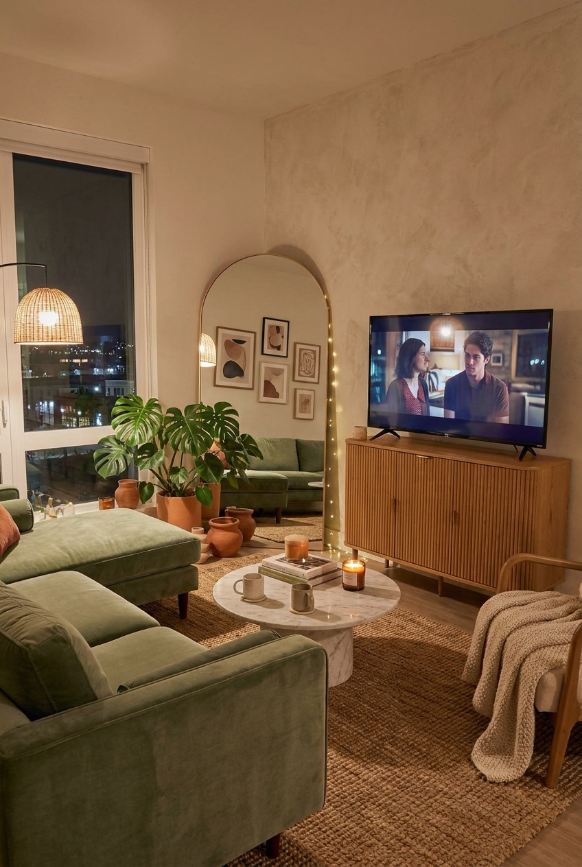
The arched floor mirror leaning against the wall here is doing double duty. It reflects the gallery wall on the opposite side of the room, which basically doubles the art for free, and it adds height to a room with otherwise low, boxy furniture.
Leaning rather than mounting is also just easier in a rental, no anchors, no drilling into drywall, no patching a hole when you move out. The same logic applies to the television here, which sits on a low media console instead of being wall-mounted, so the whole setup can travel with you.
At night, the room leans on layered light instead of one overhead fixture: a rattan pendant, a candle or two on the coffee table, and the ambient glow from outside the window. Try turning off your main light one evening and see what two or three smaller light sources actually do to a space.
The Fridge Is Underrated Wall Space
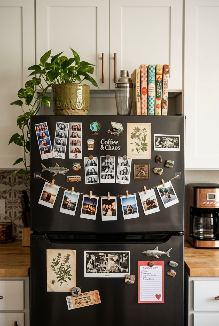
Nobody puts this on a mood board, but the fridge might be the single most personal surface in a shared apartment, and this one uses every inch of it. Photo strips, ticket stubs, a print of a famous modernist painting, and a running shopping list all live side by side, and somehow it doesn’t look cluttered.
The trick is grouping. Photos are clipped together in a garland along the middle, small magnet-mounted photo booth strips sit in their own cluster near the top, and prints stay in their own zone rather than scattered randomly across the door. Group by type first, then worry about spacing everything out evenly.
The top of the fridge is the other overlooked spot here: a plant, a stack of cookbooks, and a cocktail shaker turn dead space above eye level into something worth looking at. If your kitchen is small, that flat surface up top is basically a free shelf.
Neutral Doesn’t Mean Boring Here
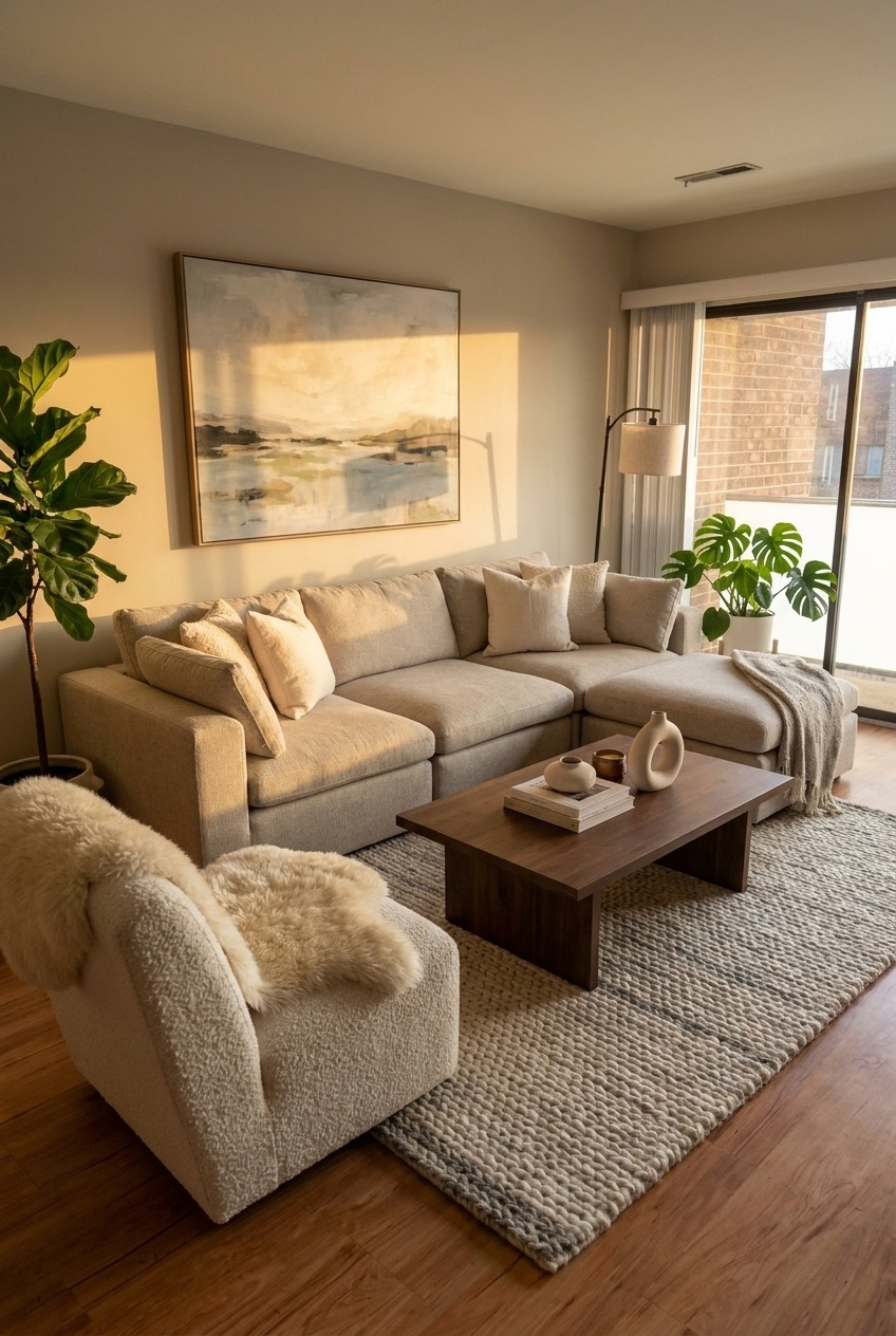
Going neutral in a small living room isn’t a lack of decision, it’s a different one. Nothing in this room is loud on its own, the palette stays in cream, oat, and warm wood the whole way through, but the room still feels layered because almost nothing matches in texture.
A boucle armchair, a sheepskin throw, a chunky wool rug, and a smooth linen sofa are all roughly the same color family and doing completely different jobs for your hands and eyes. That contrast in texture is what a monochrome room needs so it doesn’t end up feeling flat or unfinished.
A single fiddle leaf fig anchors the corner near the window and works almost like a piece of furniture rather than an afterthought plant. If you’re building a neutral room, add your greenery last, once the textures are already in place, so the plant has a clear job instead of just filling a gap.
The Best Apartments Feel Like a Decision, Not an Accident
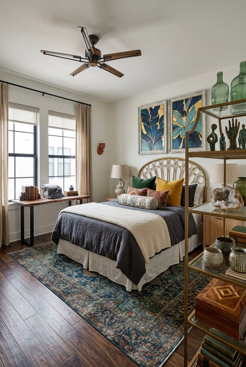
What ties every one of these spaces together isn’t a specific color palette or a single trick, it’s that someone actually made choices. A lamp instead of an overhead light. A rug that covers the ugly carpet. Photos on the fridge instead of a blank one. None of it is expensive, but all of it is deliberate.
You don’t need to tackle all of this at once, or do it perfectly. Start with the room you spend the most time in, or the one that bothers you every time you walk past it. One good lamp can shift how an entire apartment feels.
A rental is still temporary, but the year or two you spend in it isn’t. Treat the space like it’s worth the effort now. Your apartment doesn’t need a bigger budget, it mostly needs a few more decisions like the ones above.
 Steal Our Home Styling Secrets!