
Why Blue Keeps Working in Bedrooms No Matter the Style You Love
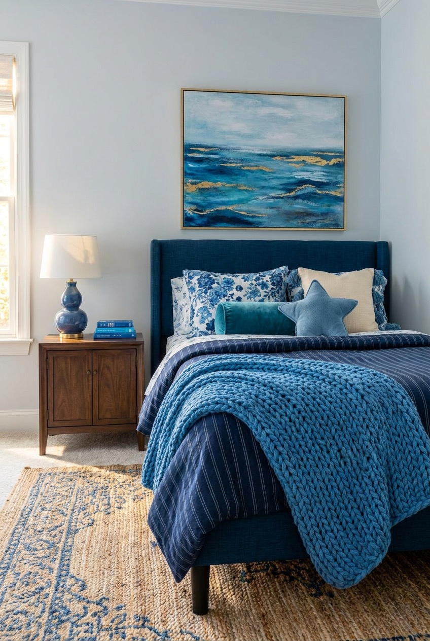
Blue gets treated like the safe choice, the color you reach for when nothing else feels obvious. But spend a few minutes with these bedrooms and that reputation starts to crack. Depending on how it’s mixed, painted, or layered, blue can feel loud, quiet, warm, or almost architectural.
What we noticed pulling these rooms together is how differently blue behaves depending on its company. Paired with gold, it turns dramatic. Next to wood and wool, it softens into something almost rustic. Alone, in every shade at once, it becomes the whole point of the room.
None of these spaces rely on the color to do all the work by itself. Texture, lighting, and a few confident material choices carry just as much weight. That combination is really the takeaway here, more than any specific shade of blue you end up picking for your own walls.
Build a Wall That Tells Stories
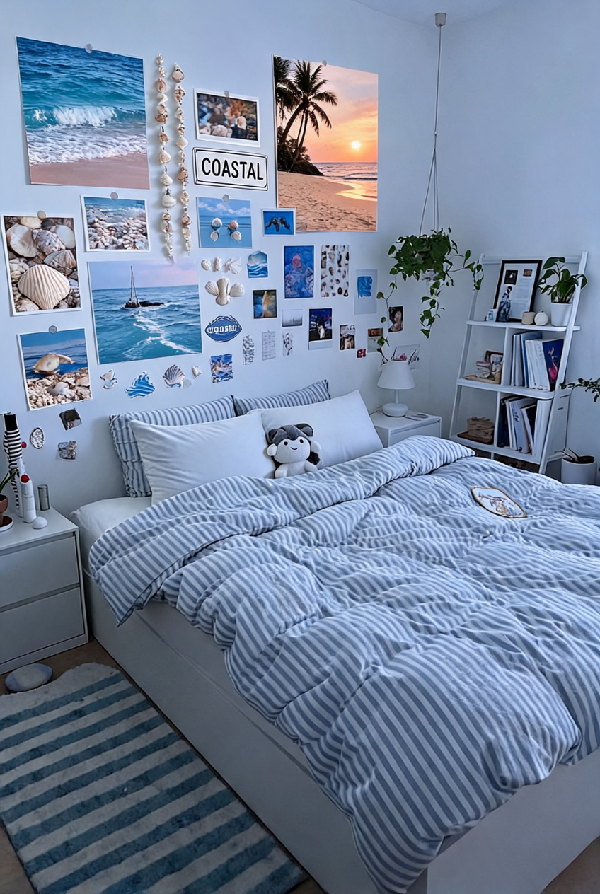
That gallery wall is doing more work than any single piece of furniture in this room. Beach photos, shells, a hand-lettered sign, a scrap of fabric, even a little stuffed animal all sit together without competing for attention, mostly because everything shares the same washed-out blue and sandy tone.
A wall like this rewards patience more than budget. Print a handful of photos that actually mean something, mix in a couple of low-cost objects like shells or postcards, and resist the urge to make every frame match. Uneven spacing and slightly mismatched sizes are part of what keeps it feeling collected instead of ordered from a kit.
If a full wall feels like too much commitment, start smaller. Pick one corner above a nightstand or headboard and treat it as a test run. You can keep adding pieces as you find them, which honestly tends to produce a better result than planning the whole thing out at once.
Let Ambient Light Do the Talking
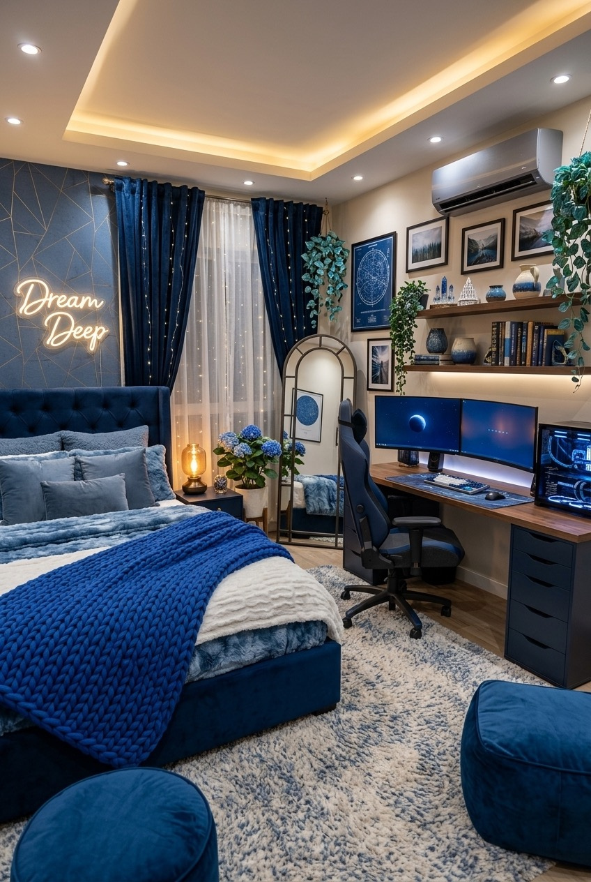
Lighting is really the star of this room, even though the navy tufted headboard and geometric accent wall are doing plenty on their own. Warm recessed lighting, a soft neon sign, and string lights tucked along the drapery all work together to keep the space glowing instead of harshly lit.
Layering light sources matters more in a saturated room like this one, where a single overhead fixture would flatten all that color and texture. Recessed cove lighting along the ceiling edge, a table lamp, and a few strategically placed fairy lights give the eye somewhere different to land depending on the time of day.
You don’t need a full renovation to borrow this idea. A plug-in LED strip behind a headboard or along a shelf, paired with one warm lamp, gets you most of the way there. Just avoid mixing warm and cool bulb temperatures in the same room, since that’s usually what makes ambient lighting look accidental rather than planned.
Small Nook, Surprisingly Big Personality
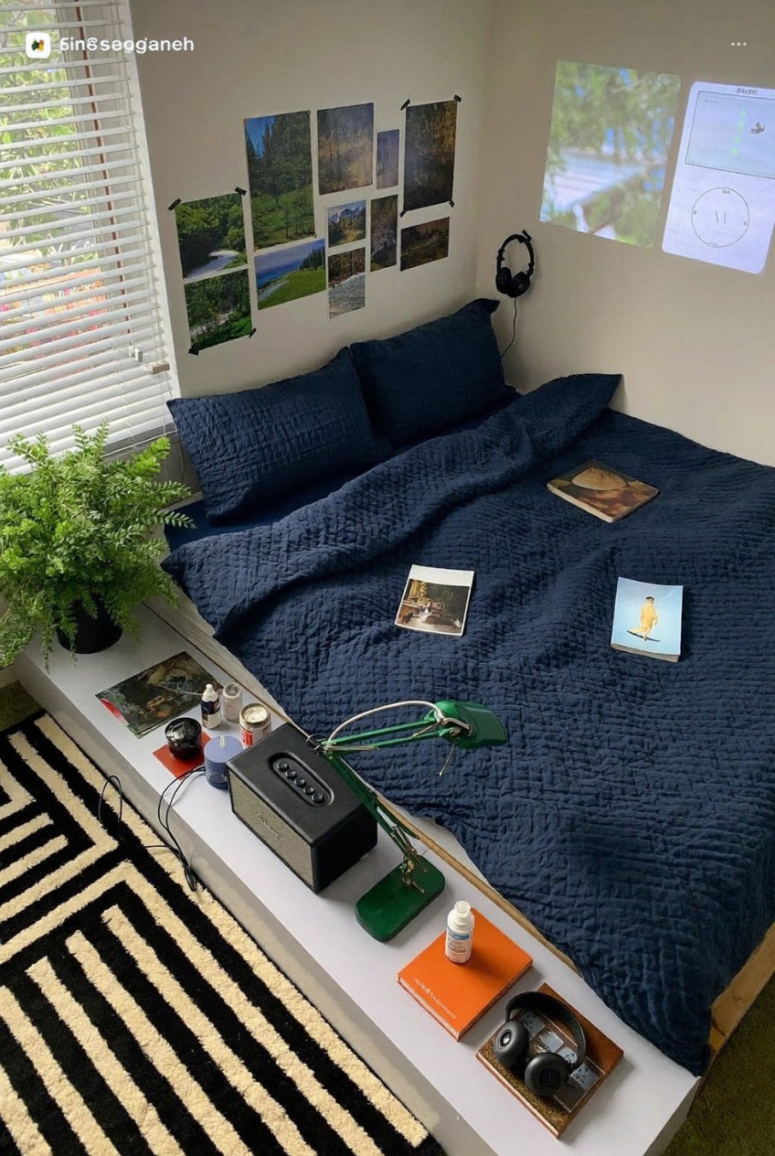
There’s no headboard, no nightstand, barely any furniture at all here, and yet the space still feels distinctly like someone’s. A low platform bed, a gallery wall of nature photography, and a narrow ledge doubling as a desk make the most of a tight footprint without feeling cramped.
Navy bedding grounds the whole setup, giving the eye a resting point among all the smaller objects scattered along that ledge: speakers, a desk lamp, magazines, headphones. None of it looks staged, which is honestly part of the charm. A projector even stands in for a television, saving space that a bulky screen would otherwise eat up.
If you’re working with limited square footage, this is a solid blueprint. Skip the traditional furniture pieces you think you need and build around what actually gets used daily. A single ledge or shelf can replace two or three separate pieces, and a deep, calming bedding color anchors everything else around it.
Blue Walls Make Other Colors Pop
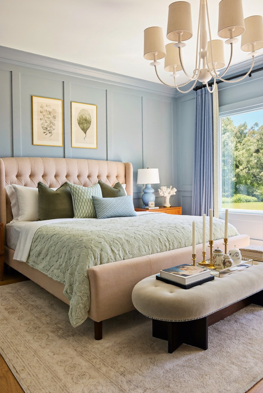
Painted walls do more than set a mood, they change how every other color in the room reads. Here, a dusty, muted blue on the walls and paneling gives the blush pink headboard and sage green bedding room to actually shine instead of competing for attention.
This is basically color theory at work. Blue and pink sit near each other on the color wheel, so pairing them keeps things harmonious rather than jarring, while the green bedding adds just enough contrast to stop the room from feeling one-note. The paneled walls add depth too, catching light differently throughout the day.
If you’re drawn to pastel furniture or bedding but worried it’ll feel too sweet, try backing it with a muted, slightly grayed-out blue instead of white. It takes the edge off softer colors without dulling them, and it gives the room a more grown-up feel than an all-pastel palette usually manages on its own.
Pair Navy With Warm Gold Tones
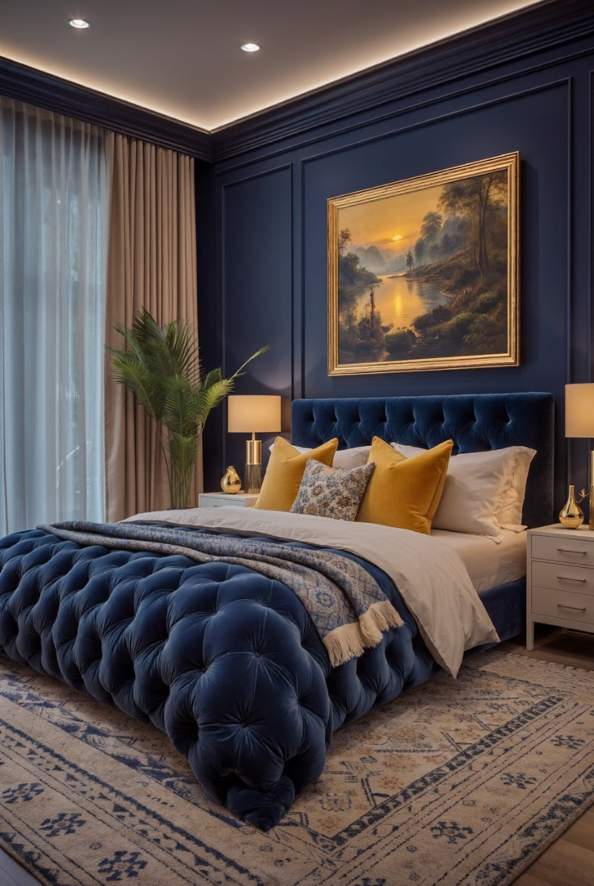
If you want a bedroom that reads as genuinely glamorous rather than just expensive, start with the metal finishes before you even think about fabric. Gold lamp bases, a gilded frame, and warm brass hardware against deep navy walls are doing most of the heavy lifting in this room.
Navy on its own can feel a little cold, especially in a room with limited natural light. Warm gold accents counter that instantly, and the channel-tufted bed frame adds a textural softness that keeps the whole thing from feeling like a hotel lobby. Even the mustard throw pillows echo that same warm undertone.
This pairing works because gold and navy sit on opposite ends of the temperature spectrum: cool color, warm metal. If you’re nervous about going this saturated, test it first with pillows, a lamp, and one piece of framed art before committing to painted walls or upholstered furniture in that deep a shade.
Stack Every Shade of Blue Together
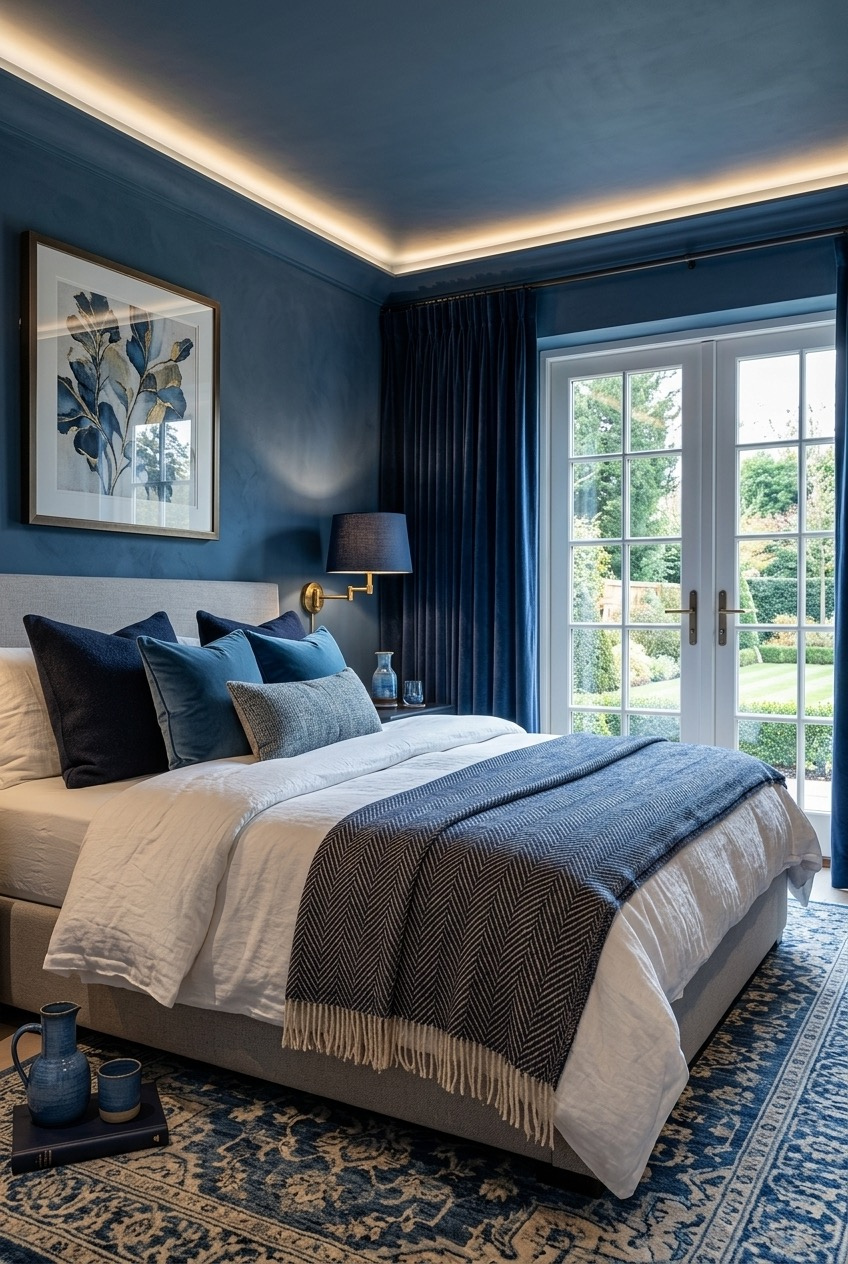
Count the pillows on that bed and you’ll find navy, denim, slate, and a pale dusty blue all sitting side by side, and somehow none of it clashes. That’s the trick with tonal layering: as long as everything stays within one color family, you can mix shades pretty freely.
What keeps this from looking flat is the range of textures involved. Velvet, herringbone weave, linen, and a chunky knit throw all reflect light differently, so even though the palette barely shifts, the bed still reads as layered and considered rather than one-note.
Try this at home by picking one color and buying pillows and throws in at least three different shades and textures instead of matching everything exactly. A slightly darker throw blanket at the foot of the bed and one lighter accent pillow near the headboard usually does more than a dozen matching cushions ever could.
Let Wood Soften a Bold Wall
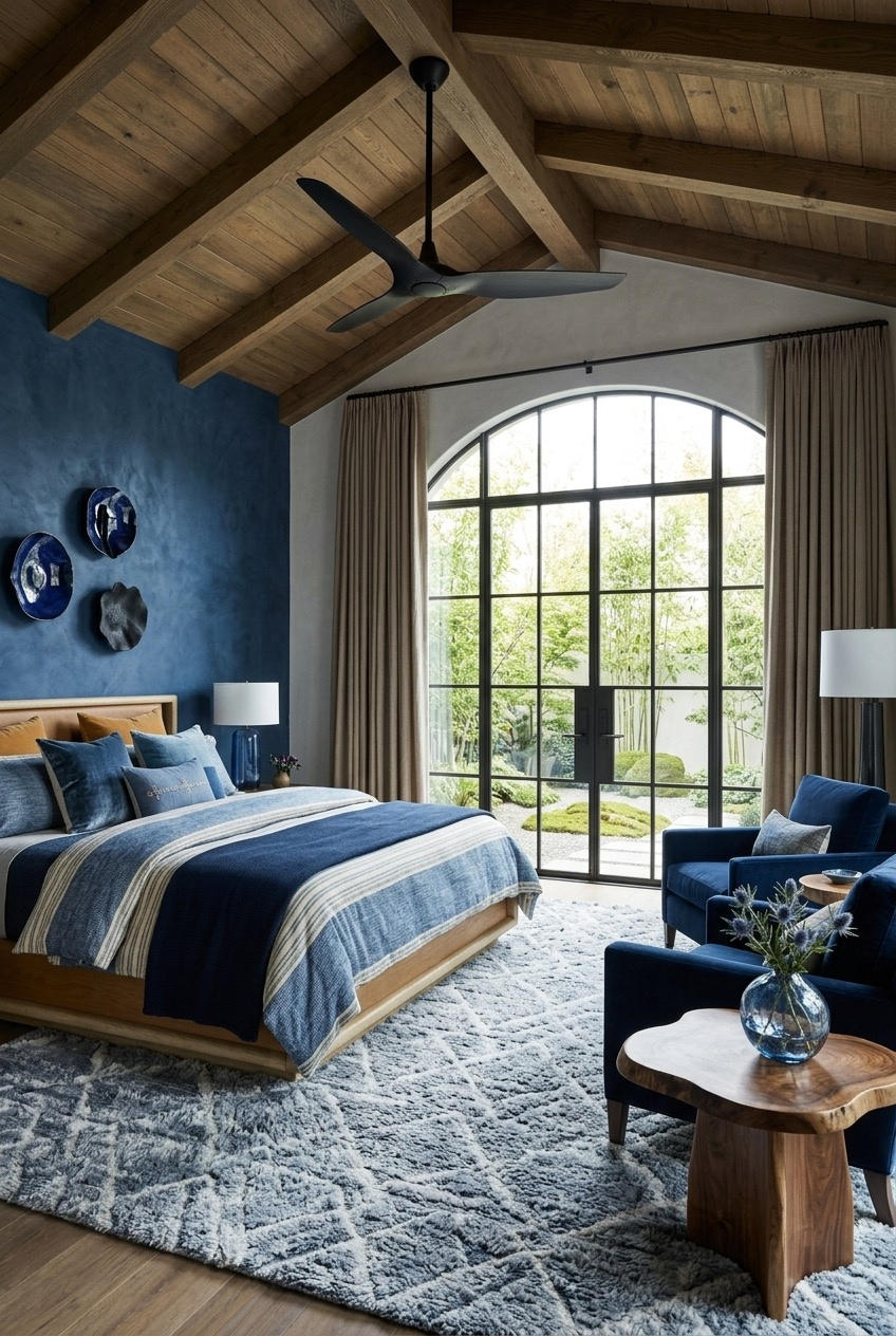
A wall painted this saturated a blue could easily feel overwhelming, but exposed wood beams overhead and a live-edge wood table nearby keep the whole room feeling grounded and almost outdoorsy instead. It’s proof that a bold color choice doesn’t need to be toned down, just balanced.
Wood grain has a way of softening color that white trim or metal accents simply can’t replicate. The warm, uneven texture of the beams and furniture contrasts against the smooth plaster wall, and that contrast is really what keeps the deep blue from reading as heavy or closed-in, even with a vaulted ceiling overhead.
If you’re considering a saturated wall color but worried about it feeling like too much, look at what’s already made of wood in the room, whether that’s flooring, a dresser, or exposed beams. Leaning into that material rather than fighting it with cooler tones is usually the easier, more forgiving route.
Mix Patterns Through One Color Family
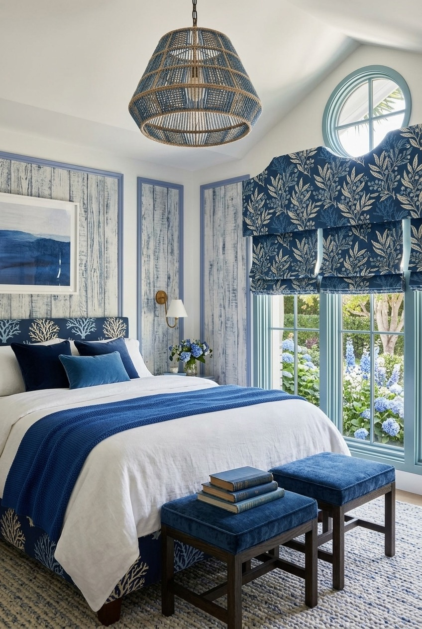
Between the woven pendant light, the printed floral roman shade, the coral-patterned headboard, and the whitewashed wood paneling, there’s a lot going on in this room. What keeps it from feeling chaotic is that every pattern stays within the same narrow range of blues and off-whites.
This is a genuinely useful trick for anyone nervous about mixing patterns. Instead of trying to coordinate a floral, a stripe, and a texture through matching scale or style, just keep the color palette tight. A busy floral and a woven texture can sit right next to each other as long as neither one strays far from the room’s core colors.
To try this yourself, pick two or three patterns you like, whether that’s a stripe, a floral, or a woven texture, and check that they all pull from the same two or three colors before combining them. It’s a much easier rule to follow than trying to match patterns by style or scale.
Use Navy as a Quiet Accent
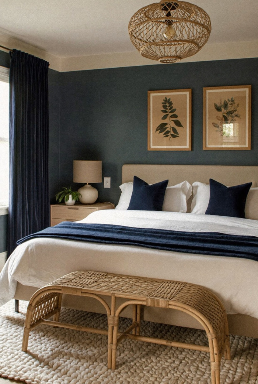
Not every blue bedroom needs to go all in on the color. Here, a deep teal-navy wall and two navy pillows are the only real nods to the shade, while rattan, jute, and warm tan textiles carry the rest of the room. It still reads as a blue bedroom, just a restrained one.
This kind of restraint actually takes more discipline than going bold. Committing to one accent wall and a couple of pillows means everything else has to earn its place, and the natural textures here, a woven pendant, a rattan bench, a chunky jute rug, do exactly that without competing with the wall color.
If a full blue room feels like too much of a commitment, this is the safer entry point. Paint one wall, add two or three pillows in the same shade, and lean on natural materials for everything else. You get the mood without redoing the whole room.
Go All In on One Color
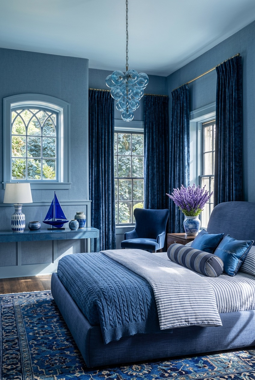
Walls, bedding, curtains, furniture, even the rug: this bedroom commits to blue almost completely, and it works because the shades shift just enough to keep things from flattening into one giant block of color. It’s the most extreme version of the idea running through every room here, just taken all the way.
A monochromatic room like this needs one thing to break the pattern, or it risks feeling like a paint sample rather than a finished space. Here, that job falls to a vase of purple flowers and a small golden sailboat model, both understated enough not to fight the color scheme but different enough to catch your eye immediately.
Going this monochromatic isn’t for everyone, and that’s fine. But if the idea appeals to you, commit to varying the shades and finishes rather than buying everything in identical blue, and leave room for one small object in a completely different color. That contrast is what keeps a single-color room from feeling flat.
One Color, a Hundred Ways to Make It Yours
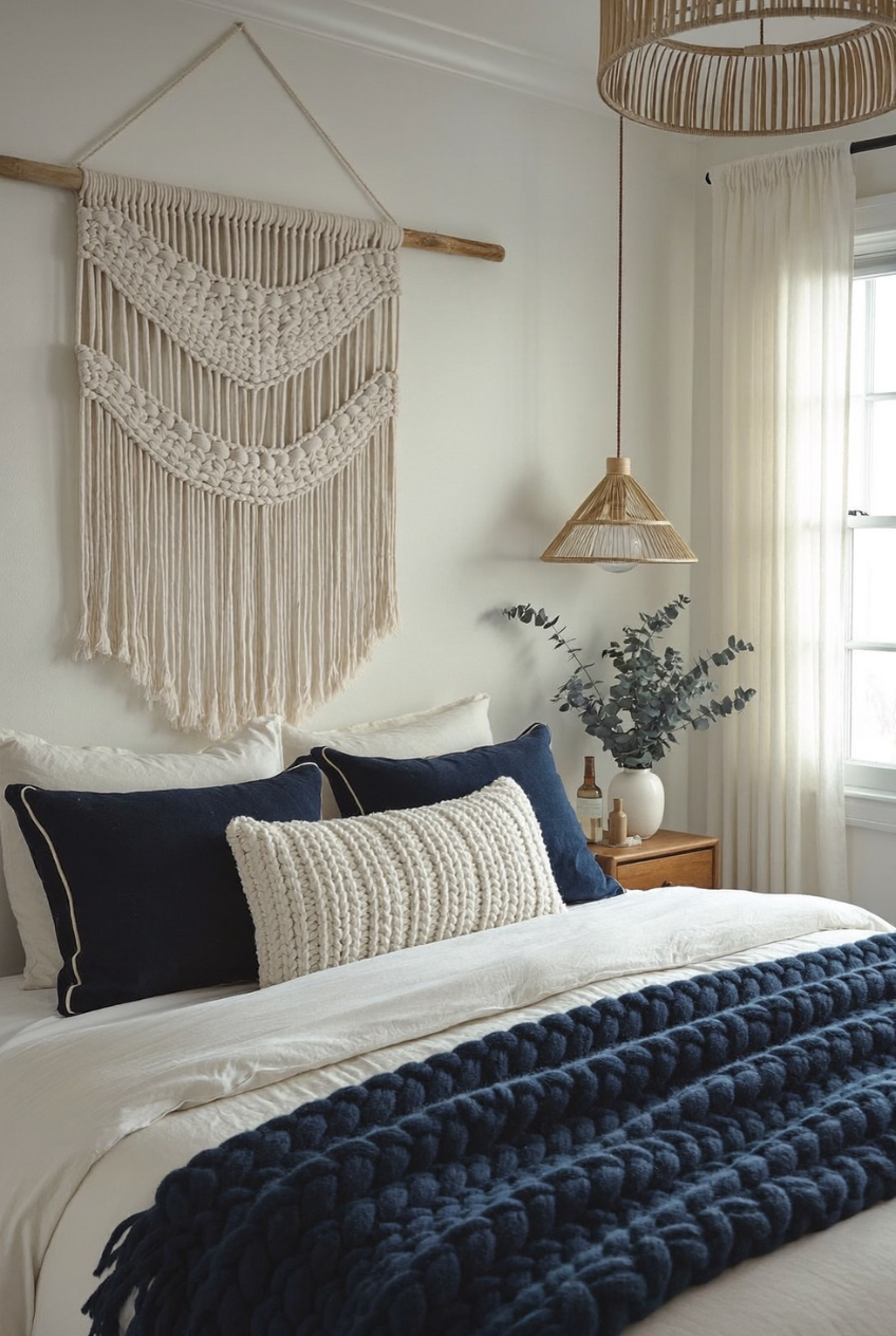
Look back through these rooms and you’ll notice something: no two of them treat blue the same way. It shows up as a wall color, a single throw blanket, a floor-to-ceiling commitment, or barely a whisper of an accent, and every version manages to feel complete on its own terms.
That flexibility is really the appeal here. Blue doesn’t force a single mood or style onto a room the way some colors do. It bends toward glam with gold, toward calm with wood and wool, toward coastal with white paneling and rope textures, depending on what you put around it.
If you’re planning a bedroom refresh and keep circling back to blue, trust that instinct without feeling like you need to commit to one specific version of it. Start with the mood you’re actually after, and let the shade and materials follow from there instead of the other way around.
 Steal Our Home Styling Secrets!