
Retro Apartments That Prove Personality Still Beats A Perfectly Matched Room
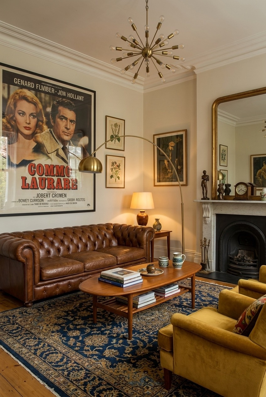
Retro apartments are having a real moment right now, and it makes sense. After years of white walls and identical gray sofas, people are craving spaces with actual personality. Warm wood tones, saturated color, and a little pattern chaos feel like a relief instead of a risk.
We pulled together apartments that lean into different decades without turning into a costume. Some go full color-drenched seventies, others keep things closer to sixties modernism, and a few just borrow one strong idea and build a whole room around it. None of them require gutting a rental.
What ties everything together is restraint hiding inside boldness. A bright orange ceiling still needs a plan, and a wall of collected objects still needs breathing room. Keep scrolling for the details behind each space and the small decisions that make it feel lived-in rather than staged.
One Bold Chair Against Warm Wood
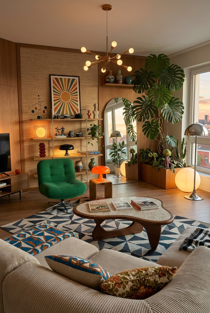
The wood paneling here does a lot of quiet work. It is warm without being heavy, and it gives every colorful object in the room something calm to sit against. That green swivel chair would look almost aggressive on a white wall, but here it reads as confident instead.
One strong accent color does more for a room than five subtle ones. Pick a single piece, a chair, a lamp base, or a low table, and let it carry the color while everything else stays in the wood-and-neutral family. The terrazzo-topped coffee table is the other anchor, and its organic shape softens all the straight lines around it.
Lighting is doing double duty too. The sputnik-style chandelier and the mix of globe lamps sitting at different heights mean no single bulb is fighting for attention, which keeps the whole room glowing rather than glaring. If you rent, a plug-in fixture or a floor lamp with a similar silhouette gets you most of the way there.
Turn Your Music Collection Into Art
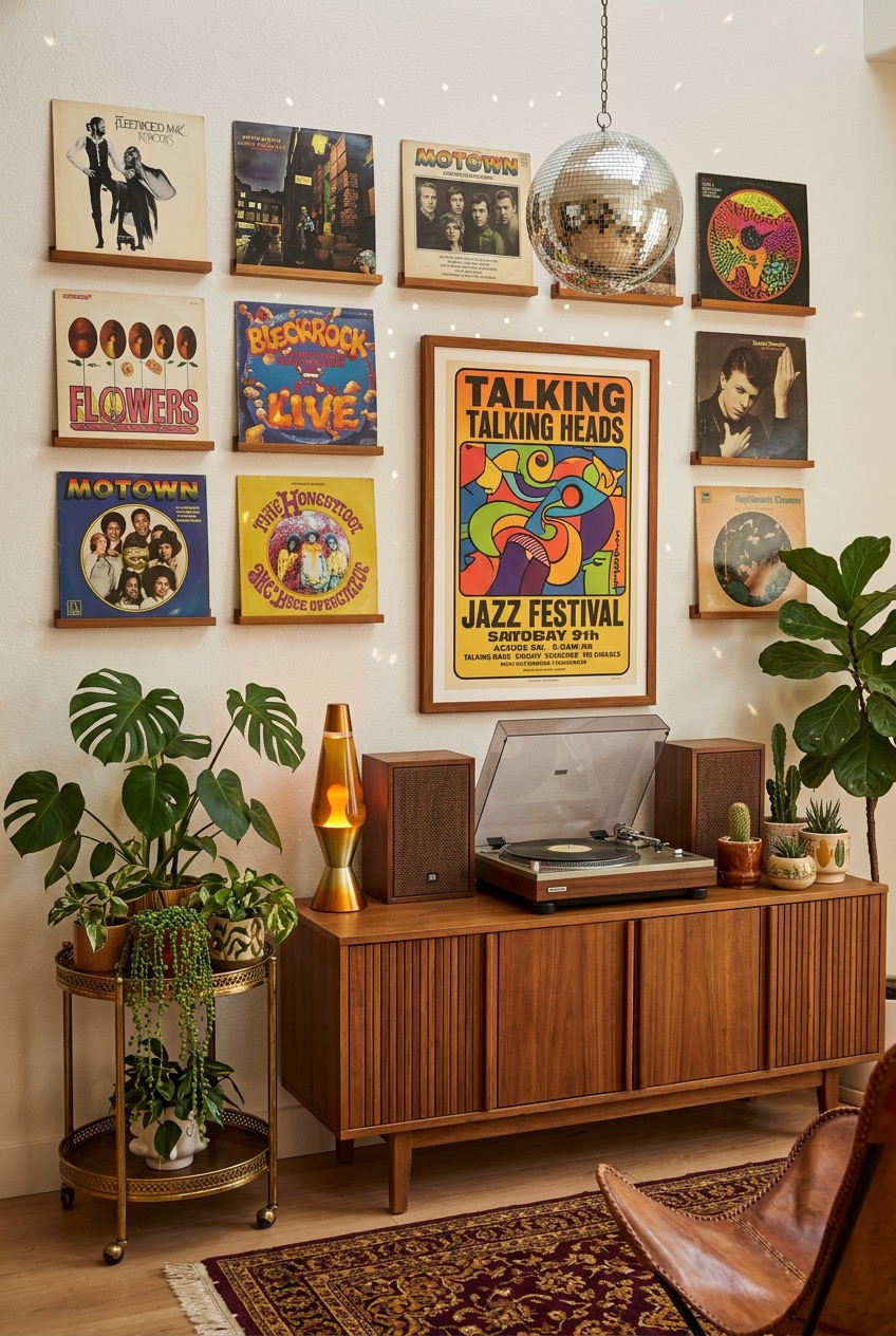
If you already own a stack of records, stop hiding them away in a cabinet or a box on the floor. Mounting the album covers directly on the wall in a simple grid turns something you already have into a rotating piece of art that changes anytime you want, no new spending required.
The disco ball hanging above it is not just for parties. During the day it catches ambient light and throws small reflections around the room, and at night it adds sparkle without needing a single extra lamp turned on. Small sculptural objects like this earn their place by doing more than sitting still.
A working turntable and a pair of small speakers on a low credenza give the whole setup a reason to exist beyond decoration. Add a lava lamp nearby and a tiered plant stand next to it, and you have got a corner that actually earns its spot in the room, not one that just gets dusted.
Let Your Barstools Do The Talking
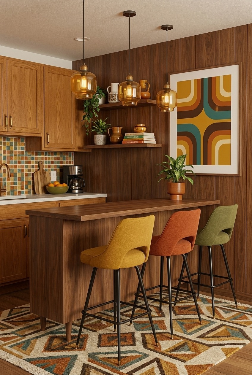
Three barstools in three different colors sounds risky on paper, but it works here because the colors are all pulled from the same warm family, mustard, rust, and olive, so they read as a set instead of a mismatch. If you are working with a rental kitchen, this is one of the cheapest ways to bring in personality without touching the cabinets.
The mosaic tile backsplash is doing something clever too. It is busy, but it is contained to one strip of wall, so it reads as a feature instead of visual noise. Pattern almost always works better in a defined space than spread across an entire room.
Wood tones this deep can start to feel like a cave if you are not careful, which is why the amber glass pendants and the graphic print on the wall matter so much. They give the eye somewhere bright to land. A cluster of hanging lights at slightly different heights also breaks up what would otherwise be a flat ceiling line.
Do Not Rip Out Avocado Fixtures
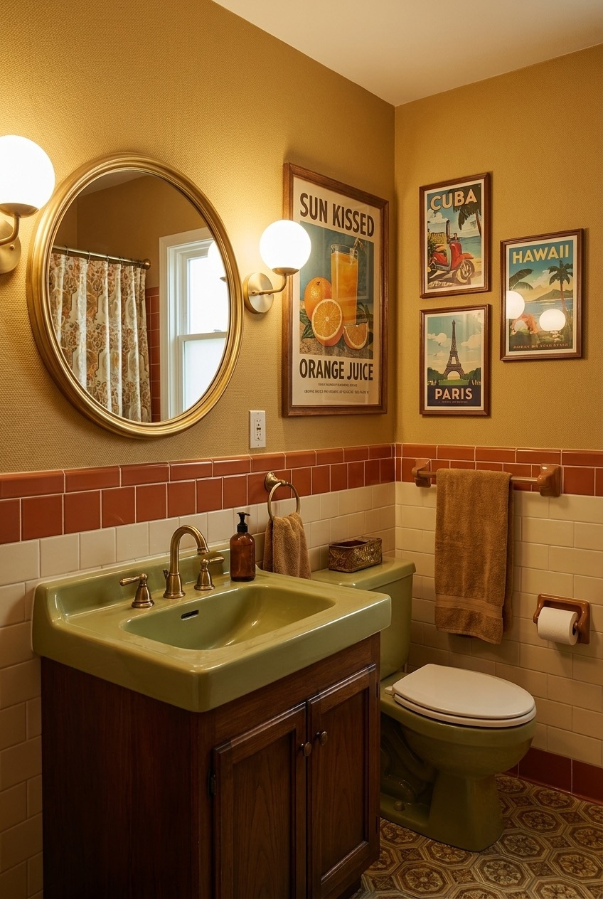
The instinct with an old avocado green sink is to tear it out immediately. We would argue you build around it instead. That shade of green is genuinely hard to find in new fixtures now, and pairing it with warm terracotta tile and brass hardware turns what looks dated into something with real character.
The two-tone tile wainscoting is the trick that makes it feel finished instead of half-renovated. Terracotta on the bottom, cream tile above it, with a thin trim line separating the two. It is a straightforward pattern any tiler can replicate, and it gives a small bathroom a defined bottom half instead of one flat wall of color.
Small travel posters grouped near the mirror do a lot for very little cost. Pick a handful that share a color palette, frame them simply, and hang them close enough together that they read as one gallery moment instead of scattered art. The round gold mirror ties it all back to the warm metal finishes used throughout the room.
Painting The Ceiling Changes The Room
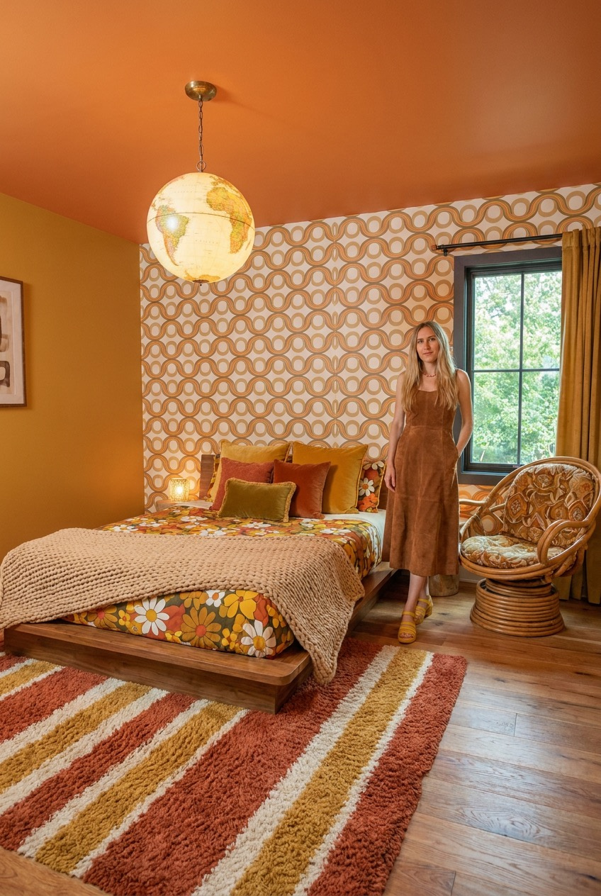
The fifth wall gets ignored constantly, and that is a mistake. Painting the ceiling a saturated burnt orange here does more to set the mood of this bedroom than any single piece of furniture in it. It is also one of the more forgiving color choices, since you are rarely looking directly at it for long.
Pattern-heavy wallpaper and a floral bedspread sitting next to each other could easily clash, but they stay in the same warm gold and rust family, so your eye reads them as coordinated instead of competing. Sticking close to one color story is what lets you mix that many patterns in a single room without it feeling chaotic.
A round globe pendant hanging low over the bed adds another soft shape into a room full of circular wallpaper motifs, and the rattan chair in the corner brings in texture that keeps everything from feeling too slick. Even the striped rug on the floor sticks to the same three-color palette as the rest of the room.
Maximalism Still Needs A Backbone
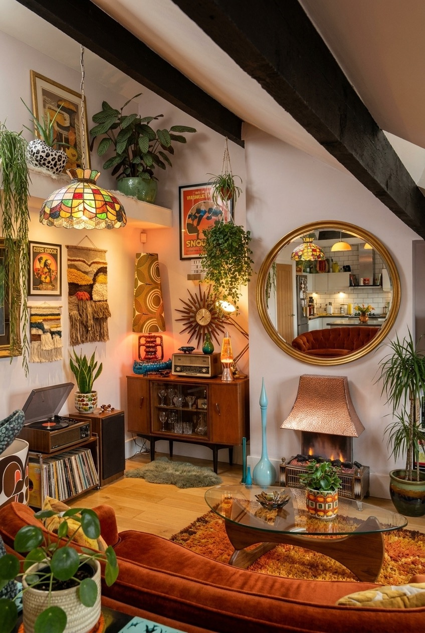
This is about as maximalist as a living room gets, plants stacked on plants, woven wall hangings, a stained glass lamp, a sunburst clock, and still somehow it does not feel cluttered. The reason is the exposed dark beams running across the ceiling. They give the whole space one strong structural line to organize around.
Every collected object in here, the pottery, the framed prints, the tiny sculptures, sits within a narrow band of warm colors: rust, ochre, olive, brown. That is the actual trick to filling a room this full without it turning into visual chaos. Pick your palette first, then collect within it, not the other way around.
The round mirror and the copper hood over the fireplace both catch light and bounce it back into a room that otherwise leans dark and cozy. Plants do the rest of the work, softening every hard edge from the beams to the glass coffee table below them.
One Wall Color Can Anchor Everything
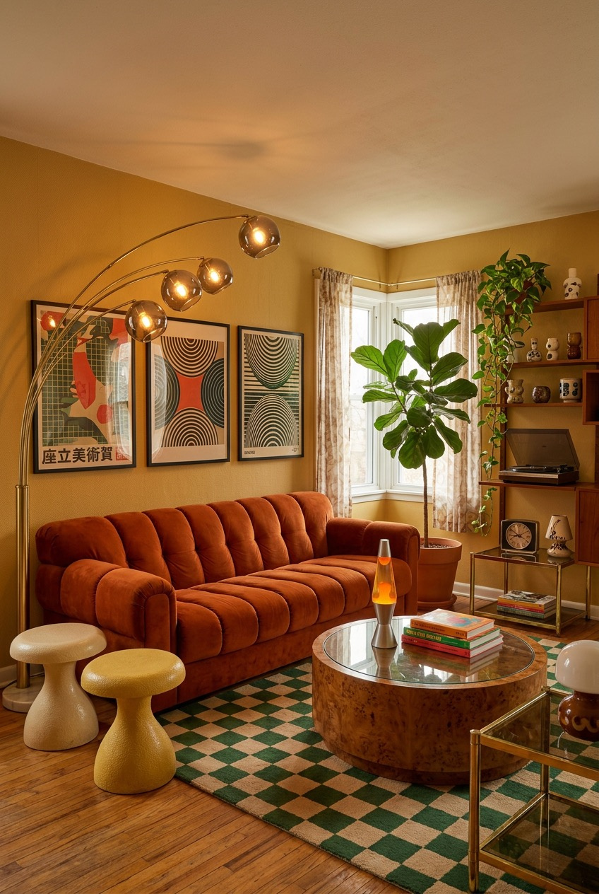
Those two mushroom-shaped stools next to the sofa are not just extra seating, they are doing a color-blocking job too, one cream and one pale yellow, breaking up what would otherwise be a very orange corner. Small, low furniture pieces like this are an easy way to add variation without committing to another big statement piece.
The mustard wall color is the real anchor of the whole room, and it works because nothing else fights it for attention. The channel-tufted sofa is rust, the rug is a muted green checkerboard, and the framed prints keep to a tight graphic palette. Loud wall color needs a quieter supporting cast, not a louder one.
A five-arm floor lamp with globe bulbs at staggered heights lights the whole seating area without a single overhead fixture, which keeps the ceiling clean and the light itself warm and low. A fiddle-leaf fig tucked into the window corner is really the only green in the entire room, and it does not need company.
Let The Ceiling Define The Zone
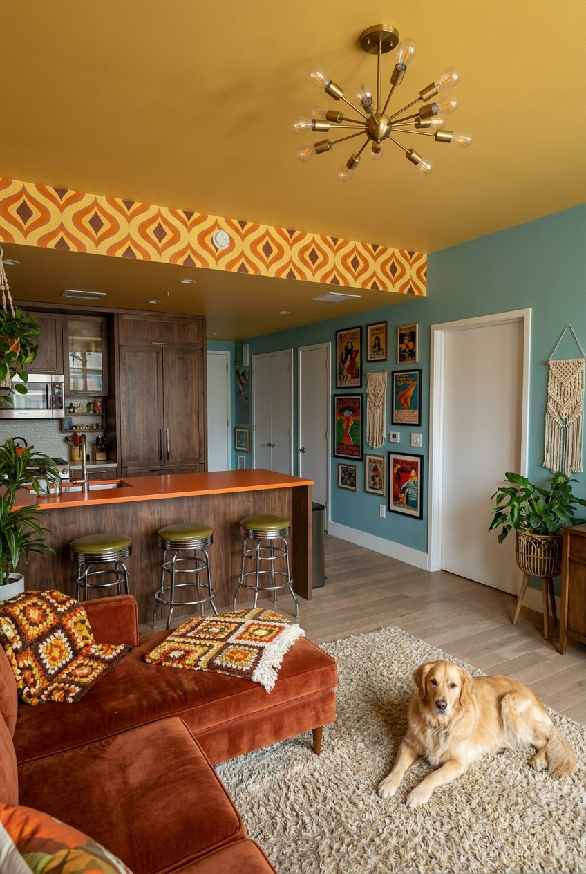
In an open floor plan, walls are not always available to separate one zone from another, so this space uses color instead. The mustard ceiling and patterned soffit hang directly over the kitchen, while the walls shift to teal the moment you step into the living area.
The crocheted granny-square pillows on the sofa add a handmade texture that softens all that saturated color around them, and they are the kind of thing you can genuinely make yourself or find secondhand for very little. Teal and mustard sit on opposite ends of the color wheel, which is exactly why they read as so lively together instead of clashing.
A wall of framed posters clustered together fills the hallway without needing matching frames, since a shared color story does the unifying work instead. And yes, the dog on the shag rug is not technically a design choice, but a soft, low-pile rug that can handle daily traffic from paws and feet is worth thinking about on purpose.
Wall-Mounted Storage Frees Up Floor
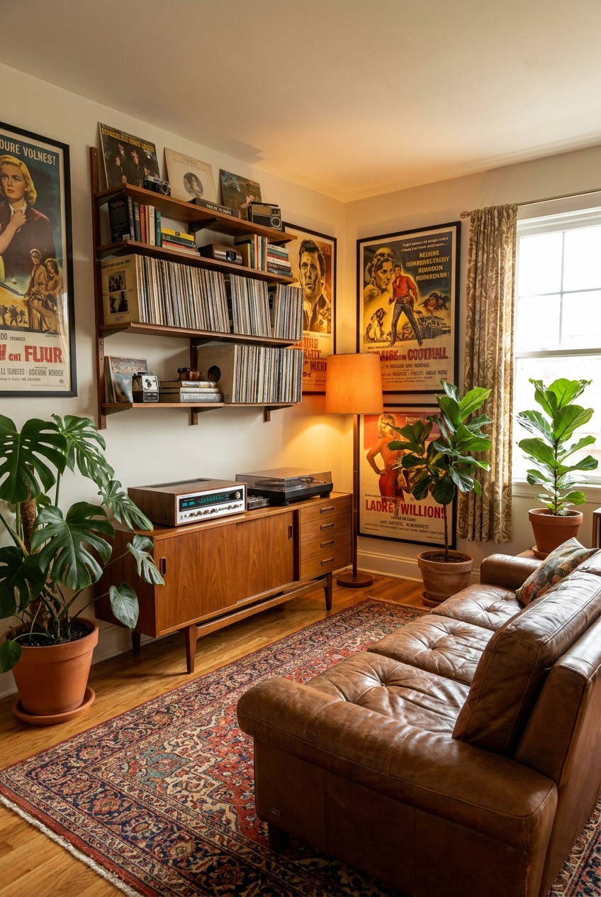
Floating shelves mounted above the credenza hold an entire record and book collection without eating into floor space, which matters a lot in a smaller living room. Everything stays visible and easy to grab, but the floor underneath stays completely open for the sofa and a proper walking path.
Large-scale vintage posters are one of the most affordable ways to fill wall space with real visual weight. A single oversized print does more than a dozen small frames scattered around, and it gives a corner an instant sense of history even in a brand-new apartment.
The tufted leather sofa stays solid and neutral on purpose, which is what lets the richly patterned rug underneath it take center stage instead of competing for attention. Two fiddle-leaf figs on either side of the shelving frame the whole setup like a pair of parentheses, tying the vertical and horizontal elements of the room together.
Sage Green Softens The Retro Palette
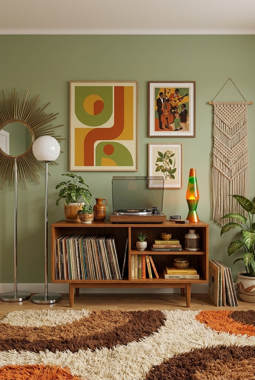
Most retro rooms lean hard into orange, mustard, and rust, so a sage green wall like this one stands out by doing the opposite. It still nods to the era through the furniture and the prints on the wall, but the color itself feels calmer, almost like a palate cleanser between louder rooms in the same apartment.
Grouping three different print styles together, an abstract geometric piece, a jazz-themed illustration, and a botanical print, only works because the frames all match and the color palette across all three stays tight. That is the actual rule for building a gallery wall that reads as a set instead of leftovers from three different eras.
The sunburst mirror and the globe floor lamp both bring in metallic shine without adding another color to keep track of, and the chevron-patterned shag rug on the floor picks up the browns and oranges from the furniture, tying the room back to its warmer neighbors. A lava lamp on the cabinet is the one playful detail that keeps it from feeling too serious.
Retro Style Always Rewards Personality Over Plain Perfection
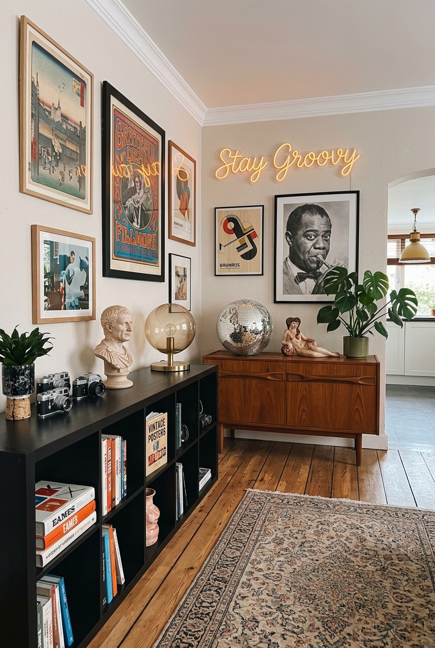
None of these apartments are precious about matching everything perfectly, and that is the whole point. A green sink stays a green sink, a wall gets painted a color most people would call risky, and a shelf gets filled with whatever someone actually collects.
If you are starting from scratch, do not recreate an entire room in one weekend. Pick one idea, a color-blocked wall, a mounted record collection, a single piece of wallpaper, and build outward once it feels right instead of forcing every element in at once.
The apartments above prove that personality and comfort can coexist without a strict theme holding everything together. Borrow whatever speaks to you, leave the rest, and give it some time to settle in before deciding what to change next.
 Steal Our Home Styling Secrets!