
What Separates a Decorated Fall Kitchen From One That Actually Feels Seasonal
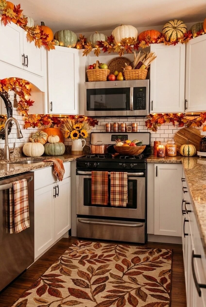
Fall decorating gets reduced to a pumpkin on the counter way too often, and we think the kitchen deserves more credit than that. It is the room where people actually gather, where the oven runs and the coffee maker goes, so it makes sense it carries the bulk of the seasonal feeling in a home.
What we noticed pulling these ideas together is how differently each kitchen approached the same general goal. Some leaned into warm light and layered textures, others kept things graphic and playful, and a few just let one strong arrangement do the talking.
We are walking through ten kitchens that each handle fall a little differently, breaking down what is actually working in the styling and how you would borrow the idea for your own space, whatever your counters and cabinets look like right now.
Let Candlelight Take Over the Sink
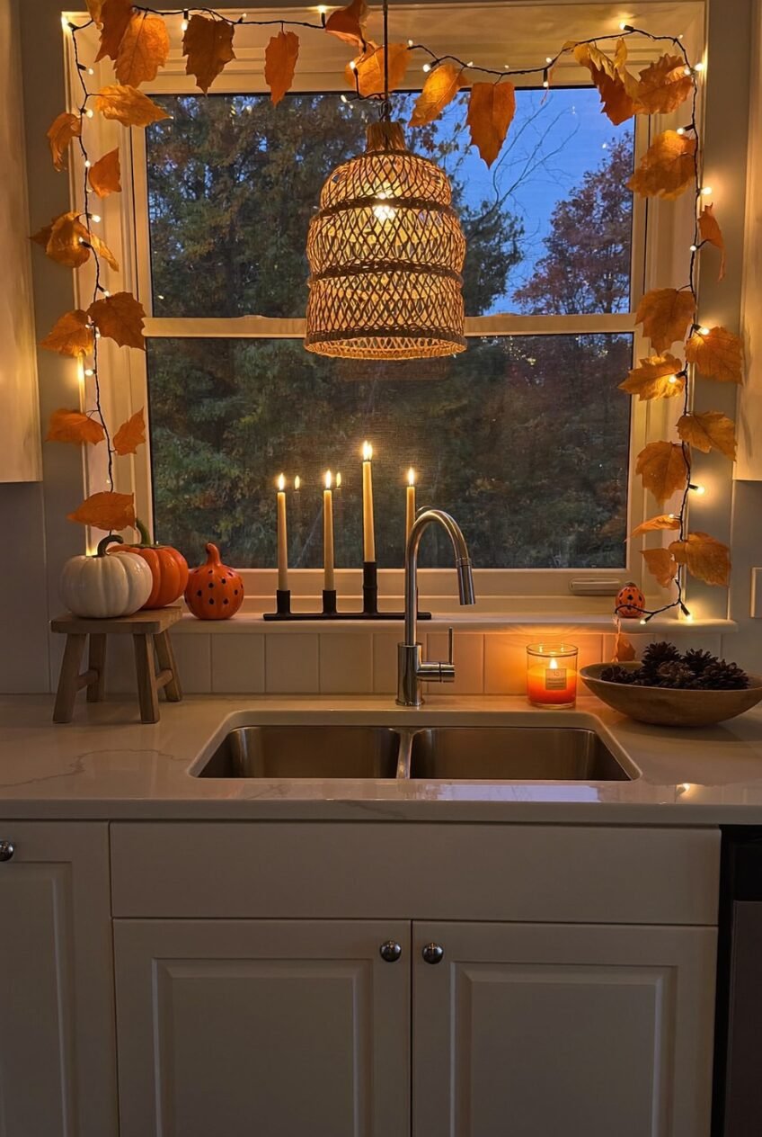
Nobody decorates around a sink, which is exactly why this one stands out. The window above it becomes the focal point once string lights and paper-style leaves wrap the frame, and a cluster of taper candles at different heights does more atmospheric work than any overhead fixture could.
The trick here is height variation. Five candles at five different levels create a skyline effect that a single matching set never will. A woven pendant hanging close to the window adds another texture layer without blocking the view outside, which matters once it gets dark earlier.
If your sink faces a window, this is one of the lowest-effort high-impact moves you can make. A taper candle holder, a strand of battery-powered lights, and a couple of mini pumpkins on a small stool nearby.
Open Shelves Want Worn-In Pieces
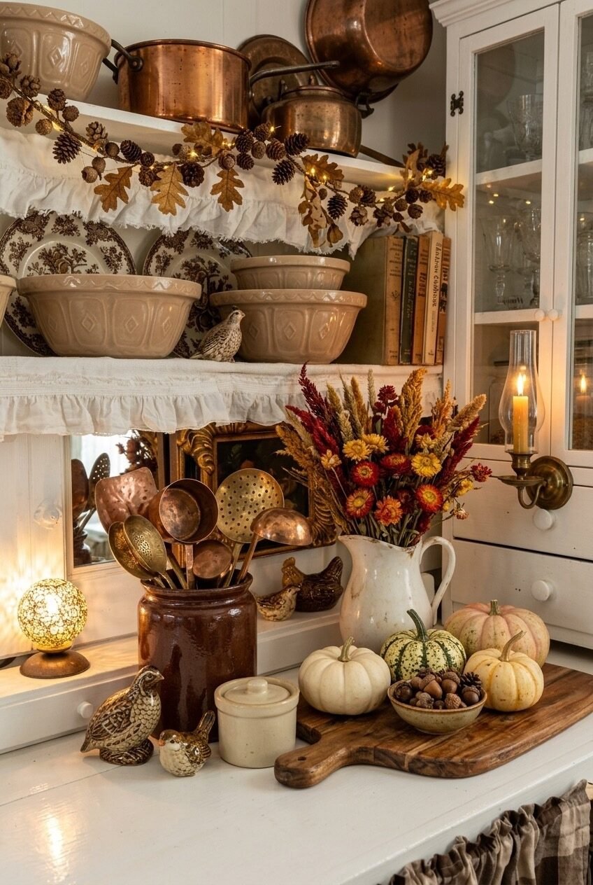
Open shelving is unforgiving. Everything is visible all the time, which means the pieces you choose are doing double duty as both function and decor. This hutch leans hard into stoneware mixing bowls, ruffled shelf liners, and a row of old cookbooks that look like they get used.
The pinecone and oak leaf garland tucked along the shelf edge is doing more than it gets credit for. It softens the hard line where the shelf meets the wall and gives the eye a place to land before jumping to the next object. A small ceramic bird or two adds whimsy without tipping into theme territory.
Pull out anything too shiny or too new if you are trying this look. The pieces that read as fall here have a little patina, a little wear, something that looks collected over time rather than bought last week.
A Tablescape Earns Its Real Estate
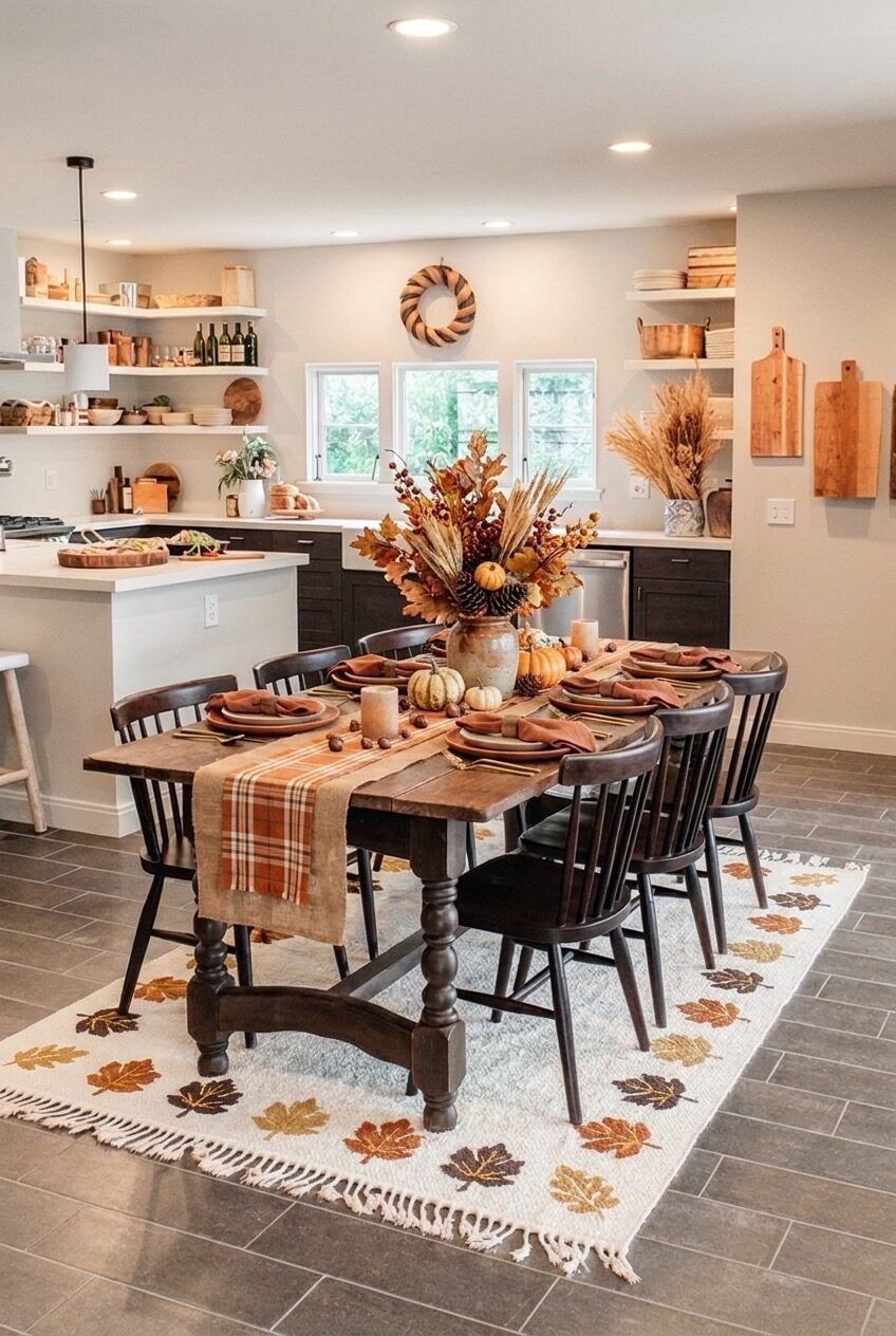
A long dining table covered edge to edge in plaid, wheat, and gourds only works if every layer is doing something. Start with the base layer: this one uses a plaid runner over raw wood, which gives texture before a single object is added. Stoneware plates and dried florals build height and color without crowding the place settings.
The centerpiece deserves a closer look. Dried wheat, pinecones, and a few faux berries arranged loosely in a ceramic vase reads far more natural than a tightly packed floral foam arrangement ever could. Letting a few stems lean at slightly different angles instead of trimming everything to match keeps the whole thing from looking store-bought.
Underneath it all, a leaf-print rug ties the tablescape to the floor instead of letting it float as a separate moment. If you only take one thing from this kitchen, let it be that the rug matters as much as anything on the table.
Color Coordination Does the Heavy Lifting
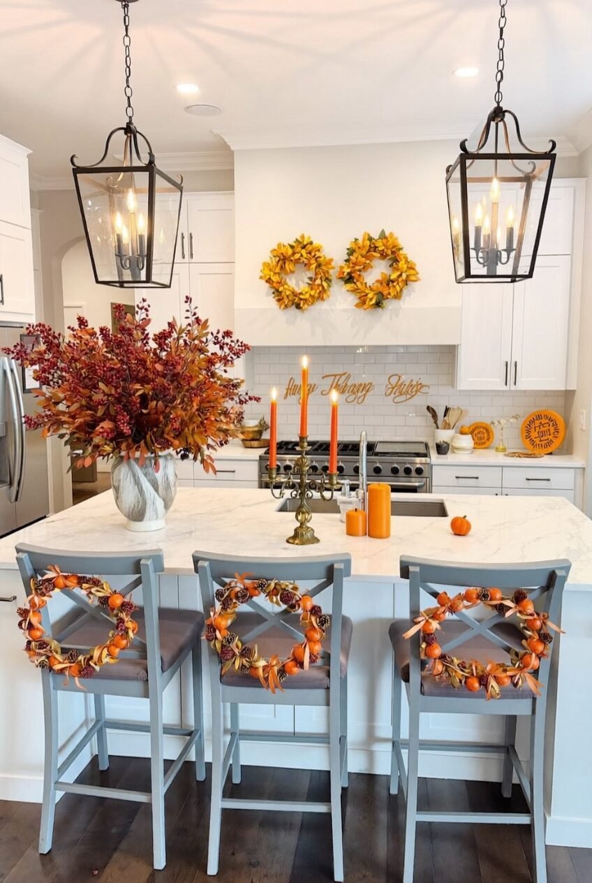
Notice how every object in this kitchen sits somewhere on the same orange-to-gold spectrum. The wreaths, the candles, the berry stems, even the wreaths tied to the barstool backs. Sticking to one tight color family across that many objects takes more discipline than most people give it credit for.
Lantern-style pendants overhead give off a warm, almost amber glow that flatters the orange palette below. Pair that with a brass candelabra holding tapers in the exact same shade, and you get a color story that repeats from ceiling to countertop without ever feeling matchy in a bad way.
The barstool wreaths are the unexpected detail worth stealing. Most people stop decorating at the counter. Hanging small wreaths on the chair backs extends the seasonal feeling into a spot most kitchens leave bare, and it costs almost nothing if you already have leftover wreath material.
Decor and Function Share One Shelf
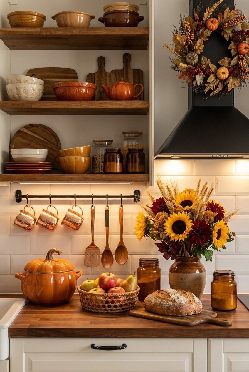
This kitchen makes a strong case for decorating with things you would buy anyway. Wooden cutting boards leaned against the back of an open shelf, hammered copper mugs hanging from hooks below, a row of stoneware bowls stacked by size. None of it is purely ornamental, and that is exactly the point.
A single wreath on the range hood and a sunflower bouquet on the counter are the only items here that exist purely for the season. Everything else is permanent kitchen gear that simply happens to look good together once it is arranged with some intention behind the placement.
Try sorting your own open shelves by material instead of by use. Grouping wood, copper, and stoneware into their own zones, the way this shelf does, reads far more polished than mixing materials randomly across the same shelf.
Warm Light Changes a Whole Room
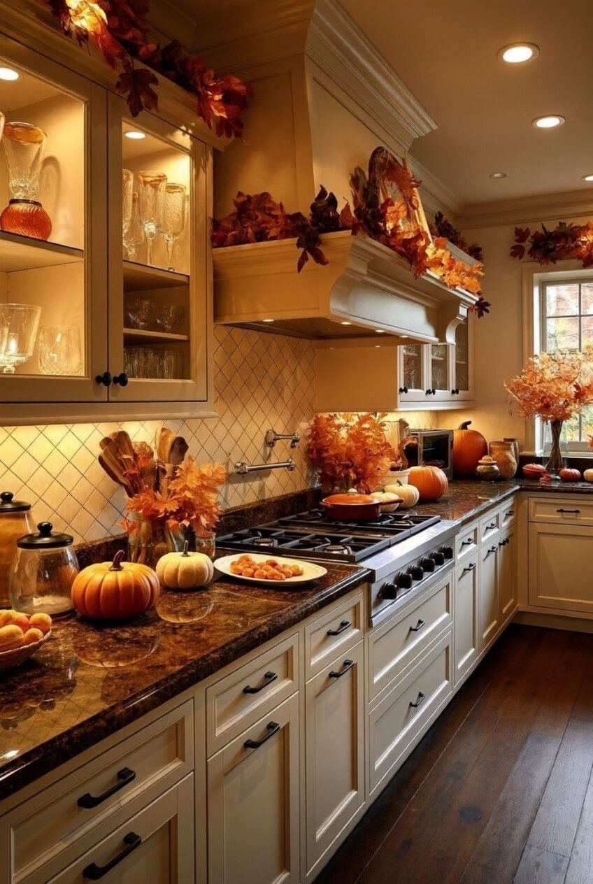
Strip the garland and pumpkins out of this photo and look at the lighting alone. Recessed cans, under-cabinet lights, and the warm reflection bouncing off dark granite countertops are doing a huge amount of the seasonal work before a single decorative object enters the frame.
Draping leaf garland along the top of a large range hood is the move most people skip because hoods are awkward to decorate around. Letting the garland spill slightly over the edge softens that hard architectural line and makes the hood feel like part of the styling instead of something decor has to work around.
Dark countertops are an underrated partner for fall decorating, by the way. Mini pumpkins and warm-toned florals show up with way more contrast against a dark stone surface than they ever would on something pale, which is worth remembering if your kitchen runs darker.
Texture Carries a Vignette Without Color
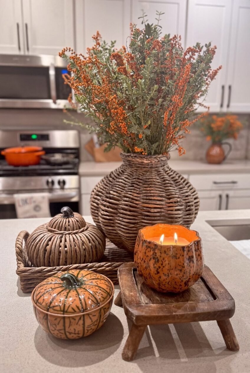
What pulls this little countertop scene together is not color at all, it is texture. A woven rattan vase, a carved ceramic pumpkin with a lid, a candle glowing inside what looks like a hollowed gourd. Three different materials, one cohesive moment, almost no reliance on the orange-and-gold palette everyone defaults to.
The riser underneath the candle is a small detail that makes a real difference. Lifting one object slightly off the counter on a tiny wooden stand creates depth in a vignette that would otherwise sit flat. It is a trick borrowed from styled photography that translates surprisingly well to everyday counters.
If your fall decor box is mostly orange and you are tired of looking at it, this is your sign to raid the texture aisle instead. Woven baskets and carved ceramics will read as seasonal even in a neutral palette.
An Island Becomes the Harvest Table
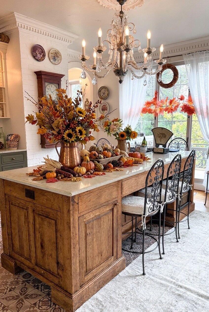
Some kitchens have a separate dining table for the big seasonal spread. This one skips that entirely and turns the island itself into the harvest centerpiece, scattering corn husks, gourds, and pinecones directly across the wood countertop like it is a farmhouse table from another century.
The reclaimed wood surface is doing a lot of the visual work, since it already looks aged and grain-rich before anything sits on top of it. A copper pitcher loaded with sunflowers anchors one end, while loose gourds and dried husks drift down the rest of the surface without any obvious symmetry.
Ornate iron stools tucked underneath add an antique, almost European farmhouse note that keeps the setup from feeling like a basic harvest display. Letting the centerpiece sprawl across the counter instead of containing it in a single bowl is what makes this read as abundant.
Pastel Tones Soften the Fall Palette
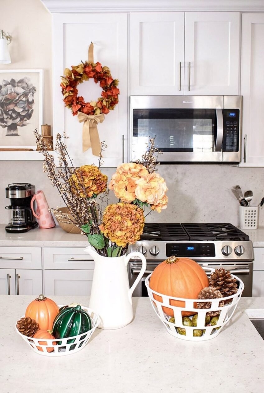
Hydrangeas in dusty pink and muted gold are not where most people start when they think about fall florals, and that is exactly why this arrangement stands out against a sea of orange-and-burgundy kitchens. Paired with a clean white pitcher, the softer palette feels more like early autumn than peak Halloween season.
Wire mesh bowls holding mini pumpkins and pinecones bring a slightly industrial edge into an otherwise soft, romantic scene, and that contrast is worth paying attention to. Mixing a delicate floral moment with a more utilitarian container keeps the counter from feeling overly precious.
A muted wreath with a simple ribbon bow rounds out the look without screaming for attention. For anyone whose kitchen already leans neutral or pastel, this is proof that fall decor does not have to mean abandoning your color story for three months.
A Backsplash Can Tell a Story
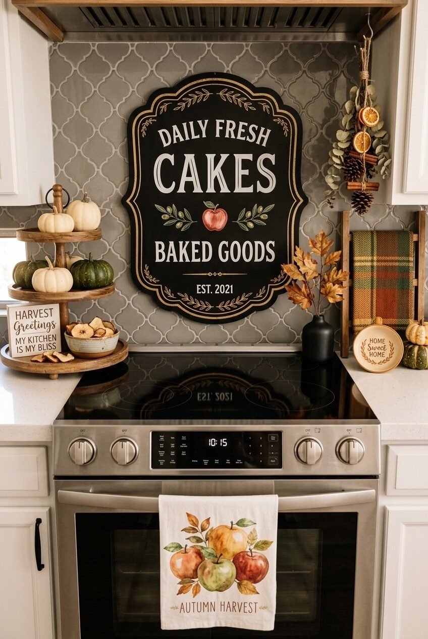
Most fall styling treats the stove as a surface to decorate around. This kitchen treats the backsplash above it as the main event, hanging a vintage-style bakery sign that turns the whole cooking zone into a small scene with its own personality and backstory.
A tiered stand on one side holds mini pumpkins and dried apple chips at three different heights, which keeps the eye moving instead of settling on one flat plane. On the other side, dried citrus and a small cinnamon bundle hang from a simple string, adding scent-adjacent styling that photographs beautifully.
What makes this approach worth copying is the sense of humor in it. A sign that reads like an actual bakery storefront turns a stove backsplash into a small piece of personality rather than another spot for generic gourds, and that kind of specific detail is what people remember.
Small Vignettes Add Up to a Season-Ready Kitchen
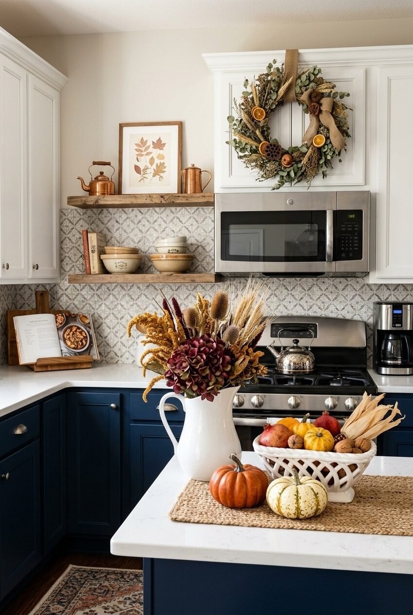
Looking back across all ten kitchens, the common thread is not a shared color palette or a specific object everyone bought. It is restraint paired with one or two strong focal points per space, whether that is a sink window, a backsplash, or an island left to sprawl with gourds.
None of these kitchens needed every surface covered to feel like fall had arrived. A single styled shelf, a tablescape with real texture, or even just a wreath and a few well-placed candles did more than a counter buried in matching decor ever could.
If you are starting your own fall refresh this week, pick the one zone in your kitchen that gets the most daily attention, your sink, your island, or the wall behind your stove, and build outward from there. The smallest, most lived-in corner of the room is usually the one worth decorating first.
 Steal Our Home Styling Secrets!