
Fall Decor Ideas That Work Whether Your Home Is Rustic or Modern
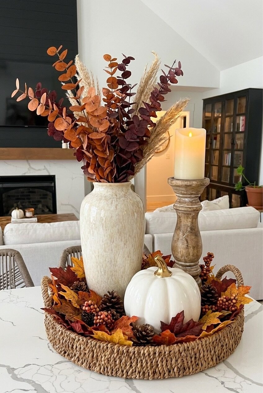
There’s a specific kind of feeling that hits when the air gets crisp and you suddenly want your home to match it — warm, a little moody, full of texture. Fall decor has this reputation for being either over-the-top orange-everything or so minimal it barely registers. The sweet spot is somewhere in between, and that’s exactly what we’re exploring here.
What makes fall decorating genuinely satisfying is that it’s one of the few seasons where almost everything works together naturally — dried botanicals, warm wood tones, earthy ceramics, soft knits. The palette practically builds itself. The trick is knowing how to layer it without things looking like a Halloween store exploded in your living room.
From front porch setups to bedroom bedding swaps, the ideas ahead cover a range of styles and budgets. Some are weekend projects, some are as simple as buying one good piece. All of them are worth stealing.
Rustic Porch Scarecrow With Personality
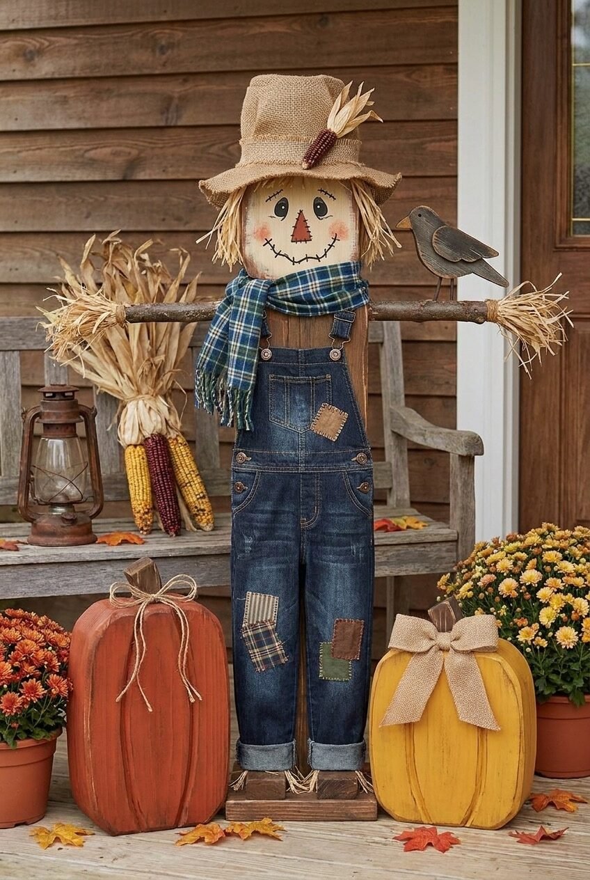
Okay, the scarecrow on this porch is actually kind of charming — and that’s not something we say lightly, because porch scarecrows can go very wrong very fast. What saves this one is the specificity of the styling: real denim overalls with fabric patches, a plaid scarf, a burlap hat with dried corn tucked into the band. The details are what make it feel considered rather than kitschy.
The surrounding vignette follows the same principle. Wooden pumpkins in terracotta red and mustard yellow sit at the base, painted with a slightly distressed finish that ties into the aged wood tones of the porch. Potted mums in rust and yellow flank the sides — mums are one of those plants that are basically foolproof for fall porch color, and they’re cheap enough to replace as they fade. Dried corn stalks and a vintage-style lantern complete the scene without overcrowding it.
The real design principle at work here is layered storytelling — every element reinforces the same rural, harvest-season narrative, which is what makes the whole setup feel cohesive instead of random. If you’re building something similar, resist the urge to throw in non-rustic elements. Commit to the bit.
Vintage Ladder Styled With Signs
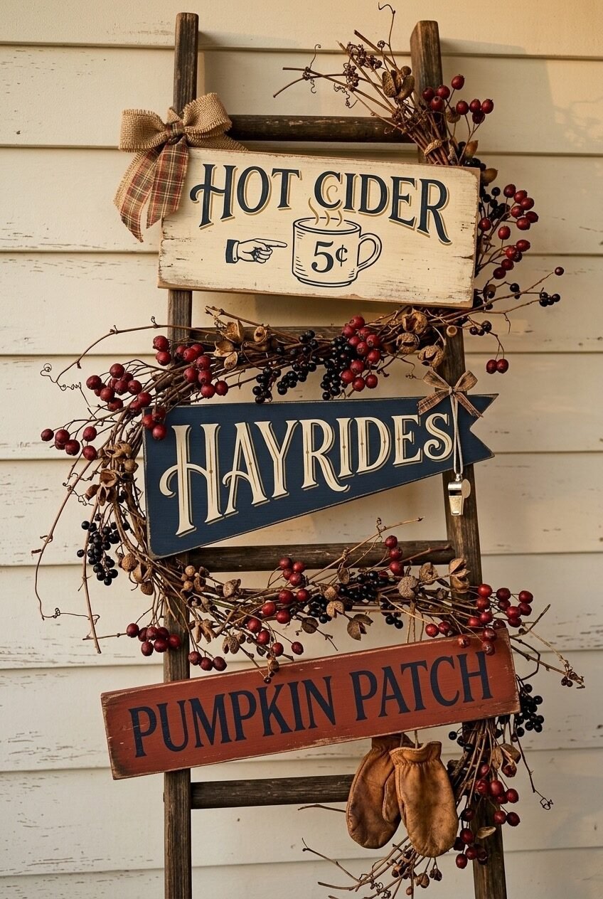
A weathered wooden ladder leaning against a white-painted shiplap wall — already a solid fall prop on its own. But what this setup does really well is use the ladder as a display structure for seasonal signage: a cream-painted “Hot Cider” board at the top, a navy pennant-shaped “Hayrides” sign in the middle, and a red “Pumpkin Patch” plank at the bottom. Three different shapes, three different colors, all vintage-lettered and completely cohesive.
The berry and dried branch wreath looped through the ladder rungs is the detail that ties everything together. It fills negative space between the signs and adds organic texture without competing for visual attention. A plaid burlap bow at the top and a tiny pair of worn leather mittens hanging from the bottom round it off — small touches that feel genuinely collected over time.
Want to pull this off at home? Start with any old ladder — thrift stores usually have them for under $20. The signs can be DIY’d with wood planks, craft paint, and a stencil font, or bought as a set from farmhouse decor shops. The key is varying the sign shapes — rectangle, pennant, horizontal plank — so the display has rhythm rather than just stacking identical formats.
The Seasonal Doormat That Works Hard
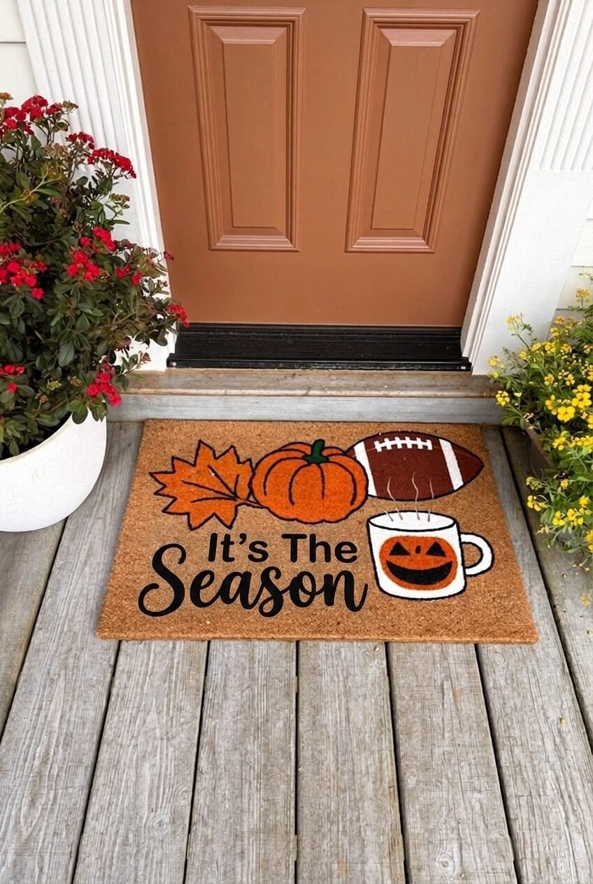
Here’s the thing about a well-chosen doormat: it does the entire job of signaling the season before anyone even touches your door handle. This coir mat with its “It’s The Season” script and illustrated icons — a maple leaf, an orange pumpkin, a football, a jack-o-lantern mug — covers basically every fall cultural touchpoint in one graphic. It’s fun without being overwhelming, and the natural coir base keeps it from reading as cheap.
The door color behind it is doing real work here too. That warm terracotta-orange paint is not a coincidence — it echoes the mat’s color palette and creates a front-entry moment that feels seasonally complete even with minimal surrounding decor. A single potted plant on each side keeps it from feeling bare without requiring a full porch setup.
If you already have a colored front door, pick a doormat graphic that pulls from that color rather than fighting it. Coir mats are widely available in seasonal designs, but the ones with cleaner illustration styles tend to age better through the whole season than hyper-trendy graphics that feel dated by mid-October. Swap it back to your everyday mat after Halloween and you’re done — low commitment, high return.
Candle and Texture Vignette Done Right
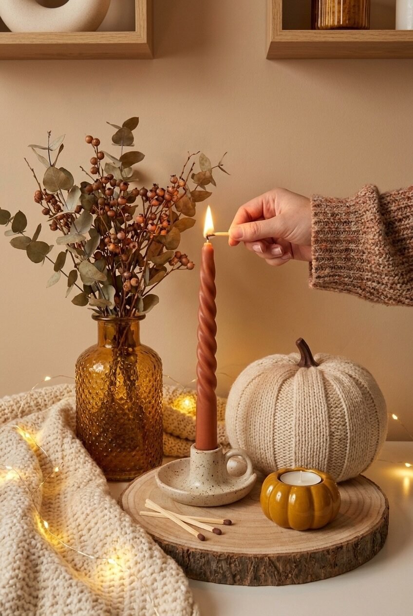
Pull out a wood slice board, a speckled ceramic candle holder, one twisted terracotta-colored taper candle, and a knitted pumpkin — and you basically have this whole vignette. What looks like a spontaneous little arrangement is actually a pretty deliberate application of the contrast principle: smooth amber glass against rough knit texture against natural wood grain. Every surface finish is different, which is what keeps the eye moving across a small setup without it feeling busy.
The amber ribbed glass vase holding eucalyptus and dried berry branches adds height to the left side, balancing the rounder, lower forms of the pumpkin and tealight holder. The fairy lights draped loosely in the foreground and a chunky knit throw pulled into frame on the left aren’t just props — they extend the warmth of the scene beyond the wood slice surface and into the surrounding space.
For recreating something like this, the wood slice board is your foundation — it defines the display boundary and gives everything a natural landing surface. Layer in height differences first (tall vase, medium candle, low tealight), then fill gaps with small organic objects like loose matches or a few extra dried stems. Resist adding more than five or six elements total; this kind of vignette loses its charm fast when it gets crowded.
Crochet Jack-O-Lantern Coasters, Actually
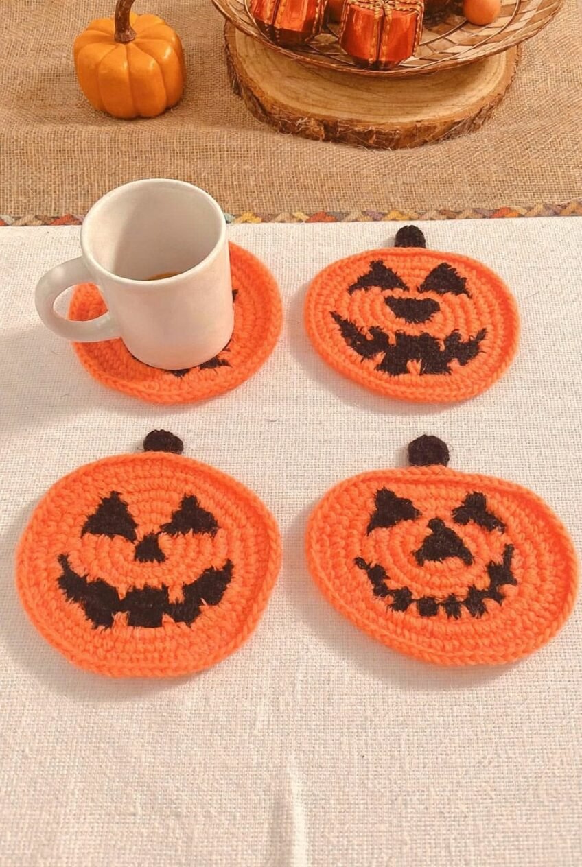
These are crocheted jack-o-lantern coasters and they are genuinely delightful — the kind of thing that sits on your coffee table and makes people smile before they’ve even sat down. Four coasters, each with a slightly different carved face worked in black yarn against orange, and a tiny stem at the top. Simple concept, strong execution.
From a design standpoint, small textiles like these are what interior designers call “functional decor” — pieces that earn their spot by doing an actual job while still contributing to the seasonal atmosphere. They don’t take up visual real estate the way a centerpiece does, but they add up. A set of four is enough to cover a coffee table arrangement and still leave room for a candle or a small tray.
If you crochet, these are a beginner-friendly project — basic circle with colorwork details — and patterns are widely available for free online. If you don’t, Etsy has an enormous supply of handmade versions in every face style imaginable. Either way, the principle is the same: small seasonal textiles are one of the lowest-effort, highest-personality things you can introduce to a shared space in fall. They wash easily, store flat, and come out again next year.
Vintage Truck Centerpiece, Glass Cloche Pairing
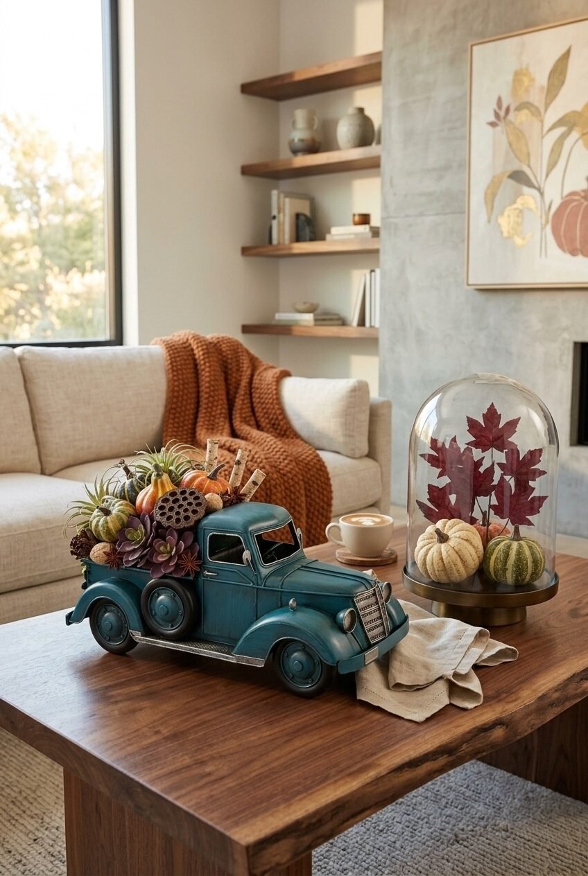
The vintage-style blue metal truck filled with miniature gourds, air plants, and dried botanicals is the kind of decor piece that sounds a little much in theory and looks completely right in practice. The teal finish creates a complementary contrast against the warm harvest tones of the pumpkins and foliage — and that contrast is exactly why it works. If the truck were orange or brown, it would just blend into the fall palette and disappear.
Paired beside it on the coffee table: a glass cloche on a brass pedestal base, enclosing a cluster of cream and green gourds with pressed red maple leaves behind them. The cloche is doing double duty here — it adds a layer of visual structure (contained vs. open arrangement) while also giving the preserved leaves a gallery-like presentation. The two pieces together create a balanced vignette with clear left-right rhythm on the table surface.
A neutral linen napkin is casually draped between them, which softens the transition and prevents the display from looking too symmetrical. In the background, a rust-orange chunky knit throw across the sofa pulls the warm tones forward without adding more objects to the table. When styling a coffee table with two focal pieces, the supporting elements — a draped cloth, a mug, a small stack — should bridge the gap rather than compete with either anchor.
Chunky Knit Pumpkins as Decor
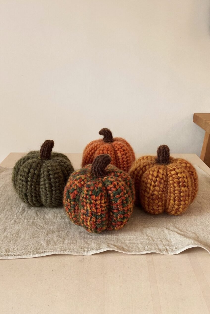
Four chunky-knit pumpkins arranged on a linen cloth — olive green, burnt orange, multicolor tweed, and golden mustard — and somehow this is more satisfying than an actual pumpkin arrangement. The textile versions hold their shape all season, don’t attract fruit flies, and look genuinely good on a coffee table, bookshelf, or mantle without needing any supporting props to make them work.
The colorway selection here is the real lesson. Rather than going all-orange, the palette spans the full harvest spectrum: muted green, warm amber, rust-and-forest tweed, deep golden yellow. Grouping them together in varied sizes creates what designers call a “collected” feeling — like these were found across different places over time rather than purchased as a matching set. That’s actually the goal: variety within a shared color family reads as more authentic than perfect uniformity.
You can knit or crochet these from chunky wool yarn using any number of free patterns online — the basic construction is a gathered circle sewn into a round form, stuffed, and gathered at the top with a small brown stem. For non-crafters, handmade versions from small makers are genuinely worth the price over mass-produced alternatives, because the yarn weight and stitch texture make a visible difference in how they read from across the room.
Fall Throw Blanket as Bedroom Anchor
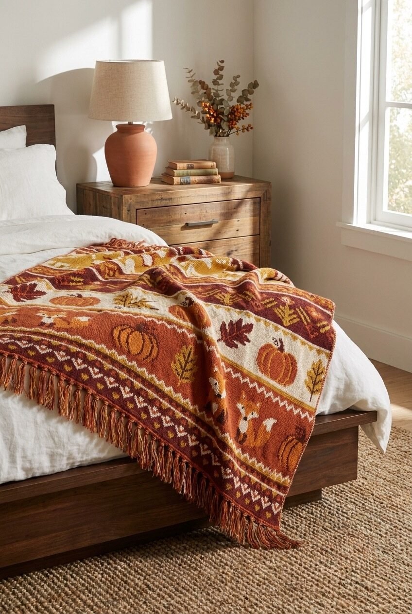
Draping a patterned throw across the foot of a bed sounds like a small thing. In this bedroom, it’s basically the entire fall decor strategy — and it works completely. The blanket carries a folk-art-style tapestry pattern in deep burgundy, rust, mustard, and cream, with motifs of pumpkins, maple leaves, foxes, and geometric border bands. It’s busy in a way that feels intentional, because it’s the only thing in the room asking for attention.
Everything else is deliberately quiet: white linen bedding, warm wood nightstand, natural jute rug, a terracotta lamp base. The neutrals give the throw a clean backdrop to land against, which is a classic high-contrast anchoring technique. If the bedding were also patterned, the throw would compete rather than pop.
On the nightstand, dried eucalyptus and berry stems in a simple cream vase add seasonal texture without introducing new colors. The principle here — one statement piece against a neutral base — is the most transferable fall decor move in this entire roundup. You don’t need to redecorate a room for fall; you need one piece that’s doing the heavy lifting while the rest of the room stays calm around it. A tapestry throw on an otherwise neutral bed is exactly that.
Rusty Wood Trees for Tabletop Styling
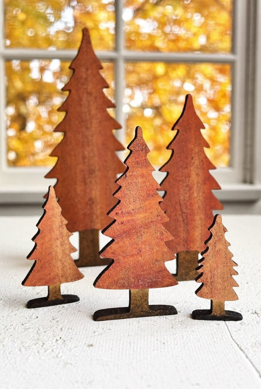
Small, flat-cut wooden Christmas tree silhouettes stained a deep rust-orange, arranged in a cluster of varying heights on a windowsill — with fall foliage blurring golden in the background. The setup is minimal in the best way: no tray, no props, just the trees at different scales creating depth through simple height variation.
What makes this genuinely interesting is that these aren’t typically positioned as fall decor — they’re usually considered Christmas pieces. But in rust or amber stain, against an autumn window backdrop, they read completely differently. It’s a good reminder that the season a piece is “meant for” is often just a matter of context and color.
If you’re into DIY, these can be cut from thin plywood or MDF on a scroll saw or laser cutter, then stained with a warm walnut or mahogany finish. Pre-made versions are available through craft suppliers and Etsy in several sizes. The arrangement principle — group objects in odd numbers and vary the heights — applies here exactly as it would for any tablescape, and it’s what separates a cluster that feels designed from one that just looks like things were put down somewhere.
Gingham Bedding and Autumn Tray Styling
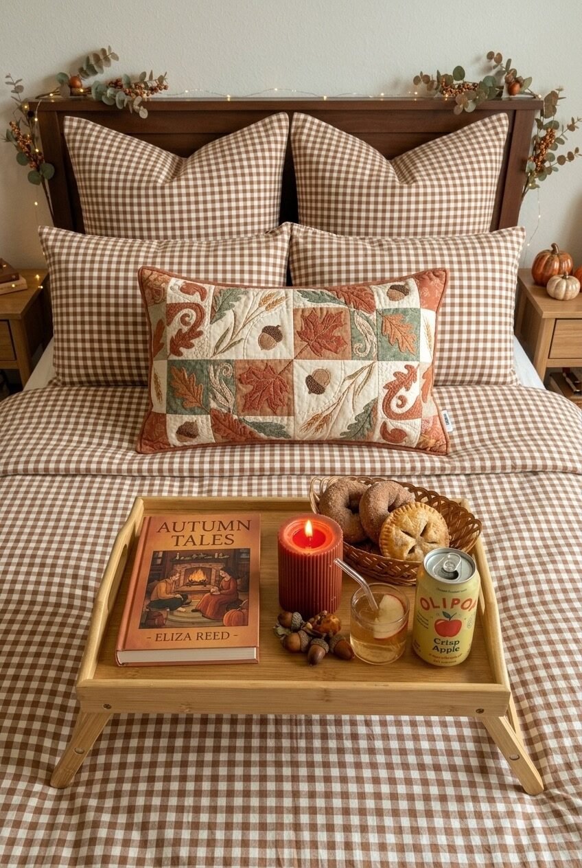
Brown and cream gingham bedding might be the most underrated fall bedroom move. It hits that country-cottage register without going full farmhouse, and it pairs naturally with basically every autumn accent color — rust, mustard, sage, cream. The bed here uses it for both the duvet cover and euro shams, then layers a single embroidered lumbar pillow in a patchwork leaf-and-acorn design across the front. Pattern mixing done simply: one geometric base, one nature motif accent.
The bed tray in the center is styling, not just staging. A burnt-orange ribbed pillar candle, a few scattered acorns, a fall-themed hardcover book, a small basket of pastries, a glass of something sparkling — it’s a scene that communicates how a fall bedroom is actually used, not just how it looks in a photo. That lived-in quality is much harder to fake than people think, and the key is using real objects rather than props.
Along the headboard, a string of fairy lights and dried eucalyptus garland add warmth without requiring any hardware installation — just tuck the garland between the headboard slats and let the lights run across loosely. Small orange pumpkins on each nightstand complete the corners. The gingham-plus-one-statement-pillow formula is genuinely replicable at almost any budget, and it photographs well enough to make the whole bedroom feel intentionally styled for the season.
Fall Decor Works Best When It Feels Lived In
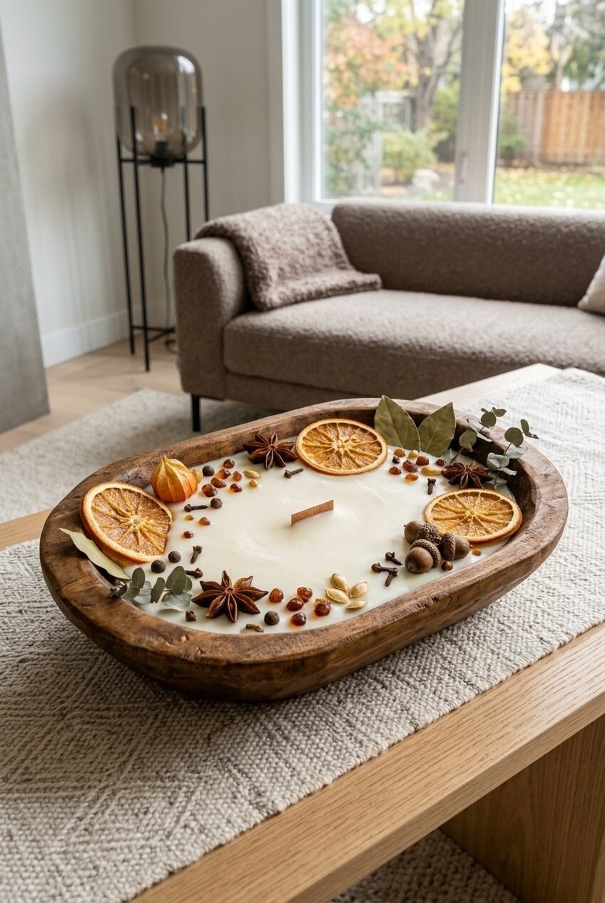
The setups that actually nail fall decor all share one thing: they look like someone lives there and just happens to love this time of year. Not like a store display, not like a Pinterest board come to life — just a home that’s been leaned into seasonally with some genuine care. That’s a harder thing to manufacture than it sounds.
The good news is that most of what makes fall decor work isn’t expensive. It’s a tray with a few well-chosen objects. A throw blanket in the right colorway. A doormat that makes you smile every time you come home. Textile pumpkins that don’t rot. Small things that add up to a space that feels genuinely warm for the season.
Pick one or two setups from above that fit your actual home — your existing furniture, your palette, the spaces you actually use. Fall decor has the best shot of feeling right when it belongs to the room it’s in, rather than being dropped into it from somewhere else entirely.
 Steal Our Home Styling Secrets!