
Fall Living Room Decor Ideas That Actually Hold Up Past October
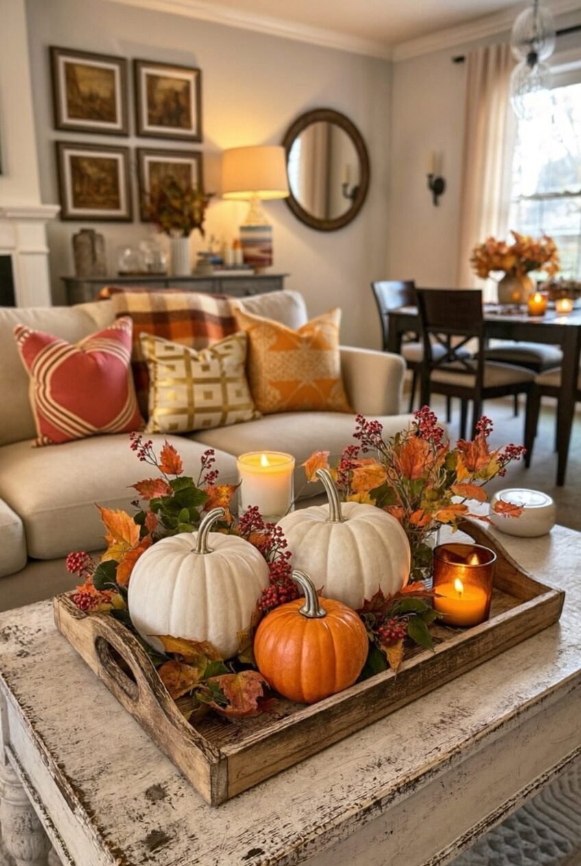
There’s a specific moment every September when the light changes and beige throw pillows suddenly feel wrong. We don’t think that instinct needs justifying. Fall decorating isn’t about going full pumpkin patch overnight, it’s about letting a few materials and colors do the talking while everything else stays exactly as it was.
The living rooms ahead range from quiet and tonal to loud and velvet-everything, and that’s sort of the point. Some people want a room that whispers autumn through one pumpkin balanced on a stack of books. Others want string lights, plaid, and a TV playing a fall movie like it’s a fourth wall. Both approaches work.
What ties these spaces together isn’t a single formula, it’s restraint applied unevenly and on purpose. We’ll walk through what’s actually doing the work in each room, the textures, the color logic, the small props that earn their spot.
Let the Mantel Carry the Room
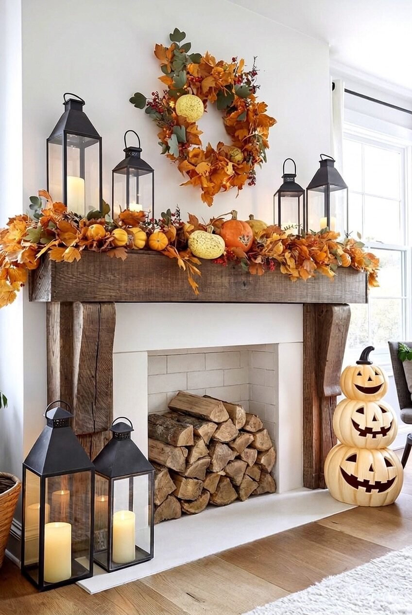
Most people treat a fireplace mantel as an afterthought, one candle, maybe a photo frame, when it could be doing so much more. Here, the wood mantel gets layered front to back: a wreath hung at eye level, a garland of leaves and mini pumpkins running the length of the shelf, then lanterns flanking either side at different heights. That layering is what reads as full without reading as cluttered, since everything sits on one plane instead of competing for attention.
The lanterns matter more than they get credit for. Black metal frames with candles inside add height and visual weight, which keeps the softer leaf garland from floating off into nothing. If your mantel currently holds one candle, this is your sign to add a second tier of height first.
For the stacked jack-o-lanterns on the floor, you don’t need to carve anything. Faux stacking pumpkins in graduated sizes do the same job and survive well past October. The real lesson here is proportion: tall lanterns, a wide garland, and one vertical floor piece anchoring the corner.
Warm Light Beats Warm Color
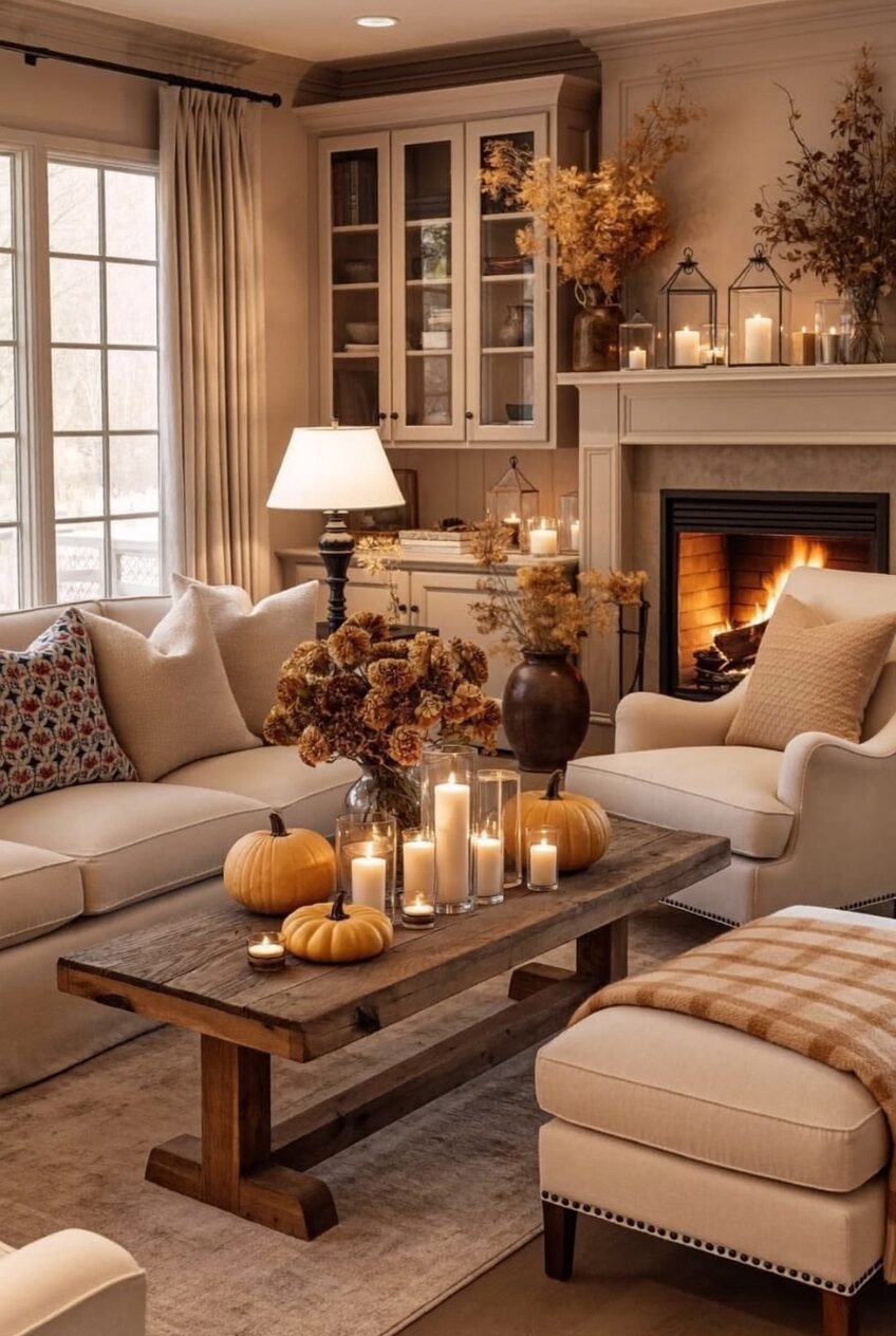
Notice how little actual orange shows up in this room, and how warm it still feels. A lit fireplace, a fabric-shaded lamp, and a cluster of pillar candles at different heights on the coffee table create three separate light sources at three separate eye levels, which is the real trick behind a room that photographs cozy and actually feels it too.
Dried florals in muted gold and rust sit in simple vases rather than anything ornate, because a neutral palette this heavy on beige and cream needs texture more than it needs added color. Mini pumpkins get scattered loosely across the table rather than lined up, which keeps the styling from reading as staged.
If you’re recreating this on a budget, skip buying new candles entirely. Just consolidate what you already own onto one tray or board. Grouping does most of the visual work on its own. Add a vase of dried stems and a couple of small pumpkins, and you’re most of the way there.
Boho and Mid-Century Without the Clash
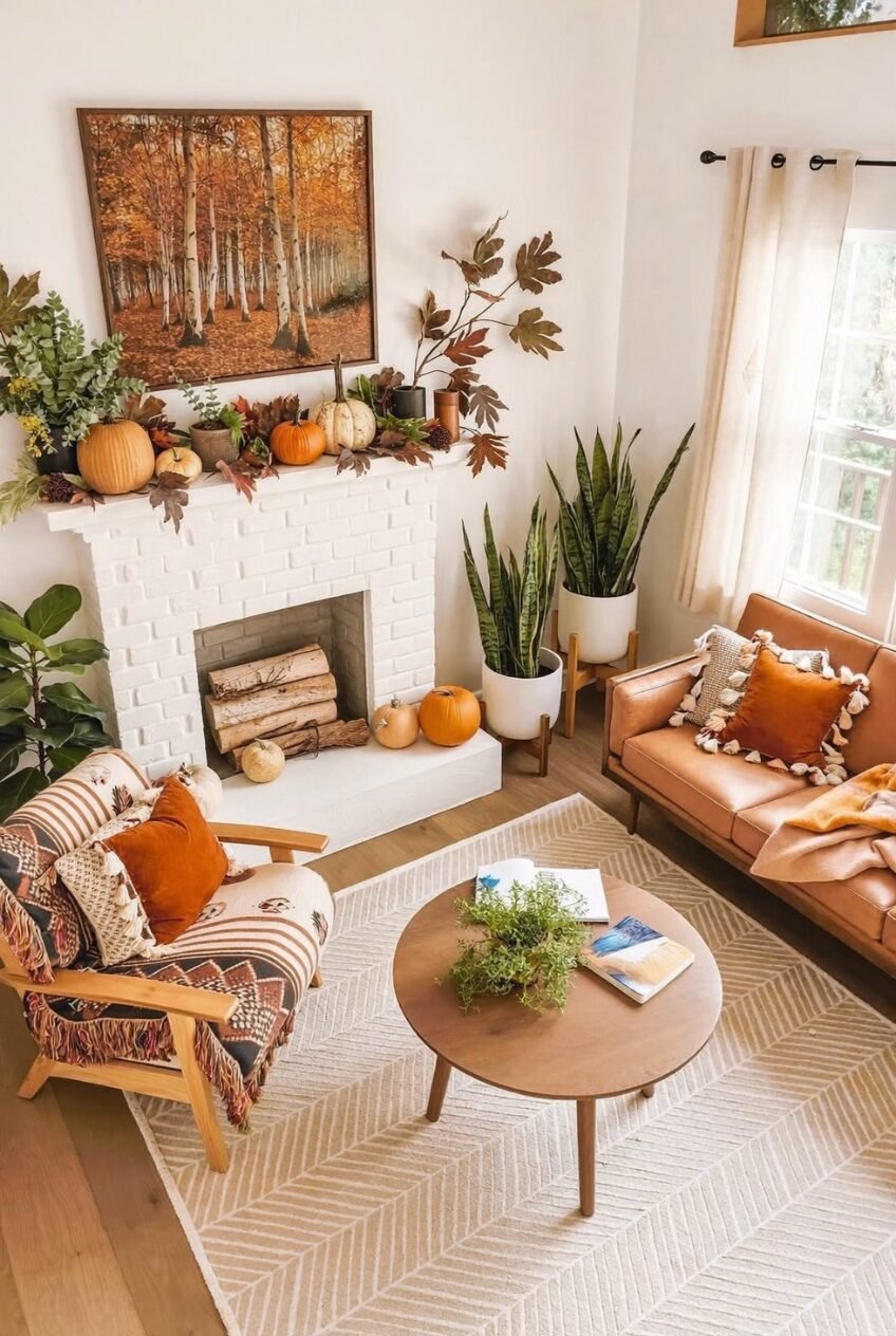
This room shouldn’t work on paper. A leather sofa, a woven striped armchair, snake plants on wooden stands, and a forest landscape painting are pulling from at least three different design vocabularies, and somehow it reads as one cohesive space. The connector is wood tone, not a matching pattern. Every piece of furniture, the chair frame, the coffee table, the plant stands, lands in roughly the same warm honey shade, so your eye treats them as a family even though the patterns don’t match at all.
White-painted brick on the fireplace does a quiet job too, giving the eye somewhere plain to rest between the busier textiles and the leafy wall art. Without that pause, a room layered this densely would start to feel chaotic instead of collected.
To borrow this approach, pick one wood tone and commit to it across every furniture piece you buy this season. Layer in pattern through pillows and throws, not through the furniture itself. Add a single oversized leaf branch in a vase and a couple of plain pumpkins on the hearth, and the boho-meets-midcentury mix takes care of itself.
When Fall and Halloween Share Space
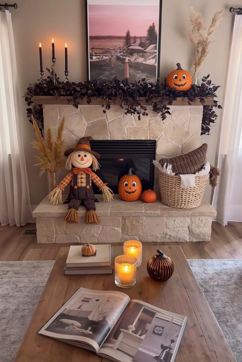
There’s an unspoken rule that fall decor and Halloween decor live in separate seasons, and this room quietly breaks it. Dark, almost black foliage garland runs along the stone mantel right next to a grinning scarecrow and a couple of cheerful jack-o-lanterns, and the combination feels moodier than either theme alone, not messier. Black taper candlesticks reinforce the darker half, while the orange pumpkins and a basket of plaid blankets keep the whole arrangement from tipping fully into spooky territory.
Stone as a mantel material is doing more than people realize. Its texture is busy enough on its own that the styling on top of it can stay relatively sparse, just a few pieces spaced out rather than crowded together. A smooth painted mantel usually needs more layering to look finished; a stone one doesn’t.
For a version of this in your own space, pick one warm-toned theme and one darker, moodier one, then let them share a surface instead of separate rooms. A basket of cozy textiles at one end balances out the darker garland at the other, so the whole look stays inviting rather than eerie.
Built-In Storage Can Be the Decoration
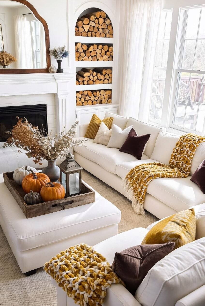
Firewood doesn’t usually get to be the main event, but stacked into an arched, built-in niche, it basically becomes art. The curve of the alcove softens what would otherwise be a very utilitarian pile of logs, and the warm wood tone reads as deliberate texture against the bright white walls and trim surrounding it. You’re not hiding the firewood storage here, you’re letting it be the focal point next to the fireplace.
Everything else in the room stays purposefully muted to let that happen. A white sectional, cream curtains, and a mostly neutral rug all step back so the gold and burgundy pillows and the honey-colored throw can carry the seasonal color without overwhelming the space. Even the pumpkins on the ottoman tray lean toward gray and white rather than classic orange, matching the room’s restrained palette.
If your own fireplace setup has any kind of open shelving or niche nearby, consider stacking firewood there instead of tucking it out of sight. Pair it with two or three jewel-toned pillows in mustard or wine, and you’ve got the same effect without needing built-in architecture to match exactly.
Go Loud With Color on Purpose
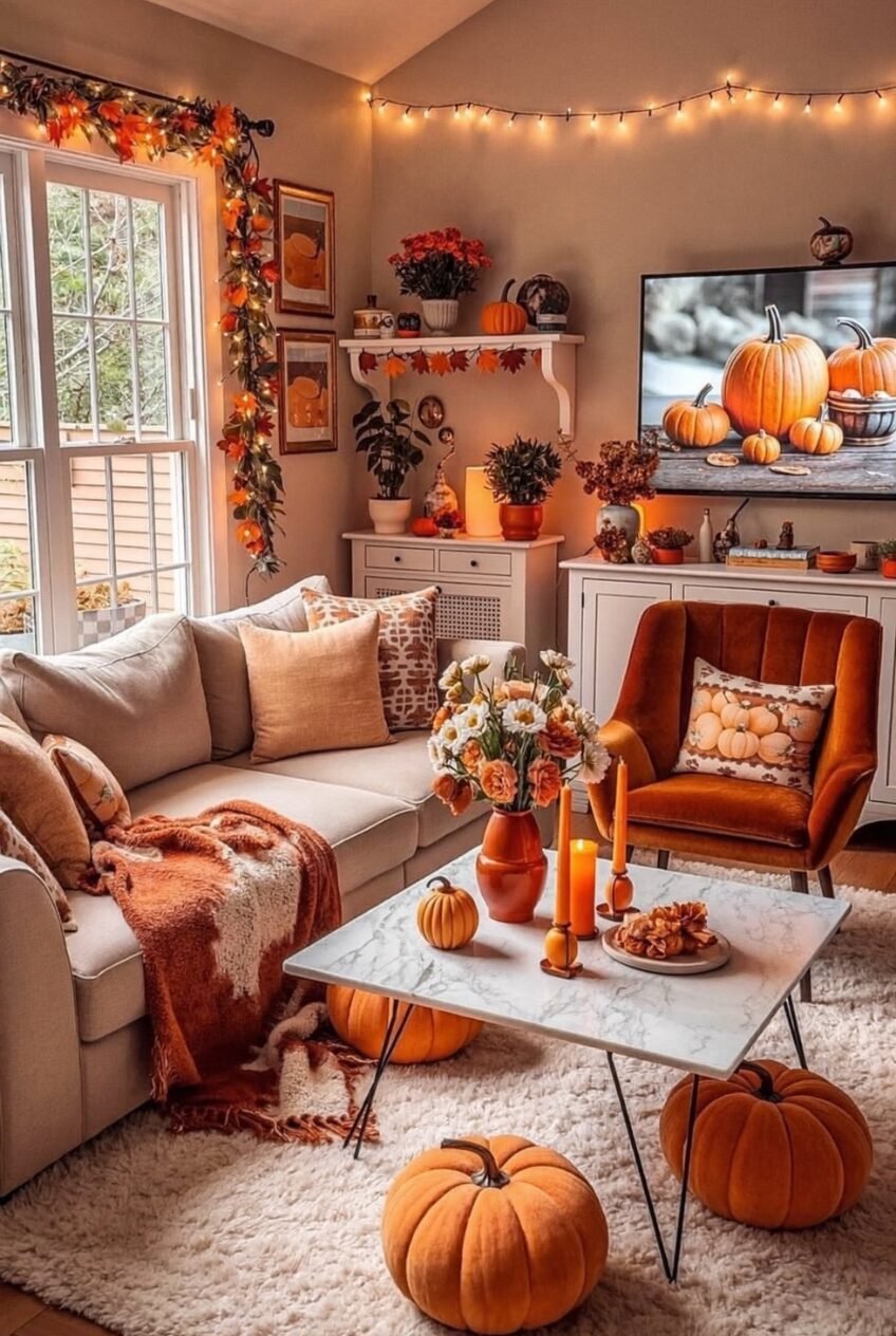
Maximalism gets a bad reputation in decor circles, but a room like this makes the case for it. Rust velvet, burnt orange, mustard, and warm wood stack on top of each other with zero apology, string lights line the window, and a TV displays a pumpkin still life that practically matches the throw pillows nearby. It would be easy to call this too much. It isn’t, because every element pulls from the same narrow color family instead of fighting each other.
That’s the whole trick to going bold without it reading as chaotic: pick a tight palette, rust, orange, and gold here, and let every single piece, the velvet chair, the candles, the florals, stay inside that range. Variety comes from texture and shape instead of competing colors.
Starting small works if this feels like a lot. Add one velvet accent chair in a saturated fall tone, then build out with candles and a throw in the same family before introducing anything patterned. String lights are optional but add a soft glow regular lamps don’t quite replicate.
One Statement Branch, Neutral Everything Else
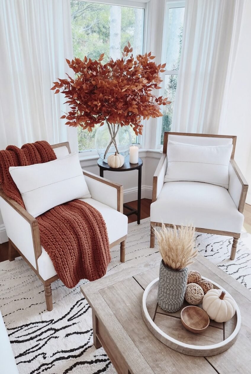
Sometimes the entire seasonal update is one object. These two matching linen armchairs and their wood frames stay completely neutral, and the only real nod to autumn is a single oversized arrangement of rust-colored branches in a clear glass vase by the window. It’s a noticeably restrained move compared to some of the more layered rooms in this roundup, and it works precisely because it doesn’t try to do everything at once.
The rust knit throw draped over one chair picks up the same color from the branches, which is the only repetition needed to make the styling feel deliberate rather than random. A patterned rug in black and white adds contrast without adding more color, keeping the whole vignette from feeling one-note despite the limited palette.
This is the easiest idea on this list to recreate, honestly. Buy one substantial faux branch arrangement in a fall tone, put it somewhere with good natural light, and add a single throw in a matching shade. You don’t need to touch anything else in the room.
Build a Corner for Watching TV
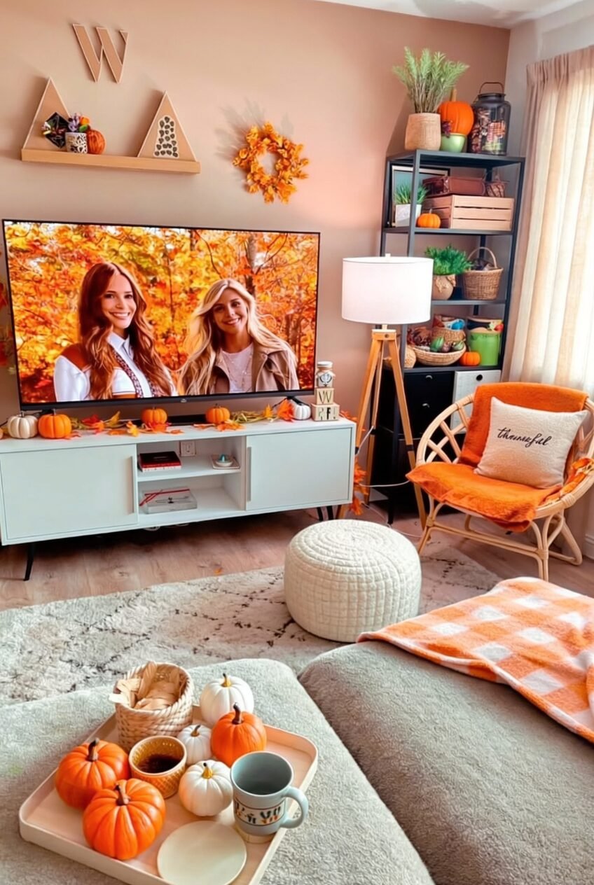
This is less of a styling lesson and more of a layout one. The whole corner is built around comfort first: a low woven chair, a soft pouf, layered rugs, and a tray of pumpkins and a mug set up at exactly the right height from the sofa. The decor, the orange throw, the pumpkin garland on the console, the wreath on the shelf, is secondary to the function, which is having a genuinely comfortable spot to sit and watch something.
Color-wise, the room leans into a warm pink-orange wall that most fall decor would clash against, but here it enhances the rust and cream tones nearby rather than competing with them. That’s worth remembering if your own walls aren’t neutral: work with the undertone you already have instead of assuming you need beige first.
To recreate the comfort factor, prioritize a floor pouf or low ottoman within arm’s reach of your seating, plus a tray that can hold a drink and a couple of small props. The seasonal decor is the easy part. Getting the layout this livable is the actual achievement.
Gradient Pillows Anchor This Whole Sofa
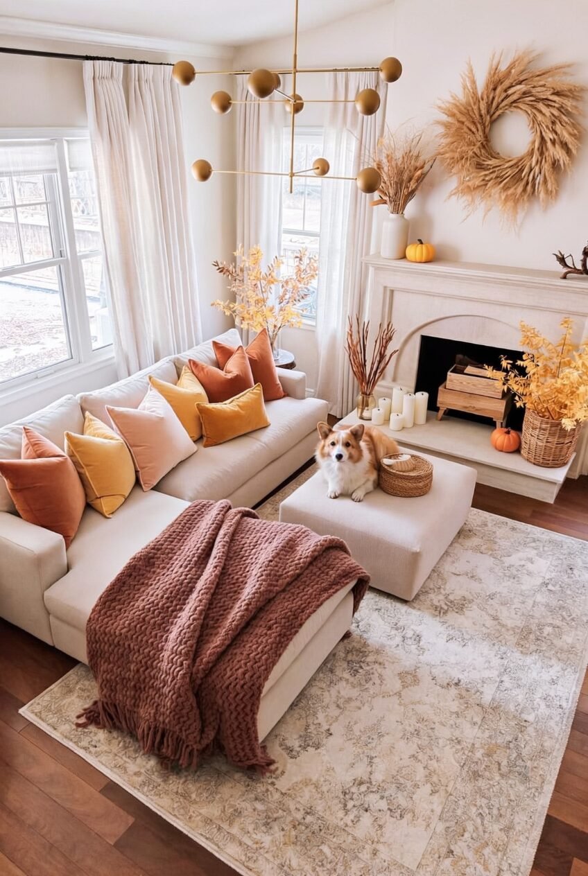
Gradient pillow arrangements are having a moment, and this sectional shows exactly why they work. Burnt orange, mustard, blush, and a soft pink move across the cushions in a loose ombre rather than a strict pattern, which keeps a fairly large color range from looking mismatched. A single rust-colored knit throw at the other end of the sofa pulls the warmest tone back toward the floor, tying the whole arrangement together.
A pampas wreath on the mantel and dried branches in simple vases keep the rest of the room textural rather than colorful, which matters because the pillows are already doing plenty of color work on their own. Adding more saturated pieces elsewhere would have competed with them instead of supporting them.
If gradient pillows feel intimidating to shop for, buy them within one velvet or cotton family so the textures match even as the shades shift. Start with three tones minimum to get the ombre effect; two just looks like mismatched throw pillows instead of a deliberate gradient.
Heirloom Pumpkins Make Everything Feel Older
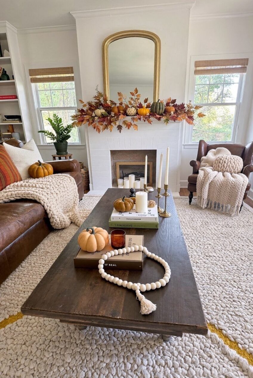
Warty, oddly-shaped heirloom pumpkins in muted greens and grays do something a smooth orange pumpkin can’t: they make a room feel collected over time rather than shopped for last weekend. Scattered along this mantel garland between dried leaves and stems, they add visual texture that reads as more sophisticated, without us needing to use that word, than the standard pumpkin lineup most people default to.
A wood bead garland with a tassel and a stack of well-worn hardcover books on the coffee table reinforce that same feeling, like the room has existed for a while rather than being freshly staged. The leather sofa helps too. Leather only looks better with time and use, which fits the broader theme of objects that feel earned rather than brand new.
For the easiest version of this idea, swap your usual smooth pumpkins for the bumpy heirloom varieties in muted colors, and resist the urge to buy them all the same size. A little visual irregularity is exactly the point here, not a flaw to fix.
Pick Two of These Ideas and Actually Commit to Them
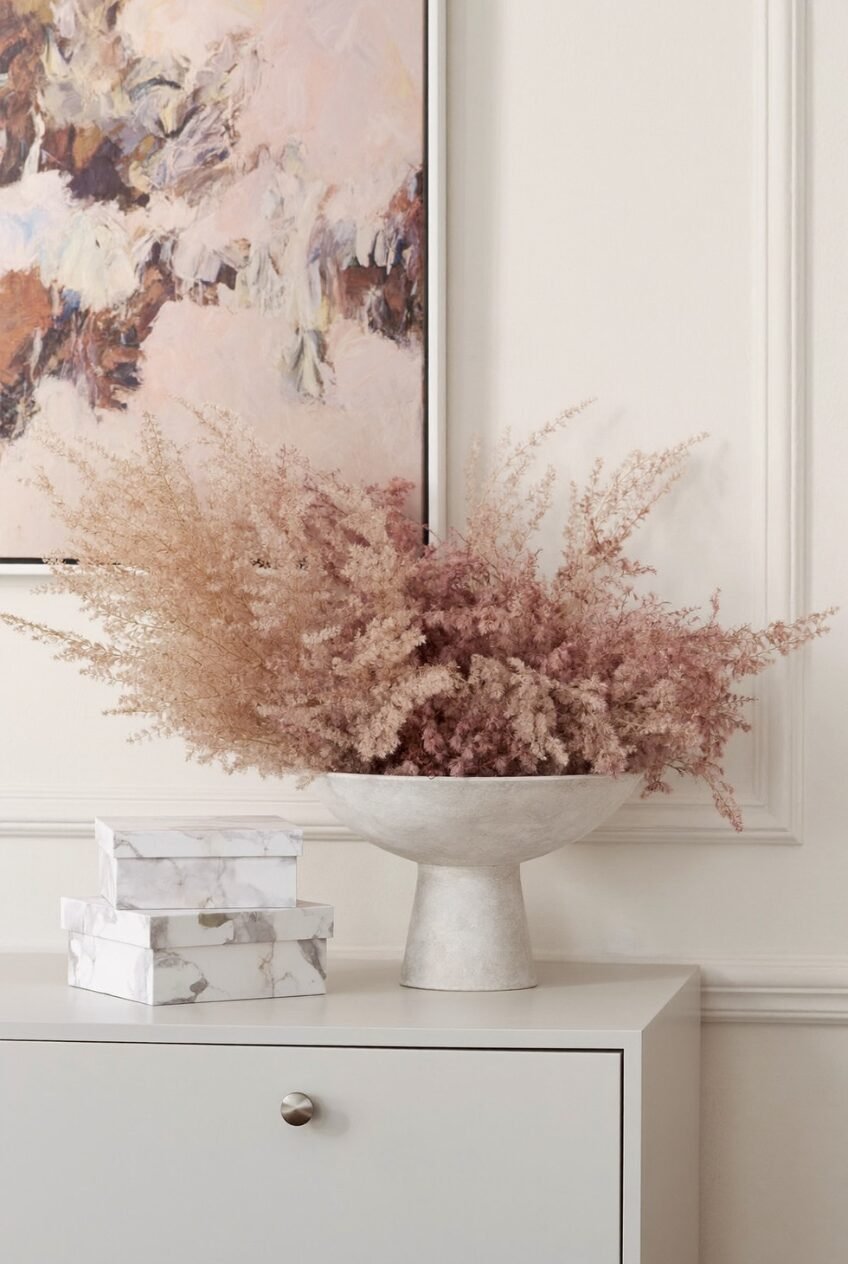
If there’s one thing worth taking from these ten rooms, it’s that none of them are doing everything at once. The maximalist orange living room commits hard to one color family. The pair of linen chairs commits to a single branch arrangement and nothing else. Restraint and boldness both work, but only with some intention behind them.
We’d rather you pick two ideas and actually execute them well than cram a mantel garland, a gradient pillow set, and heirloom pumpkins into one weekend. Pick the mood you’re drawn to, moody and stone-textured, bright and maximalist, quiet and branch-led, and build from there. The rooms that feel most finished here have a clear point of view, not the most stuff.
Fall decor is temporary by nature, and that’s freeing. Try the heirloom pumpkins this year, try the velvet route next year. The season changes again soon enough anyway.

 Steal Our Home Styling Secrets!