
That Warm Hug Feeling Certain Nancy Meyers Dining Rooms Manage To Pull Off
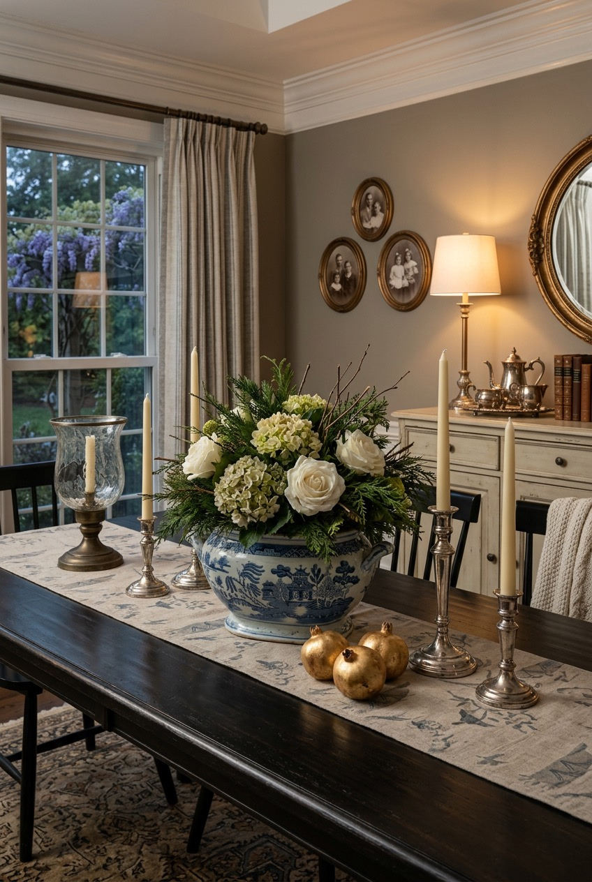
Some dining rooms have a pull to them. You walk in and everything, the light, the wood tones, the flowers sitting a little too big for their vase, feels gathered rather than staged. That kind of room does not happen by accident, even when it looks like it did.
What ties these rooms together is not a single paint color or a shopping list. It is a set of habits: oversized lighting, natural texture layered three or four times over, pattern used with restraint, and tables set like someone is actually expected for dinner.
We pulled apart what is actually happening in each space, the choices that make a room feel warm instead of staged, generous instead of fussy, so you can borrow whatever fits your own house.
Texture Does More Work Than Color
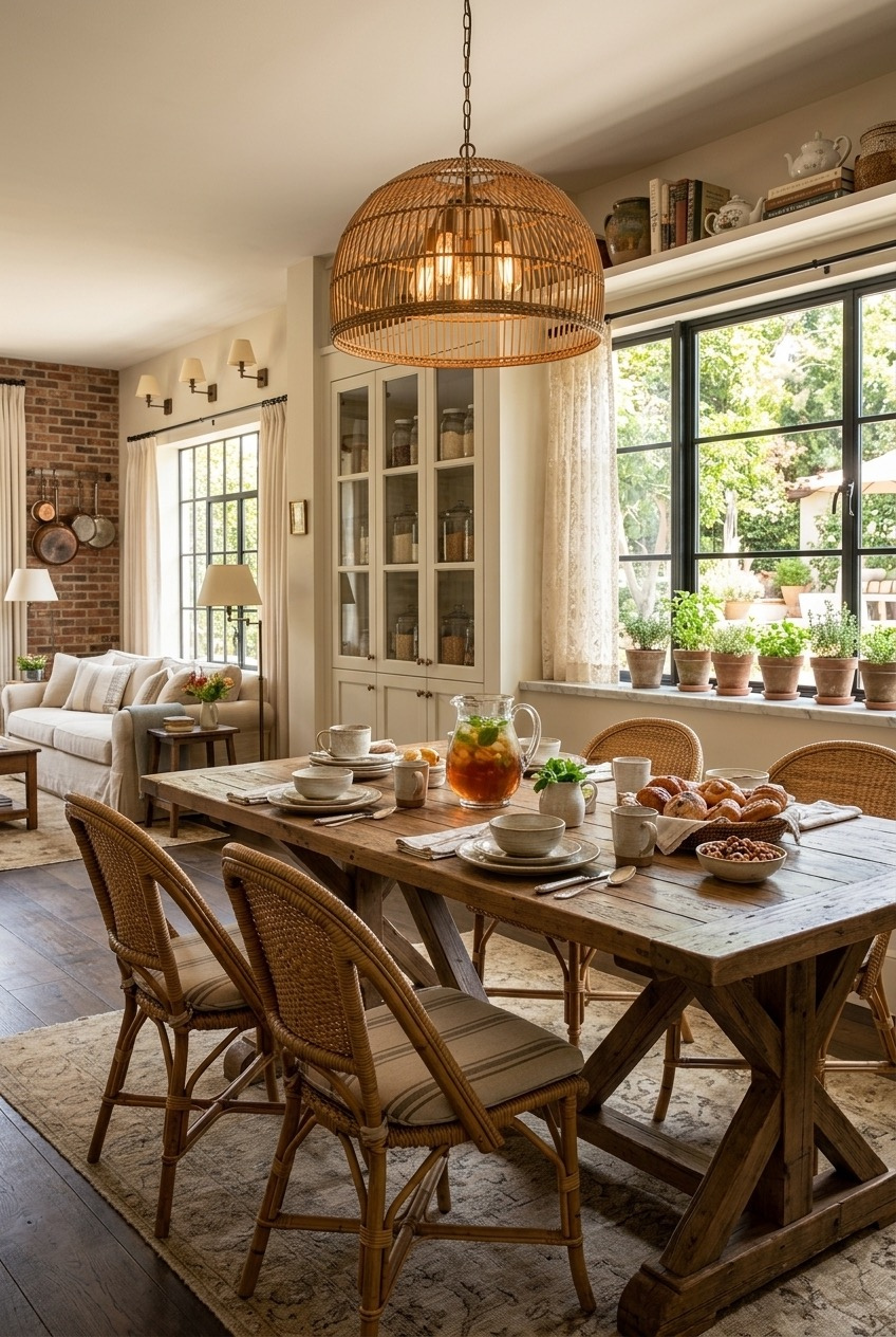
Nothing in this room technically matches, and that is exactly the point. A woven dome pendant hangs over a reclaimed wood table, glass-front cabinetry sits against exposed brick, and wicker bistro chairs pull up to it all without a single fabric print in sight anywhere in the room. The warmth comes from material choices, not paint choices.
That is a principle worth stealing even if your own kitchen has none of these specific pieces sitting around. Wood, rattan, brick, and glass all catch and bounce light a little differently from each other, and a room stacked with several natural textures ends up reading as warm regardless of what color happens to be on the walls behind it.
If you are working with an all-white or all-neutral kitchen right now, this is a good place to start. Swap one hard-edged light fixture for something woven or textural, leave a cabinet or two glass-front instead of fully solid, and resist the urge to fill every remaining gap with more color. Texture, more than anything, will do the heavy lifting.
Painting Everything One Color Actually Works
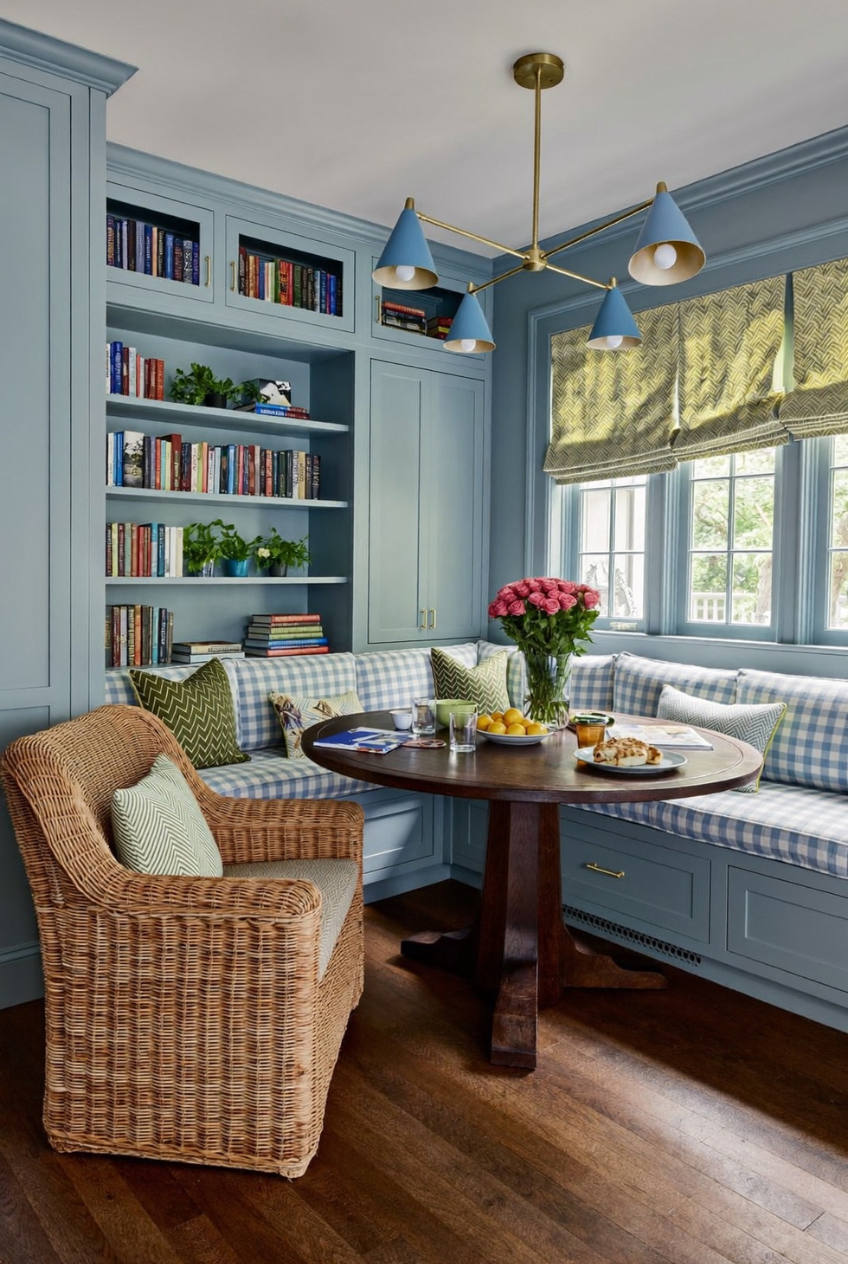
Walls, trim, and floor-to-ceiling cabinetry, all painted one dusty blue, all in the same finish. It sounds like it should feel flat and a little dull, but it does the opposite: the color recedes into the background and lets the gingham cushions, the brass light fixtures, and the stack of books on the open shelf become the actual focal points of the room.
This is what people mean when they talk about drenching a room in a single color from top to bottom. The trick is picking a shade that is neither too dark nor too pale, something with enough gray mixed into it to feel calm rather than childish, and then applying that same shade everywhere, walls, trim, and built-ins alike.
Keep the pattern limited to one place if you try this in your own home. Here, that place is the cushions. Everything else, the shelving, the walls, the trim, stays solid, so the room has an actual resting point for your eyes instead of several competing patterns fighting for attention at once.
Soft Shapes Change The Whole Room
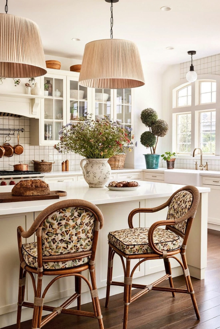
An all-white kitchen with hard countertops, tile backsplash, and glass-front cabinetry could easily tip into feeling clinical. Two pleated linen pendant shades hanging over the island stop that from happening. Their soft, gathered shape breaks up all the straight lines sitting below them, and the fabric catches and softens light in a way that a glass or metal fixture never really manages.
The floral cushions on the rattan counter stools are doing similar work, just at a smaller scale. Neither choice on its own is particularly loud, but together they keep a very white, very clean kitchen from tipping into sterile territory, and the copper pots hanging near the stove add one more warm, worn-in note to the whole space.
You do not need a renovation to borrow any of this. Swap a hard-lined pendant for a fabric or pleated shade over an island, and choose a printed cushion for your stools instead of a plain solid one. Both changes are reversible later, which makes them a fairly low-risk way to soften an otherwise hard-surfaced kitchen.
Function Comes Before The Decoration
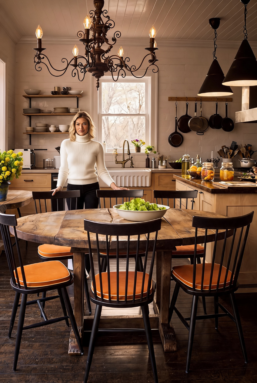
This is a kitchen clearly built to be used every single day, and it shows in the choices made throughout it. Spindle-back chairs wear leather cushions instead of linen because leather wipes clean in seconds. The dishware sits out on open shelving instead of tucked behind glass because it gets pulled down constantly. Nothing here is precious for the sake of being precious.
Even the lighting is practical in its own quiet way. A substantial wrought iron chandelier reads as decorative at first glance, but its scale and dark finish also mean it will not show fingerprints, smoke, or cooking splatter the way a pale, delicate fixture would in a room that gets this much daily use.
For a kitchen table your household actually gathers at every night, this is the model worth copying. Choose durable, wipeable upholstery over anything delicate, keep everyday dishware within arm’s reach rather than tucked behind cabinet doors, and pick fixtures dark enough to hide daily wear instead of showing off every mark.
Go Bigger On The Lighting
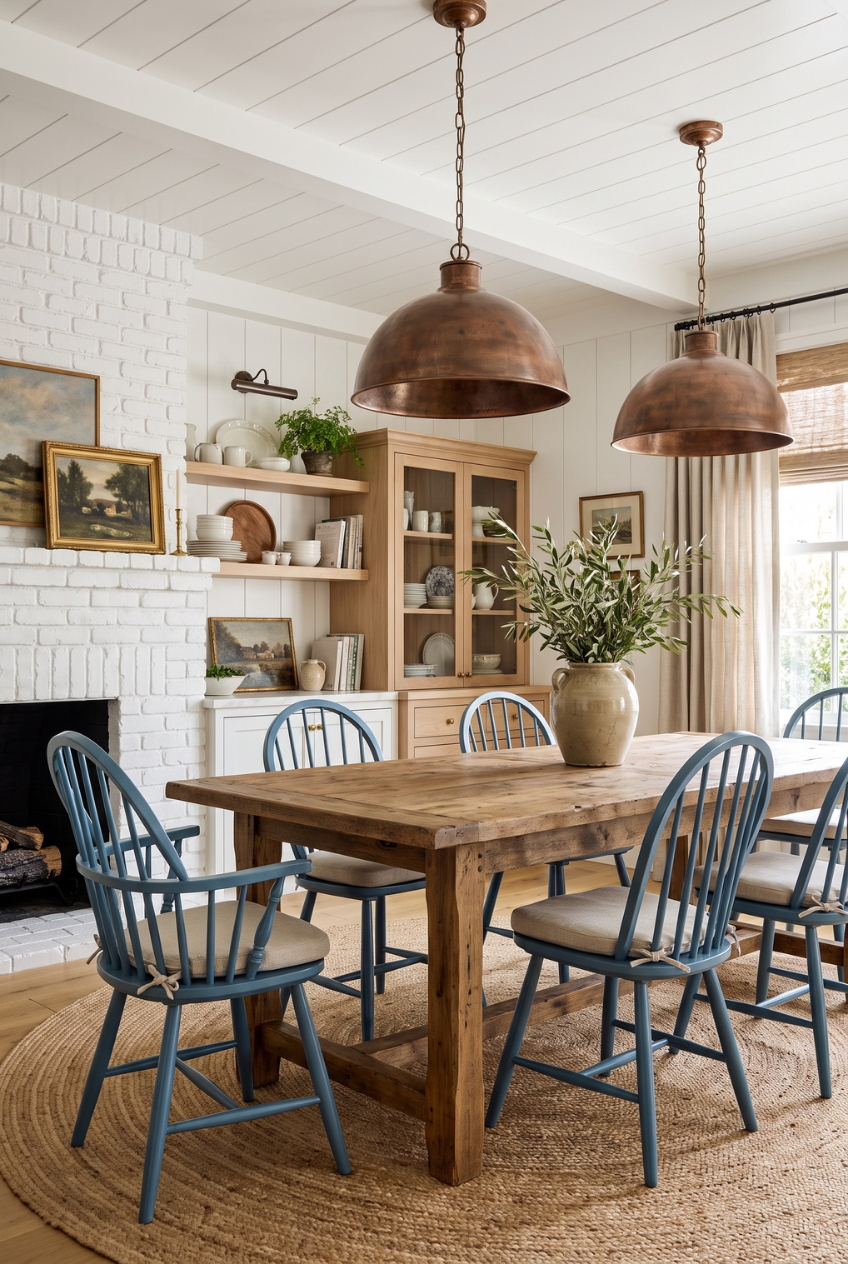
Two dome pendants hang low over this farm table, and they are large, noticeably larger than most people would default to on their own. That is deliberate. A pendant sized to the table rather than to the ceiling height becomes the anchor of the whole room, and undersized fixtures are one of the most common, most overlooked reasons a dining room ends up feeling unfinished.
The art in the room follows a similar logic without actually matching it. Paintings lean against the mantel and the shelf edges instead of hanging in a straight, even row, which reads as collected over years rather than installed all at once in a single afternoon.
If your own dining room feels a little flat, check the lighting first, before you touch anything else. A pendant should measure roughly a third to half the width of your table, not a third of your ceiling height. And when you hang or place art, let a piece or two lean instead of forcing every single frame into a perfect grid.
Small Nooks Need Bigger Textiles
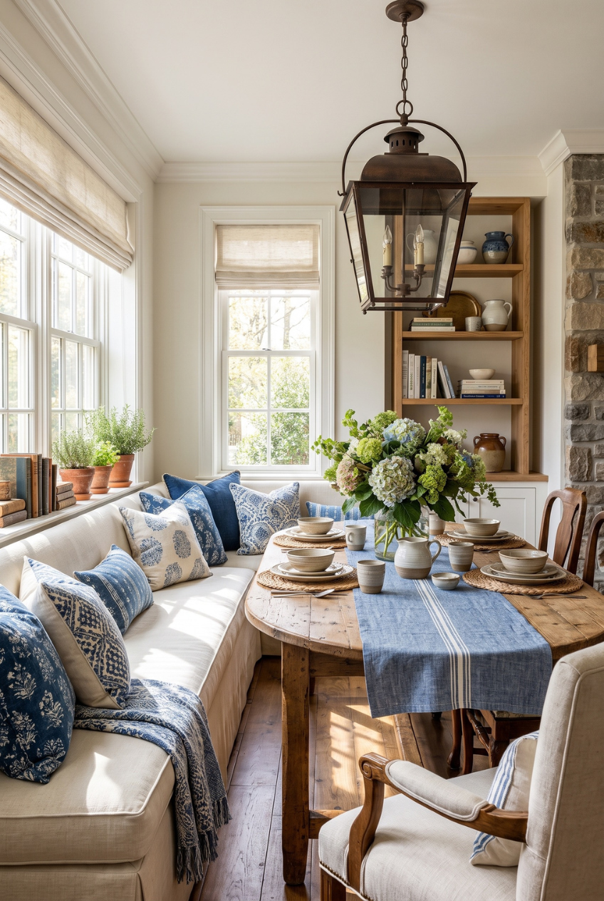
A built-in banquette is already the right move for a tight dining footprint, since it seats more people per square foot than a set of individual chairs ever will. But the pillows are really what keep this corner from feeling like a plain, forgettable bench. Indigo block prints, layered two and three deep, give the eye plenty to look at in a space that has very little floor area to work with otherwise.
Notice that every pattern in this nook stays within one narrow color family instead of pulling from several. Mixing prints gets riskier the smaller the room gets, since there is nowhere for a clashing pattern to hide once it goes wrong.
A lantern-style pendant, hung low and kept slim, finishes the look without crowding a lower ceiling above it. If you are furnishing a breakfast nook or window seat of your own, lean into an L-shaped bench for seating capacity, keep pillow patterns within one palette, and choose a narrower fixture over a wide, bulky one.
Let The Room Be Symmetrical
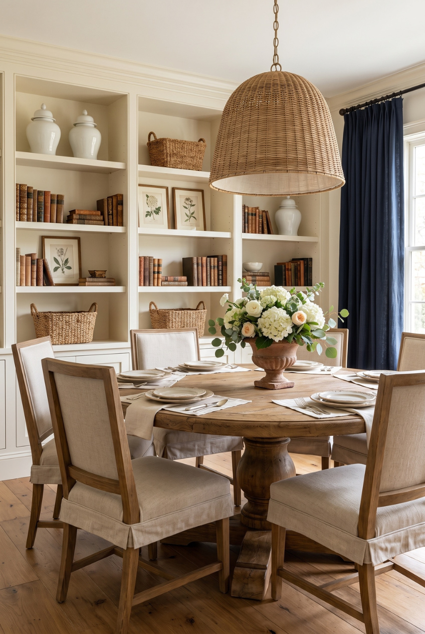
Built-in shelving flanks this dining area in perfectly even columns on either side, stacked with books, ginger jars, and woven baskets in a rhythm that repeats from one side of the room to the other. That symmetry is what allows everything else in the room, the round table, the slipcovered chairs, the oversized pendant, to feel relaxed rather than sparse or underfurnished.
A round table set against a symmetrical backdrop like this one is a genuinely smart pairing. The straight lines of the shelving give the architecture its structure, while the curved table softens that structure, so the finished room does not read as too formal or too rigid in either direction.
When you style built-in shelves like these, group objects in odd numbers, threes tend to work particularly well, and repeat that same grouping across each section rather than treating every shelf as its own separate project. Consistency across the shelving is what reads as planned design instead of random, accumulated storage.
Pattern Immersion Beats Pattern Restraint
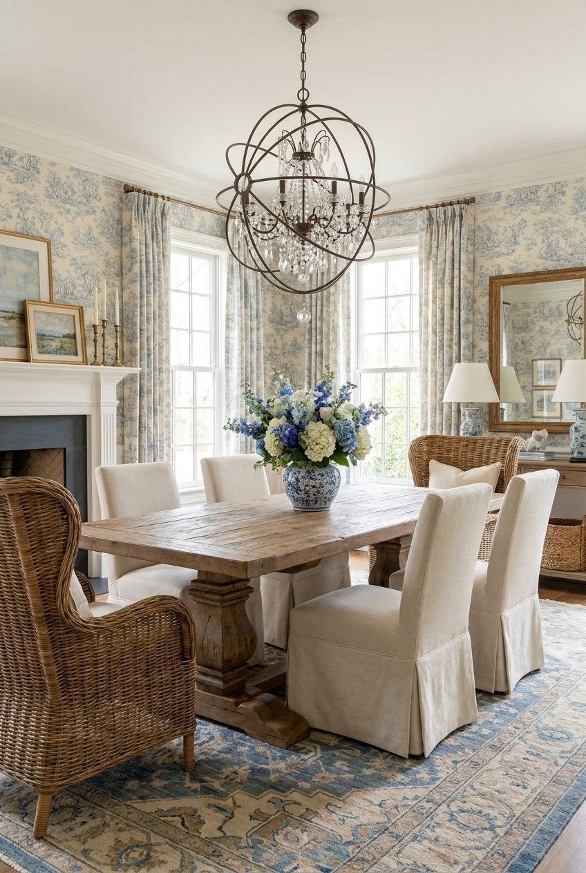
Matching the wallpaper to the curtains, in the exact same toile print, is a bolder move than most people would ever attempt on their own, and it works precisely because there is no competing pattern left to fight it. The eye stops trying to separate one print from another and simply reads the whole room as one continuous, calm backdrop instead.
A crystal orb chandelier keeps the room from tipping too far into country territory despite all that pattern. Its metal and glass introduce enough shine that the space still feels a little formal, even with a fully patterned wallpaper wrapping around three of the four walls.
One wicker wingback chair, mixed in among the fully upholstered dining chairs, prevents the whole seating set from feeling too matched or too showroom-perfect. If a full-pattern room appeals to you, commit to a single print across both wallpaper and drapery, add one metallic light fixture for contrast, and break up an otherwise uniform chair set with a different material somewhere.
Dining Rooms Do Not Need Walls
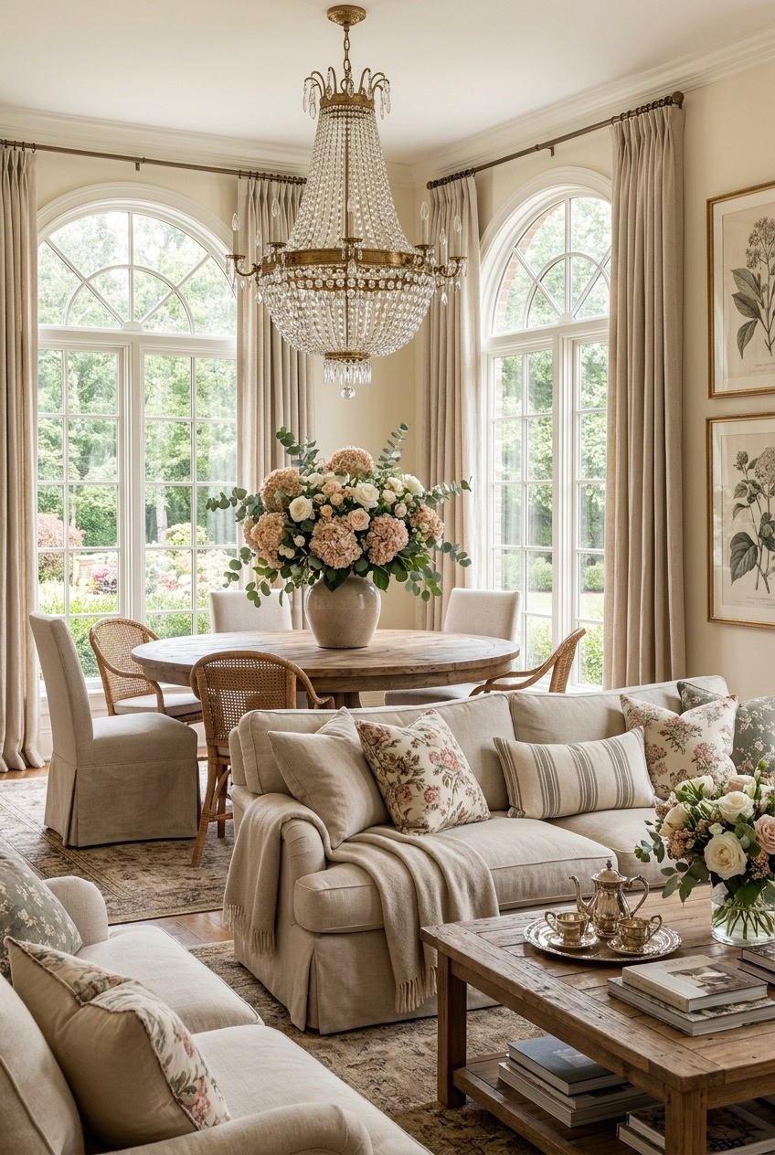
There is no hard line here between where the sofa area ends and the dining table begins. Arched windows and the exact same neutral wall color wrap around both zones, which is why cane dining chairs and a slipcovered sofa can sit twenty feet apart from each other and still feel like they belong to one continuous room.
Floral chintz pillows on the sofa quietly echo the flowers sitting on the dining table nearby, a small repetition that ties the two different functions together without anyone really noticing it happening on a conscious level.
An arrangement like this depends almost entirely on that kind of consistency to hold together. Keep your wall color, curtain fabric, and flooring identical across an open dining and living area, then repeat one pattern or color across both zones, on a pillow here, a vase there, so the eye reads the whole footprint as a single space rather than two separate rooms pushed together.
Small Details Finish The Table
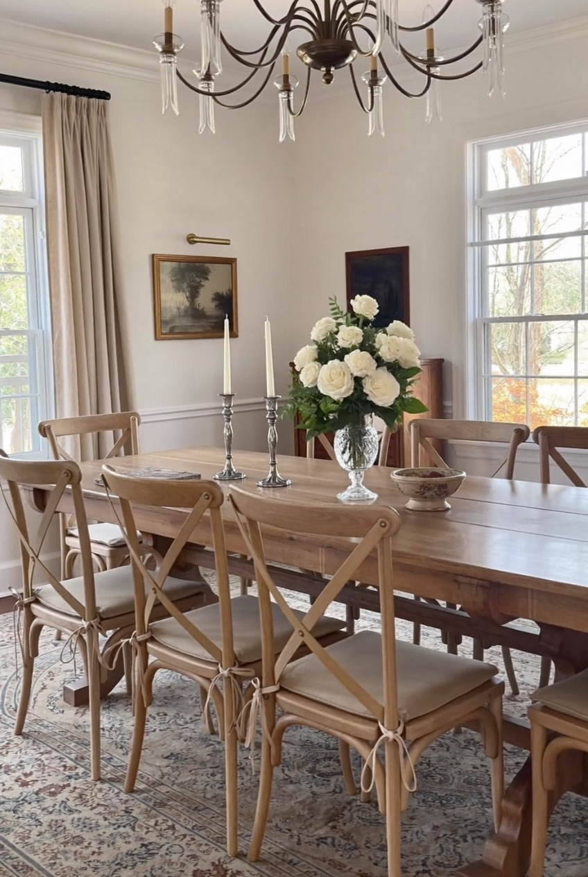
Cross-back chairs, each seat tied on with a leather strap instead of screwed or glued permanently in place, give a long communal table a handmade quality that a fully upholstered chair could never quite manage on its own. It is a small, almost incidental detail, but it is exactly the kind that gets noticed by anyone sitting down at the table.
Above the table, a mixed-metal chandelier hangs next to a pair of silver candlesticks, which quietly breaks the old rule about matching every metal finish in a room. The combination still feels collected rather than mismatched, mostly because everything else nearby, the wood, the linens, the walls, stays fully neutral.
White roses in a simple crystal vase finish the table without competing with anything already sitting on it. When you are unsure what flowers to buy for a table setting, white or cream is about as close to foolproof as it gets, and tying a chair cushion on with leather or ribbon costs very little for how much character it quietly adds to a room.
Good Dining Rooms Are Built, Not Bought All At Once
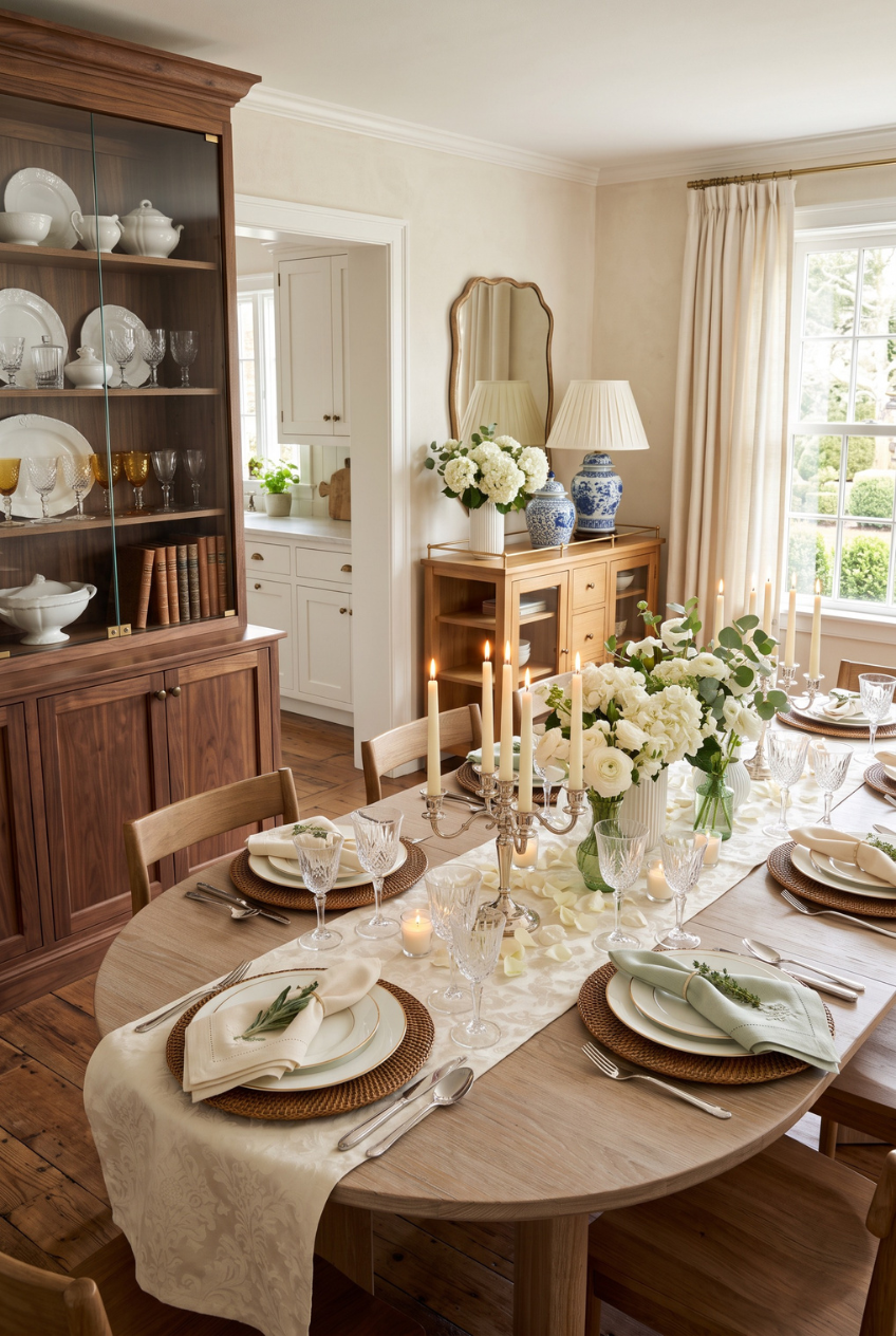
None of these rooms were finished in a weekend. The chandeliers got upgraded, the chairs got reupholstered, the art got swapped out until it stopped looking like it came from one store. That is the part most people skip when they are chasing a look.
If you take one thing from all of this, let it be permission to slow down. Buy the good chandelier when you can afford it. Let the table stay a little bare until you find flowers worth putting on it. A dining room gets better with restraint, not speed.
We hope at least one of these ideas gives you a starting point, whether that is a lighting swap, a paint color, or just the confidence to let a room feel a little more lived-in than perfect.
 Steal Our Home Styling Secrets!