Fall Table Decor Ideas We Kept Coming Back to and Why They Work
Every fall, the table becomes the one surface in the house that gets permission to be a little extra. It’s not just where you eat anymore. It’s where pumpkins, candlelight, and whatever you found at the flower stand all get to coexist for a few months.
We think this is the most forgiving room in the house to experiment in, because nobody’s grading you on it the way they might a living room redo. A few gourds, some candlesticks, maybe a runner that’s seen better days. That’s basically the whole assignment.
What follows are ten directions pulled from real fall tables that each lean on a slightly different design idea, from color theory to texture layering to scale. Some are formal, some are barely-trying, and all of them work.
Let One Runner Do the Heavy Lifting
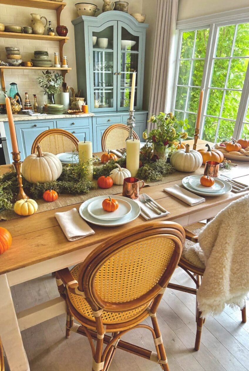
There’s a specific kind of table that looks abundant without looking cluttered, and the secret is usually a single textural runner running the entire length, like the moss-and-greenery base anchoring this one. It gives every object — the mini pumpkins, the brass candlesticks, the stems of dried hydrangea — a shared surface to sit on instead of fighting for space against bare wood.
What makes this version work is restraint in the color story. The blues in the hutch and the cane chairs echo just enough to keep the orange pumpkins from feeling like a Halloween aisle dumped onto the table. We’d argue that’s the actual skill here: picking two or three colors total and repeating them in different materials.
If you want to try this at home, start with a runner that has some texture or dimension to it rather than flat fabric. Tuck small pumpkins directly into it so they look grown there, not placed. Add candlesticks at varying heights before you add anything else, since height is much harder to fix once the table is full.
Plaid and Blue and White, Together
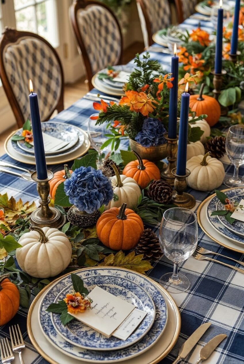
Navy tapers next to blue-and-white china next to a blue plaid tablecloth sounds like a lot of patterns in one frame, but it reads as cohesive because every single pattern shares the same two colors. That’s the principle worth stealing: pattern-mixing isn’t really about mixing patterns, it’s about locking a color palette first and then letting prints move freely within it.
Orange shows up here too, but only in small, controlled doses — a few mini pumpkins, some marigold-colored florals tucked into the greenery — just enough to keep the blue from feeling cold or wintry. Without that orange, this table would look more like Christmas than fall.
We’d recommend this approach if you already own blue and white dishes, since most people do. Layer in a plaid or check tablecloth in the same family, then treat pumpkins as the seasonal accent rather than the main event. The greenery garland running underneath everything is what keeps the whole thing from looking stiff or overly matched.
Glass Vases Turn Foraged Stuff Into Decor
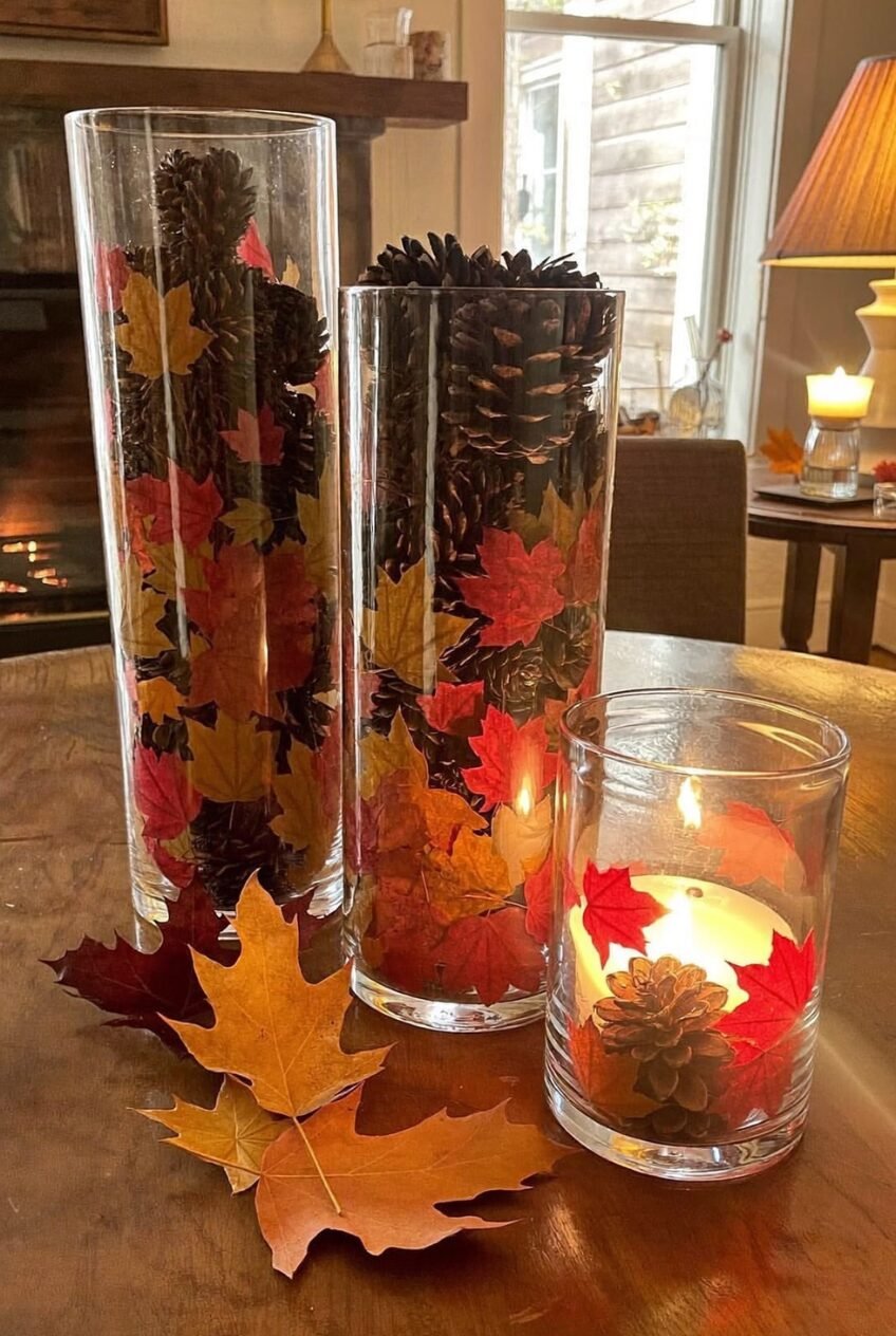
Pinecones and maple leaves are free, technically, but stacked loose on a table they just look like yard debris. Drop them inside a clear glass cylinder instead and suddenly they’re a centerpiece, which is the whole trick behind this one. The vase isn’t decoration, it’s containment, and containment is what makes natural materials look intentional.
Scale matters more than people expect here. Using three vases of different heights, like this trio, keeps the eye moving instead of landing flat on one object. The tallest holds the densest pinecones, the shortest holds a single floating candle and a few leaves, and that size gradient is doing more visual work than the leaves themselves.
To pull this off, collect leaves and pinecones on a walk rather than buying faux ones, since the slight imperfection of real foliage actually reads as more expensive than perfect silk leaves. Layer them against the glass so they’re visible from the side, not just dumped in from above.
A Sign Gives the Table a Voice
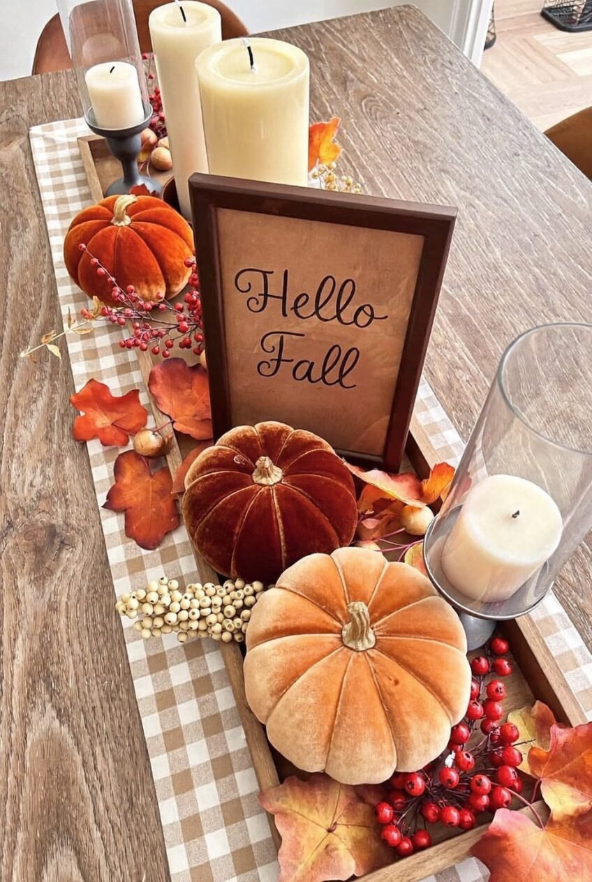
We’re generally wary of decor that just says words at you, but a small framed sign earns its spot when it’s surrounded by enough texture that it doesn’t feel like the whole idea. Here it’s wedged between velvet pumpkins and a buffalo check runner, so it reads as one more material in the mix rather than a standalone statement piece.
Velvet is doing most of the actual design work in this image, honestly. Pumpkins in a soft, light-catching fabric instantly feel warmer than their plastic or ceramic counterparts, and pairing burnt orange with a rust-red velvet shows how much range you get from staying within one warm family instead of reaching for every fall color at once.
If you’re recreating this, buy velvet pumpkins in two adjacent shades rather than matching ones — it adds depth without adding more colors. Use the buffalo check as your base layer first, then build height with candles before placing the frame, so it has something to lean against instead of standing alone.
Branches Add Height Candles Can’t
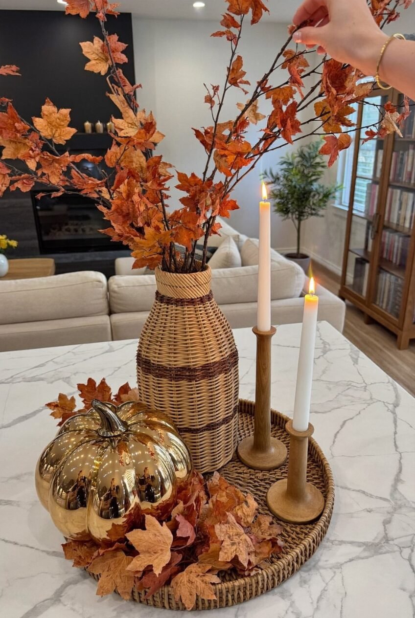
Most fall arrangements stay low and round, which is exactly why tall maple branches stuck into a woven vase stand out so much. Height changes how a vignette reads from across a room, pulling the eye upward instead of just scanning a flat tabletop, and it’s an easy move that a lot of people skip because pumpkins feel like the obvious centerpiece.
The materials here are quietly doing a lot of contrast work. A glossy gold pumpkin sits right next to a rough woven rattan vase and matte wood candlesticks, and that mix of finishes — shiny, woven, matte — keeps an otherwise monochrome orange-and-wood palette from feeling flat.
Grab the tallest faux or dried branches you can find for this one, taller than you think you need, since they get visually shorter once they’re sitting on a counter or table. Anchor them in a vase with some weight to it so they don’t tip, and place one reflective object nearby to bounce a little light around.
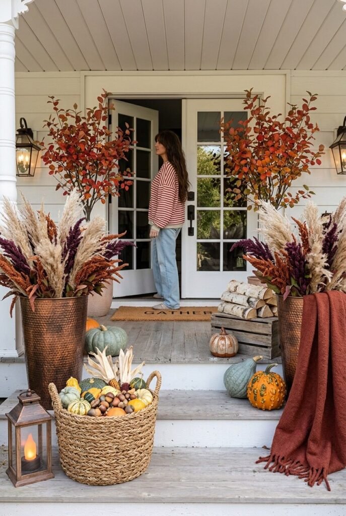
Take the Table Setting Outside
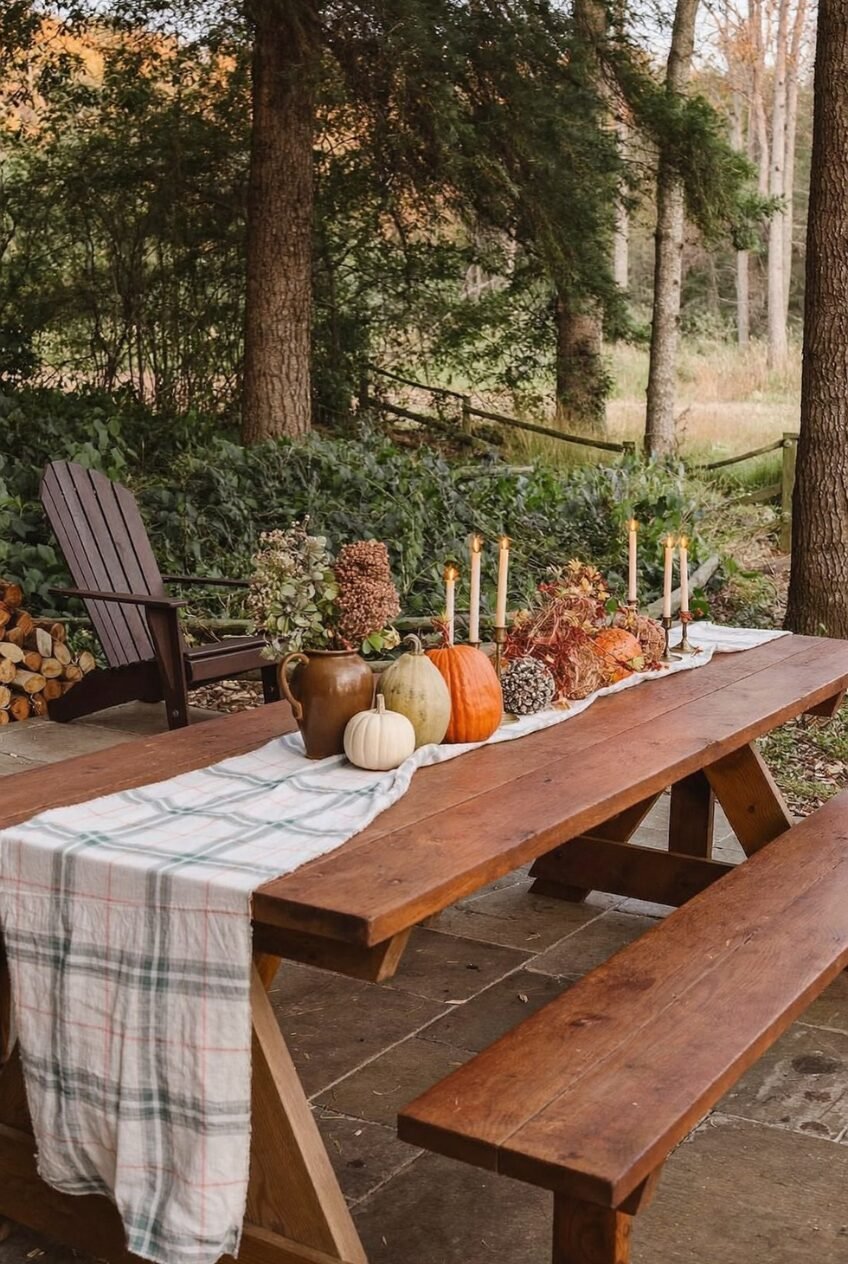
Bring the indoor formula outdoors, and the rules don’t really change — runner, candles, gourds — but the setting does all the romanticizing for you. A plaid linen runner draped over a weathered picnic table next to a stack of firewood gets you ninety percent of the way to looking intentional with almost no effort.
What’s smart about this one is the candlestick height working against the low gourds and stoneware jug. Tall brass tapers next to squat pumpkins and a stout pitcher create the kind of silhouette variation that makes a table photograph well, and that’s not an accident, it’s the same height-contrast logic that works on any tablescape, indoors or out.
If your patio furniture has seen a season or two of weather, lean into it rather than fighting it. Worn wood actually pairs better with a casual fall spread than a brand-new table would. Group your tallest elements toward the back or center and let shorter gourds spill toward the edges.
Florals Don’t Have to Be Orange
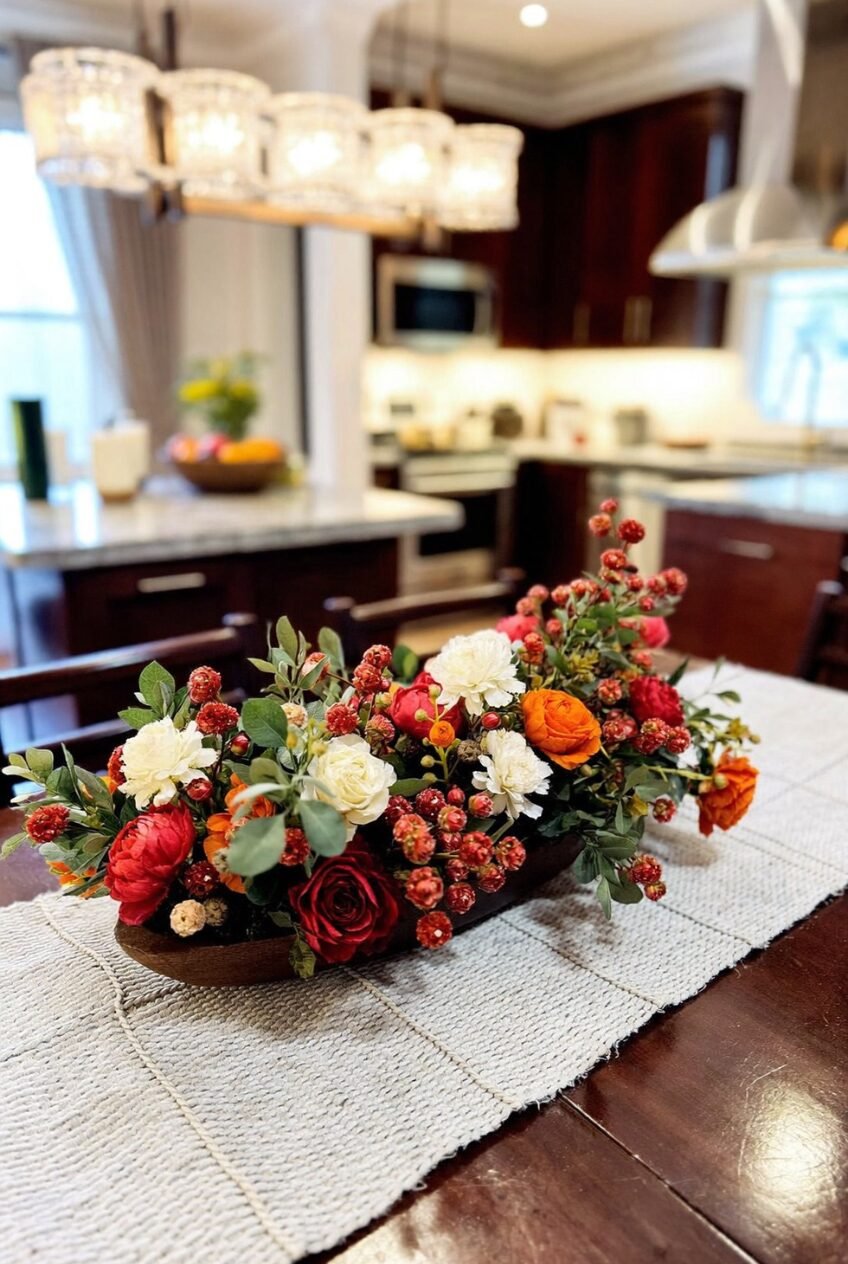
We’ll say it: fall decor doesn’t legally require orange and brown, and this low, oblong arrangement of red roses, ivory ranunculus, and rust berries proves it. Swapping the expected pumpkin-spice palette for something closer to a Christmas-adjacent red-and-cream mix still reads as autumnal because of the berry clusters and dried textures mixed in, not because of the actual hue.
The shape of the arrangement matters as much as the colors. Going long and low instead of tall and round means it never blocks sightlines across the table, which is a real consideration if you’re hosting people who actually want to see each other while eating.
For a version of this at home, pick one unexpected color, deep red, blush, even burgundy, and build around it using berry stems or seeded branches to keep the fall connection obvious. Choose a low oblong or boat-shaped vessel over a tall round one if the centerpiece is going on an actual dining table rather than a console.
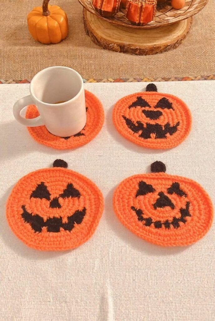
Soft Texture Through Crochet Pumpkins
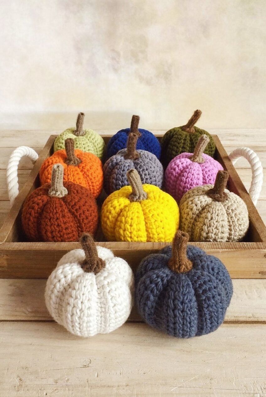
A tray of crocheted pumpkins in colors ranging from mustard yellow to slate blue makes the case for texture over realism. None of these look anything like an actual pumpkin’s surface, and that’s sort of the point — yarn adds a tactile, handmade softness that the usual smooth ceramic or plastic versions just don’t have.
Color range is what keeps this from looking like a craft fair table. Stretching from warm rust through cool navy means the collection works with almost any existing palette in a room, which makes it one of the more flexible pieces on this whole list.
If you’re sourcing or making your own, aim for at least eight to ten pumpkins in a real spread of colors rather than five in similar shades, since the variety is what reads as a curated little collection instead of a random handful. Group them in a low tray or basket with handles so they can move from table to shelf depending on the week.
Chinoiserie Vases Make Pumpkins Look Fancier
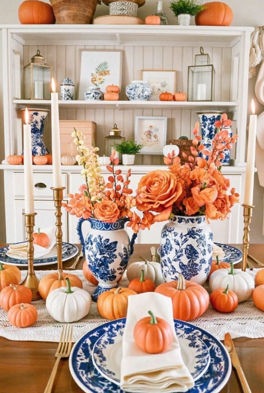
Pair blue-and-white chinoiserie vases with bright orange florals and a swarm of mini pumpkins, and somehow the whole table feels more put-together than the sum of its parts. The reason is contrast: cool, formal patterned ceramics next to casual, bumpy little pumpkins create tension that’s actually more interesting than an all-matching display.
Brass candlesticks add a third material into the mix, and that combination of ceramic, gourd, and metal is what keeps things from reading as one-note. Notice, too, how the pumpkins vary in both size and shade of orange and white, scattered rather than sorted, which feels more like a harvest haul than a styled product shot.
To recreate it, dig out any blue-and-white pottery already in the house, even if it usually lives on a shelf, and fill it with whatever orange stems are available. Scatter pumpkins of mismatched sizes directly around the base of the vases instead of lining them up.
A Black Pumpkin Changes the Mood Completely
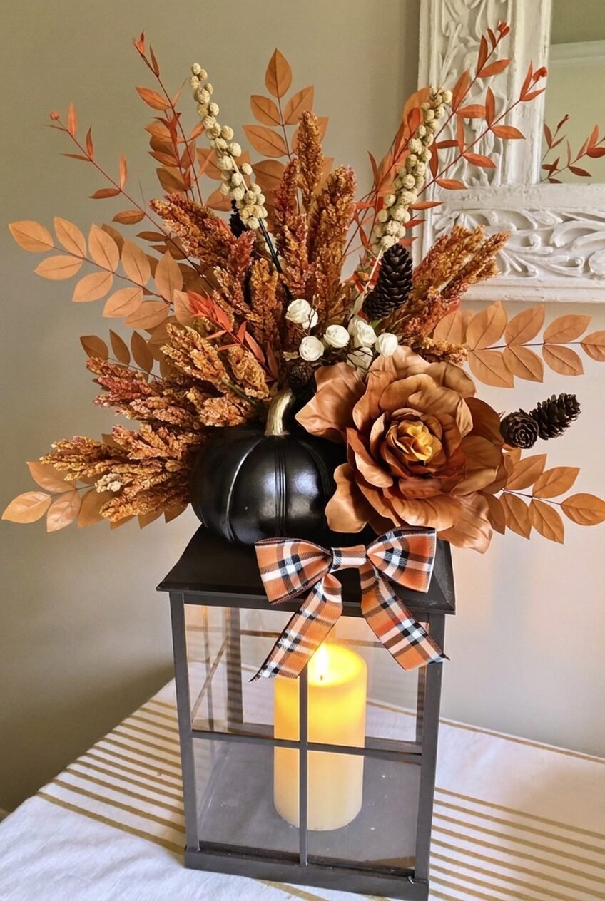
Swap a traditional orange pumpkin for a matte black one, and the entire arrangement shifts from cheerful to moody in one move. This lantern topper, with its black pumpkin nestled among dried wheat stems and a single oversized copper rose, leans gothic-autumn rather than pumpkin-patch, and honestly, it’s a refreshing change from the usual orange-on-orange fall display.
The plaid bow tied around the lantern’s neck is a small detail doing a lot of finishing work. It softens what could otherwise feel like a severe color choice and ties the black back into the warmer browns and rusts surrounding it, which is a good reminder that one dark accent needs a connector back to the rest of the palette or it just looks out of place.
If black pumpkins feel like a stretch for your space, start with just one as an accent rather than the centerpiece, and surround it with warm-toned dried botanicals to keep the overall feel from tipping too dark.
Your Table Doesn’t Need a Theme, Just a Mood
Looking at all ten of these side by side, the thing that stands out isn’t a shared color or a shared object, it’s that each one commits to a mood and follows through on it. Moody and dark, bright and chinoiserie-leaned, casual and outdoorsy — none of them are trying to do everything at once.
We’d push back gently on the idea that fall decor needs an extensive shopping list. Several of these tables run on stuff you might already own: glassware, a forgotten runner, whatever’s blooming nearby. The pumpkins and candles are doing less work than the actual composition choices.
If you take one thing from this whole roundup, let it be the height variation and the color restraint, since both showed up again and again across completely different styles. Everything else, the plaid, the velvet, the chinoiserie, is just personal taste filling in around those two rules.
 Steal Our Home Styling Secrets!