How Real Dorm Rooms Are Pulling Off Impressive Wall Designs
Most dorm rooms arrive the same way — white walls, fluorescent overhead lighting, furniture bolted to the floor like it gave up hope. And most students leave them that way, either because they don’t know where to start or because the whole thing feels too temporary to bother. That logic is understandable, but it also means spending an entire academic year in a space that feels borrowed.
Here’s the thing about dorm walls specifically: they’re actually one of the easier canvases to work with, precisely because the constraints are so clear. You’re not repainting. You’re not ripping out cabinetry. You’re working with what’s there and layering meaning on top of it — and when that’s done well, even a 12×12 cinderblock box can feel like somewhere you actually want to be.
The ideas ahead cover a wide range of aesthetics — from handcrafted boho textures to neon-lit maximalism to sport-obsessed gallery walls — but they all share one thing: each one treats the wall as a reflection of the person living in front of it. That’s the actual goal. Not a Pinterest-perfect room. A room that feels like yours.
Tree Shelf Meets Bohemian Wall
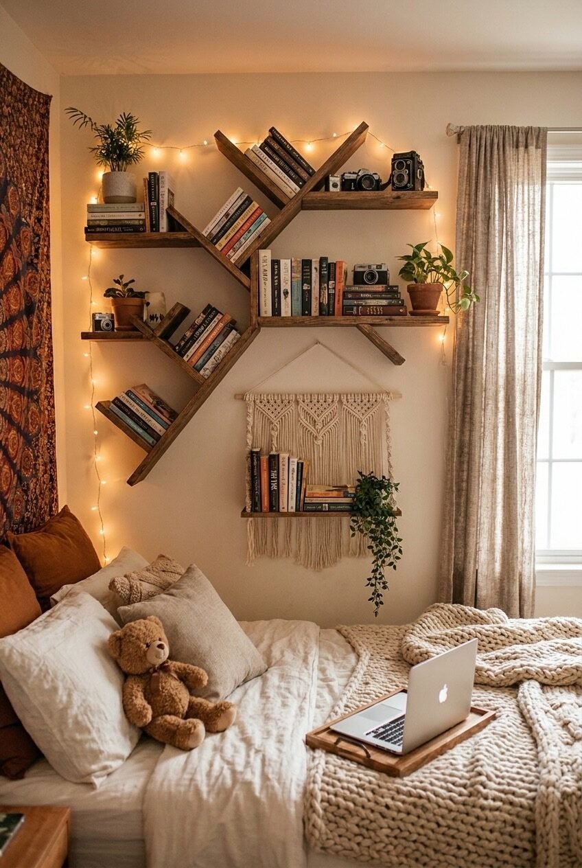
The tree-shaped shelf arrangement in this room is doing most of the heavy lifting, and it works because it treats storage as sculpture. Diagonal wooden shelves branch outward from a central point, loaded with paperbacks, small plants, vintage cameras, and a dangling macrame wall hanging below. The asymmetry is key — it reads organic rather than constructed, and that changes the entire energy of the wall.
Fairy lights threaded loosely along the shelves are not an afterthought here. They trace the branching lines and create warmth that no overhead fixture could replicate, especially against the warm cream wall tone. The shelf styling follows a principle worth stealing: every level mixes a vertical element (stacked books), a living element (a potted plant), and one object with texture or nostalgia (a camera, a small figurine). That mix is what makes shelves look styled rather than just filled.
To pull this off, the branch configuration is the hardest part — but individual floating shelves installed at deliberate diagonal angles will get you there without a custom build. The macrame hanging below anchors the arrangement downward, so the whole composition doesn’t feel like it’s floating off the wall. Finish with a bohemian tapestry on an adjacent wall to echo the natural-material palette without competing for attention.
Personality Wall With Zero Filter
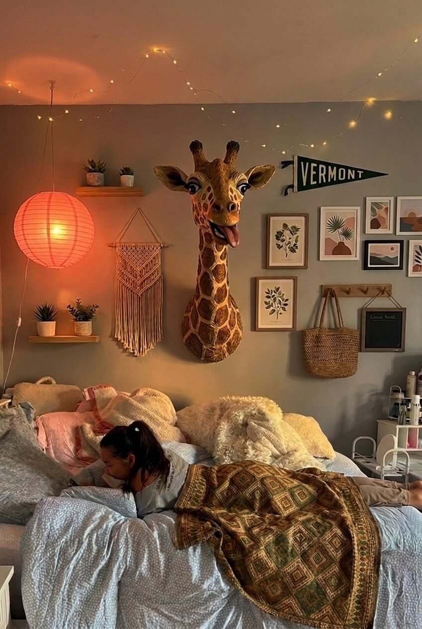
Hanging a cartoonish giraffe head on a dorm wall is either a bold design choice or a personality statement — and in this room, it’s clearly both. The grey wall creates enough visual neutrality that the giraffe reads as intentional rather than random, and it becomes the anchor point for everything else: a pink paper lantern glowing warm on the left, a cluster of framed botanical and abstract prints on the right, a Vermont pennant flag tucked in between.
The decor principle here is contrast through mix — the giraffe is three-dimensional and sculptural, the gallery prints are flat and graphic, the macrame wall hanging adds texture, and the paper lantern introduces color temperature. None of it matches, and that’s exactly why it works. Rooms like this tend to feel genuinely inhabited rather than staged, because they’re built from accumulation rather than a mood board.
If you’re building a wall like this, resist the urge to edit too heavily. The apparent randomness is the point. Start with one large anchor piece — the more unexpected, the better — and let the rest of the wall develop around it. Pennant flags, woven baskets as wall decor, and paper lanterns are all low-commitment, high-personality additions that won’t cost much but will completely shift how the space reads.
Grand Macrame Statement Above Everything
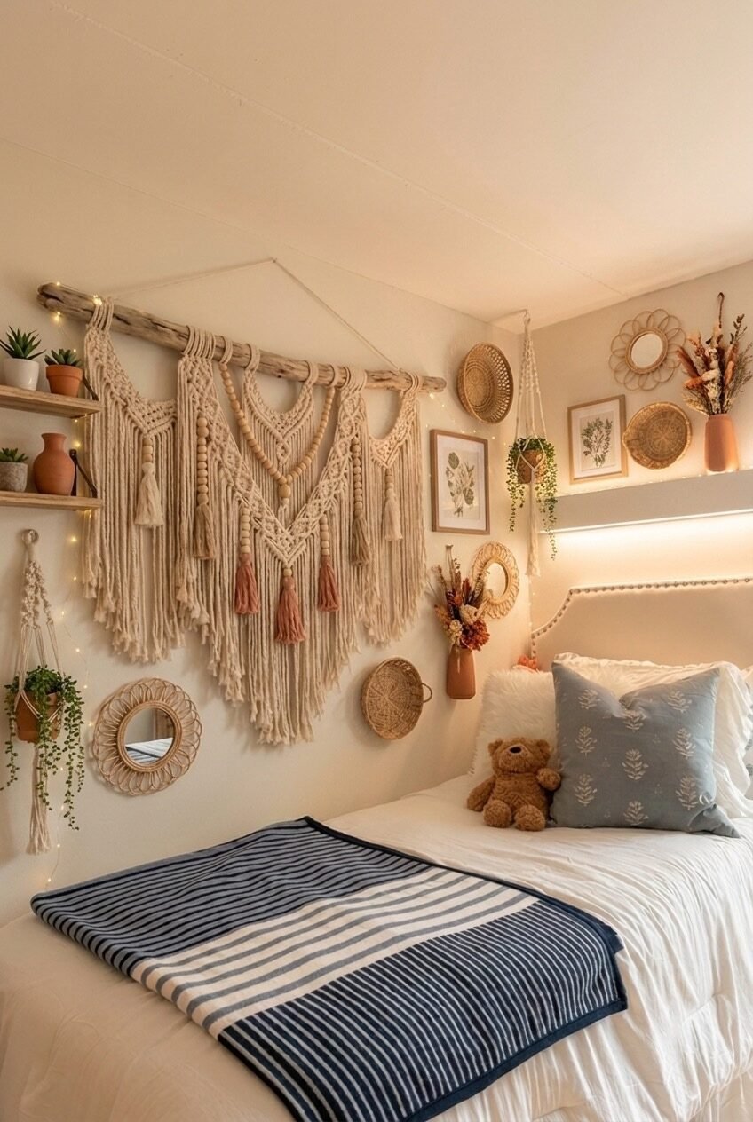
Scale is the whole argument in this room. The macrame wall hanging is enormous — spanning most of the width above the headboard, hung from a raw driftwood branch, fringed down in long cream and dusty rose tassels. At that size, it stops being an accessory and starts being the room’s defining visual. Everything else — wicker mirrors, framed botanical prints, rattan plates, dried flower arrangements on a shelf — exists as supporting texture around it.
The color palette is ruthlessly disciplined: cream, warm sand, terracotta, dusty pink. That restraint is what lets the room carry so many different textures — woven rattan, knotted cotton, glazed ceramic, dried botanicals — without feeling chaotic. When everything is the same temperature, you can layer endlessly without the space looking messy.
For a dorm, the challenge is scale. A large macrame hanging will visually overwhelm a twin bed in the best possible way, but you need to commit to the size — small macrame over a large headboard wall just looks like it got lost. Source oversized wall hangings from independent fiber artists on Etsy if you want something genuinely impressive, then build the supporting cast of wicker mirrors and rattan objects around it slowly. The fairy lights tucked along the shelf add the warmth that keeps all this natural texture from reading as too rough.
Surfboard as the Focal Point
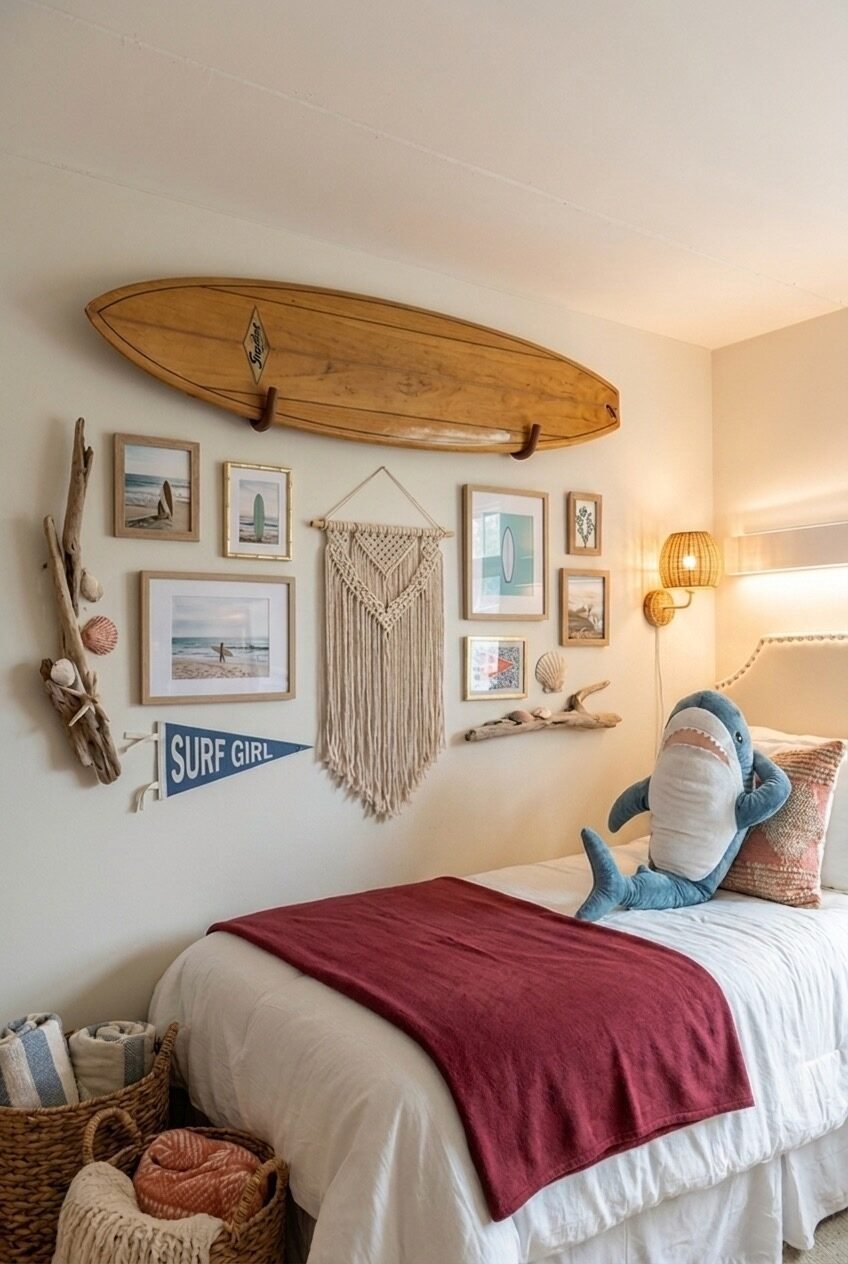
Mount a wooden surfboard horizontally across the upper wall and the room has already told you what it is. This is coastal living translated into a landlocked dorm space — and it’s more convincing than most beach-themed rooms because it leans on real objects rather than printed palm tree graphics. The driftwood branch propped against one side, the seashells mounted casually on the wall, the mix of ocean photography prints in natural wood frames — all of it reads like someone actually brought their life with them.
Below the surfboard, the gallery wall is notably unfussy: beach photos in different frame sizes, a small macrame accent, a Surf Girl pennant, and a couple of framed prints with coastal color palettes. The wicker wall sconce on the right side is doing real work here — it introduces warm light and woven texture that ties back to the surfboard’s natural wood finish.
The surfboard is obviously the trickiest piece to source and mount safely — look for wall-mount surfboard hooks rated for the board’s weight, and check dorm policies before drilling. Command strip alternatives exist for lighter decorative boards, but structural integrity matters. If a surfboard isn’t practical, a longboard or an oar hung horizontally achieves the same horizontal line and coastal reference. The objects around it handle the rest of the storytelling.
Neon, LEGO, and Deliberate Maximalism
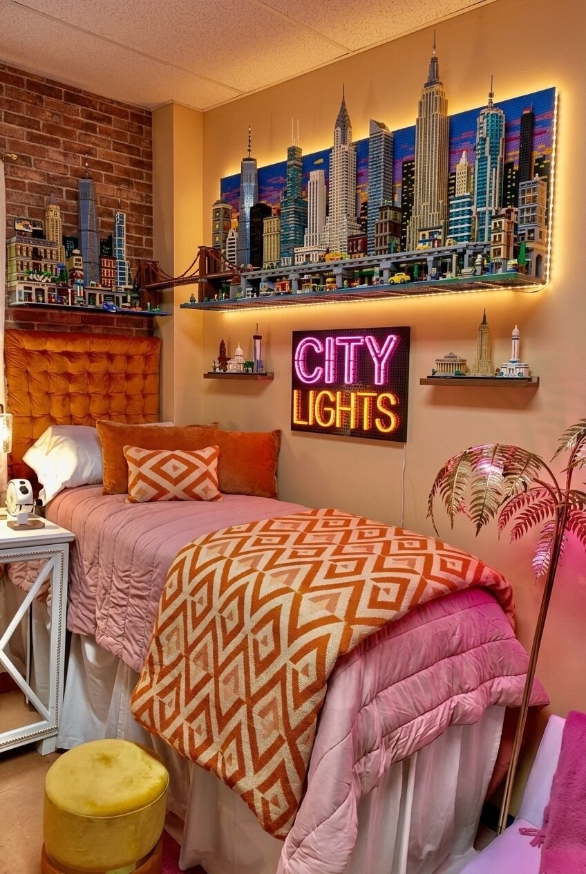
There’s a level of commitment to this room that deserves acknowledgment. A full LEGO New York City skyline — backlit with LED strip lighting — runs across a floating shelf above the bed. Below it, a neon City Lights sign in magenta and yellow sits on a pegboard. The brick-textured accent wall on one side reinforces the urban theme without being literal about it. This is maximalism with a concept, which is the only maximalism that actually works.
Orange velvet bedding, geometric-patterned pillows, and a warm amber color palette on the furniture keep the overall room from reading as chaotic despite all the visual noise on the walls. Color cohesion is what saves a room like this — when the dominant tones in the wall decor are echoed in the textiles, the eye understands the room as a whole rather than a collection of individual things vying for attention.
The LEGO display is genuinely difficult to replicate at this scale, but the principle — treating a personal collection as a gallery installation, with dedicated shelving and dramatic backlighting — is applicable to almost anything. Vinyl records, model trains, action figures, book collections. The lighting matters enormously: without the warm LED strip illuminating that shelf from behind, the LEGO display would read as clutter. The light is what turns it into a feature.
Neon Name Sign in Botanical Company
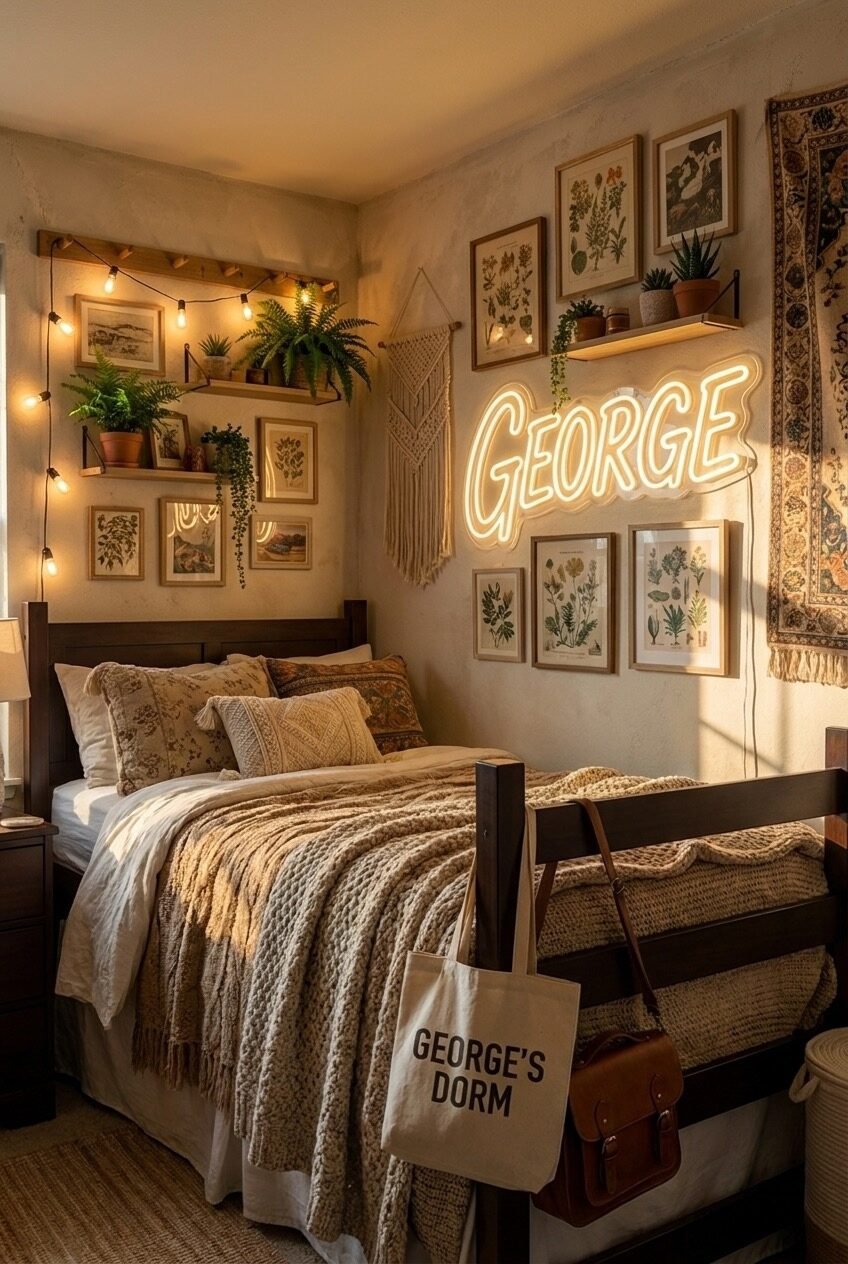
Start with what’s immediately readable here: a custom neon sign spelling out a name in warm white light, mounted at eye level above the bed, surrounded by framed vintage botanical prints, floating shelves with live plants, macrame, and Edison-style string lights draped across a wooden rack. It’s a warm, layered, plant-heavy wall — and the neon is what keeps it from feeling too studied.
The botanical gallery wall is genuinely well done. Frames vary slightly in size but stay within the same warm wood tone, creating cohesion without uniformity. The prints themselves — vintage plant illustrations — share a green and sepia palette that ties directly into the live plants on the shelves. Trailing pothos and ferns bleeding over shelf edges add movement that no print can replicate, and they’re arguably the most important design elements in the whole composition.
A custom name neon sign is an investment, but it functions as both lighting and personalization — which is a lot of utility for one piece. If budget is a constraint, LED flex neon alternatives have gotten genuinely good in the last few years and are significantly cheaper than glass neon. The botanical prints can be sourced from public domain archives and printed affordably. The real time investment is the plants — they take a few weeks to settle and trail, so plan accordingly if you want that lived-in look by October.
Faith-Centered Wall Done With Depth
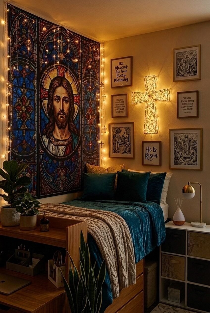
A stained glass tapestry on one full wall changes the light quality of the entire room. Here, the deep blues, golds, and reds of a religious tapestry become the room’s dominant color story — and the jewel-toned teal velvet bedding is a direct response to that palette. This is color-matching done backwards from the wall rather than the furniture, and it’s more interesting than the reverse.
The faith-based gallery wall on the adjacent side handles religious imagery without becoming heavy-handed: scripture quote prints in warm wood frames, a woven light-up cross, and a couple of pencil-sketch style devotional illustrations. The variety of media — textile, illuminated sculpture, printed text, engraved illustration — is what gives the wall its depth. A gallery wall built entirely from one format, however beautiful, will always feel flatter than one that mixes how things are made.
The gold desk lamp and warm fairy lights are earning their place in this room. They soften what could otherwise read as quite serious iconography and keep the space feeling like a bedroom rather than a chapel. For recreating the tapestry effect, large-format fabric wall hangings printed with religious or sacred art are widely available, and when combined with warm-spectrum string lights draped at the border, they do roughly what this image achieves — without a single nail hole.
When Your Sport Is the Theme
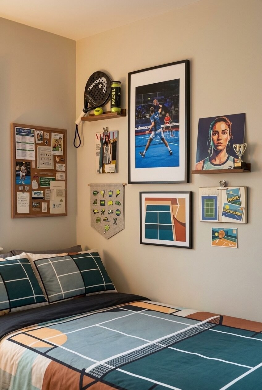
The padel racket mounted on a small floating shelf is the most honest thing in this room — it’s not decoration, it’s equipment that happens to be displayed. That’s an important distinction. The wall around it builds a sport-themed gallery without resorting to generic athlete posters: an action shot in a large black frame, an abstract court-geometry print, sport-specific postcards clipped to a wooden board, a pin banner with padel enamel pins, and a cork board covered in schedules and match memos.
The bed linen is doing something clever — a court-mapped duvet in teal, rust, and slate extends the sport theme into the bedding without being kitschy. The color palette of the wall pieces and the bedding are clearly in conversation with each other, which is the difference between a themed room that looks designed and one that looks like a merchandise display.
The principle worth taking here is that sport-themed rooms work best when they include items that are actually from the sport — tickets, equipment, postcards from competitions — rather than relying entirely on purchased posters. The cork board with real documents grounds the gallery in lived experience. Mix that with one or two well-framed graphic prints, and the result is a wall that reflects a real passion rather than a purchased aesthetic.
Full-Color Maximalism That Earns It
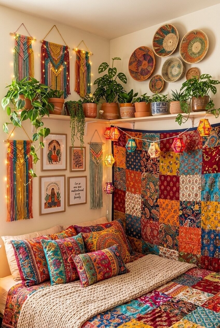
Colorful macrame wall hangings in red, teal, and gold — three of them in varying sizes — run down the left wall. A corner shelf runs wall to wall loaded with terracotta pots, monstera plants, and trailing pothos. Woven African baskets cluster on the opposite wall above the plants. A patchwork quilt in deep jewel tones hangs vertically as a headboard alternative. Lantern-style fairy lights string across the whole scene. This room is running at maximum volume and it doesn’t apologize for it.
What saves a room this dense from becoming visually exhausting is the warm white wall serving as a neutral ground throughout. Without that breathing room, the colors would fight each other — but against cream, every saturated element reads clearly. The plants are also critical: greenery in this quantity acts as a natural visual reset, giving the eye somewhere to rest even within the chaos.
For anyone trying to build toward this aesthetic, the most practical advice is to start with the textiles and plants, then fill upward. The macrame hangings and woven baskets define the wall’s texture and color range, so selecting those first makes everything else easier to calibrate. The patchwork quilt-as-headboard is one of the more directly copyable ideas here — it avoids dorm headboard restrictions entirely and adds a substantial block of color and pattern without requiring any mounting hardware.
Vampire Meme Wall, Absolutely Unashamed
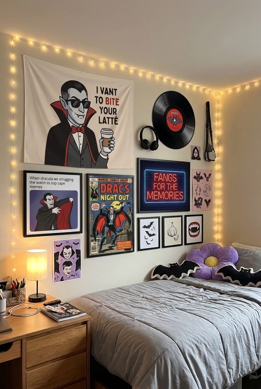
A large fabric tapestry of a sunglasses-wearing Dracula holding a latte takes up nearly half the wall. Below and around it: a vintage-style Dracula comic book cover in a frame, a neon Fangs for the Memories sign, bat and garlic illustration prints, a vinyl record mounted on the wall, headphones as wall art, and a bat plush on the bed beside a giant purple flower pillow. This wall is committing to a bit, and it’s one of the better rooms in the entire roundup because of it.
The design principle hidden inside all this absurdity is cohesion through theme: when every element belongs to the same universe — however niche — a gallery wall reads as designed rather than random. The black and red color scheme running through the prints, neon, and tapestry unifies what could otherwise be a chaotic mix of different graphic styles and scales.
The practical lesson here is that humor is a legitimate interior design strategy. A wall built around a specific fandom, joke, or subculture will always feel more alive than a generic inspirational quote gallery, because it’s actually saying something about the person living there. The vinyl record and headphones as mounted objects rather than stored items is also worth borrowing — functional objects that are visually interesting enough to display are free decor, and they add dimension that flat prints can’t.
Blank Walls Are a Choice You Don’t Have to Make
Every room on this page started with the same thing you have — bare walls and a limited square footage. What separates them isn’t budget or access to a design degree. It’s the decision to treat the space as worth investing in, even temporarily. A dorm room is where a lot of people spend their most formative years, and what’s on the walls tends to reflect — and sometimes shape — who they’re becoming.
The aesthetics here run the full spectrum on purpose. Because the question isn’t which style is best — it’s which one is actually you. A wall that looks copied from someone else’s Pinterest board will always feel borrowed. A wall built from your real interests, your actual objects, and your honest sense of humor will feel like somewhere worth coming home to.
Start with one wall. One anchor piece. And build outward from there. The rooms that feel most complete aren’t the ones that were planned all at once — they’re the ones that accumulated over a semester, piece by piece, until the wall started looking back at you.
 Steal Our Home Styling Secrets!