Inside the Dorm Rooms That Get Small-Space Design Completely Right
Most dorm rooms start exactly the same — cinderblock walls, a mattress that came with the building, and fluorescent lighting that makes everything look vaguely medical. The square footage is laughable, the furniture is unmovable, and the lease won’t let you paint. And yet, some people walk into these exact same spaces and somehow make them feel like a real room — one with atmosphere, personality, and actual warmth.
The difference isn’t budget. It’s not even necessarily taste. It’s knowing which design principles travel well into small, restricted spaces and which ones just create noise. Layering light sources instead of relying on overhead fluorescents. Choosing a rug that anchors the room instead of leaving bare institutional floors exposed. Understanding that a few considered pieces will always do more than a cart full of random finds.
The setups ahead cover a lot of ground — warm and maximalist, spare and editorial, playful and neon-lit, coastal and calm. What they share is a sense that someone made actual decisions about the space, rather than just filling it. That’s the thing worth borrowing from each one.
Warm Walls, Lofted Bed Logic
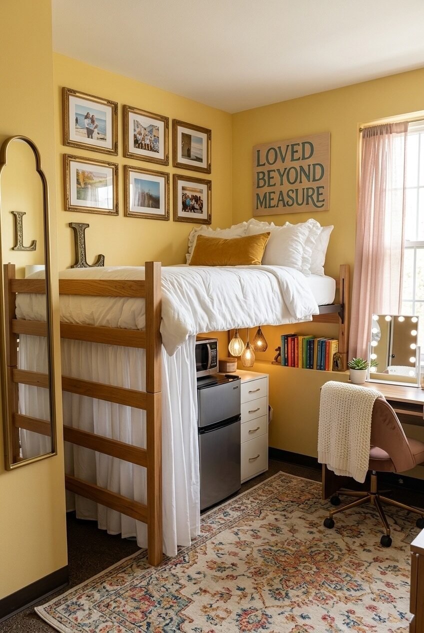
Start by lofting the bed — not just to free up floor space, but to create a distinct zone underneath that works as hard as the sleeping area above. This setup shows exactly how to use that underbed real estate: a mini fridge, a compact dresser, and hanging pendant lights that turn what would otherwise be dead space into a warm little alcove. The curtain panel draped along the loft frame adds softness and visual separation without fully closing things off.
The buttery yellow walls are doing a lot of work here. They read warm and lived-in even against white bedding, and they make the gold-frame gallery wall feel grounded rather than formal. Getting a similar effect in a dorm where you can’t paint means working with warm-toned fabric, rugs, and lighting to shift the room’s overall color temperature. A string of Edison-style bulbs tucked into the loft frame or strung low on the wall behind the bed mimics that amber glow without touching paint.
The gallery wall above the bed — a mix of family photos in matching gold frames — anchors the personal identity of the space. Command strips handle the hanging, and keeping the frames consistent in finish (not necessarily in size or shape) is what holds it together visually. The arched floor mirror against the near wall rounds it out: tall, gold-framed, and doing the space-expanding work that mirrors are uniquely good at in tight rooms.
Boho Living Room Energy, Small Footprint
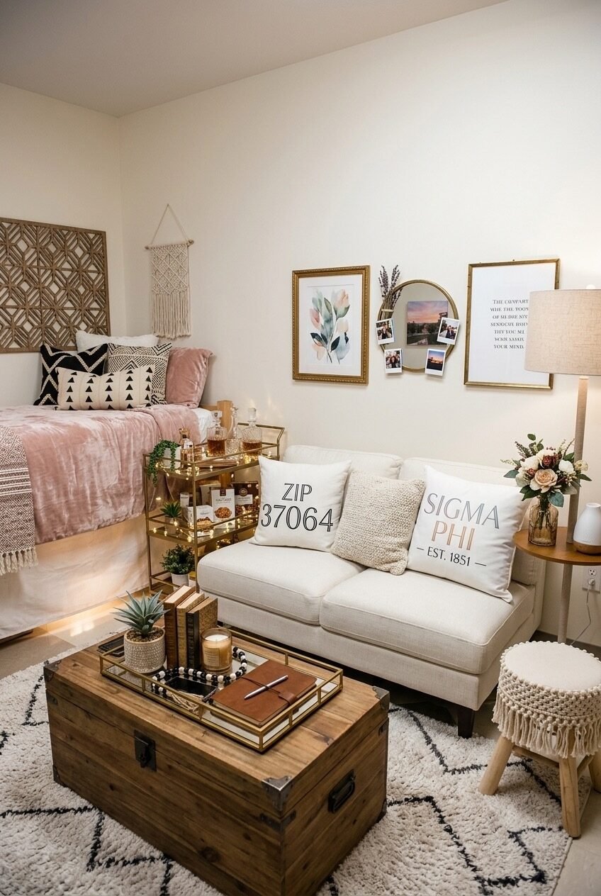
The trunk-as-coffee-table is the move that makes this whole layout work. It’s storage, surface, and character in one piece — and in a dorm room where every item needs to justify its presence, a vintage wooden trunk clears that bar easily. Pair it with a small loveseat or two-seater sofa facing the bed and you’ve effectively split the room into sleeping and living zones without a single wall or partition.
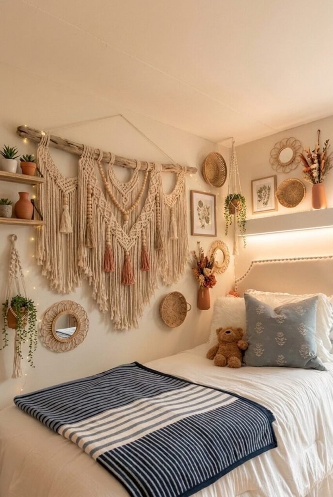
On the wall, a loose gallery arrangement mixes a watercolor print, a round mirror, Polaroids pinned directly to the wall, and a text print — all in gold frames but at varying heights and spacings. The key is that nothing is perfectly aligned, which is exactly what makes it feel like it grew over time rather than being installed in an afternoon. The macramé wall hanging adds a handmade texture overhead that helps anchor the whole composition without competing with it.
The gold bar cart beside the bed is worth flagging as a specific piece worth hunting for. In a dorm, it works as a side table, a display shelf, and a bit of personality all at once — far more interesting than a plastic nightstand from a big box store. Keep the styling on top deliberate: a plant, a candle, a small tray of objects. The Moroccan-style rug underfoot ties it all together without making it feel heavy.
Coastal Calm With Serious Storage
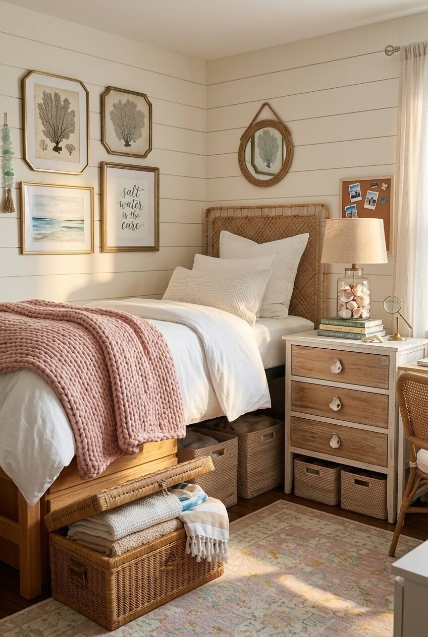
Everything in this room earns its spot twice — once for how it looks and once for what it holds. Under the bed, wicker baskets and a vintage-style trunk handle the overflow storage that every dorm room needs but rarely deals with gracefully. The nightstand beside the bed is a three-drawer dresser on legs — more storage than a standard nightstand, same footprint, and it fits the coastal aesthetic through its weathered-wood finish and shell hardware.
The shiplap-style wall panels are almost certainly a renter-friendly wallpaper or peel-and-stick panel application. It sounds ambitious but it’s one of the more impactful swaps available to dorm residents — a single accent wall in a horizontal-line pattern immediately reads more like a designed space and less like an institutional room. White or cream keeps it bright; the natural light in this setup does the rest.
The gallery wall of coastal botanicals and seascapes in mismatched gold frames is the kind of thing that looks collected rather than purchased as a set — which it very well might be. Affordable coastal prints are widely available as digital downloads; print them, frame them in thrift-store gold frames, and the effect is exactly as shown here. The rope-wrapped circular mirror above the headboard and the cork pin board beside the nightstand both add functional texture without pulling the aesthetic off course.
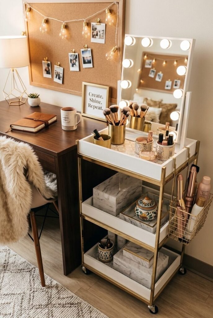
Gold Tones, Soft Shelves
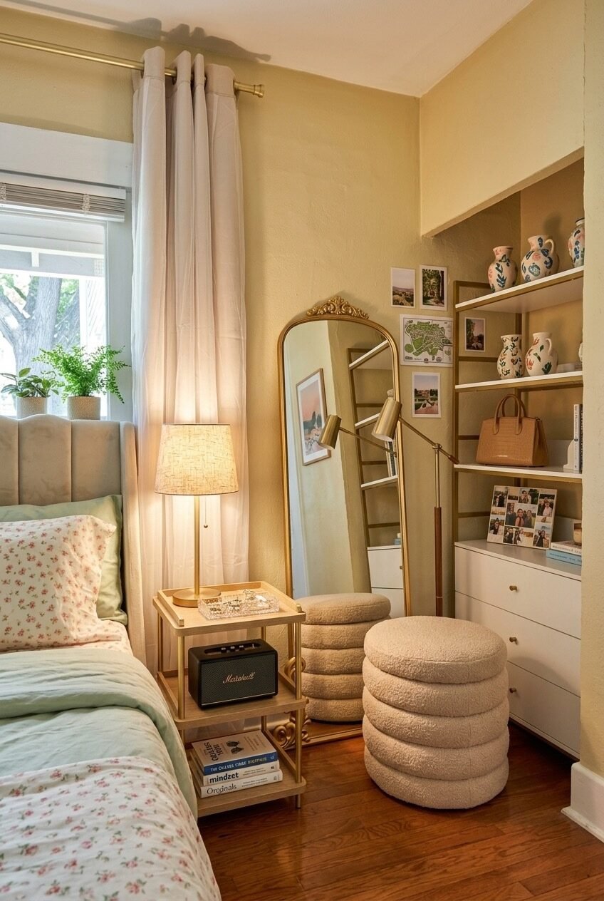
The built-in shelving unit here is what most people would just use for books and call it done. Instead, it’s been treated like an actual display — painted or wrapped in a warm gold-olive tone that ties it to the mirror frame and the table lamp base across the room. The objects on the shelves are deliberately spare: a couple of ceramic pitchers with painted details, some postcards pinned casually, a bag as a display item. It’s the kind of shelving that makes a room feel like a person lives in it rather than a student crashing through it.
The floor-length mirror with its ornate gold frame leans against the wall just beside the curtain, which is a smart placement — it catches the natural light from the window and bounces it back into the room. A leaning mirror is significantly easier to execute in a dorm than a wall-mounted one, and at this size it genuinely opens up the space. The bouclé stacking stools function as both seating and a side table, and their rounded profile softens what would otherwise be a fairly angular corner.
Floral bedding in a delicate ditsy print is the wildcard that anchors the whole room in a more feminine, vintage-leaning direction — which contrasts nicely with the structured gold shelving. The sage green pillow shams keep it from going too sweet. It’s a balancing act between decorative and livable, and this setup lands it.
Neon, Lights, and Organized Chaos
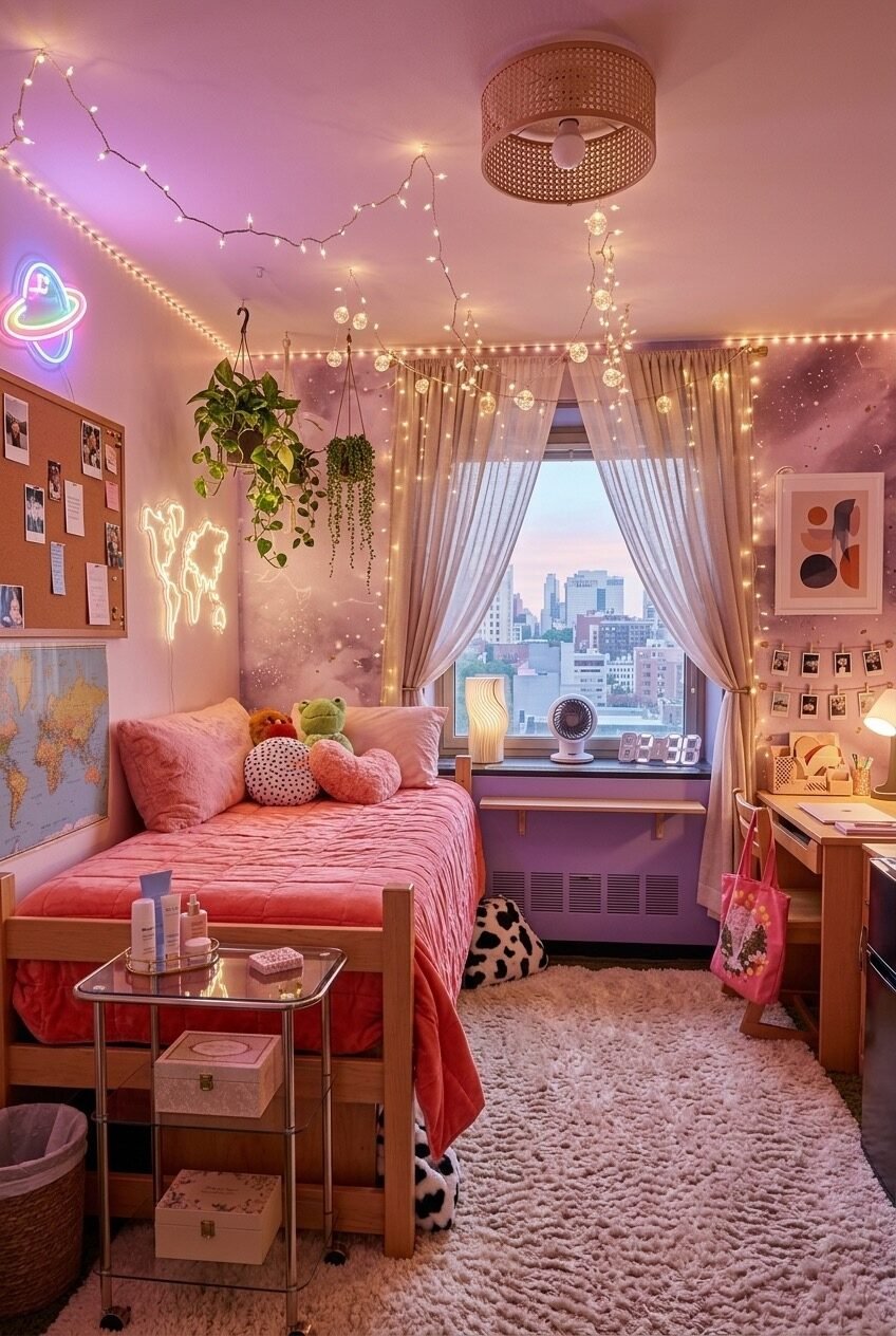
Globe string lights draped along the ceiling perimeter, a neon planet sign glowing on one wall, a neon world map outline on another — the lighting strategy here is the entire design strategy. The room uses at least five distinct light sources working at different heights and intensities, and the result is something that feels genuinely atmospheric rather than just lit. The rattan flush-mount ceiling light at center provides a natural anchor to all the electric glow.
The space-themed wallpaper panel behind the curtains is a smart way to add visual depth at the window wall without competing with the view — it’s only partially visible, which is more effective than if it covered the whole wall. The cork board on the left keeps the room from floating off into pure decoration; it’s functional, personal, and grounds the whole setup. What makes this kind of high-sensory room work rather than overwhelm is that the furniture is actually simple — a standard loft bed frame, a basic rolling cart — which gives all the decorative layers somewhere to breathe.
Hanging plants in macramé holders bring life to the vertical dimension in a way that doesn’t eat floor space. Pothos and string of pearls are the reliable choices here — they trail well, tolerate indirect light, and survive the neglect that exam season inevitably brings. The fluffy white area rug underfoot gives the eye a place to rest amid all the visual activity overhead.
Platform Bed, Editorial Restraint
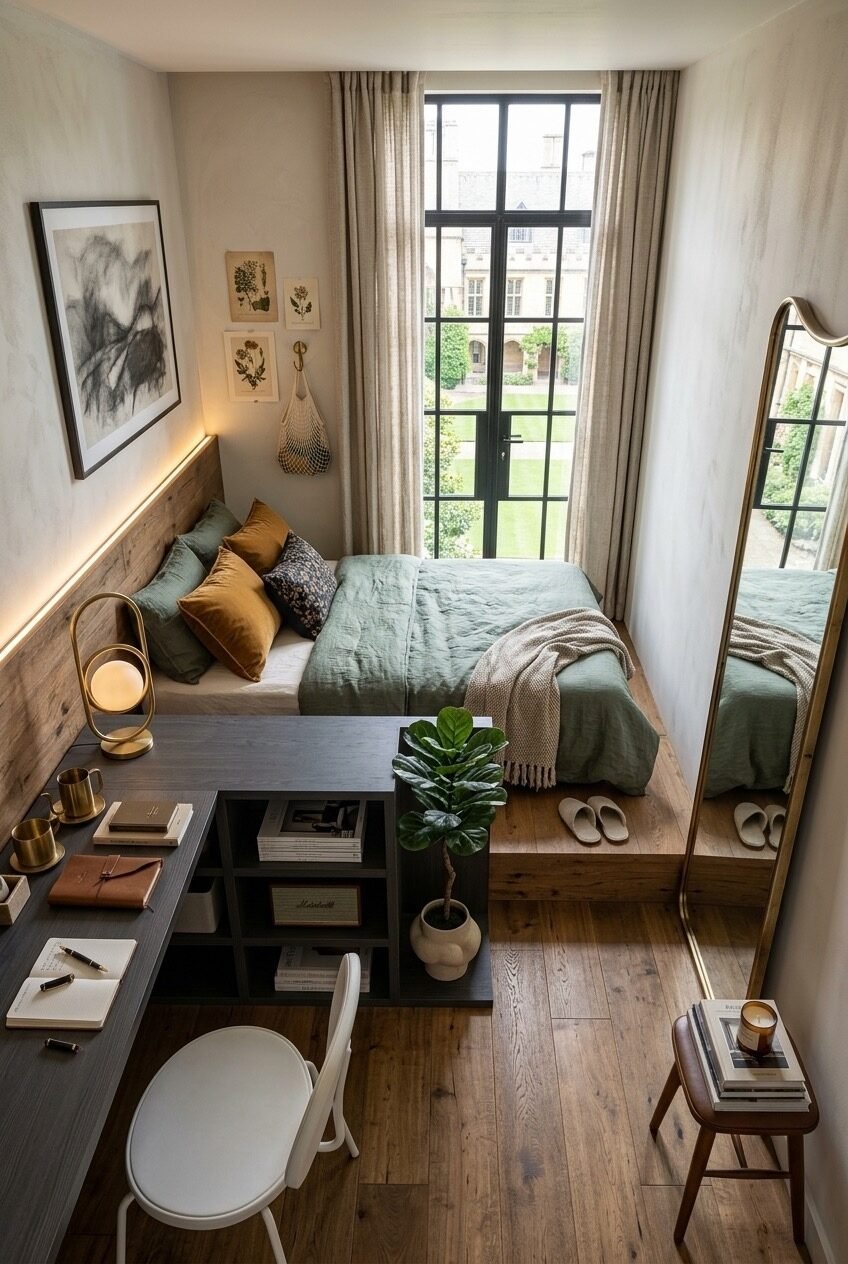
The elevated platform bed here isn’t just a design choice — it’s a zoning tool. By raising the sleeping surface and pushing it toward the window wall, the room gains a clear foreground zone for the desk and storage without those areas feeling cramped against the bed. The linen curtains at the tall window are floor-length and hung high, which is one of the most consistently effective tricks in small-space design: the eye reads height, not square footage.
Sage and ochre bedding against a raw wood headboard panel is a combination that hits that particular quiet-luxury register without requiring expensive pieces. The LED strip tucked behind the headboard panel provides warm indirect backlight that makes the whole sleeping zone feel intentional in a way that a bedside lamp alone wouldn’t achieve. Botanical prints and a single charcoal drawing on the wall keep the art selection considered — not empty, not overcrowded.
The desk here is positioned in the foreground rather than pushed to a wall, which is counterintuitive in a small room but actually works because the desk shelf beneath it provides visual layering rather than blocking sightlines. A fiddle-leaf fig on the floor beside it and a leaning gold mirror at the room’s edge round out a space that feels like it belongs somewhere much larger than a university building.
The Door As Design Surface
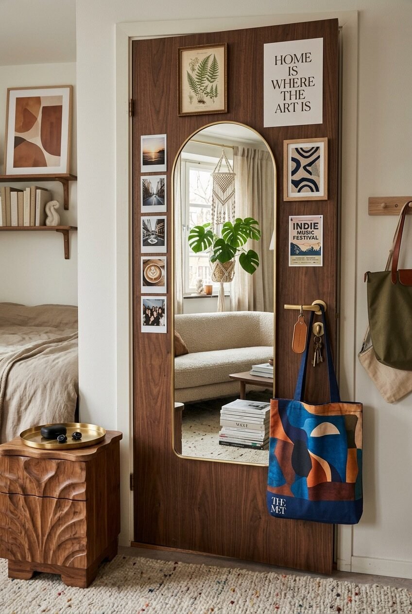
Nobody thinks to decorate the back of the door, which is exactly why it’s worth doing. Here, an arched full-length mirror with a brass frame is mounted flush against a walnut-toned door — a practical choice that also makes the door look like a deliberate design feature rather than a slab of wood with a handle. Around the mirror, a tight collection of prints, a botanical illustration, a strip of Polaroids, and a music festival poster are arranged in a way that uses the door frame as an implicit boundary, keeping the composition contained.
A simple peg rail on the adjacent wall holds bags and accessories in a way that’s both accessible and styled. The visual discipline here is that every element on the door has a different format — framed print, unframed poster, loose photos — but they’re kept within a consistent size range, which prevents it from reading as clutter. The carved walnut nightstand beside the bed is the kind of piece that does a lot of character work for the overall space; one well-made vintage or vintage-style piece like this outperforms a roomful of fast-furniture alternatives.
The rest of the room is deliberately quieter — neutral bedding, warm wood shelf, a simple wall piece in terracotta tones — so the door wall gets to be the focal point without competing for attention. That kind of visual hierarchy is often the thing that separates rooms that feel designed from rooms that feel decorated.
Cube Storage That Actually Looks Good
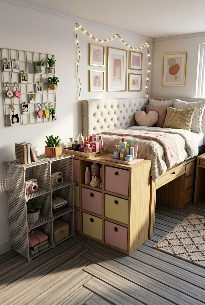
The fabric cube bins inside the bed-frame storage unit are pastel pink and yellow — and that color choice is doing more design work than it might seem. When storage is this visible, the bins essentially function as decor. Choosing them in tones that echo the blush and warm neutral palette of the bedding and gallery wall above means the functional elements read as part of the design rather than an interruption of it. It’s the kind of decision that separates rooms that feel finished from rooms that feel assembled.
The tufted upholstered headboard in cream gives the bed a more formal, furnished look than most dorm setups manage — it reads more like a bedroom than a student room, which is partly the point. String lights looped casually from the upper corner of the room down toward the wall add warmth without requiring any installation beyond a couple of push pins. The globe string doesn’t need to be perfectly arranged; slightly loose and organic in its drape is actually more effective than measured and geometric.
The metal grid wall panel on the left is a functional display surface that holds photos, small plants, and keychains — the kind of piece that handles personal memory items without requiring holes in the wall. It’s a bit more dimensional than a standard corkboard and works with the gold-and-neutral aesthetic running through the rest of the room. A wire mesh open shelving unit beside it handles books and small objects without the visual weight of solid shelves.
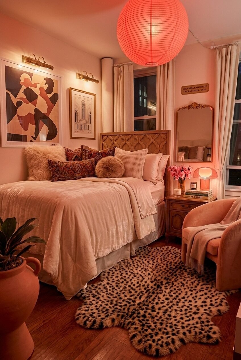
All-Pink, Done Without Apology
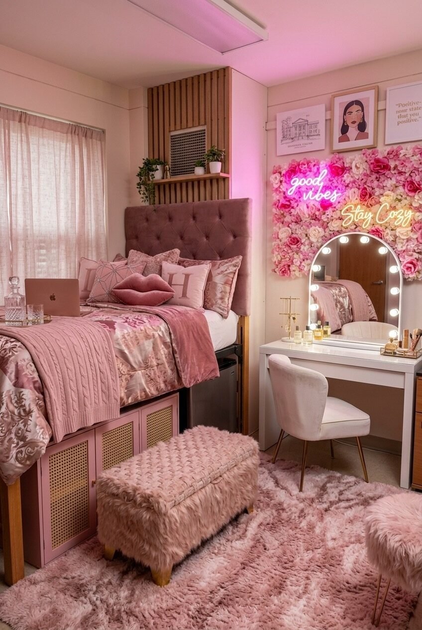
Committing this fully to a single color family is harder than it looks — not because the pink itself is difficult to source, but because rooms that go monochromatic tend to fall flat unless there’s enough variation in texture and finish to keep the eye moving. This one avoids that trap through deliberate material contrast: satin duvet against velvet headboard against faux fur bench against plush rug. All pink, but never the same pink twice.
The flower wall panel backdrop behind the vanity mirror is the statement piece that anchors the whole right side of the room. It’s a lot — faux flower panels in cream and pink with neon signs layered over them — but the fact that it’s contained to that one zone means it reads as a feature rather than an overwhelming pattern. A Hollywood mirror (arch-topped, bulb-lit) placed in front of it doubles the flowers in reflection and amplifies the effect without adding more visual material. The vanity setup itself is clean: white table, white chair, products arranged on a tray.
The wooden slatted wall panel behind the bed adds a warm vertical element that prevents the room from becoming too soft and saccharine. It’s a practical touch — this kind of panel can be found as an affordable peel-and-stick product — and in this context it gives the pink tones something slightly more structural to lean against. The small plants on the shelf above it are the only truly natural elements in the room, and their presence registers clearly because of it.
White and Gold, Genuinely Livable
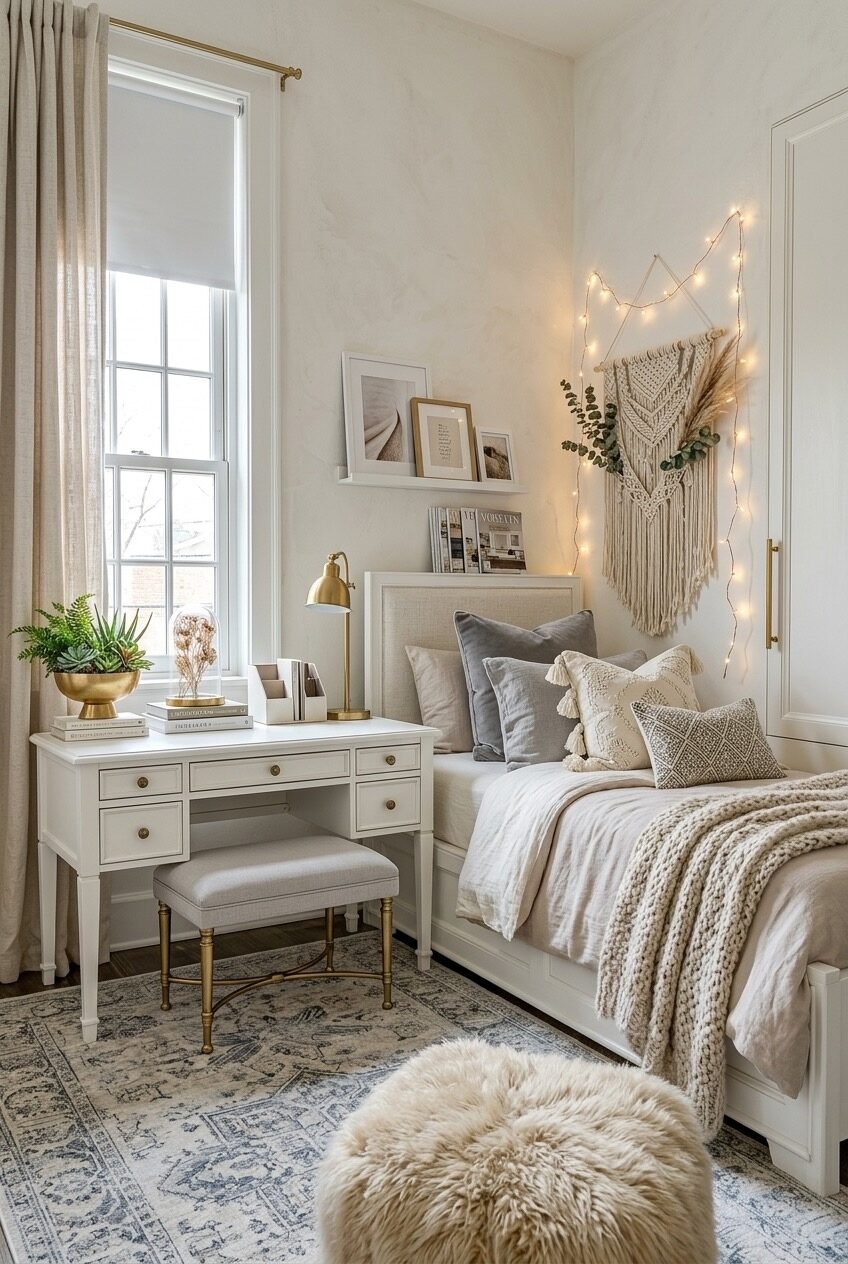
The desk placement beside the window is the first right call this room makes. Natural light for studying, warmth from the gold lamp when the sky goes grey, and a plant (succulents in a brass bowl) to give the eye something alive to land on during a study session. The white desk with gold hardware reads classic without being stuffy — the kind of piece that ages out of a dorm and into a first apartment without feeling out of place in either.
Layering the bedding is where the warmth comes from in a room that’s otherwise quite pale. Linen duvet, textured throw pillow, cable-knit blanket trailing off the edge — the bed is doing a lot of the visual work that color would do in a more saturated space. The macramé wall hanging above the bed, lit from behind by string lights, functions as a headboard alternative — which is useful in rooms where a real headboard either doesn’t fit or isn’t allowed to be mounted. It draws the eye upward and adds handmade texture to an otherwise smooth wall.
The picture ledge shelf running above the headboard area handles art without requiring any wall holes — frames just rest on the ledge and can be swapped easily. Mixing frame sizes and finishes (white frame, gold frame, unframed print) keeps it from looking like a kit. The fluffy pouf in the foreground is the kind of thing that looks like decoration but actually gets used constantly — extra seating, footrest, somewhere to drop a bag.
Small Spaces Reward Every Deliberate Decision You Make
There’s a version of dorm decorating that’s just reactive — buy whatever’s trending, fill the walls, layer a few textures, and call it done. And then there’s the version where someone actually thought about how the room should feel at 7pm on a Tuesday, not just how it looks in a photo. The difference between those two approaches is almost always visible in the final result.
The rooms above all share one underlying principle: restraint applied strategically. Not minimalism — several of them are quite full — but a sense that each element was chosen rather than accumulated. The lighting is layered. The storage is visible but styled. The personal pieces (photos, plants, prints) are distributed rather than piled. None of that requires an expensive haul. It requires making actual decisions.
Wherever your aesthetic lands — warm and maximalist, spare and editorial, coastal and sun-bleached, fully pink and fully committed — the framework transfers. Pick a palette and hold it. Choose one or two statement pieces and let the rest support them. And sort out your lighting before anything else, because no amount of nice furniture overcomes a room lit by a single overhead bulb.
 Steal Our Home Styling Secrets!