Pool Coping and Tile (Probably) Matter More Than the Entire Pool Design
We don’t usually think about pool coping first—but maybe we should. It’s that quiet detail sitting right at the edge, literally framing everything. And somehow, it decides whether a pool feels basic… or like a whole moment. Funny how the smallest line can carry the entire vibe, right?
Across these ideas, there’s a pattern (no pun intended). It’s not about picking the fanciest tile or the most expensive stone. It’s about how materials interact. Warm with cool, matte with glossy, structured with organic. That contrast is what makes a pool feel designed, not just built. And once you see it, you can’t unsee it.
If we’re being honest, most pools fail in the details. Slightly off proportions, mismatched tones, random tile choices—yeah, it shows. So if we’re doing this, we commit. Clean lines, intentional palettes, and textures that actually talk to each other. Not chaos. Never chaos.
Brick Coping With Soft Curves Energy
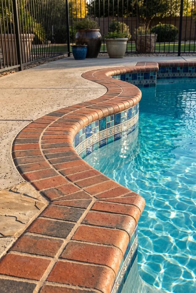
There’s something low-key irresistible about a curved brick coping moment. It’s giving timeless, slightly nostalgic, but still very put-together. The rounded edge softens the entire pool silhouette, which matters more than we think. Sharp geometry can feel a bit… aggressive. This? It whispers instead of shouts.
Design-wise, this works because of contrast. You’ve got warm, textured brick against cool, glossy water. That push-and-pull creates visual interest without trying too hard. The curve also guides the eye naturally, making the pool feel more organic and less “boxed in,” especially in smaller yards.
If we’re recreating this, don’t skip on proportion. Go for slightly thicker coping bricks so the curve reads clearly. Pair it with neutral decking (like light concrete) so the brick stays the star. And please, let the grout lines be clean. Crooked lines? Immediate vibe killer.
Tropical Spillover Spa With Mosaic Tiles
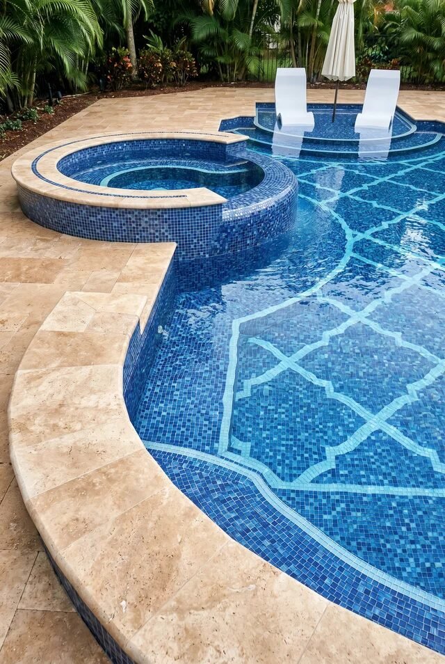
Okay, this one feels like a vacation we didn’t budget for but somehow deserve. The spillover spa wrapped in blue mosaic tile is doing the most—in a good way. It’s layered, dynamic, and honestly a little bit extra… but we’re not mad about it.
The magic here is cohesion. The same tile language flows from spa to pool, creating continuity instead of visual chaos. That tonal blue palette amplifies water clarity, making everything look deeper, cleaner, and borderline cinematic. And those soft, freeform edges? They keep it from feeling too formal.
If we’re stealing this idea (we are), commit to high-quality glass or porcelain mosaic. Cheap tiles = dull finish, and we don’t do dull. Balance it with warm stone decking so things don’t go icy. Bonus tip: add shallow loungers like this. Suddenly your pool isn’t just a pool, it’s a whole lifestyle.
Moroccan Inspired Tile Coping Drama
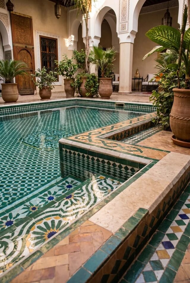
This is where we stop pretending we’re minimalists. Moroccan-style tile coping is rich, detailed, and unapologetically decorative. And somehow, it still feels calm. That’s the real flex.
The design principle here is layering. Patterns on patterns, but controlled. The geometric tiles, the earthy stone, the greenery—it all stacks without overwhelming because the color palette stays grounded. Repetition of motifs creates rhythm, which keeps the eye moving instead of getting stuck in chaos.
If we want to recreate this, restraint is key. Pick one dominant pattern for the coping and let everything else support it. Use muted greens, creams, and terracotta tones to keep it elevated, not theme-park. And lighting? Soft, warm, slightly shadowy. This look thrives in ambiance, not harsh daylight.
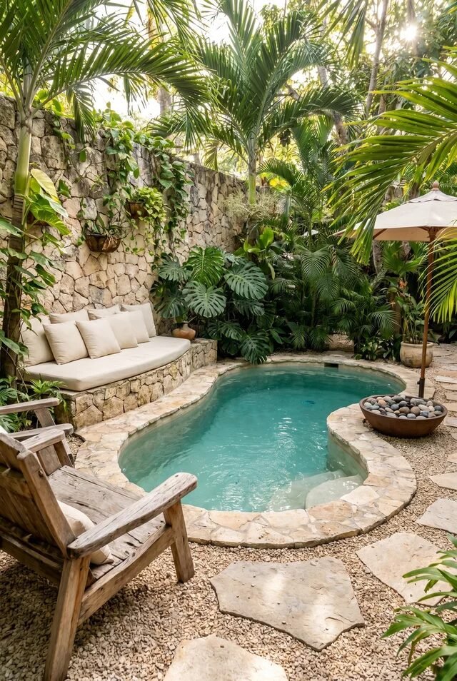
Pebble Coping With Organic Flow
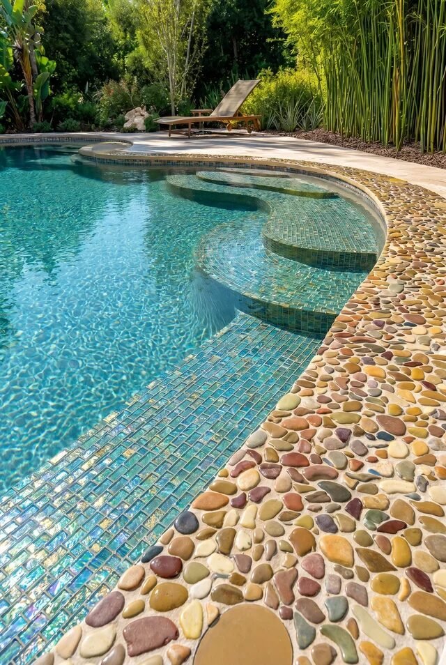
This one feels like nature casually outperformed us again. Pebble coping brings in texture that’s imperfect in the best way. It’s relaxed, tactile, and very “we just threw this together,” even though it definitely took planning.
What makes it work is the organic flow. Nothing is too straight, too polished, or too predictable. The irregular pebble surface softens transitions between deck and water, which makes the whole space feel more integrated with the landscape.
If we’re going for this vibe, mix pebble sizes slightly for a more natural look, but keep the color palette tight—think warm neutrals or earthy tones. Pair it with lush greenery or bamboo for that immersive feel. And quick reality check: seal those pebbles properly. Cute is great, but we also don’t want slippery chaos.
Playful Polka Dot Tile Border Moment
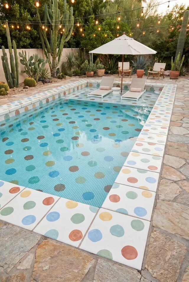
Not every pool needs to take itself seriously. This polka dot tile border is playful, slightly cheeky, and honestly kind of iconic. It’s giving boutique hotel energy without the $800/night commitment.
The secret here is balance. The pattern is bold, but the base stays simple—light blue water, clean lines, neutral decking. That contrast keeps the design from tipping into visual overload. It’s fun, but still curated. Like, we’re spontaneous… but organized.
If we’re trying this, keep the dots within a cohesive color palette—pastels or muted tones work best. Avoid going full rainbow chaos unless that’s truly your personality (no judgment, just… proceed carefully). And let the border be the statement. Everything else? Calm, minimal, and quietly supportive.
Luxe Stone Coping With Jewel Tiles
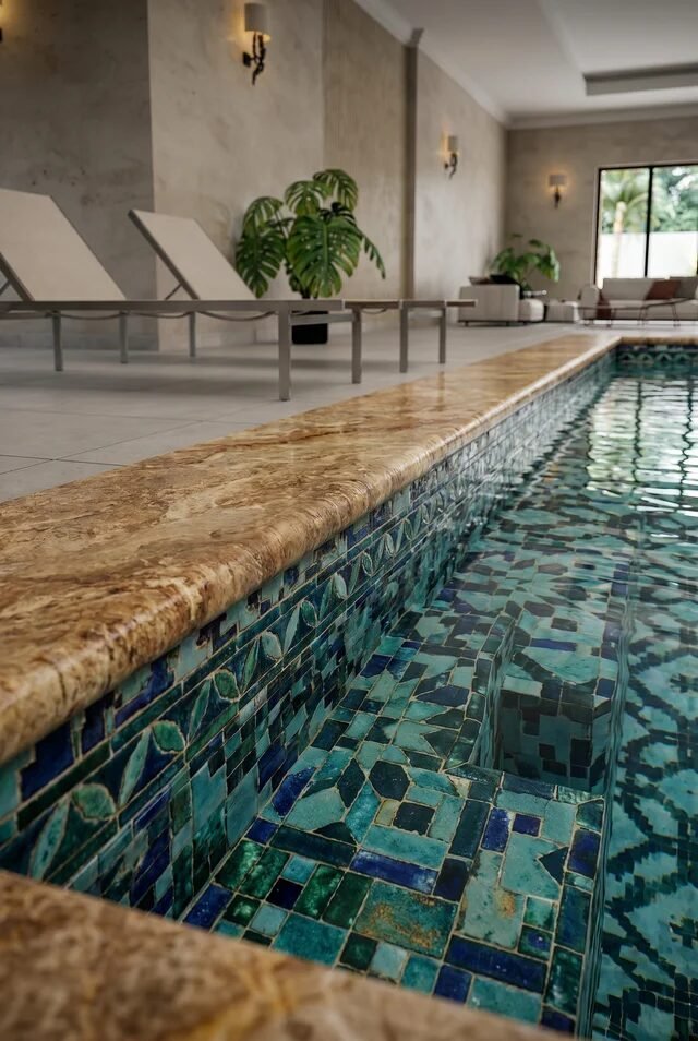
This one is quietly rich. Not loud, not flashy—just sitting there looking expensive without trying. The warm stone coping paired with jewel-toned mosaic tiles underneath? Yeah, that’s a power move. It’s giving spa energy, but like… the kind where you whisper automatically.
What makes this work is contrast in finish, not color overload. The coping is matte, earthy, grounded. The tiles underneath are glossy, reflective, slightly dramatic. That texture contrast creates depth without visual chaos, which is honestly harder to pull off than it looks.
If we’re recreating this, don’t mix random tones. Stick to a tight palette—deep greens, teals, maybe a hint of navy. And choose a natural stone with subtle veining so it doesn’t compete. Lighting matters here too. Soft, warm lighting will make those tiles glow instead of glare. We’re going for glow, always.
Sculpted Blue Mosaic With Flowing Lines
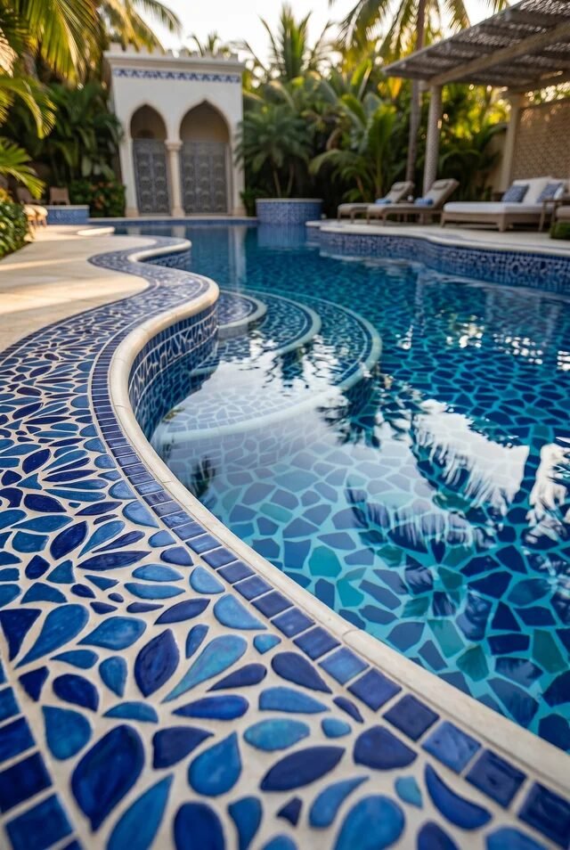
This pool said “straight lines are overrated” and honestly… we agree. The flowing coping line paired with layered blue mosaic creates movement before anyone even steps in the water. It feels fluid, almost like the design is mimicking the water itself. Very on-theme, very intentional.
The principle here is rhythm. Repeating curved lines, layered steps, and tonal blues guide the eye in a smooth loop. Nothing feels abrupt. That continuity makes the space feel bigger and more immersive, which is a sneaky trick we love.
If we want to pull this off, consistency is everything. Don’t mix ten shades of blue and hope for the best—pick three to four tones and repeat them. Keep the coping edge clean and slightly rounded to match the flow. And please, align your tile patterns with the curves. Misaligned mosaics? We will notice.
Playful Checker Tile With Story Details
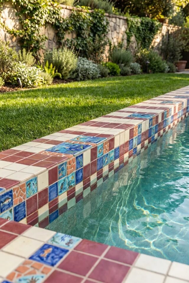
This one feels like someone had fun designing it—and that energy shows. The checker pattern mixed with illustrated tiles (hello little fish moments) gives personality without going full chaos. It’s playful, but still curated. Like a cool aunt’s backyard, if we’re being honest.
The design works because of controlled variety. There’s pattern, yes—but it’s structured. The checker grid anchors everything, while the decorative tiles act like little surprises. That balance keeps it charming instead of overwhelming, which is a fine line.
If we’re recreating this, edit yourself just a little. Pick a limited set of accent tiles and repeat them instead of using every design you find. Keep the base colors cohesive—terracotta, cream, soft blues always work. And spacing matters. Those decorative tiles need room to breathe, not fight for attention.
Classic Brick And Tile Accent Combo
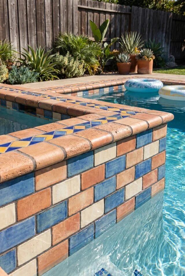
We’re back to brick, but with a little upgrade moment. Adding a tile accent band right under the coping is such a small detail, but it changes everything. It’s like wearing a simple outfit and then adding really good jewelry. Suddenly, we care more.
The strength here is layering without overcomplicating. Brick brings warmth and familiarity, while the tile adds color and pattern. That thin accent line acts as a visual break, separating materials in a way that feels intentional, not accidental.
If we’re trying this, keep the tile band narrow—this is not the place to go oversized. Choose colors that complement the brick (blues and muted yellows are safe, chic choices). And align the tile perfectly along the edge. Crooked accents will stand out immediately, and not in a good way.
Natural Stone Coping With Mosaic Swirls
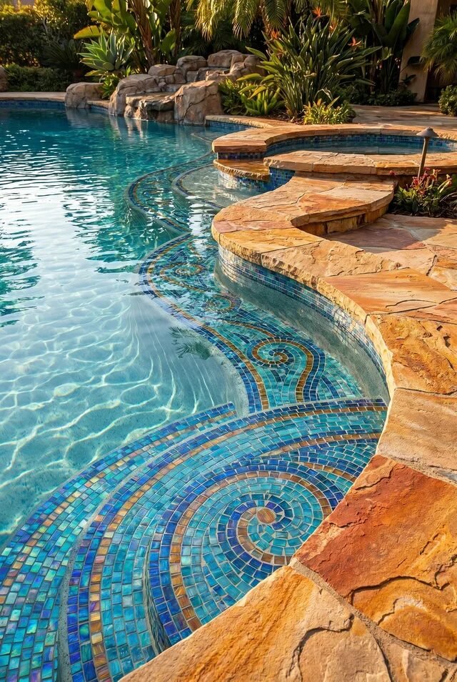
This is where things get a little artistic—and we’re kind of into it. The natural stone coping keeps everything grounded, while the mosaic swirls underneath bring movement and personality. It’s giving “functional pool,” but also “accidental art installation.”
The design magic here is contrast between control and freedom. The coping is structured, predictable, calm. The tile pattern underneath? Fluid, expressive, a little wild. That contrast creates visual storytelling, which sounds dramatic but… it works.
If we’re recreating this, plan the mosaic like an artwork, not an afterthought. Sketch the flow before installation so it actually looks intentional. Keep your color palette cohesive—blues, teals, maybe a touch of gold for warmth. And balance it with simple surroundings. When the floor is doing this much, everything else needs to relax.
Where Texture Meets Water And Everything Clicks
At the end of the day, pool design isn’t just visual—it’s sensory. It’s how the edge feels under your hand, how the tiles catch the light at 4PM, how everything shifts when water starts moving. It’s subtle, but it’s doing a lot.
What we’ve seen here is range. From playful polka dots to intricate mosaics, from rustic brick to polished stone—there’s no single “right” look. The real goal is cohesion. When the coping, tile, and surroundings feel like they belong together, the space instantly levels up. Effortlessly, even.
So if you’re planning your own pool moment, don’t rush the edge. Sit with your materials. Test combinations. Be a little picky—it’s allowed. Because once it’s done, that coping line becomes the thing you notice every single time. And ideally… you’re still obsessed with it.
 Steal Our Home Styling Secrets!