How the Right Boho Entryway Sets the Mood for Your Entire Home
Most people treat the entryway like a corridor — something to walk through on the way to the real rooms. But in boho design, the entry is where the whole personality of a home announces itself. It’s the first thing you see when you come home tired, and the first thing guests absorb before they even say hello. That matters more than we usually give it credit for.
Boho entryways work because they layer meaning into a small footprint. A kilim runner, a rattan pendant, a trailing plant — individually, these are just objects. Together, they build a narrative. The trick isn’t buying the right things; it’s understanding why certain combinations feel lived-in and warm while others just look like a mood board that never landed.
What follows pulls from real spaces that get it right — some minimal, some maximal, all of them worth studying. Whether you’re working with a narrow hallway or a proper foyer, there’s a principle in each of these that you can actually use.
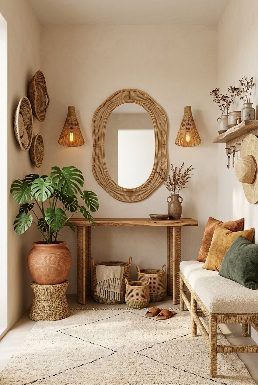
Rattan Mirror, Cane Console, Natural Light
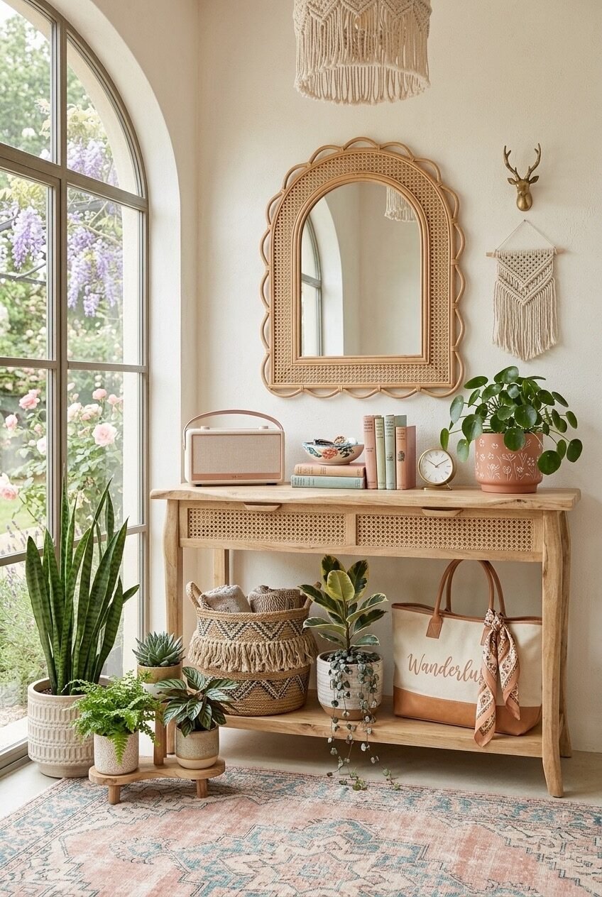
Start with the bones: a raw wood console with cane drawer fronts, an arched rattan mirror centered above it, and a macramé pendant hanging just beyond the frame. What makes this work isn’t any single piece — it’s the material continuity. Rattan, cane, raw timber, and woven cotton all share the same warm-beige frequency, so the eye moves between them without friction. The arch of the mirror echoes the arched window beside it, and that kind of architectural call-and-response is what separates a decorated space from a designed one.
The console shelf does real organizational work here without announcing it. A woven basket holds everyday clutter, a small plant and a few books add life without fuss, and a canvas tote draped casually over the shelf edge signals that this is a space people actually use. Boho doesn’t perform tidiness — it absorbs the reality of daily life and makes it look considered.
If you want to pull this off, prioritize the mirror shape first — the scalloped arch is load-bearing aesthetically. Look for rattan or cane options, not gilded frames. Then match the console material (raw or lightly stained wood, not lacquered). The macramé wall hanging and antler accent are supporting cast; don’t let them outcompete the mirror-console pairing.
When the Rug Does All the Talking
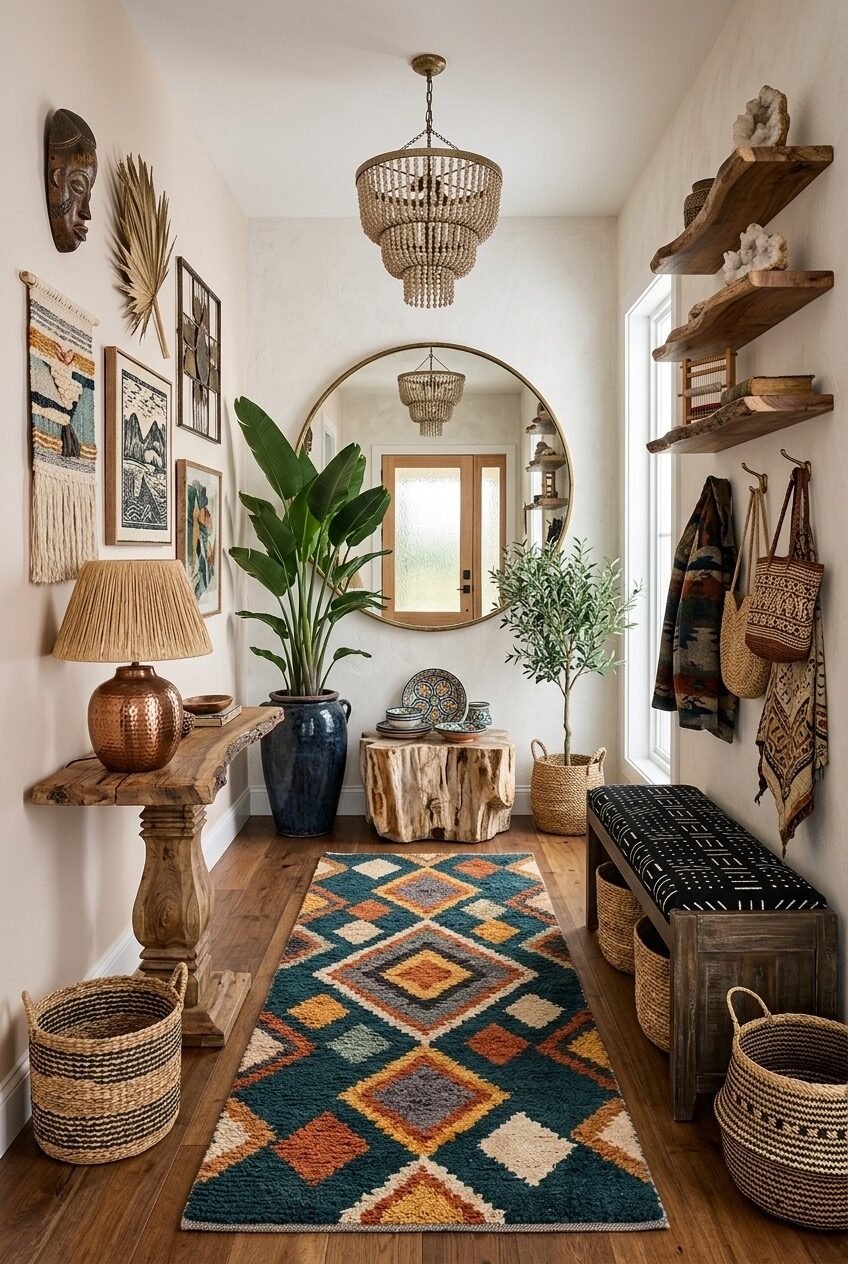
A chunky beaded chandelier, raw live-edge console, round brass-framed mirror, and a rug so colorful it practically hums — this entryway leans into visual abundance without ever tipping into chaos. The key is that the walls stay quiet. Creamy off-white plaster-look walls give all that pattern and color somewhere to breathe, and the rustic wood tones across the console, wall shelves, and tree stump side table keep everything anchored in the same earthy family.
The geometric kilim-style runner is doing the heavy lifting here. Its teal, rust, yellow, and ivory palette essentially sets the color brief for every other decision in the room — the mudcloth bench cushion, the copper lamp base, the warm gold of the chandelier beads. When a rug is this confident, the rest of the space can afford to be quieter. It’s a principle worth remembering: one loud element works; two loud elements compete.
For recreating this kind of layered, globally-inspired foyer, don’t start with the chandelier or the mirror — start with the rug. Find something with real color complexity (not a faded boho print, but something with actual contrast), then build your material choices around what it already contains. Float the round mirror above center, bring in live-edge or reclaimed wood wherever you can, and stack the floating shelves with crystals, books, and objects that look like they came from somewhere.
One Statement Piece, Full Stop
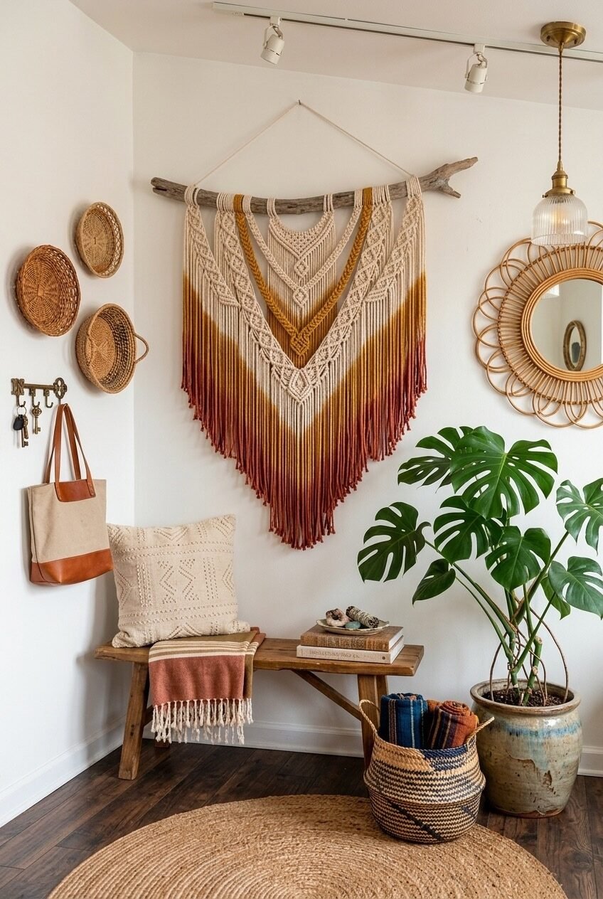
Everything in this entryway — the simple wooden bench, the jute round rug, the woven basket, the modest pendant — exists to support one thing: that dip-dyed ombre macramé wall hanging. It goes from cream at the top to amber to a deep rust-burgundy at the fringe, suspended from a raw driftwood branch. The scale is large, and it’s intentionally so. When you commit to a single dominant wall piece, the rest of the room has permission to be simple.
The woven basket trays on the left wall, the small rattan sunburst mirror to the right — these aren’t fillers. They create a visual perimeter that frames the macramé without crowding it. The monstera in the corner adds organic contrast: something living against something handmade. Notice also the track lighting above, which isn’t the most boho fixture choice, but it does the practical job of throwing light on the hanging piece. Utility and beauty aren’t opposites.
Pulling this off requires restraint, which is harder than it sounds when you’re a person who loves boho. Hang the macramé first, then stand back and decide what the wall actually needs around it — not what you want to add, but what it needs. A large piece like this usually needs very little company. Keep seating low and textural (a slatted bench, a jute pouf), and let the floor stay mostly clear so the hanging reads from foot to ceiling.
Carved Sideboard, Dried Botanicals, Maximum Character
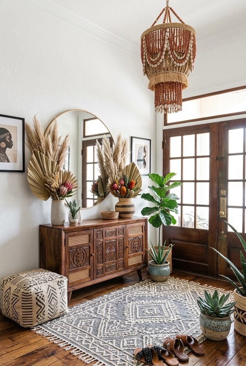
Pampas grass and dried palm fans spilling out of a woven vase, a carved-and-cane sideboard in dark walnut, a mud cloth floor pouf, a bead-and-shell chandelier, and a fiddle leaf fig beside French doors — this is a space that earns its complexity. Every piece has a story, or at least looks like it does. The dried botanicals are doing something important here: they add height and wildness without adding color, which lets the warm wood tones and earth-toned rug read clearly beneath them.
The carved sideboard is the kind of furniture that carries a room. It has enough visual weight and craft to anchor everything around it. Pair a piece like this with a round brass mirror (not sunburst, not rattan — brass) and you get a focal point that feels more collected than decorated. The mud cloth pouf on the floor introduces pattern without introducing color, which is a useful trick when a space is already rich with material texture.
To recreate this specific warmth, focus on the layering of natural materials at different scales: architectural (the French doors, the wide plank floors), furniture-scale (the carved sideboard), and accessory-scale (baskets, botanicals, sandals left by the door). The last one matters. A boho entryway that looks like no one ever walks through it loses something essential.
Hat Wall as Functional Gallery Art
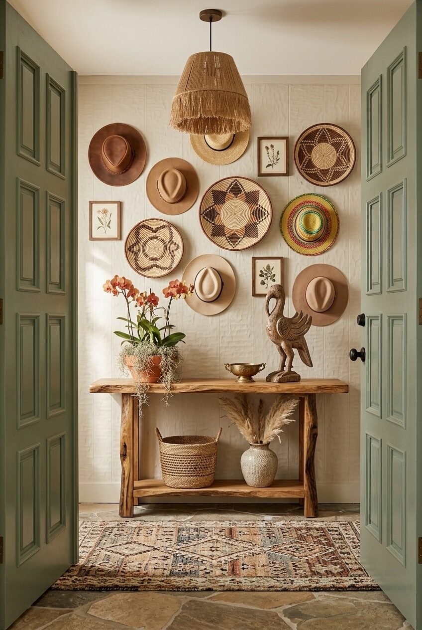
The moment you walk through these sage-green double doors, you’re looking at a wall covered in hats — wide-brimmed felt, straw, woven — interspersed with flat African basket plates and small botanical prints. It reads as a gallery wall, but every single thing on it is functional. That’s a genuinely clever design move: storage that doubles as art, or art that doubles as storage, depending on your angle.
The sage doors are quietly doing a lot of work in this composition. That particular green — muted, dusty, with grey undertones — against the cream shiplap wall creates a frame that makes you actually look at what’s between them. Without the door color, this would just be a busy wall. With it, it feels like a display. Color can be a frame as much as any piece of trim.
The live-edge console below is deliberately simple — raw wood, no drawers, just a lower shelf holding a seagrass basket and a dried grass arrangement. This is the right call. A heavily decorated wall needs a lighter piece of furniture beneath it, not another layer of detail fighting for attention. An orchid in a terracotta pot and a carved bird sculpture are enough to give the console some personality without pulling focus from above.
Yellow Walls, Green Plants, Good Bones
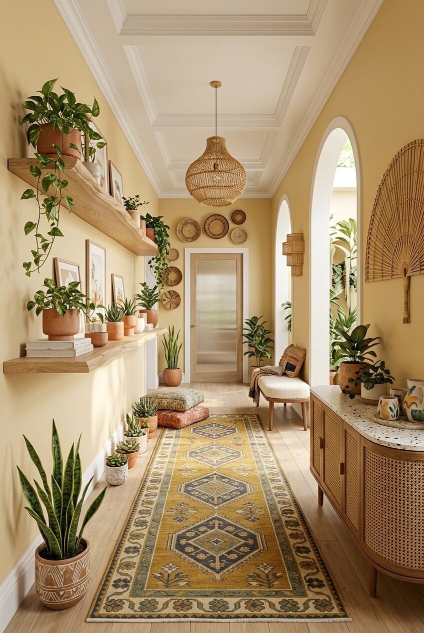
Warm yellow walls are polarizing in a way that beige never is, and that’s exactly what makes them interesting. This long hallway uses a soft, saturated golden-yellow that could easily feel overwhelming — but because the shelves, floor, and furniture are all in pale natural wood, and because the plants are uniformly green, the yellow just reads as sunshine rather than noise. The color balance is: one warm, two neutral, one recurring natural element. That ratio is worth noting.
The shelving wall is a plant display, essentially. Terracotta pots at varying heights, trailing pothos, small succulents, stacked books — it’s the kind of shelf that grows over time rather than being arranged once and left. On the opposite side, arched openings frame views into adjacent rooms, and a cane-front sideboard sits beneath a large rattan fan mirror. The arch motif — repeated in the openings, in the mirror shape, in the pendant lamp’s round silhouette — gives this hallway its architectural coherence.
If you’re considering a yellow entryway, the wall color is only the starting point. The success of this space depends on everything else being quieter — pale timber floors, natural wood shelves, simple terracotta pots. Don’t add a patterned rug until you know the walls aren’t competing. Here, the mustard Oushak runner works because it echoes the wall tone rather than contrasting with it.
Green Door, Vintage Mirror, Lived-In Bench
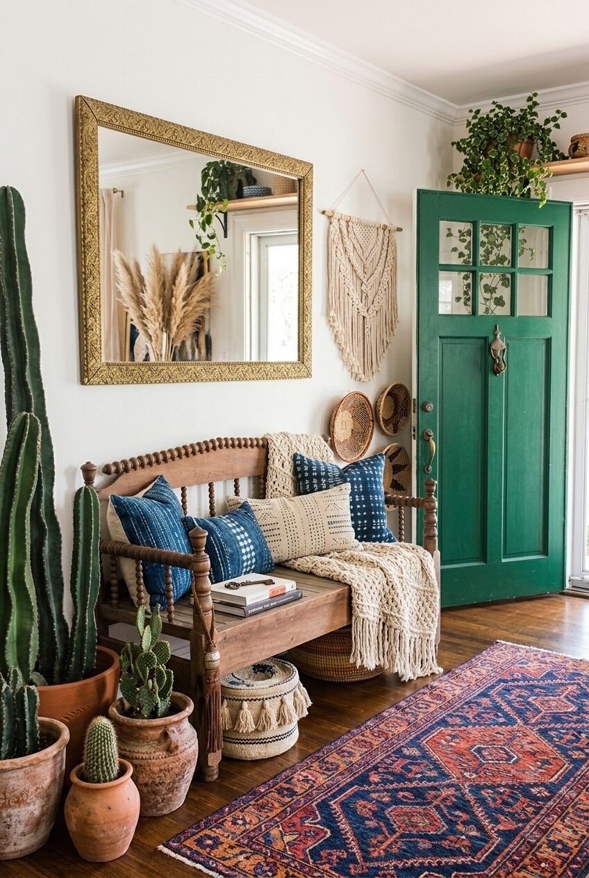
A lacquered emerald green interior door is a commitment, and this entryway commits fully. The rich, jewel-toned door anchors an otherwise cream-and-neutral space and gives the whole corner its energy. The ornate gold mirror frame above the spindle bench echoes the brass hardware on the door without matching it exactly — close enough to feel related, different enough to feel layered. That’s a subtler move than it looks.
The spindle bench is an antique or antique-adjacent piece, and it’s doing real work here. Boho entryways that rely only on new rattan and wicker risk feeling like they came off a single shelf at a furniture chain. An older, heavier wood piece — especially one with turned details — introduces the sense that a space has been assembled over time. The indigo mud cloth pillows and cream woven throw draped over the arm read as genuine comfort, not staging.
The cactus situation on the left is full commitment: multiple varieties in terracotta pots of different heights, clustered together like a small landscape. It’s the kind of plant arrangement that only works when you go all the way with it. One small cactus in a corner would disappear; six of them become a statement. Think about that principle whenever you’re working with plants in an entry — singular plants as anchors (fiddle leaf, monstera), clusters as environment.
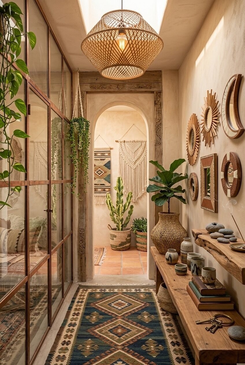
Three Rattan Mirrors, One Arched Wall
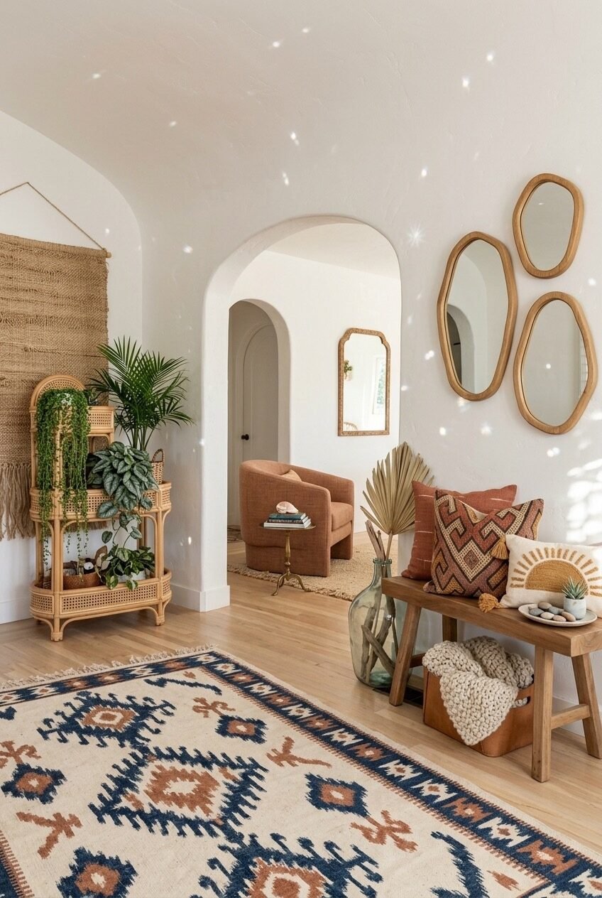
Organic-shaped rattan mirrors clustered in a trio on a white wall — not a gallery wall, just three mirrors, slightly different sizes, arranged in a loose triangular grouping. It’s a restraint move that feels bold because of how much white space it lets breathe around it. The Moroccan arch beyond opens into the living room, and its shape ties back to the arch of the rattan wall mirror visible inside. Repetition of form across a space — especially arch shapes — creates harmony without requiring matching materials.
The rattan plant stand on the left holds a rotating collection of trailing and leafy plants at different heights, which adds organic movement without committing to a fixed arrangement. The wooden bench on the right keeps things grounded: terracotta-toned cushions, an Aztec-print pillow, a chunky knit throw folded at the foot, and a large glass vessel with a single dried palm frond. That last detail — one dramatic botanical in a clear glass bottle — is the kind of simple move that photographs beautifully and costs almost nothing.
This is a relatively open foyer, which helps, but the design principles transfer to smaller spaces. The key is the restraint in the mirror cluster: similar frames, organic shapes, nothing matched perfectly. If you’re buying three mirrors to group, buy them from different places so they share only material, not size or exact form.
Painted Arch, Ribbed Cabinet, Earthy Everything
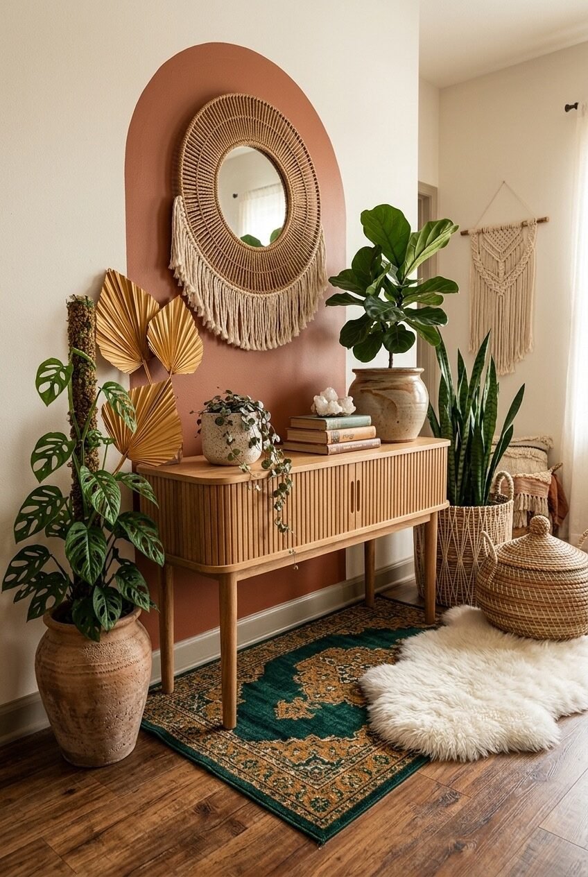
A terracotta-painted arch directly on the wall — not an architectural arch, just a painted one — frames a rattan sunburst mirror and a macramé hanging below it. It’s one of those ideas that sounds risky and looks obvious once it’s done. The arch gives the console area a dedicated visual zone without any furniture rearrangement, and the warm, clay-toned paint pulls the monstera, the dried golden palm fans, and the stoneware vase into a single warm conversation.
The ribbed oak sideboard is a quieter piece than you might expect in a boho space — clean lines, minimal hardware, almost Scandinavian in silhouette. But the surrounding elements are so richly textural (the woven baskets with lids, the snake plant in a seagrass planter, the rough terracotta urn) that the cabinet’s simplicity reads as sophistication rather than plainness. Mixing one cleaner contemporary piece into a heavily textured boho setup prevents the space from feeling costume-y.
For anyone tempted by the painted arch idea: use a matte finish, tape your arch shape carefully with flexible painter’s tape, and choose a tone already present in your accessories — terracotta, sage, dusty rose. The arch works because it mirrors the forms already in the room. A bright or contrasting color would fight everything else rather than unify it.
Distressed Red Walls and Zero Apologies
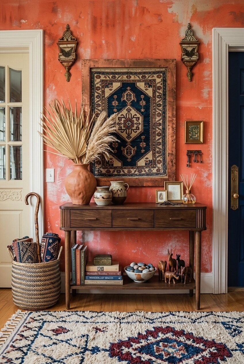
This is the most maximalist entry in this entire post, and it earns every bit of that. Venetian plaster-style walls in a deep, worn terracotta-red, a vintage Turkish rug hung as art above the console, paired Moroccan-style brass wall sconces, and a walnut console table stacked with textured ceramics, dried botanicals, and personal objects. The distressed wall treatment is non-negotiable here — smooth painted walls in this color would look like a restaurant. The texture is what makes it feel ancient and personal.
The objects on and under the console are worth studying: a rough terracotta vase with dried pampas and palm, a ceramic jug, a reed diffuser, stacked books with nomadic textile titles, carved wooden animals, a bowl of river stones, a vintage key rack. None of it matches, all of it coheres. This is curation without the curated feeling — the difference being that everything here looks like it arrived over years rather than in one shopping cart.
Red walls of this depth are genuinely difficult to pull off in small spaces, and this one works partly because of the white door frames and ceiling acting as visual relief. If you want to try a version of this, start with the rug-as-art concept before committing to the wall color — hang a vintage textile in a copper or gilded frame and see how the surrounding wall needs to respond to it. The wall color should feel like it was chosen to honor the textile, not the other way around.
The Entry Doesn’t Have to Earn Its Keep Alone
A boho entryway at its best doesn’t announce itself as a design project. It feels like something that grew — a rug found on a trip, a mirror inherited, a plant that outgrew its original room and ended up here. The intentionality is real, but it doesn’t show its work. That’s the goal worth chasing.
Most of the spaces here share a few underlying principles: a rug that sets the palette, at least one piece with genuine craft or age, plants in terracotta rather than white ceramic, and walls that either stay quiet or commit completely. None of them are complicated ideas. The execution is what takes time, and the willingness to edit once things are up.
If you take one thing from all of this, let it be that the entry is worth the effort. It’s a small space with outsized influence on how a home feels to be in. Get the bones right — a good mirror, a solid console, a rug with personality — and the rest of it will follow.
 Steal Our Home Styling Secrets!