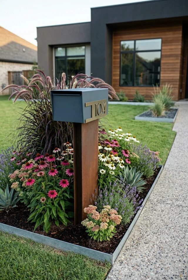
The Mailbox Was Never the Problem—We Just Styled It Wrong
Let’s be honest—most of us treat the mailbox like it’s just… there. Functional, forgettable, slightly leaning to one side if we’re unlucky. But after seeing all these designs? Yeah, we’re not doing boring anymore. Your mailbox is literally the first thing people see, so why not let it set the tone?
Across these ideas, we’re seeing a pattern: balance always wins. Whether it’s mixing soft landscaping with clean structures, or pairing bold designs with minimal surroundings, it’s never just about the mailbox—it’s about the whole moment around it. Even the smallest detail can shift your curb appeal from “meh” to “wait, that’s actually cute.”
So if you’ve been ignoring your mailbox era, consider this your sign. You don’t need a full front yard makeover—just a little intention, a bit of styling, and maybe a tiny personality upgrade. Because yes, even your mail deserves better presentation.
Modern Minimalist Mailbox With Soft Landscaping
There’s something quietly powerful about a mailbox that doesn’t scream for attention but still wins the whole curb appeal game. This one leans into a clean-lined, matte-finish box paired with a warm wood post, and honestly… it’s giving “effortless but expensive.” The surrounding planting bed softens everything so it doesn’t feel too sharp or sterile. We love a design that knows how to balance itself.
From a design perspective, this setup nails contrast and layering. You’ve got structured geometry from the mailbox and edging, balanced by organic shapes from grasses and florals. That mix of hardscape and softscape is what makes it feel intentional, not accidental. The color palette also plays nice—greens, muted purples, and warm wood tones keep it cohesive.
If we’re recreating this, keep your plant choices low-maintenance but varied in height. Add edging to frame the space (it matters more than we admit), and stick to two or three core materials. Minimal doesn’t mean boring—it means edited, and yes, we’re gatekeeping clutter here.
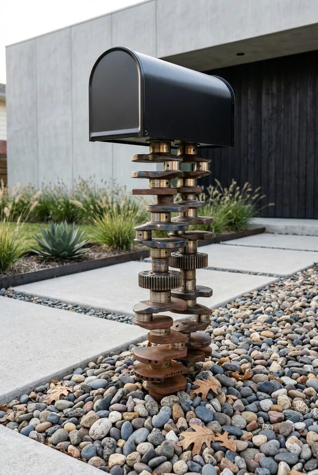
Rustic Wood Mailbox With Pebble Base
Okay but this one? She has character. The chunky wood post paired with that rounded black mailbox feels grounded, almost architectural, but then the pebble base comes in and softens the whole moment. It’s giving “we care about details” without trying too hard—which, let’s be honest, is the ultimate flex.
What makes this design work is texture layering. Rough wood, smooth metal, and polished pebbles all play different roles but still feel cohesive. The circular planter base is also a subtle genius move—it creates a visual anchor so the mailbox doesn’t feel like it’s floating awkwardly. Everything feels placed, not just… there.
If you want to recreate this, don’t skip proportion. A thicker post makes the whole thing feel more premium. Use mixed pebbles for dimension (flat ones are elite, btw), and sneak in a few succulents for that low-effort greenery. It’s rustic, but like… curated rustic, not backyard DIY chaos.
Whimsical Cottage Mailbox That Feels Storybook
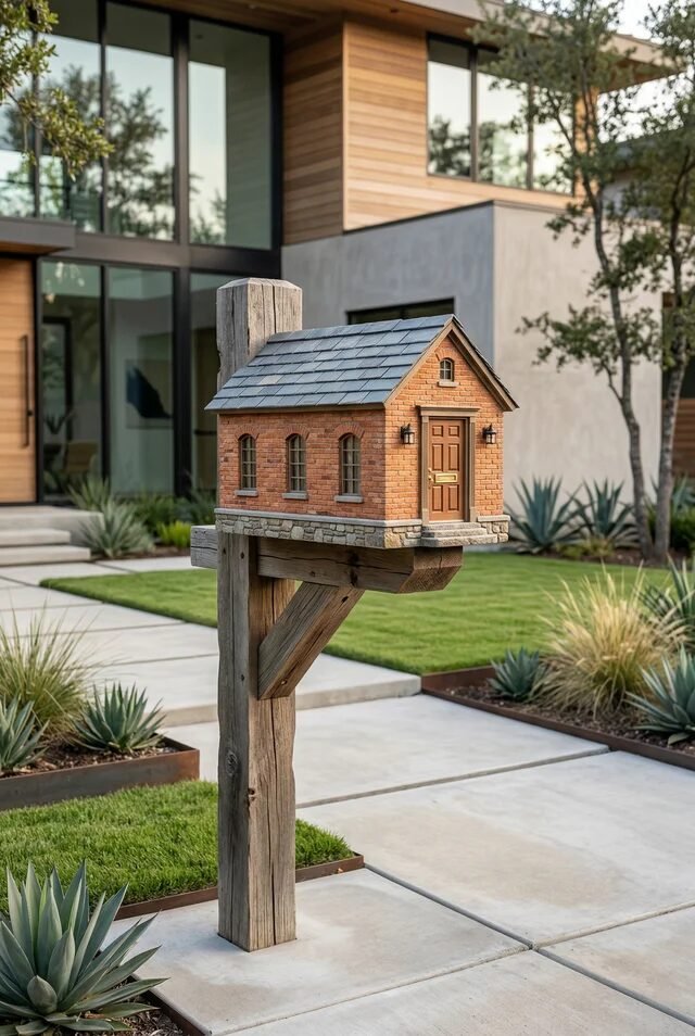
We’re not saying your mailbox should look like it belongs in a fairytale… but also, why not? This tiny house-style mailbox is unapologetically charming, and somehow it still works in a modern setting. It’s playful without tipping into kitschy, which is honestly a fine line.
Design-wise, this leans into thematic styling. The miniature architecture mirrors real-home elements—brick texture, pitched roof, even tiny windows—creating visual harmony. That repetition of form is what keeps it from feeling random. It’s not just cute; it’s conceptually consistent, and we respect that.
If you’re recreating this, commit to the theme or don’t do it at all. Match materials or colors from your actual home exterior so it feels connected. Keep landscaping simple around it so the mailbox stays the star. And maybe don’t go full Disneyland—just a hint of whimsy is enough to make people smile (and low-key jealous).
Bold Statement Mailbox With Sculptural Drama
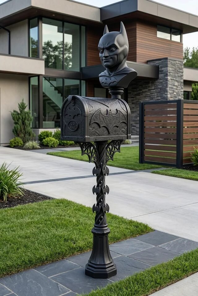
This one said, “subtle? never heard of her.” And honestly, we’re not mad about it. A sculptural mailbox with dramatic detailing instantly turns a functional object into a full-blown focal point. It’s edgy, a little theatrical, and definitely not for the indecisive.
The design principle here is all about emphasis and contrast. The dark, ornate structure stands out sharply against a clean, modern home backdrop. When everything else is minimal, one bold element hits ten times harder. It’s controlled drama, not chaos, and that’s the difference between stylish and… questionable.
If you’re tempted to try this, commit to a strong silhouette but keep the surroundings simple. Neutral paving, trimmed grass, and clean lines will let the mailbox shine without competition. Also, make sure the scale feels right—too small and it looks awkward, too big and suddenly it’s giving theme park energy.
Classic White Pillar Mailbox With Elegance
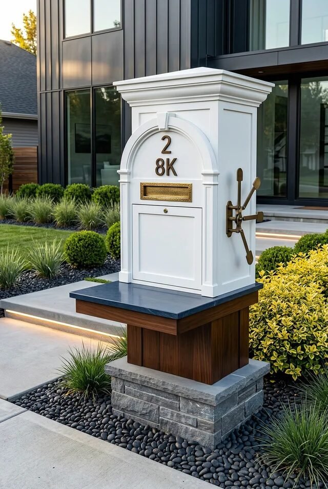
There’s something about a crisp white pillar mailbox that just feels… expensive. It’s timeless, polished, and quietly confident—like it knows it doesn’t need trends to stay relevant. Paired with soft landscaping and clean stonework, it creates a very “put together” first impression.
This design leans heavily on symmetry and proportion. The structured pillar, balanced base, and centered detailing create a sense of order that’s super satisfying visually. Clean lines + neutral tones = instant sophistication, no overthinking required. It’s basically the design equivalent of a perfect white shirt.
To recreate this, focus on materials that feel solid and well-finished—paint quality matters here. Add subtle lighting if you want a glow-up moment at night (trust, it hits). Keep plants neat and slightly sculpted rather than wild. This isn’t the place for chaos; it’s the place for calm, curated elegance.
Playful Pink Mailbox That Sparks Joy
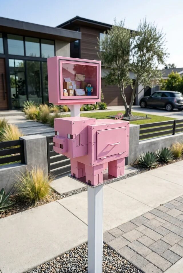
We don’t usually expect a mailbox to have personality, but this one said, “why not be iconic?” The soft pink tone paired with that almost toy-like, blocky structure feels playful without being childish. It’s giving main character energy… in the best way. And honestly, in a street full of neutral tones, this one wins attention effortlessly.
What makes it work is contrast and intentional boldness. The modern home backdrop is all clean lines and muted colors, so this pop of pink becomes a focal point instantly. When you introduce a statement color, everything else needs to stay calm so it doesn’t turn chaotic. The boxy geometry also echoes the architecture, which keeps it from feeling random.
If we’re recreating this, commit to one standout color and keep the silhouette simple. Add a small display window or quirky detail if you’re feeling brave. Just remember—bold is cute, but balance is what keeps it chic, not chaotic Barbie-core overload.
Bicycle Planter Mailbox With Charm
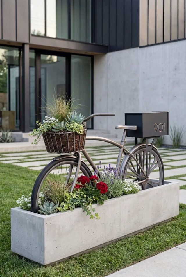
This one feels like it belongs in a Pinterest board titled “soft life but make it aesthetic.” A vintage-style bicycle paired with a planter and mailbox combo? Low-key genius. It turns something purely functional into a mini garden moment, and we’re kind of obsessed.
Design-wise, this plays heavily on storytelling and movement. The bicycle shape naturally guides the eye horizontally, while the layered plants add softness and life. It’s not just a mailbox—it’s a composition, and every element has a role. The concrete planter base grounds everything so it doesn’t feel flimsy or overly decorative.
To recreate this, look for a metal frame or repurpose an old bike (yes, we love a sustainable queen). Fill the planter with mixed heights—spillers, fillers, thrillers, you know the drill. Keep colors cohesive so it doesn’t look like a garden center exploded. Cute, but curated.
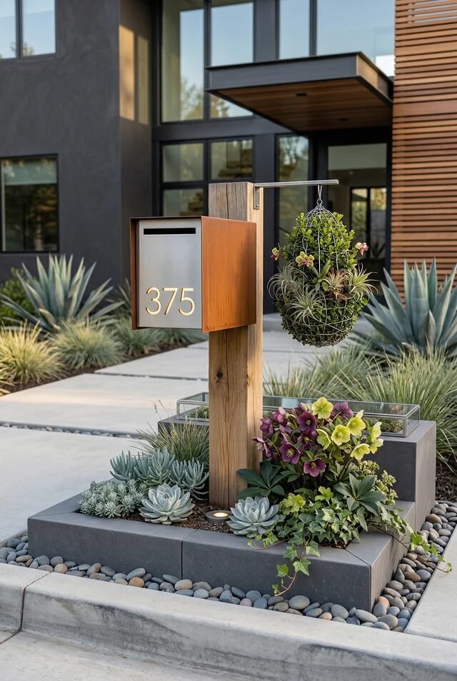
Sleek Mailbox With Built-In Planter
This design is giving “we read architecture blogs for fun,” and honestly… same. The clean vertical post with integrated planter boxes feels modern, intentional, and just a little bit smug (in a good way). It’s functional, but elevated—like your mailbox went to design school.
The magic here is vertical layering. You’ve got height from the post, mid-level interest from the mailbox, and softness from the plants. Stacking visual elements vertically creates depth without taking up more space, which is kind of a small-yard hack. The warm metal tones also add richness against the minimalist home.
If you’re recreating this, think in levels. Add a planter at the base and maybe a smaller one mid-post. Stick to drought-tolerant plants if you don’t want extra maintenance (we’re busy, okay). And don’t forget lighting—because at night, this setup? Subtle flex.
Ornate Black Mailbox With Classic Edge
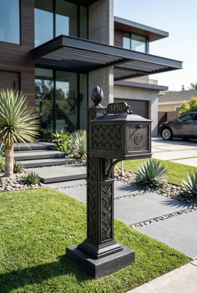
This one feels like it has opinions—and honestly, we trust them. The ornate detailing, deep black finish, and structured pedestal give it a timeless, almost heritage-inspired vibe. It’s bold without being loud, which is a rare skill these days.
The design principle here leans into texture and detail. The woven patterns and decorative elements add depth, while the monochrome palette keeps it sophisticated. When you go detailed, keeping the color simple prevents visual overload. It’s a perfect example of restraint meeting drama halfway.
If you’re into this look, invest in one statement piece instead of layering too many extras around it. Keep the surrounding landscape clean and structured—think trimmed grass, stone paths, minimal plants. This style thrives on contrast, not clutter. It’s giving quiet luxury, not maximalist chaos.
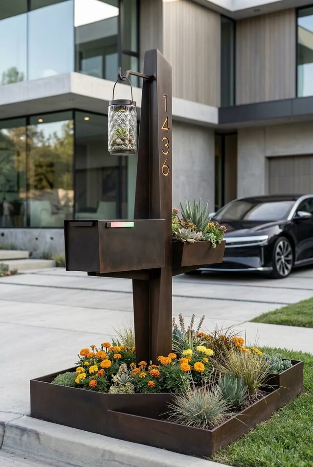
Modern Mailbox With Hanging Garden Accent
We’re ending on a soft note because this one feels like a breath of fresh air. A simple modern mailbox paired with a hanging plant detail? Effortless. It’s not trying to impress, and somehow that’s exactly why it works.
The design strength here is asymmetry. The mailbox sits cleanly on one side, while the hanging planter adds visual weight on the other. That imbalance creates interest without feeling off, which is actually harder to pull off than symmetry. The mix of wood, metal, and greenery keeps it warm and inviting.
If you want to recreate this, focus on proportion. The hanging plant shouldn’t overpower the mailbox—think accent, not jungle takeover. Use trailing plants for that soft, cascading effect. And keep the base landscaping minimal so everything feels intentional. Simple, but definitely not boring.
Small Details, Big Impact—Your Curb Appeal Glow-Up
Here’s the thing no one really talks about: curb appeal isn’t always about big, dramatic changes. Sometimes it’s literally one well-designed mailbox doing all the heavy lifting. And after going through these ideas, we can confirm—a thoughtfully styled mailbox can low-key carry your entire front yard aesthetic.
From minimalist setups to playful statement pieces, the common thread is intention. Materials are chosen, proportions are considered, and nothing feels random. That’s the difference between something that looks styled versus something that just… exists. And we’re aiming for styled, always.
So whether you’re leaning modern, rustic, or slightly whimsical (no judgment, we love a theme), pick a direction and commit. Add a little greenery, clean up the base, maybe upgrade the structure. It doesn’t have to be dramatic—just deliberate. Because sometimes, the smallest corner of your home ends up stealing the whole show.
 Steal Our Home Styling Secrets!