
The Scandinavian Living Room Mood We Keep Coming Back To
We all love a living room that looks calm, curated, and somehow not trying too hard—and that’s exactly the magic of Scandinavian design. It’s not about having less just for the aesthetic, it’s about choosing better. Think soft neutrals, natural textures, and layouts that actually make sense for real life (yes, even when laundry is lurking somewhere off-frame).
Across these ideas, we’re seeing a pattern: balance over perfection. Light woods meet cozy textiles, clean lines get softened with woven accents, and every space feels intentional without being overly styled. That quiet layering is what turns a simple room into something that feels warm, livable, and a little bit elevated.
And let’s be honest, we’re not aiming for a showroom—we want a space that looks good and feels like us. Scandinavian design just happens to be really good at giving both, without the extra drama.
Soft Neutrals With Woven Warmth Layers
There’s something quietly confident about a living room that doesn’t try too hard—and this one gets it. The palette stays in that creamy, almost-whisper tone, then lets texture do all the talking. Think boucle cushions, soft throws, and that oversized woven pendant casually stealing the spotlight. This is a masterclass in letting neutrals feel rich, not boring.
From a design perspective, this space leans heavily on layering rather than contrast. The rug anchors everything with subtle pattern, while the gallery wall adds vertical interest without overwhelming the calm vibe. Nothing screams for attention, yet everything feels considered. Low-key iconic behavior.
If we’re recreating this, we’d focus on mixing at least three textures in the same color family—linen, wool, and rattan are a safe trio. Keep furniture shapes soft and slightly rounded, and don’t over-style the shelves. Scandi works best when it looks effortless, even if we absolutely overthought it.
Warm Wood Tones Meet Natural Light
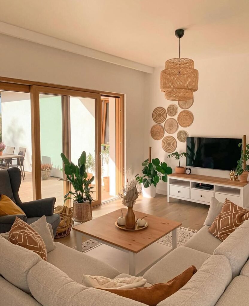
This is where Scandinavian design flirts a little with cozy minimalism and honestly… we’re not mad about it. The natural wood tones bouncing off that soft daylight? Chef’s kiss. It creates a space that feels warm without drifting into heavy or cluttered territory.
What’s happening here is all about balance. The clean-lined furniture keeps things grounded, while the plants and woven wall decor soften the edges. The layout also deserves a moment—everything is centered around conversation, not just the TV. That subtle shift makes the room feel more intentional and way more livable.
To pull this off, we’d start with a neutral base and slowly layer in warm wood finishes—oak, walnut, even a little teak if we’re feeling bold. Let natural light do its thing (no heavy curtains, please). And yes, add plants, but keep it curated. We’re going for “I have my life together,” not “indoor jungle took over.”
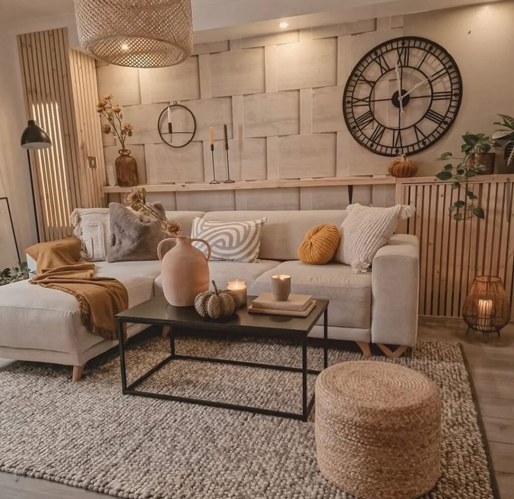
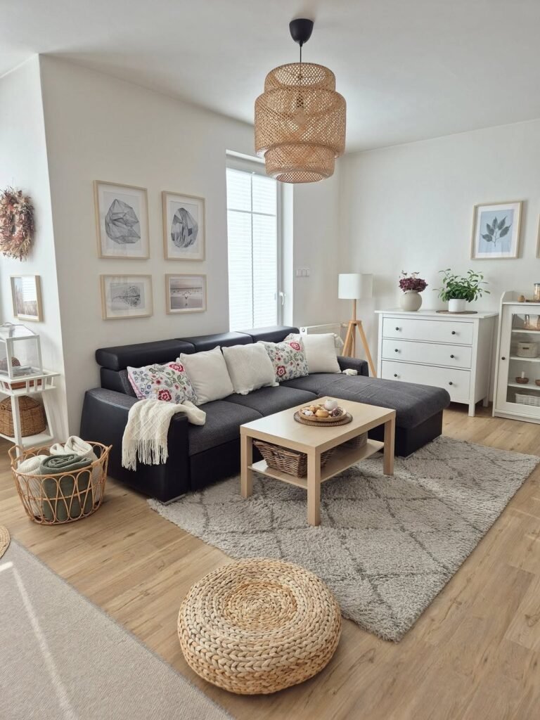
Cozy Textures With Subtle Rustic Touches
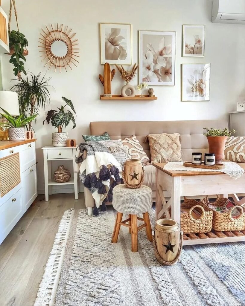
Okay, this one leans a little rustic—but in a very “Scandi went on a countryside retreat and came back cooler” kind of way. The soft beige sofa, chunky knit throws, and those lightly weathered wood pieces create a vibe that feels lived-in without looking messy.
The design principle here revolves around warmth through imperfection. Clean lines are still present, but they’re softened by handcrafted elements—woven baskets, textured rugs, and slightly distressed finishes. It’s less polished, more personality. And honestly, that’s what keeps it from feeling like a showroom.
If we want to recreate this, we’d mix refined and rustic on purpose. Pair a simple sofa with a raw wood coffee table or add woven storage that doubles as decor. Keep the color palette tight—creams, soft browns, muted greens—and let texture carry the visual weight. A little “undone” energy is actually the goal here.
Midcentury Meets Scandinavian Calm Energy
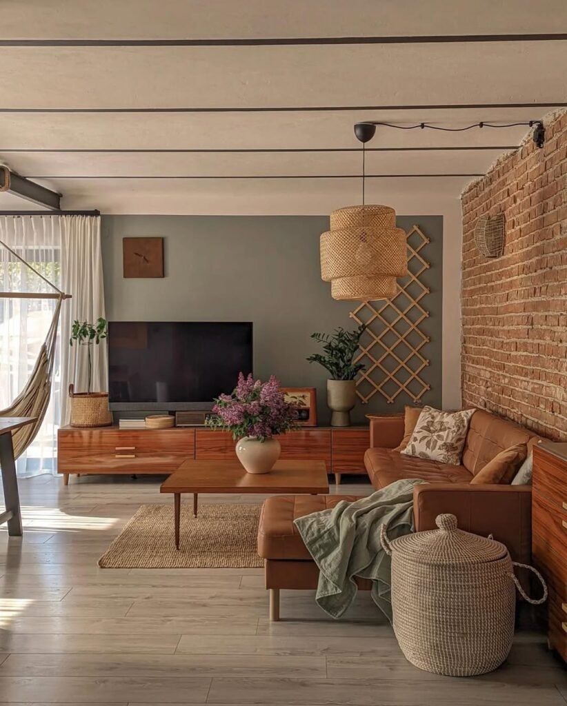
Now this is where things get a bit spicy—in a very controlled, Scandinavian way. The midcentury furniture brings depth and character, while the muted color palette keeps everything from feeling too retro. It’s giving vintage, but make it chill.
What stands out is the contrast between materials. Smooth wood surfaces, soft textiles, and that exposed brick wall all play together without competing. The layout is clean, but not rigid, and the lighting adds just enough warmth to soften the structured pieces. It’s proof that Scandinavian design doesn’t have to be all pale and predictable.
To recreate this vibe, we’d introduce one or two midcentury statement pieces—think a low-profile media console or a leather sofa. Keep everything else understated so those pieces can breathe. Add a textured wall or natural material for depth. It’s about mixing eras, but keeping the mood cohesive, not chaotic.
Minimal Corner Styling That Feels Intentional
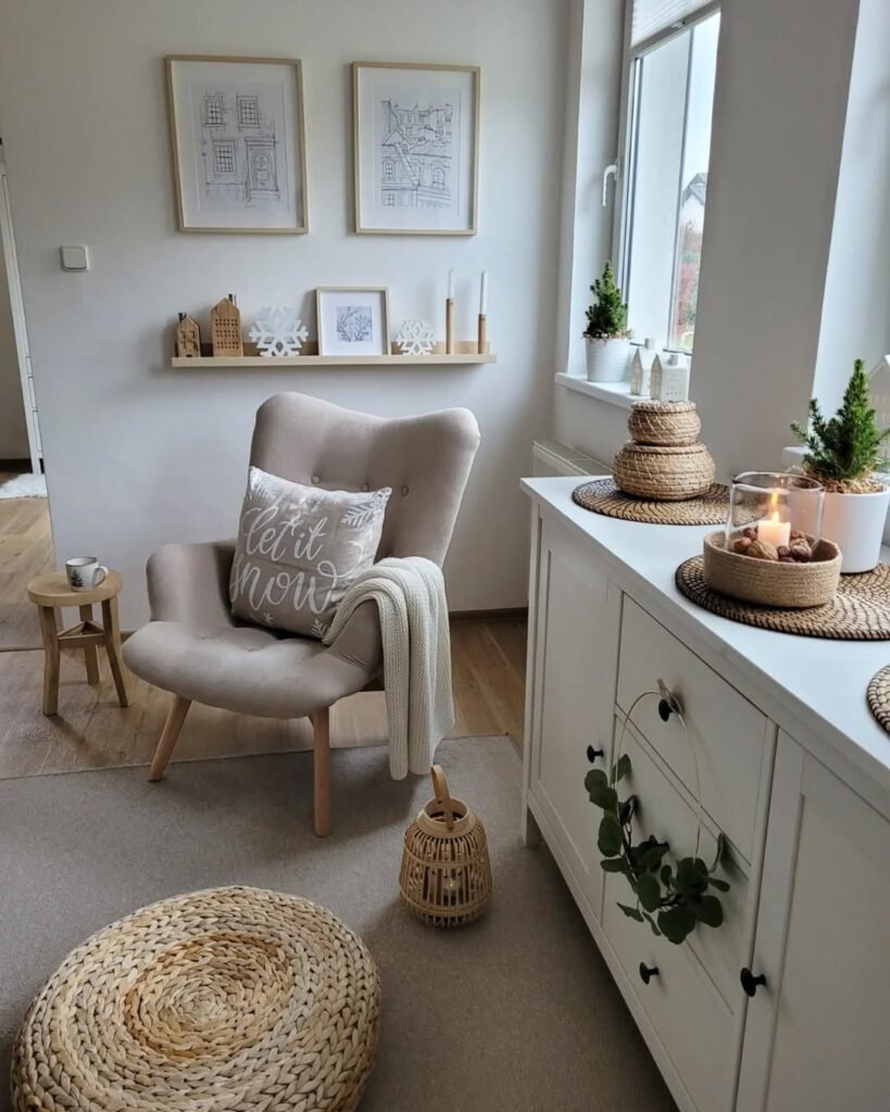
This little corner? Low effort, high impact—and we love to see it. It’s the kind of setup that looks like it just happened naturally, but we all know there was some quiet styling strategy behind it. The neutral chair, soft textiles, and minimal decor create a space that feels calm but not empty.
The principle here is restraint. Instead of filling every surface, the design lets negative space do its job. The floating shelf adds just enough visual interest, while the layered textiles bring in warmth. It’s minimalism, but with a personality—not the cold, sterile kind.
If we’re recreating this, we’d pick a comfortable statement chair first, then build around it slowly. Add one or two decor pieces with different heights, keep the palette soft, and resist the urge to over-style. Sometimes the hardest design move is knowing when to stop—and yes, we will struggle a little.
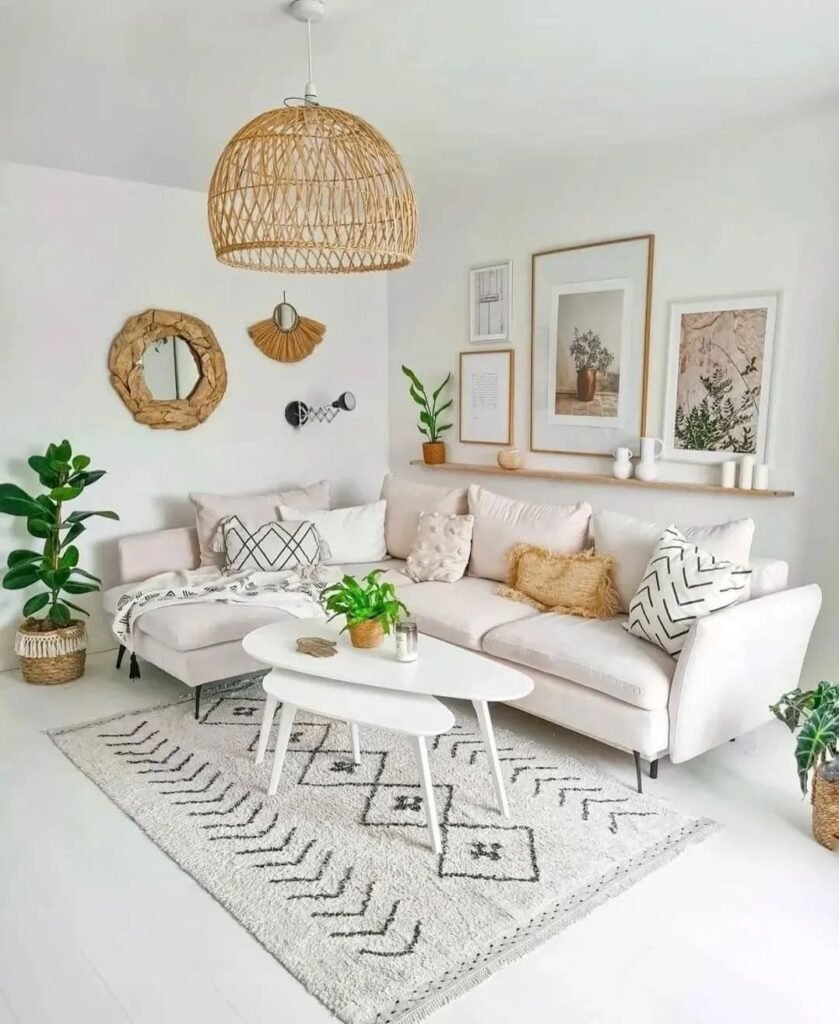
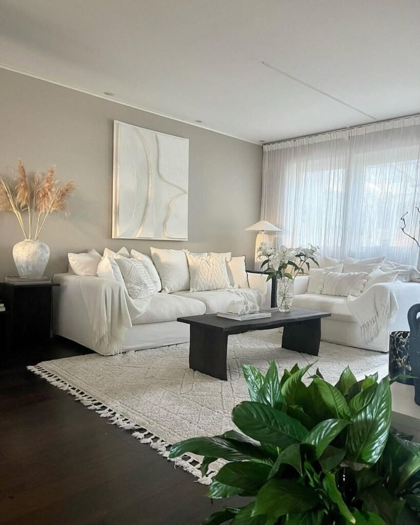
Layered Neutrals With Soft Graphic Accents
This is what happens when minimalism gets a personality upgrade. At first glance, it’s all soft beige and creamy whites, but then the subtle graphic pillows and framed art step in like, “hey, we’re not boring.” And honestly? We appreciate the restraint.
Design-wise, this space plays with quiet contrast. The base palette stays cohesive, while the line art and geometric patterns add just enough visual tension to keep things interesting. The gallery wall is evenly spaced (bless), creating balance without feeling stiff. It’s giving calm, but with a little edge—like someone who drinks oat milk but has strong opinions.
To recreate this, we’d keep the foundation super neutral, then layer in 2–3 patterned elements max. Stick to a consistent color tone so it doesn’t get chaotic. Add one plant for freshness, not a jungle takeover. The trick is letting the details whisper, not shout.
Natural Wood Paneling Cozy Corner Moment
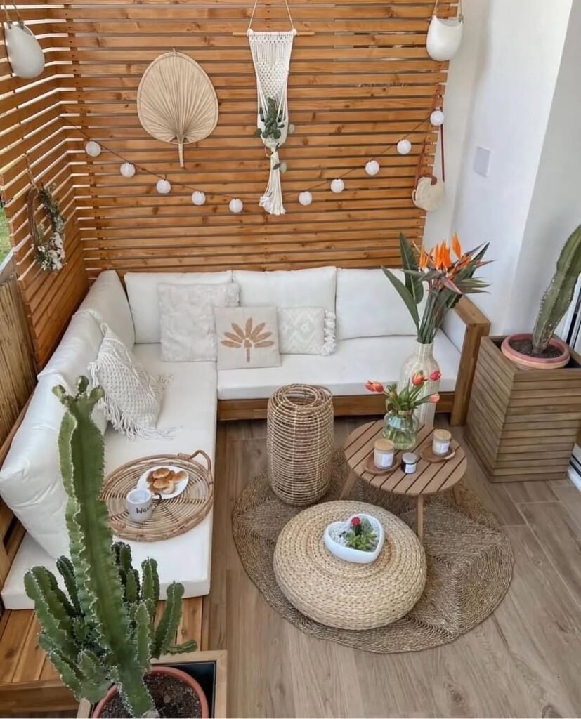
Okay but this corner? It’s low-key stealing the whole show. The wooden slat walls wrap the space in warmth, making it feel like a mini escape without leaving your house. It’s giving Scandinavian meets soft boho vacation energy—and we’re fully here for it.
The design principle here is enclosure and texture. The vertical wood lines visually elongate the space, while the layered woven pieces soften that structure. Seating is kept low and intimate, encouraging that cozy, sit-for-hours vibe. This is less about styling and more about creating a feeling.
If we’re recreating this, we’d start with a feature wall—real wood if possible, or even a slat panel hack. Keep furniture low-profile and modular. Add soft textiles, but keep the palette tight. This works because everything feels cohesive, not curated for Instagram… even though it totally is.
Textured Wall Panels With Warm Lighting Glow
Now this one leans a little moodier—and honestly, we kind of love that for Scandinavian design. It breaks the “everything must be bright white” rule in the best way possible. The layered wall panels create depth, while the warm lighting wraps everything in that cozy, evening glow.
From a design standpoint, this is all about dimension. Flat walls are replaced with subtle architectural texture, which instantly elevates the space. The lighting placement is key here—it highlights texture rather than just illuminating the room. It’s proof that lighting is not just functional, it’s a whole personality trait.
To get this look, we’d consider wall paneling or even peel-and-stick options for a budget-friendly version. Pair it with warm-toned bulbs (no harsh white light, please). Keep furniture simple so the wall can shine. Sometimes the background deserves main character energy.
Compact Scandinavian Layout With Clean Geometry
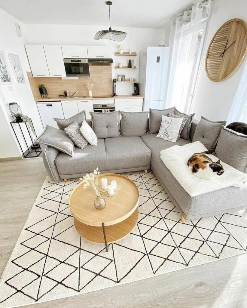
Small space? No problem. This setup is basically a masterclass in making a compact living room feel intentional instead of cramped. The clean lines, geometric rug, and open kitchen layout all work together like a well-rehearsed group chat.
The design principle here is clarity. Every piece has a purpose, and nothing feels extra. The rug defines the seating zone, while the round coffee table softens the sharper lines around it. And let’s talk about scale—everything is sized just right, which is honestly half the battle. Good design isn’t about more stuff, it’s about smarter choices.
If we’re recreating this, we’d focus on multifunctional furniture and keep pathways clear. Choose one statement rug to anchor the space, then build around it. And yes, editing is part of the process—if it doesn’t serve a purpose, it’s out. Marie Kondo would be proud.
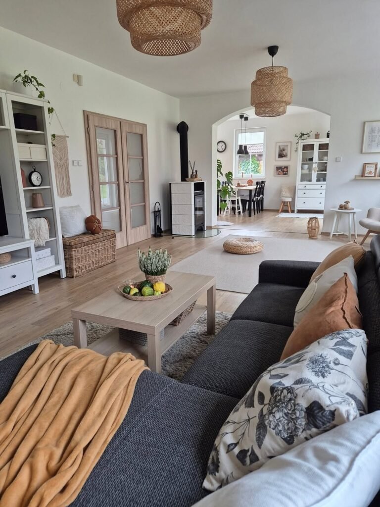
Light Filled Space With Dark Contrast Sofa
Plot twist: Scandinavian design doesn’t have to be all pale everything. This space proves that a darker sofa can actually elevate the whole room instead of weighing it down. It’s contrast, but make it chic—not dramatic.
The design balance here is super intentional. The black sofa grounds the space, while the surrounding light woods, white walls, and soft textiles keep things airy. The natural light does a lot of heavy lifting, preventing the darker element from feeling too dominant. It’s all about contrast that feels controlled, not chaotic.
To recreate this, we’d start with a darker anchor piece—sofa or even a chair—then surround it with lighter tones to balance it out. Keep textures soft and cozy to avoid a harsh look. It’s giving “I’m minimal, but I have range,” and honestly, we respect that.
Simple Choices That Quietly Elevate Everyday Living Spaces
At the end of the day, Scandinavian living rooms aren’t about chasing trends—they’re about creating a space that ages well with you. The reason these rooms work is because they rely on timeless elements: neutral palettes, thoughtful textures, and furniture that doesn’t scream for attention but still delivers.
What we’ve seen is that small decisions make a big difference. A well-placed rug can define a space, the right lighting can shift the entire mood, and mixing materials adds depth without clutter. It’s less about adding more, and more about editing better—yes, even when we’re emotionally attached to that extra throw pillow.
So if we’re recreating any of these looks, the goal isn’t perfection—it’s intention. Keep it soft, keep it balanced, and maybe leave a little room for imperfection. That’s where the space starts to feel real—and honestly, way more us.
 Steal Our Home Styling Secrets!