Where Rustic Meets Refined: Rethinking the Farmhouse Kitchen
Farmhouse kitchens are having a moment… but let’s be honest, they never really left. What has changed is how we’re styling them. It’s no longer about copying the same all-white Pinterest board from 2016. It’s about balance. Warm woods with crisp cabinetry. Soft blues with brass glow. Brick paired with sleek hardware. Cozy, but curated. Rustic, but refined. We’re not doing chaotic country. We’re doing intentional charm.
Across these ideas, you’ve probably noticed a pattern. Repetition of finishes. Controlled color palettes. Contrast between light and grounded elements. Whether it’s a bold yellow door, a moody brick backsplash, or a quiet beam cutting through white space, every detail serves a purpose. That’s the difference between themed and timeless.
So as we scroll, save, and mentally renovate, let’s remember: farmhouse isn’t a formula. It’s a feeling. And we get to define it.
Soft Blue Cabinets, Brass Glow
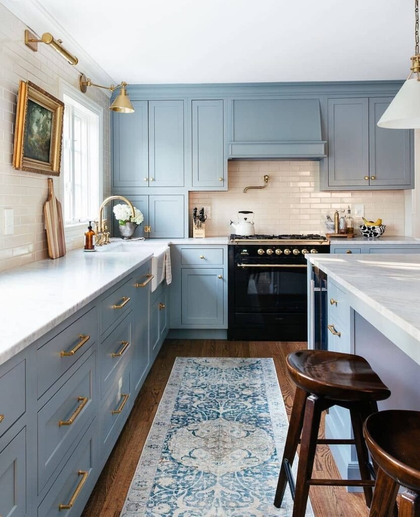
We don’t talk enough about how color can completely shift a farmhouse kitchen without screaming for attention. This muted dusty blue cabinetry? It’s giving calm, collected, slightly coastal but still grounded. The design principle here is controlled contrast. The cool-toned cabinets balance the warmth of brass hardware and creamy subway tile, creating that “effortlessly curated” vibe we all pretend just happened naturally. Spoiler: it didn’t. It’s strategic, babe.
Notice how the brass repeats across the faucet, knobs, and lighting. That repetition builds cohesion. Meanwhile, the darker range anchors the room so it doesn’t float into pastel oblivion. Even the runner rug subtly echoes the cabinet tone, tying the vertical and horizontal planes together like a quiet design mic drop.
If we’re recreating this, pick one hero color and commit. Keep countertops light for airiness, layer in warm metals for glow, and don’t overdo decor. Farmhouse isn’t clutter-core. It’s edited charm. Think balance, not chaos. We want cozy… not chaotic aunt energy.
Layered Rustic Open Shelving
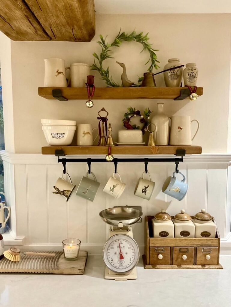
Open shelving can either look Pinterest-perfect or like we gave up on upper cabinets. The difference? Intention. This setup nails visual layering. Warm wood shelves contrast against creamy walls, while ceramics in soft neutrals keep the palette restrained. The design principle here is repetition with variation. Similar tones, different shapes. That’s the secret sauce.
See how mugs hang below the shelf? That adds vertical rhythm and makes the composition feel styled, not accidental. The wreaths introduce organic curves, softening all the straight lines from shiplap and shelf brackets. Texture is doing heavy lifting here: wood grain, ceramic glaze, metal hooks. It’s subtle but powerful.
If we’re recreating this, curate before you display. Stick to a tight color story. Mix heights and silhouettes so it feels dynamic. And please leave breathing room. Negative space is not wasted space; it’s luxury. When in doubt, remove one item. Your shelves should whisper cozy, not shout “clearance sale.”
Airy Island With Light Wood
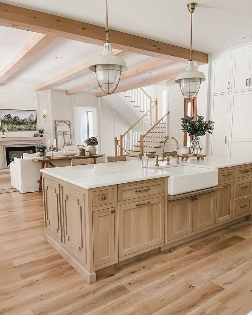
This kitchen island is proof that farmhouse can feel fresh, not heavy. The light wood cabinetry paired with a bright countertop keeps the space open and breathable. Design-wise, it’s all about tonal harmony. Floors, beams, and cabinetry live in the same warm wood family, which creates continuity and flow. It’s cohesive without being matchy-matchy. That’s grown woman energy.
The oversized pendant lights add scale and presence, balancing the substantial island below. Meanwhile, the farmhouse sink becomes a focal point through placement and contrast. It’s functional drama. We love a multitasker.
To recreate this look, prioritize proportion. If your island is chunky, your lighting should hold its own. Keep finishes warm and consistent, and avoid introducing random cool tones that fight the vibe. Layer soft decor like greenery or linen for warmth. The goal? Spacious but cozy. Think Sunday brunch hosting era, not sterile showroom.
White Shiplap, Warm Wood Contrast
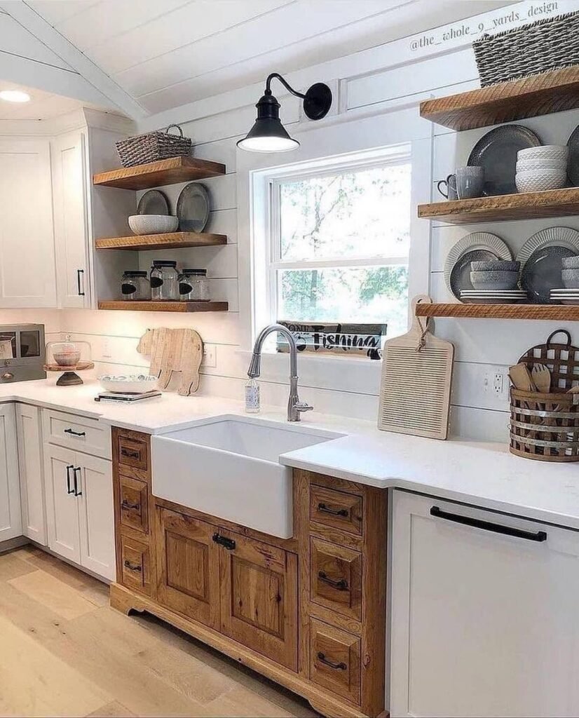
This setup quietly proves that contrast doesn’t have to be loud to be powerful. Crisp white shiplap walls create a clean canvas, while the rich wood lower cabinets ground the space. It’s a classic light-versus-warm balance, and honestly, it just works. The design principle here is anchored contrast. Light above, weight below. Stability, but make it aesthetic.
Floating wood shelves repeat the lower cabinet tone, visually connecting upper and lower halves. Black hardware and the wall sconce add tiny punctuation marks, preventing the space from drifting into beige-on-beige territory. It’s subtle edge. Farmhouse with boundaries.
If we’re recreating this, focus on distribution. Keep heavier tones lower to ground the room. Use open shelves sparingly and style with neutral ceramics to avoid visual clutter. And don’t skip texture. Matte finishes, natural wood grain, woven baskets. Farmhouse thrives on tactile layers. Smooth everything feels flat. We want dimension, not drywall vibes.
Classic Pantry With Glass Doors
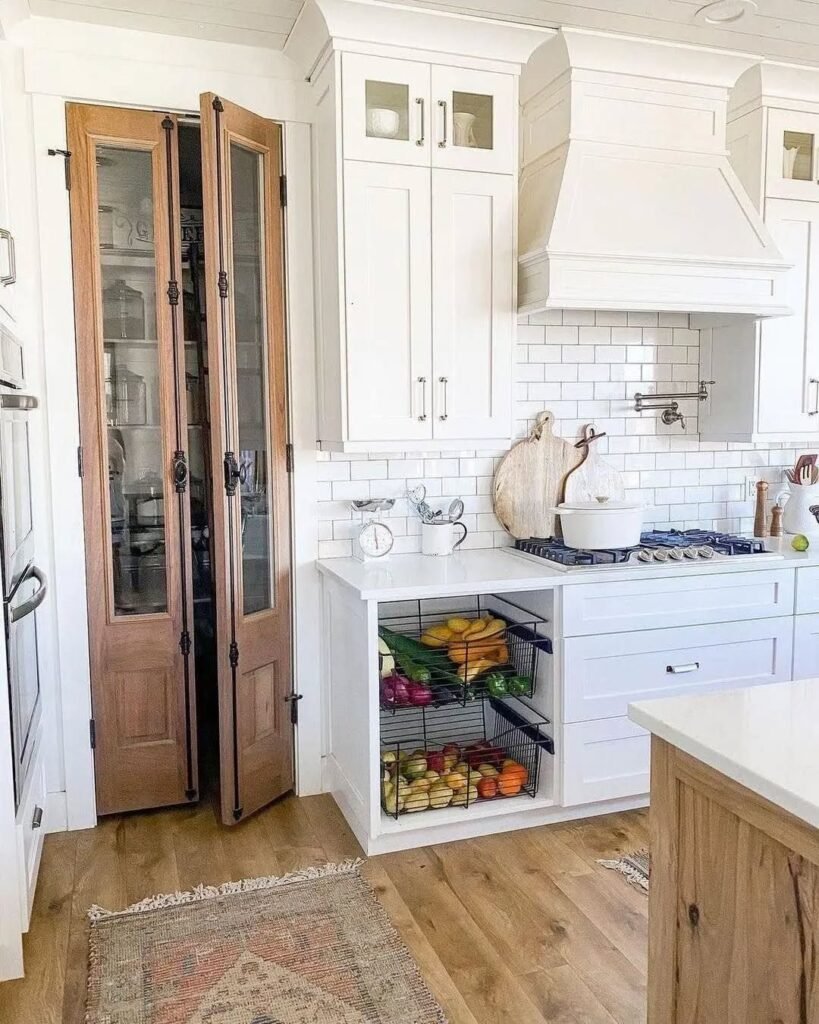
A glass-paneled pantry in a farmhouse kitchen? Elite behavior. It adds architectural interest while keeping things airy. The design principle here is transparency as depth. Those glass doors create visual extension, making the kitchen feel larger and more layered. Plus, the wood trim warms up all that white cabinetry. Balance, always balance.
The white range hood and subway tile keep the backdrop simple, allowing the pantry doors to shine without competition. Even the produce baskets below introduce functional texture. It’s practical styling. We love a kitchen that multitasks without flexing too hard.
If we’re recreating this, commit to organization inside the pantry because glass exposes everything. Use matching containers or woven baskets for cohesion. Keep the surrounding palette restrained so the wood detail stands out. And please align your shelves neatly. Visible chaos hits different. This look is farmhouse sophistication, not “we forgot to close the door.”
Cozy Built-In Festive Nook
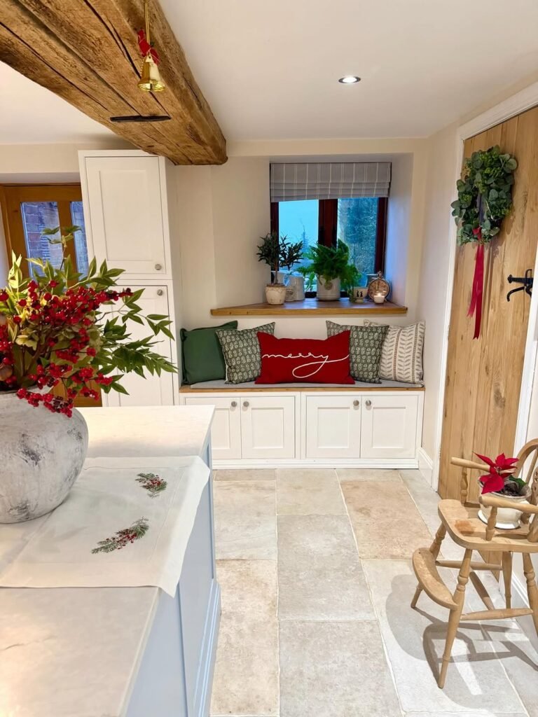
We’re low-key obsessed with a built-in bench moment, especially when it’s styled for the holidays without going full North Pole. This nook works because of proportion and warmth. The white cabinetry keeps it crisp, while the chunky reclaimed beam above adds rustic weight. That balance between refined and raw? Chef’s kiss.
The color palette is controlled: creamy walls, natural wood, deep green, and small pops of red. Notice how the red pillow becomes the focal point because everything else plays supporting character. That’s contrast done right. Even the wreath on the door mirrors the greenery inside, creating visual repetition across the room.
If we’re recreating this, think layering. Start with neutral cushions, add one bold seasonal accent, then echo that color somewhere else in the space. Keep wood tones warm for authenticity. And please don’t overcrowd the bench. Cozy reading corner, yes. Santa’s waiting room, no. We want festive, not frantic.
Vintage Tea Corner Romance
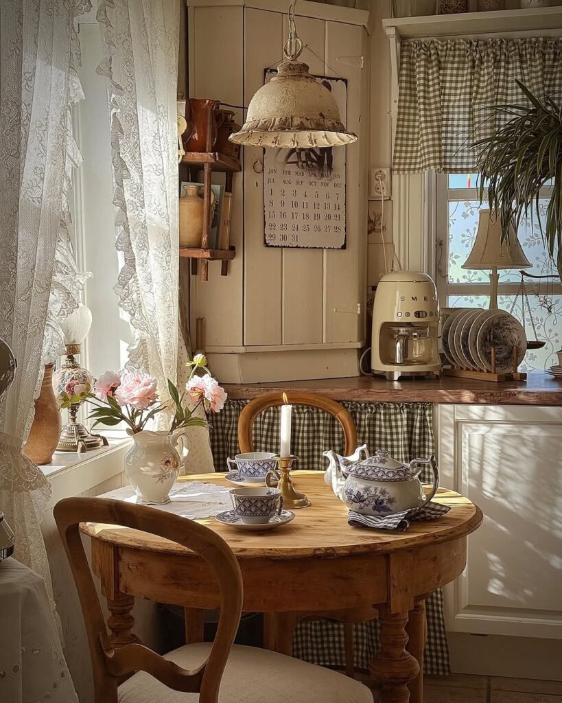
This kitchen corner feels like it time-traveled from a cottage novel, and honestly, we’re here for it. The design principle at play is intimacy through scale. A small round table softens the angular cabinetry, while lace curtains filter light into a dreamy glow. It’s giving slow mornings and zero emails.
Texture is everything here. Gingham fabric, distressed wood, ceramic florals, aged metal lighting. The palette stays warm and muted, which prevents the vintage elements from feeling costume-y. Even the SMEG-style appliance blends because the tone matches the cabinetry. That’s cohesion, babe.
To recreate this vibe, commit to softness. Choose curved furniture, layer textiles under counters, and mix patterns within the same color family. Keep lighting warm, not stark white. And resist the urge to modernize everything. Farmhouse charm thrives on imperfection. If it looks slightly inherited from your cool grandma, you’re doing it right.
Playful Colorful Farmhouse Pop
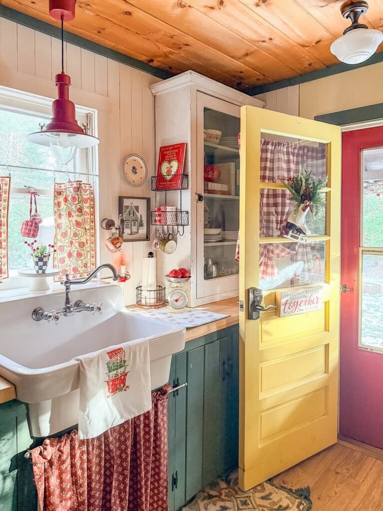
Okay, this one said “farmhouse, but make it joyful.” The yellow door alone shifts the entire energy of the kitchen. Design-wise, this works because bold color is contained. The majority of surfaces stay neutral, allowing the saturated hues to feel intentional instead of chaotic.
Notice the repetition of red across textiles, decor, and even the adjacent door. That consistency prevents the space from feeling random. The green lower cabinets ground the palette, while warm wood ceilings keep it rustic. It’s controlled maximalism, not design anarchy.
If we’re recreating this, choose one or two bold colors and repeat them at least three times. Keep cabinetry classic so the colors don’t overpower the structure. Mix vintage-inspired textiles for personality. And remember: farmhouse doesn’t have to be beige to be valid. A little dopamine decor never hurt anyone. We’re building charm, not playing it safe.
Bright White Beam Contrast
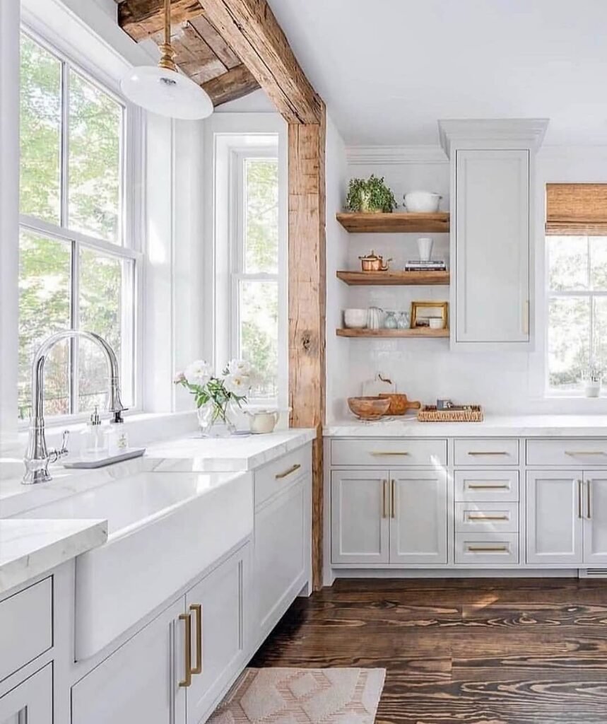
This kitchen proves white doesn’t mean boring. The real star? That exposed wood beam slicing through an otherwise airy space. The principle here is contrast and framing. Dark wood against white cabinetry creates visual structure and draws the eye upward, making ceilings feel taller. It’s subtle drama, the good kind.
Open shelving in matching wood ties the beam to the lower elements, creating cohesion. Meanwhile, brass hardware introduces warmth without competing. The color palette is restrained, which allows texture and material to carry the personality. That’s grown-up farmhouse energy.
To recreate this, mix one strong rustic element with clean cabinetry. Keep countertops light to maintain airiness. Repeat wood tones strategically so they feel intentional, not leftover. And don’t overcrowd the shelves. A few ceramics, greenery, maybe a framed piece. Let negative space breathe. White works when it’s layered, not sterile.
Brick Backsplash Modern Farmhouse
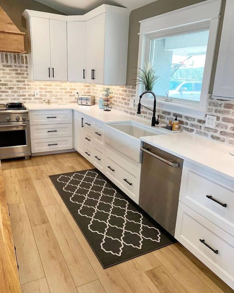
This kitchen is giving modern farmhouse with a little edge, and we love a balanced personality. The white shaker cabinets keep things classic, while the light brick backsplash adds texture and depth. Design principle? Contrast in material, harmony in color. The tones are cohesive, but the surfaces are varied. That’s what keeps it interesting.
Black hardware and faucet create crisp punctuation throughout the space. Notice how those dark accents repeat consistently, anchoring the lighter cabinetry. The patterned runner introduces softness underfoot while subtly echoing the darker details above. It’s layered, but not loud.
If we’re recreating this look, prioritize texture. Brick veneer or brick-style tile instantly elevates flat walls. Stick to a tight palette of white, warm wood, and black accents for balance. Add one patterned textile to break up solid surfaces. And remember, farmhouse can absolutely lean modern. Cozy doesn’t mean outdated. We’re timeless, not stuck in 2014 Pinterest.
Build Warmth, Balance, Then Add Personality
If there’s one takeaway from all these kitchens, it’s this: start with structure, then layer soul. Get your foundations right first. Cabinet color, wood tone, hardware finish. Make sure they’re speaking the same design language. Harmony first, personality second. That’s how you avoid the “why does this feel off?” moment at 2 a.m.
Then we add the magic. A festive built-in nook. Open shelves styled with restraint. A vintage tea corner that whispers main-character energy. A runner rug that subtly ties the room together. These aren’t random details. They’re layered with intention, repeating colors and textures to create rhythm and flow. Cozy isn’t cluttered. Modern doesn’t mean cold.
At the end of the day, farmhouse kitchens work because they feel lived in but thoughtfully edited. So trust your eye, repeat your finishes, embrace contrast, and don’t be afraid of a little dopamine decor. Your kitchen, your era.