Deck Skirting Isn’t an Afterthought—It’s the Whole Mood Shift
We don’t talk about deck skirting enough, and honestly… we should. It’s one of those design details that feels minor until you see it done right, and suddenly the whole outdoor space looks elevated. Like, not just “we added a deck,” but “we curated an experience.” Subtle difference, big impact.
Across these ideas, there’s a clear pattern—balance is everything. You’ve got heavier bases like stone and geometric panels grounding the structure, while lighter railings and open lines keep things from feeling bulky. That push and pull between weight and airiness is what makes a deck feel designed, not just built.
If we’re being real, skirting is also where personality sneaks in. Whether it’s warm wood slats, bold tile, or soft lattice with lighting, this is your chance to add character without overwhelming the space. Think of it as the outfit your deck didn’t know it needed.
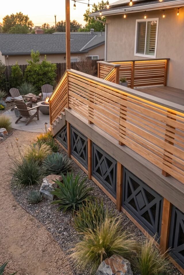
Warm Wood Slats with Hidden Glow
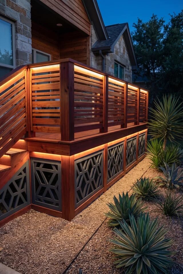
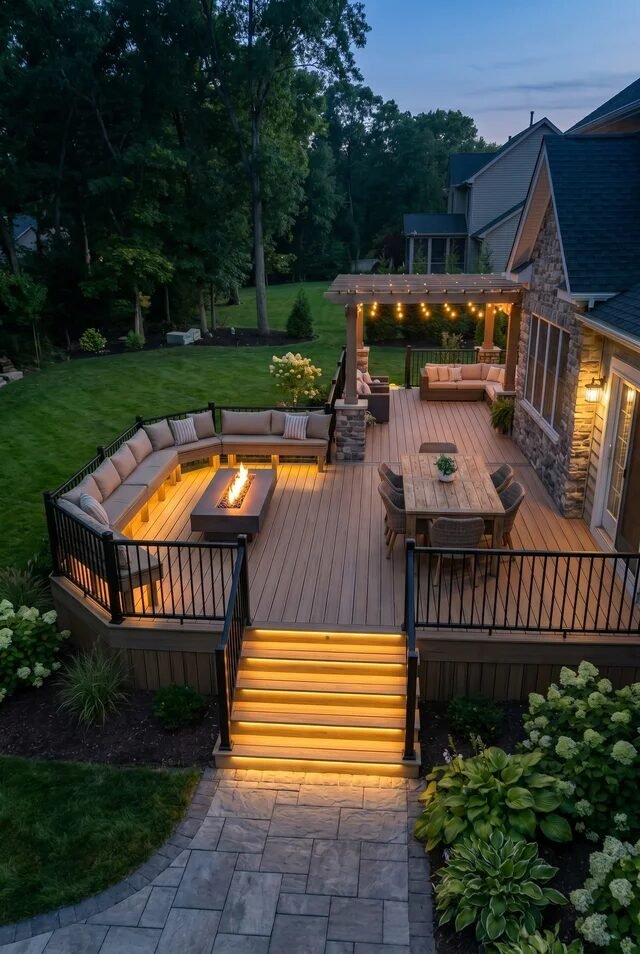
There’s something a little unfair about how good this looks at night. The horizontal wood slats already bring that clean, architectural rhythm, but then the underlighting kicks in and suddenly your deck is giving main character energy. The glow softens the structure, making it feel less like a base and more like a feature. It’s cozy, but in a “we totally planned this” kind of way.
From a design perspective, this is all about layering and contrast. You’ve got warm-toned wood against darker geometric panels, plus that subtle lighting acting as a visual outline. The lighting isn’t just decorative—it defines the deck’s silhouette after sunset, which is low-key genius. It also balances the heaviness of the base so it doesn’t feel bulky.
If we’re recreating this, focus on spacing consistency for the slats and invest in warm LED strips (not the harsh white ones, please). Tuck them under the railing and along the base edge. Dim lighting = instant ambiance upgrade, no overthinking required.
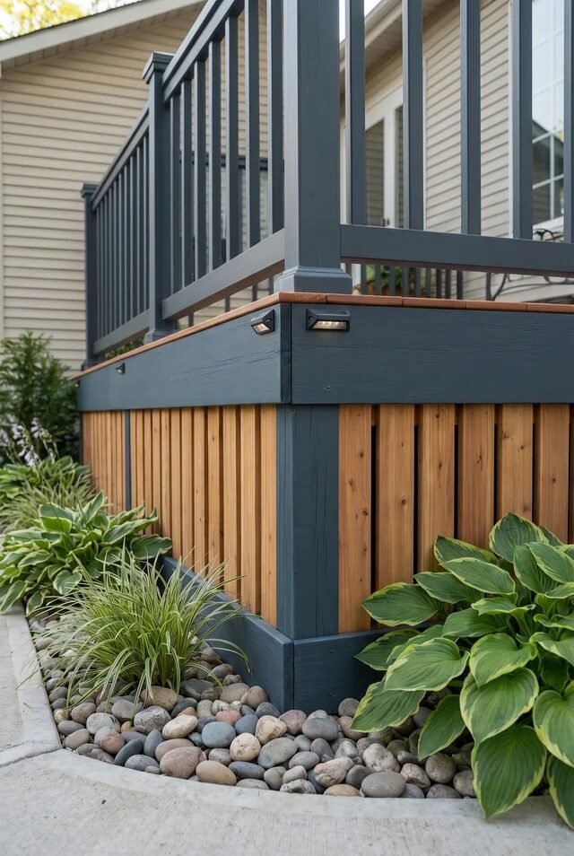
Modern Black Frame with Wood Texture
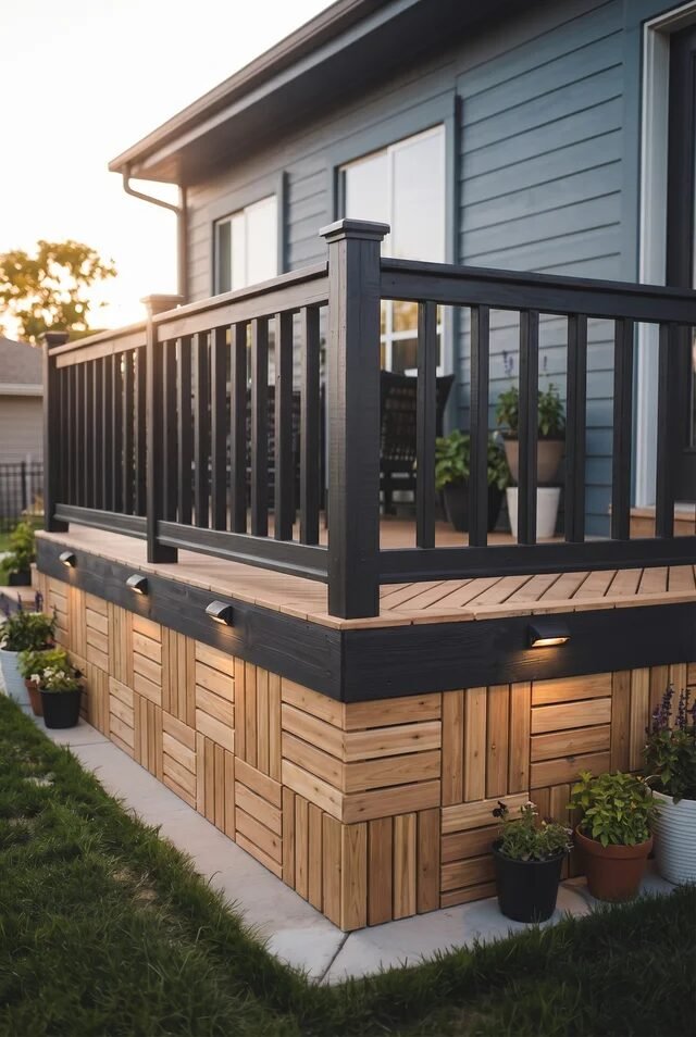
This one feels like the girl who always looks effortless but definitely has a routine. The black railing sharpens everything visually, while the skirting mixes in warm wood panels that feel grounded and approachable. It’s that perfect in-between of modern and cozy—aka, not trying too hard but still winning.
The design principle here leans heavily on contrast and repetition. The black vertical balusters echo the grid-like pattern below, while the wood tones soften the overall look. That balance between dark structure and warm texture is what keeps it from feeling too stark or too rustic. It’s giving curated, not chaotic.
To pull this off, we’d stick to a tight color palette—black, natural wood, maybe a hint of greenery. Use modular wood panels or create a checkerboard layout for subtle variation. And don’t skip the small under-deck lights. They’re doing quiet work, but trust, they matter more than you think.
Airy Cable Deck with Garden Base
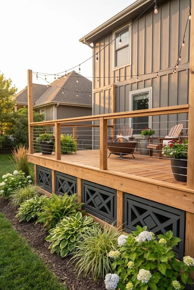
This setup feels like a deep breath. The cable railing keeps everything visually open, so your eyes go straight to the garden instead of stopping at the deck. It’s relaxed, slightly elevated (literally), and honestly kind of serene without being boring.
What’s happening here is a strong case of visual flow. The thin horizontal cables mirror the long lines of the deck boards, while the landscaping below softens the structure. The skirting panels act as a subtle boundary without interrupting the openness, which is harder to pull off than it looks. It’s all about letting elements coexist instead of compete.
If we’re recreating this vibe, don’t overcrowd the space. Choose low, lush plants like hostas or ornamental grasses to blur the edge between deck and yard. Keep the skirting design simple and geometric. And those string lights? Not optional. They’re basically the personality of the whole setup.
Classic White Rail with Woven Detail
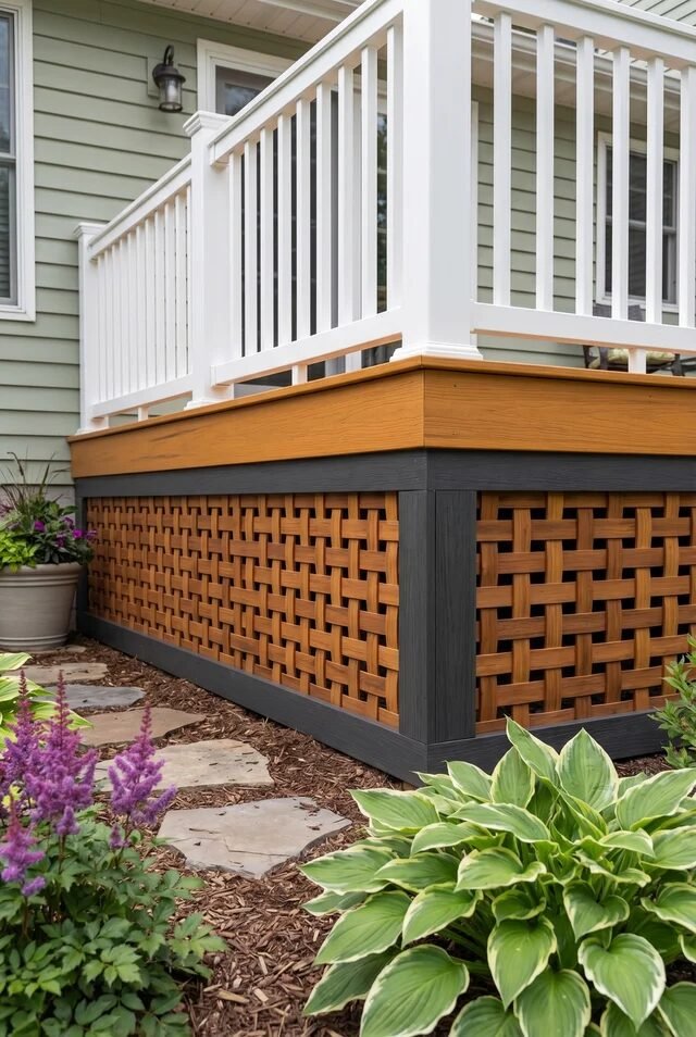
This one is giving timeless… but not in a boring way. The crisp white railing feels clean and familiar, while the woven-style skirting adds just enough detail to keep things interesting. It’s like wearing a white shirt with really good accessories—simple, but elevated.
Design-wise, this plays with texture and contrast in a very controlled way. The structured vertical railing sits on top, while the woven base introduces movement and softness. That textural shift is what keeps the design from feeling flat or predictable. Also, the darker trim framing the skirting? Quietly pulling everything together.
If we’re trying this at home, pre-made lattice panels can get you close, but consider painting or framing them for a more custom feel. Stick to a neutral palette—white, warm wood, maybe a charcoal accent. Add some soft landscaping around the base to keep it from looking too “boxed in.”
Boho Tile Skirting That Steals Focus
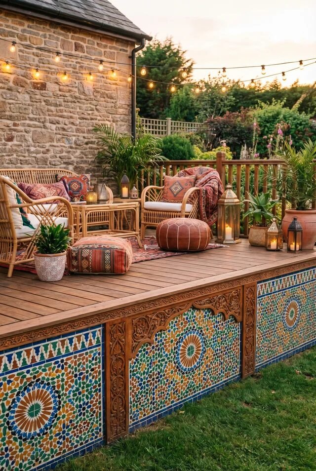
Okay, this one is not here to be subtle—and honestly, we respect that. The patterned tile skirting completely transforms the deck into a statement piece. It’s colorful, detailed, and feels like you accidentally booked a vacation in your own backyard.
The key principle here is emphasis. Everything else—the wood deck, the furniture, even the railing—steps back so the skirting can shine. This works because the surrounding elements stay relatively neutral, letting the pattern breathe instead of overwhelming the space. It’s bold, but still balanced.
If we’re recreating this, commit to the look. Half-measures will just feel confusing. Use outdoor-rated tiles or patterned panels, and pair them with warm wood tones to keep things grounded. Layer in textiles—rugs, cushions, lanterns—to echo the vibe. It’s a little extra, yes… but in the best way possible.
Stone Base That Feels Grounded
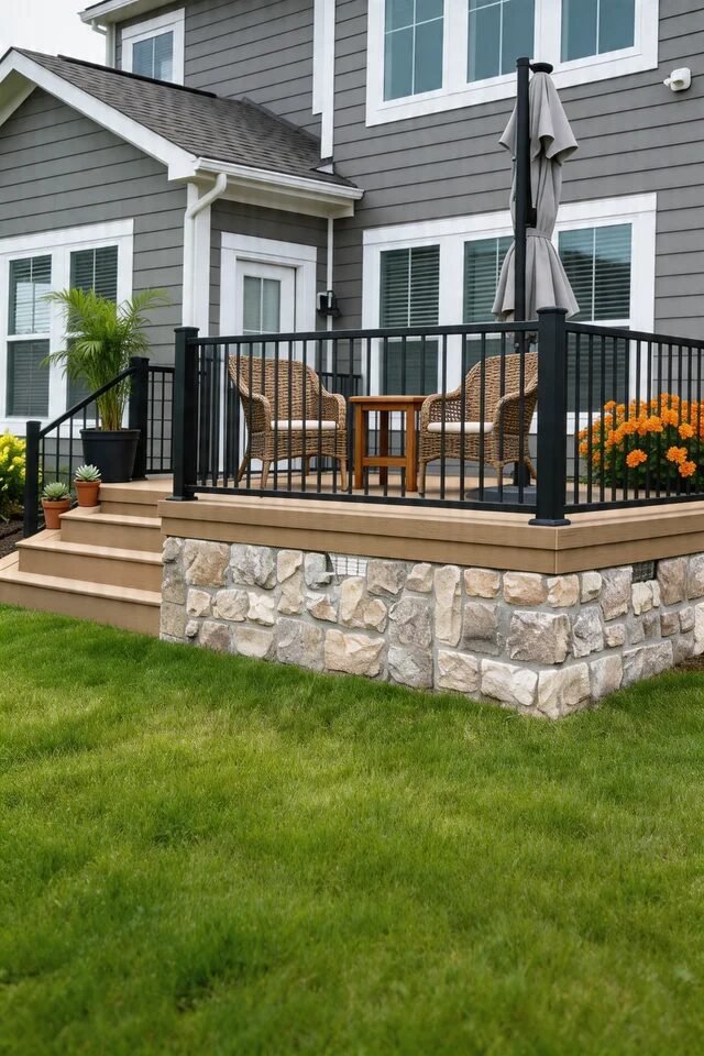
This one is giving “we have our life together” energy. The stone skirting instantly makes the deck feel permanent, like it’s part of the house rather than an add-on we impulsively decided on after one Pinterest scroll. It’s structured, solid, and honestly a little bit fancy without trying too hard.
Design-wise, this is all about visual weight and anchoring. The stone base grounds the entire structure, while the black railing above adds contrast and definition. That shift from heavy texture below to lighter lines above creates a really satisfying balance. It also ties beautifully into the home’s exterior, which makes everything feel cohesive instead of disconnected.
If we’re recreating this, go for stacked stone veneer instead of full stone (your budget will thank you). Keep the color palette aligned with your house siding, and don’t skip the clean trim line between deck and skirting. That crisp edge? Low effort, high impact.
Pixel Block Skirting That Turns Heads
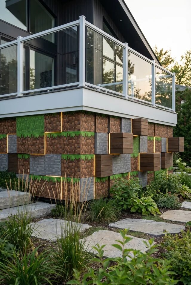
Okay… this one is not for the minimalists. It’s bold, a little chaotic, and somehow still works. The blocky, almost pixelated design feels like Minecraft grew up and got into home design, and we’re not mad about it. It’s playful, unexpected, and very much a conversation starter.
The principle here leans into repetition with variation. You’ve got these protruding cube forms creating depth, while the lighting outlines each section. That combination of dimension and glow turns a flat surface into something sculptural. It’s less about blending in and more about making a statement—loud, but intentional.
If we’re going this route, commitment is key. Choose a consistent color story (earth tones work best), and integrate lighting early in the plan. This isn’t a last-minute add-on situation. And maybe keep the rest of the deck simple… because this skirting is already doing the most (in a good way).
Dark Grid Panels with Soft Contrast
This design feels calm, like it drinks herbal tea and has boundaries. The dark grid panels bring structure, while the lighter frame keeps everything from feeling too heavy. It’s subtle, but in a very put-together way.
What’s working here is the interplay between repetition and proportion. The small square openings create a consistent rhythm, while the larger framing sections break it up just enough. That balance prevents the pattern from feeling overwhelming or too busy. Paired with the soft landscaping, it creates a really easy visual flow.
If we want to recreate this, focus on symmetry and spacing. Pre-made lattice panels can work, but consider painting them a deeper tone for contrast. Surround the base with river rocks and low grasses to soften the edges. It’s one of those designs where everything looks effortless… but we know better.
Classic Diagonal Lattice with Lighting
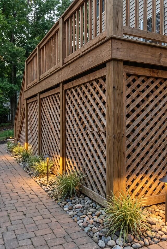
We’ve seen lattice before, but this one said “let’s glow up a little.” The diagonal pattern keeps things traditional, but the warm ground lighting underneath? That’s the twist. Suddenly it’s less “basic backyard” and more “evening wine moment.”
The design principle here is layering texture with lighting. The crisscross pattern adds movement, while the soft uplighting highlights that texture after dark. Lighting here isn’t just functional—it’s literally styling the structure. It also creates depth, making the skirting feel less flat and more dimensional.
If we’re recreating this, go for cedar or pressure-treated wood and stain it in a warm tone. Install low landscape lights along the base, angled slightly upward. And don’t overcrowd the area—let the light and pattern do their thing. Sometimes restraint is the real flex.
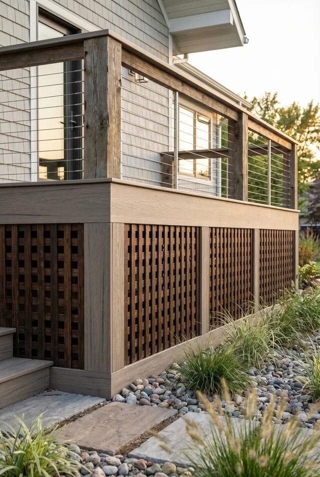
Vertical Slats with Modern Contrast
This one is clean. Like, suspiciously clean. The vertical slats feel modern and streamlined, while the darker frame gives just enough contrast to keep things interesting. It’s minimal, but not cold—basically the design version of “I woke up like this,” but we all know there was effort.
From a design standpoint, vertical lines draw the eye upward, which subtly makes the deck feel taller. The spacing between slats keeps it airy, while still hiding what needs to be hidden. That balance between openness and coverage is what makes this style so versatile.
If we’re recreating it, consistency is everything. Keep the spacing even, choose a warm wood tone, and pair it with a darker frame for that modern edge. Add a simple rock bed and a few structured plants around the base. Clean, intentional, and just a little bit smug—in the best way.
When Deck Skirting Becomes The Real Design Moment

At some point, the skirting stops being background and starts stealing the show—and we’re kind of here for it. From glowing wood panels to bold, almost sculptural designs, these ideas prove that the base of your deck can carry just as much style as what’s happening on top.
What ties everything together is intention. The best designs don’t just look good—they make sense. Materials connect with the house, lighting highlights structure, and patterns create rhythm instead of chaos. When every element feels considered, the entire deck reads as one cohesive story.
So if you’re planning a deck refresh, maybe don’t leave the skirting as an afterthought. That’s the plot twist. Go a little bolder, or a little more refined—but make it deliberate. Because once you notice good skirting, you really can’t unsee it… and your backyard deserves that level of main character energy.
 Steal Our Home Styling Secrets!